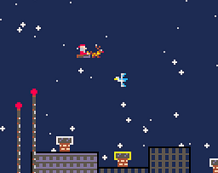
I ran out of time for the sound, unfortunately.
JP-Lopez
Creator of
Recent community posts
Quite relaxing game.
I enjoyed having a fishdex, to look for what I'm missing. Makes it fun. I would actually load that screen after fishing, to show the player where that fish falls in the index. Perhaps some text blinking on the affected entry.
The music was too high-pitch to my taste. After a while, it gets tiring.
The spinning part could improve if you slow it down so the player can read the text. Instead of stopping at once, so a small slowing down, like a roulette. That would make it attracting to the eye.
Quite relaxing game.
I enjoyed having a fishdex, to look for what I'm missing. Makes it fun. I would actually load that screen after fishing, to show the player where that fish falls in the index. Perhaps some text blinking on the affected entry.
The music was too high-pitch to my taste. After a while, it gets tiring.
The spinning part could improve if you slow it down so the player can read the text. Instead of stopping at once, so a small slowing down, like a roulette. That would make it attracting to the eye.
Very interesting idea. The mix of puzzle, physics and dungeon aesthetic works very well together.
What I enjoyed the most was watching my solution unfold after I carefully placed all spinners. That moment is super satisfying. You should definitely explore that more.
I agree with others that the controls were not that great. At times, it was hard to pick the spinners, and the pink mark doesn't suit well. I would change it to an arrow, so you know roughly the direction the missile will be launched.
I would add a missile whistle sound to the missile while traveling. Kind of like this one: https://elements.envato.com/bomb-whistle-BCMB8U6
Playing around with gravity never gets old. Is such a great platforming mechanic. The spinning hat is a nice touch. Is the character named Juniper, perhaps?
I enjoyed the game design. It felt like Celeste, every mistake it would immediately take you back to try again. That keeps the pace of the game, and engagement.
The controls need more refinement, as well as the hit-boxes of spikes and other obstacles. When they are too strict, too pixel-perfect, it doesn't feel fair for the player.
The horizontal movement could start slow and accelerate over time. Same with stopping, adding a bit of slide feels great. A couple of pixels extra in the jump landing, so you're more forgiving when landing next to a hazard. All of the above, are some improvements I think would take your game to a new level.
Specifically for the spikes, make them bigger, or more noticeable somehow. On occasions, it took me multiple attempts to realize I was hitting spikes.
Great game, the mechanics felt great, which can be challenging when you have physics-based movements, like the spinning.
What I enjoyed the most, were the weapon's combinations you could do. It was a great design choice to have weapons act as 'power-ups', adds depth to the loadout.
If you're thinking to expand on this game, the biggest risk I see, is the spinning mechanic becoming repetitive pretty soon. In my case, after 4 to 5 levels, started to feel repetitive, and I could predict enemies movement patterns.
I was able to play it on web without any issues!
I like the mechanics, there is a bit of randomness that makes you focus and engage.
the spikes are too pixel-perfect to my taste, I would make them a bit larger in size, padding the hurt boxes a couple of pixels, so is more forgiven.
Overall, great game and idea
A very simple and well made game. I think you nailed the idea of keeping it short and simple, yet still fun.
I loved that I didn't need any tutorial or hint to understand how to play in the first level. The same with every new element introduced. The game was capable of explaining by itself. Great work there!
I was able to play it on web without any issues!
I like the mechanics, there is a bit of randomness that makes you focus and engage.
the spikes are too pixel-perfect to my taste, I would make them a bit larger in size, padding the hurt boxes a couple of pixels, so is more forgiven.
Overall, great game and idea
A very simple and well made game. I think you nailed the idea of keeping it short and simple, yet still fun.
I loved that I didn't need any tutorial or hint to understand how to play in the first level. The same with every new element introduced. The game was capable of explaining by itself. Great work there!
I'm not a regular player of this genre, therefore, I'm not sure how much I can analyze it.
First, the art, color palette and music blend very well together. I would suggest better contrast in the dialog boxes, and different text colors between characters, so is easier to follow.
At first, I found it very short. The 'Restart' give me a hint that I should probably choose different answers. That's how I got to a second ending. This part should be made more explicit at any ending: explain to the player they can play it again, so they found the different endings.
I like this idea, unfortunately, the game crashed after I landed the meowlien. This is what I saw in the browser console:
"Scene 'Victory' couldn't be loaded because it has not been added to the active build profile or shared scene list or the AssetBundle has not been loaded.
To add a scene to the active build profile or shared scene list use the menu File->Build Profiles"
Thanks for trying the game! I just uploaded a newer version of the game with the missing pieces. It would mean a lot if you try it again.
I have fun making games in pico-8 because it forces me to learn inner works of game development. For example, this game had many rotation mechanics, and I had to figure out the math behind that.
I think a shader-like feature inside pico8 would derail the main purpose of pico8.
Instead, I would prefer an external tool that can run pico8 cartridges and add shader behaviors.
[EDIT] Turns out someone already thought of my idea: https://github.com/greggman/pico-8-post-processing
hi!
Thanks for the kind words.
This game was my Proof of Concept to mix 2D with 3D elements, and to learn Unity.
Im using Unity 6. And I believe the missing screen is because the Web version is a dev build.
I’ve already started the work on the commercial version of the game, working with a professional illustrator for the art and character design.
Powerups were a very last addition to the game. Mostly I wanted to implement a strategy pattern and usage of scriptable objects. I didn’t put much attention to the experience, honestly.
I love a good beat'em up.
I think you have a solid foundation for the game. Like Burnerknight mentioned before, the game gives you that dopamine hit that keeps calling you to play again.
In terms of improvement, the fighting mechanics need more polishing.
- It suffers from 'ghost' hits, which is when you get hit, but is unclear who or when.
- Speed up the hitting animations (aka Fire Rate), They felt slow.
- Block/Dodge. I missed having a dodge or blocking mechanic in the game. Maybe there's a shield weapon that I didn't get.
- Permanence: keep the bodies in the scene as you defeat them. Same with throw able weapons, weapons, bullet caskets, etc. You can reset them per stage.
- Jumping: the jumping mechanic is useless. There are no obstacles or different floors on the level, and it doesn't save you from getting hit. See my point on Block/Dodge.
This is a very well done game. I've only played this final version. No idea on the progress since the alpha.
I can tell the level design, balance of firepower, enemies, and puzzles are all there.
Small feedback, when the player is within the range of an intractable object, add a glow/outline or any visual queue to signal the player you can already interact with it.
Very good start. I loved the mechanics. It was HARD to beat.
The movement of the player feels to floaty. If that's the intention, then all good. If not, I would suggest checking the physics settings. Perhaps you need a 'gravity' in the opposite direction of the player movement. You could also implement some sort of brake or drift mechanic, if it fits the game.
I love the premise of using ancient tombs and ancient cultures in the plot. There's so much you can do there.
Here is my feedback:
1. Hard start: It took me a while to understand what I should do. The open map didn't help. I went to two different places before I got what I had to do.
2. Negative space. Be mindful of how much negative space (non-used space) you put in between sections. If it is too much, the game loses momentum as you move. I would recommend adding more non walkable elements, so the paths to move are clearer. Or make the maps smaller and use the edges to signal you're moving to another of the level.
3. Dialogues: Some of them felt too long. A trick most games use is: the first time you talk with the NPC triggers the full dialogue, from the 2nd time, you get the last sentence or last couple of sentences.
4. Nice BG Music: very suitable for the vibe and aesthetics of the stage. Great choice.
5. Lovely Pixel Art: What you have so far, is delightful. Great job.
The gameplay and feel was very solid. I loved the intro song, reminded me of Horizon Zero Dawn.
I would benefit from some visual indicator when you're hit. Like 200ms of screen freeze or screen shake. I would also add a couple of invincibility frames to recover.
Good music, and SFX. I did not beat the game, though. That's on my, though.
Here are my thoughts:
Overall, the premise is brilliant, and you could make a hell of a fun story-driven game. But I don't think this game meets that expectation (see the bootcamp video about the 'high jump principle'). Here are more detailed thoughts:
1. As the player, who am I playing here? The people described in the first row? Or the people depicted in the events below? Given the game description, I would expect the narrative describes the main character story, and at certain points we decide the NPCs behavior to affect the player's story.
2. What are the consequences of my choices? Games have a gratification/rewarding factor. Right now, I have no clue what each of my choices is doing. For example, new characters appeared in the first row. Why? Because of what I did or chose? Part of game?
3. The events repeat or both events are the same. What does that mean in terms of the game? Did I make a decision that led to a loop, or is the game is intentionally limiting my options to move forward?
4. It took me a couple of passes to realize the characters in the top row have an HP bar that my event choices affected. Do not hide the HP attribute at the bottom of the card. Put it prominently, probably with a bigger and more notorious font/color.
I think it checks all the boxes for this bootcamp: key mechanics and fun. Here are my thoughts:
1. the background music felt invasive at certain moments. Like it was competing with the SFX of enemies and items.
2. Some sprites' animation felt strange. The main character's gun was constantly flickering. Not sure if that was intentional or a bug. The dark-wolf-demon walking looked like a cartoon with the rapid tiny steps, but slow movement.
3. It was unclear how close you have to go through enemies to lose HP. Some hits I should have received, I didn't, and in other instances, my HP loss was a mystery. I would solve this with a knock back on the character, or some frames of invincibility after a hit.
4. I was a big fan of the random power-ups you get while leveling up. I would add a count of how many I have collected and tag the uncollected ones as 'new'.
For a moment, I thought I downloaded the wrong game. It looks very polished and professional. I'm assuming you're on the advanced track.
I'm not familiarized with Deck building games, so I'll apologize in advance if my feedback makes little sense.
1. I wish the cards in my hand had more stats visible, not just HP.
2. The tooltip/dialog when hovering cards were very difficult to read. I have dyslexia and ADHD, so the font choice and the excessive amount of white space threw me off.
3. The cancel function is easy to miss. Frequently I played cards by mistake, because I just wanted to see potential damage.