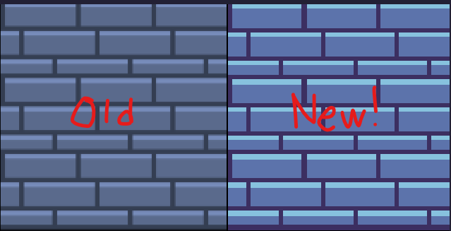
Hello and welcome back to another Aseprite tutorial. In the previous tutorial we created a few new tile variants for our dungeon. In this one we will create some new tiles and animate them!
Drawing a Candle Tile
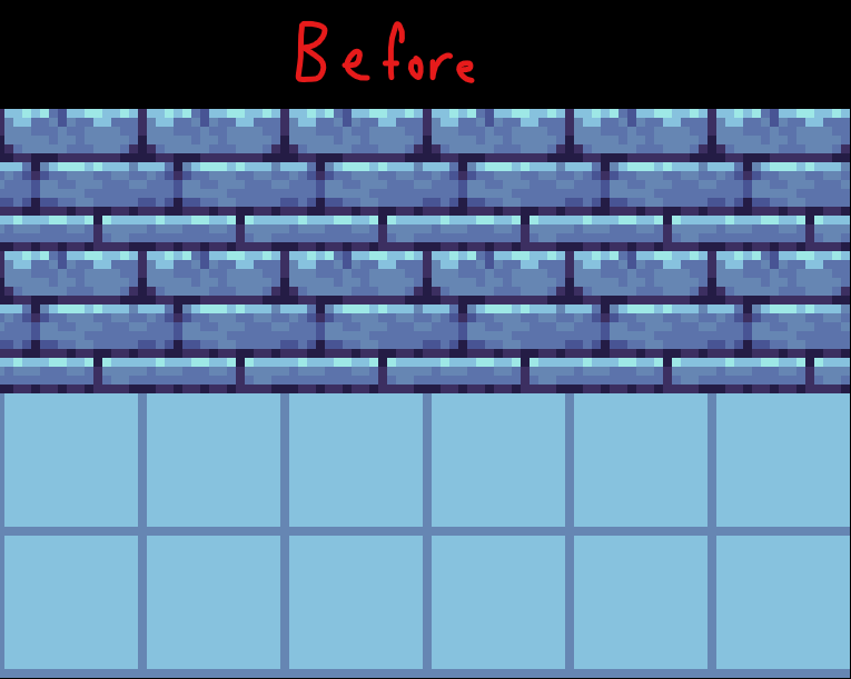
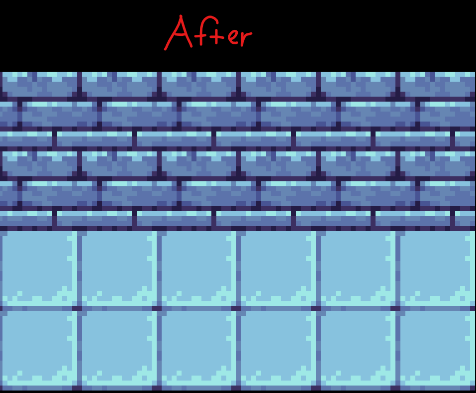
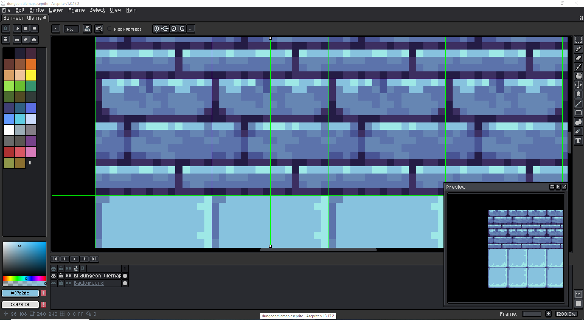
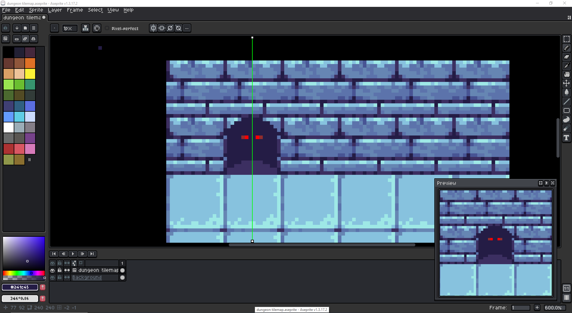
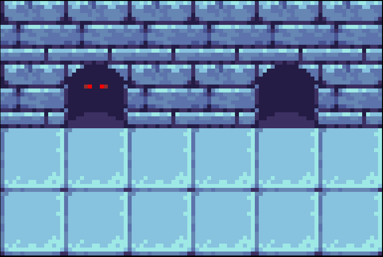
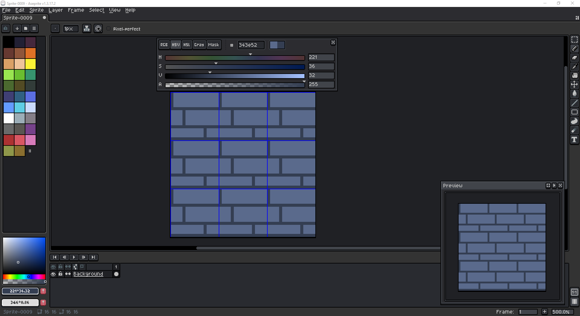
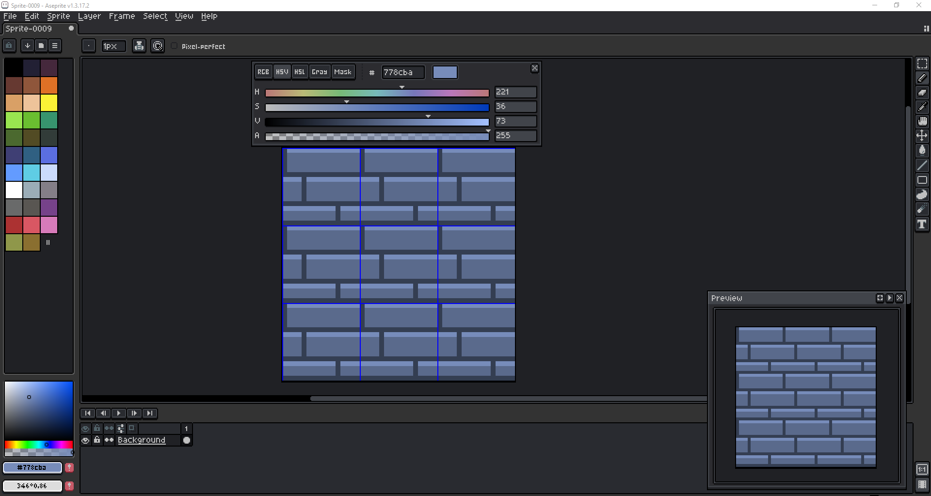
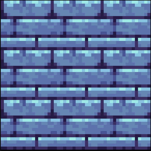
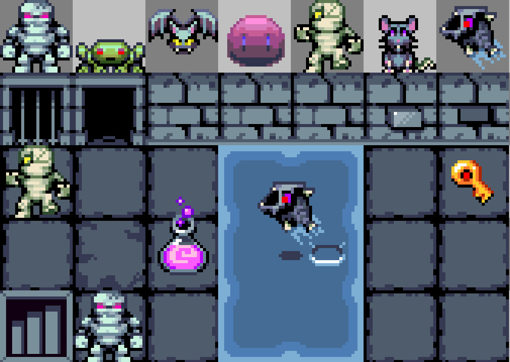
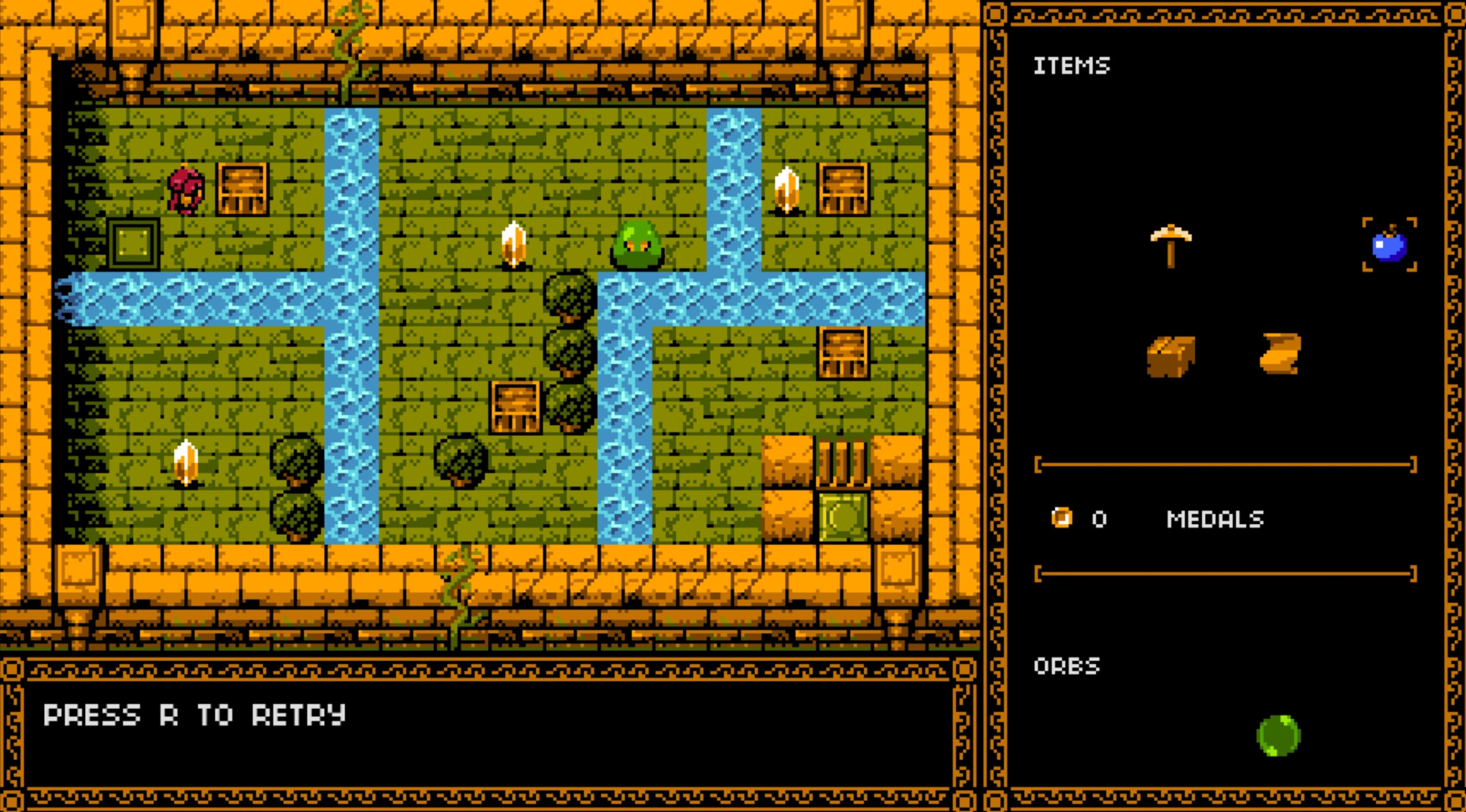
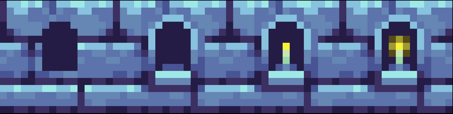
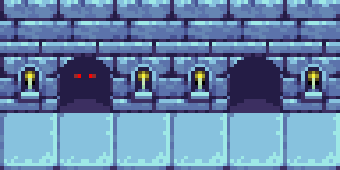
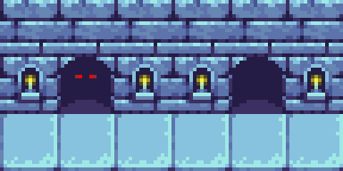
Open up your dungeon tilemap from the previous tutorial where we left off. Modify one of the brick tiles. Create a small alcove in the center of it and add a candle inside. Afterwards, feel free to place it around the dungeon.
Animating The Candle
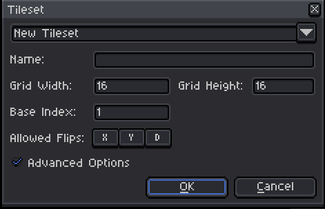
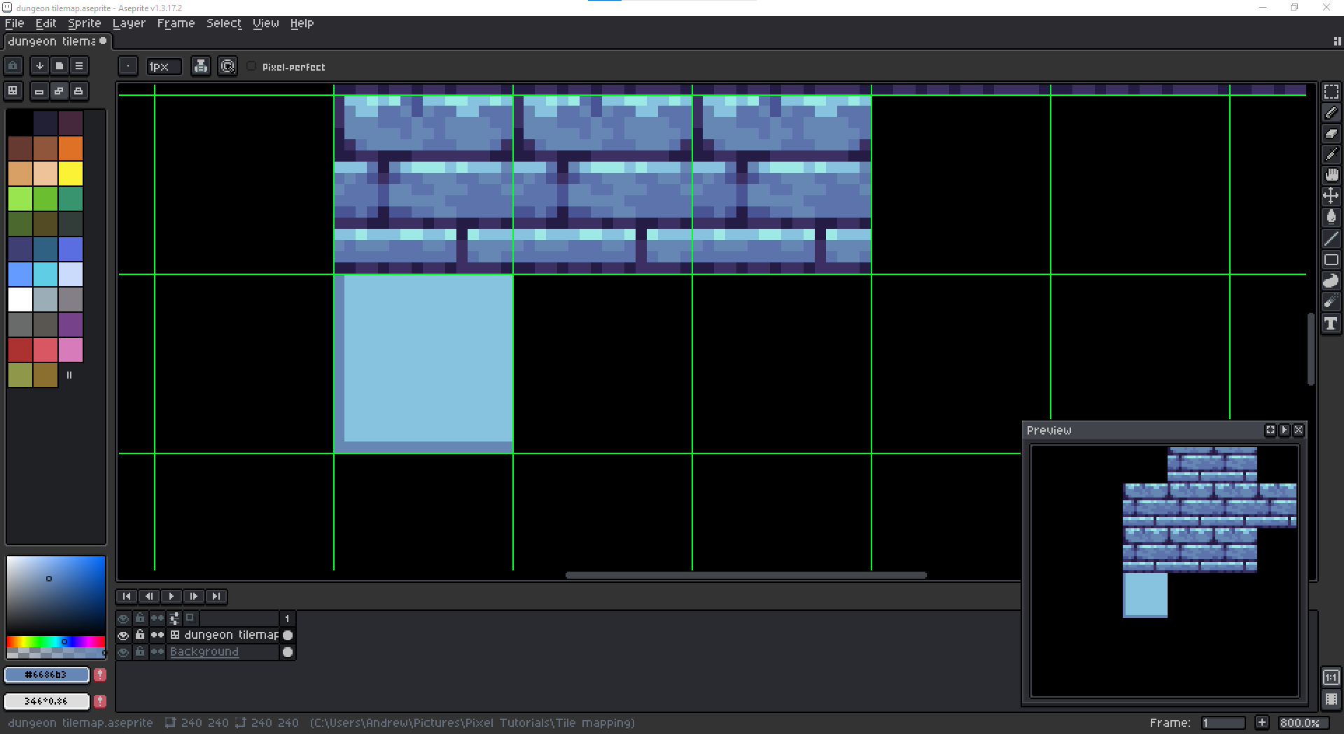
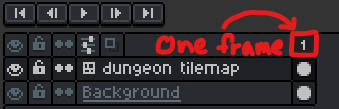
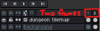
To animate the candle, we need to create at least one more frame for it. Your Timeline Panel is actually directly integrated with the layer panel, however by default, there is only 1 frame.
Creating a New Frame Slot
To create a new frame slot, by default you can press 'Alt + N' or right click the frame number and click New Frame or New Empty Frame. "New Frame" duplicates the original frame, "New Empty Frame" creates a new frame but does not duplicate the original frame. Since we probably don't want to manually redraw our entire dungeon all over again for the second frame, let's duplicate the original frame using "New Frame" specifically.
Drawing the 2nd Frame
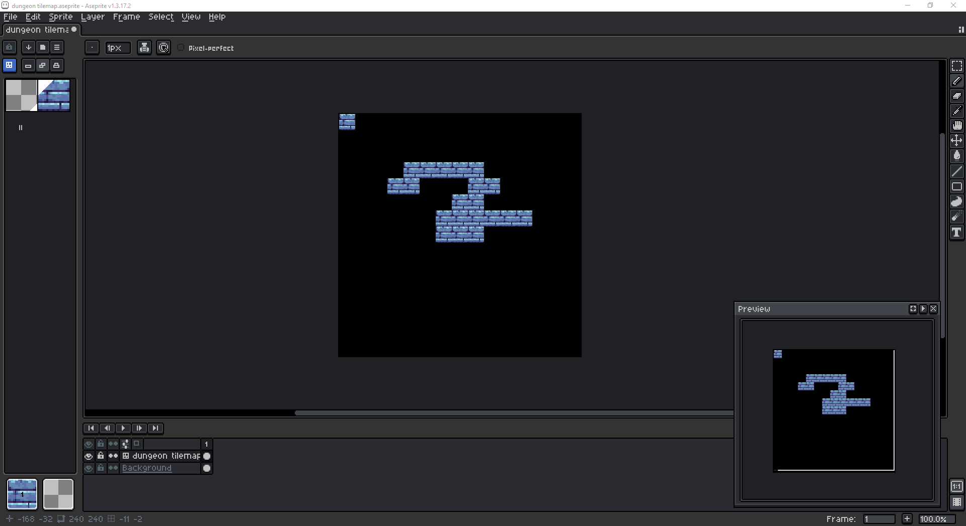
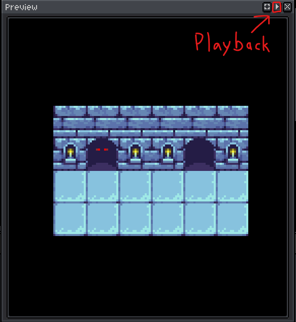
Now that we have a 2nd frame slot, we can visually edit that 2nd frame of our animation. You can view and edit any frame's canvas by left clicking its frame number. While animating, you will constantly need to switch frame views to see the development of your animation. You use the arrow keys to do that or you can autoplay your animation in the preview window. The preview window has a playback button.
Changing the Frame Speed(s)
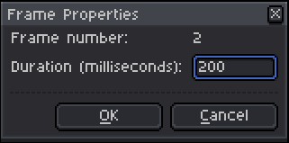
You may notice that your animation is too fast or too slow. You can modify any frame's speed by double clicking it or right clicking it and opening the frame properties. I think 200 milliseconds (ms) per frame for a 2-frame candle cycle looks ok.
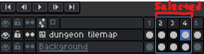
If you need to modify frame speeds in bulk, you can select multiple frames by clicking inside of a frame number square and then drag across a range of them.

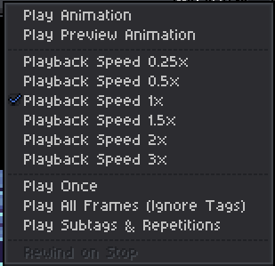
You can also modify your preview playback speed by right clicking the preview playback button. Generally, you can ignore Play Animation, but Play Preview Animation is for seeing your animation in action in just the preview window.
Resorting Frames
If you ever need to resort frames, select the frames first then drag from any of the edges.

Important Note
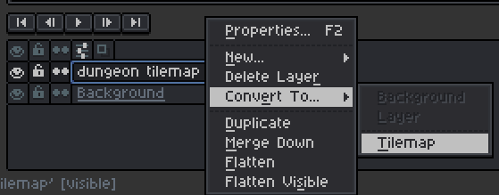
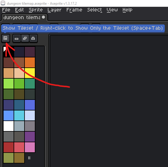
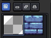
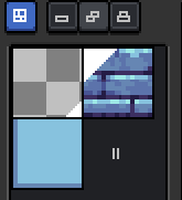
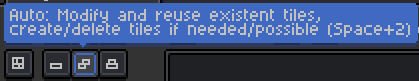
For animated tiles, you will need to use the "new tile" button specifically.
This is because each frame of an animated tile must be a new tile. If you attempt to edit frame #2 of the candle tile but don't create a new tile, then you'll replace the 1st frame with the 2nd frame. You will also need to place these new tile frames again manually within the dungeon as far as I know.
Flame Movement
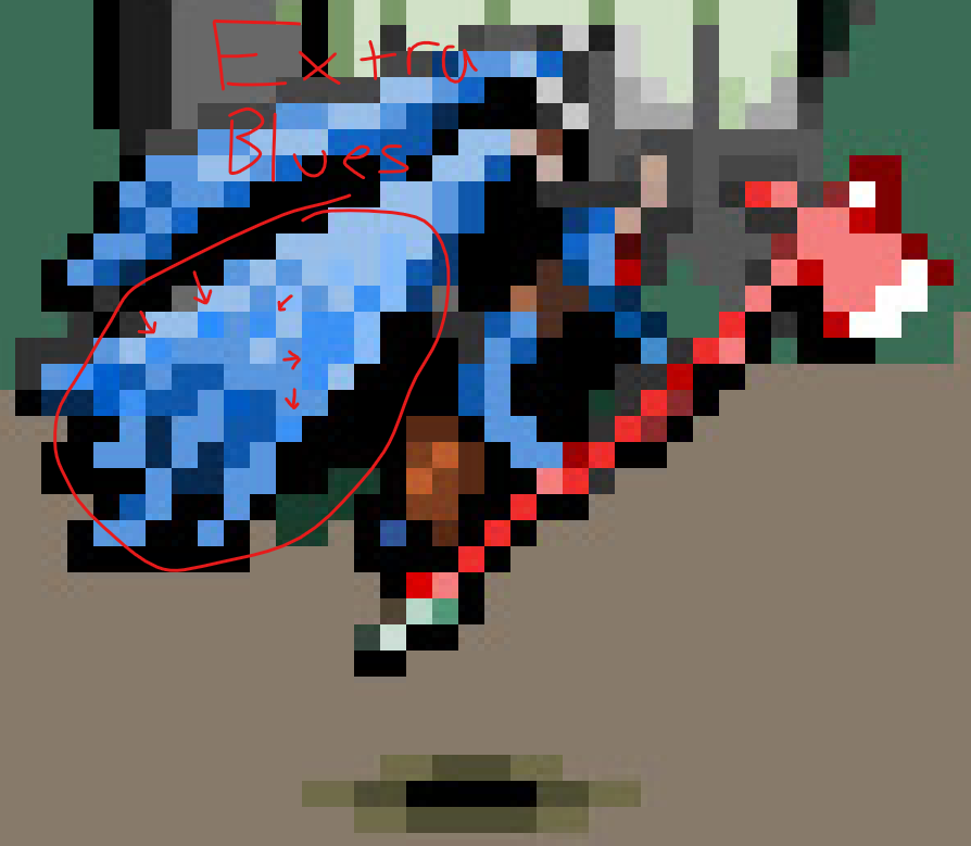
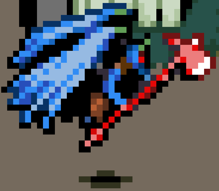
The flame of the candle should rise and fizzle out or have some natural subtle movement. It can have a slight pulsing light radius. We have options. Here's a first pass with a 2-frame cycle at 200 ms/frame, which is alright but I think could be improved with more frames.
I believe this is a better pass with a 4-frame cycle, although could be sped up.
Here is the sped up version at 100 ms/frame.

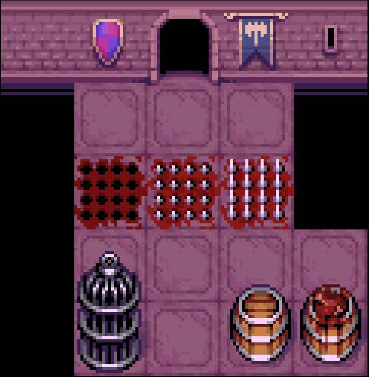
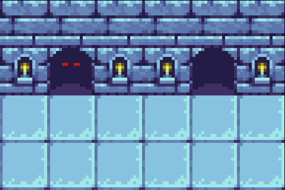
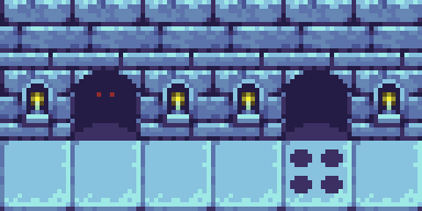
Spike Trap
We can also have spike traps, though 4 frames for it would be too little. Let's try 8 frames. You can select all of the original frames 4 frames simultaneously, then if you hold down 'Ctrl' or 'Alt' and drag that selection to the left or right, it will duplicate the set of frames! This gives us a decent loop delay for the spike animation because we don't need spikes coming in and out every 4 frames, without altering the candle animation.
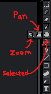
Marquee Selection Tools
I guess now would be a good time to briefly introduce you to the marquee selection tools, but not the time to go over all of them in depth yet. it can be convenient for creating our spike trap tile.
Each of them lets you select groups of pixels or tiles in your canvas. This can be convenient while drawing when you need to duplicate/ transform/rotate/flip/move/recolor them etc. For example, with the rectangle marquee tool allows me to select a single "spike hole" by left click dragging across one of them, corner to corner, then copy/paste that selection around 4 times to achieve 4 holes on the spike trap tile. To move the contents of a marquee selection, have any marquee tool active, then left click drag the inside (not the edges) to a new location on the canvas. Deselect when you're done to lock it in place.
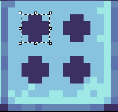
This gives us a better and faster start, rather than manually and slowly drawing each of them with the pencil tool.
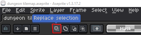
Pay attention to the settings near the menu bar. Generally I never mess with these, but I keep "replace selection" on.
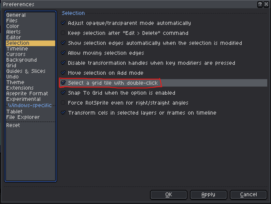
Also for tiles, there is a preference setting for marquee selecting tiles with double click.
Spike Trap Animation
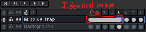
I actually had to make the holes slightly bigger so the spikes can be sharp rather than flat-topped, but here is a sprite sheet for the spike trap. Frames 2 and 4 are identical.

and here is the result:
Notice that delayed intervals I mentioned on the spike trap activation. It's actually just the same 5 frames without the spikes times. In theory, if you had the spike trap on its own layer, you could use the "frame link" feature to achieve this. You can select multiple of the white circles (cels) underneath the frame numbers by drag selecting them, then right click and select Link Cels. This would make all of the frames with linked cels display the same image.
Although I'm not actually going to do this, because our spike trap is NOT on a separate layer; it is shared with the candle layer so this would cause a delay in the candle animation and we don't that.
That's enough talk for this post. I'll see you in the next post when I find the time.