I'm back! In the previous post we made a pretty bad Doom sketch, and just to recap, here's what it looked like.
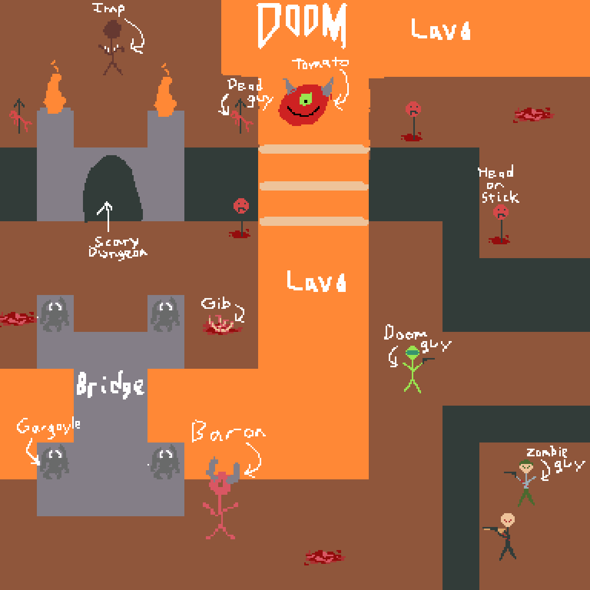
We are going to try and polish this drawing step by step. But what are those steps? Well... I don't really know to be totally honest with you, but we can start with some of the tiled rock and lava assets as this will establish the ambient lighting of the scene and will make the coloring process easier when it's time to shade and color the other assets such as the characters or demons. It's a good idea to have at least have one image layer for the environmental assets such as the floor/wall and dungeon tiles, and another layer for the characters, monsters, and gibs (classic gamer word for gory corpse bits). For now let's hide all the extra stuff except for environmental assets. Let's keep things simple. We don't need the extra stuff right now.
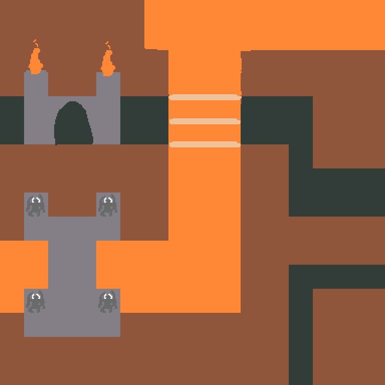
Now I didn't say this earlier because it really wasn't that important during the sketching phase, but when we're trying to draw in tiled assets for something like an actual game, it's important to measure grid space to know where and how big everything should be on screen. For this mockup, let's try 16x16px based tiles. I think we can work with this resolution because Zelda: The Minish Cap looked great for it's tile resolution being that small.
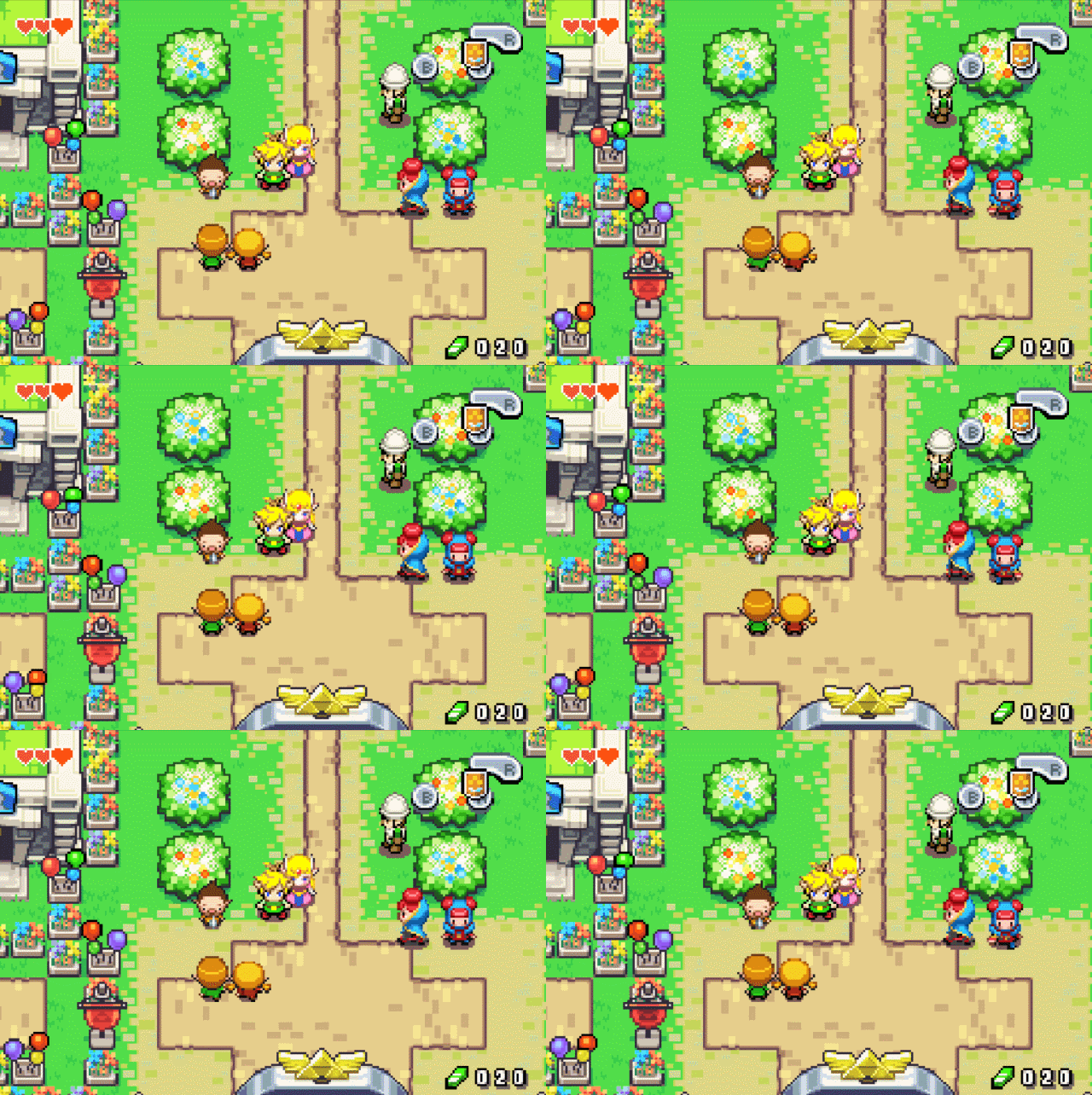
Zelda: The Minish Cap
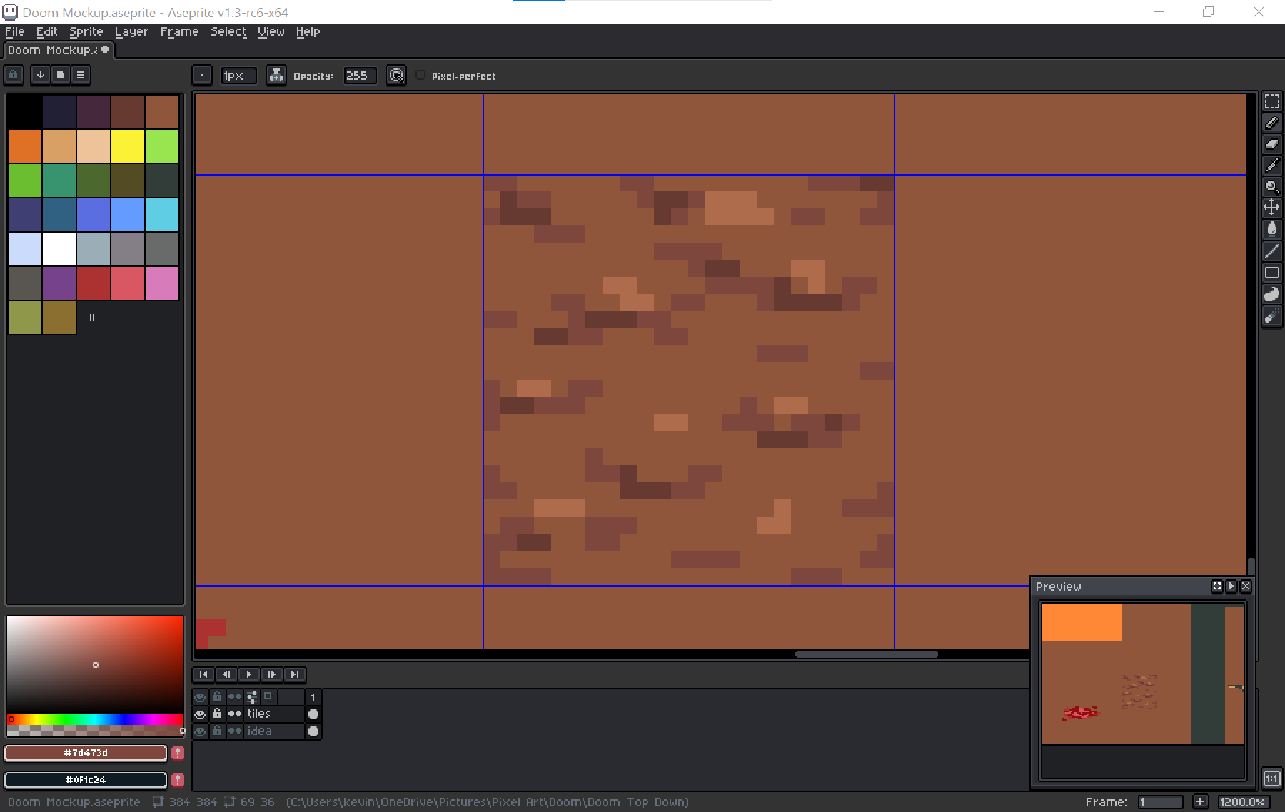
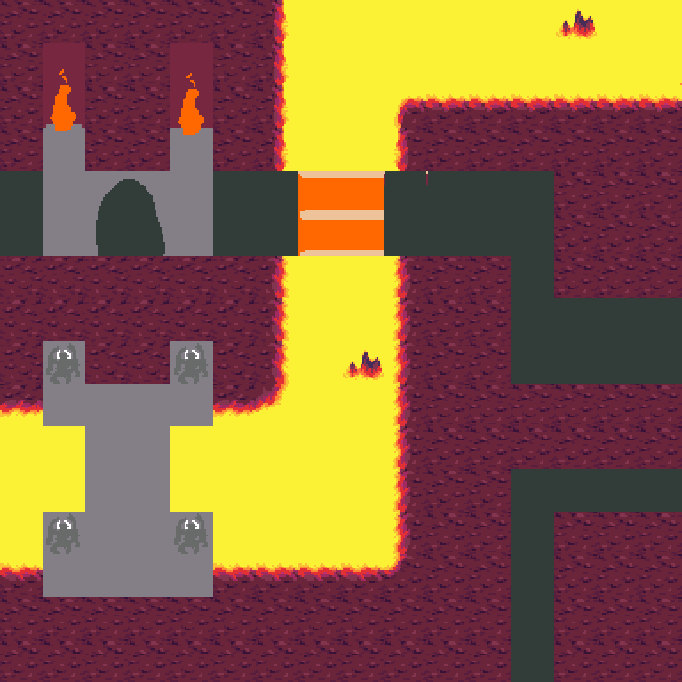
So I turn the grid on and set it to 16x16px as I'm drawing, starting with the rocks and lava then I just copy and paste them around a bit to see how they look in the scene. I know I want the floor rocks to look kind of crumby and the lava to look less plain somehow, although I didn't look at much reference yet and just went off of imagination and memory.
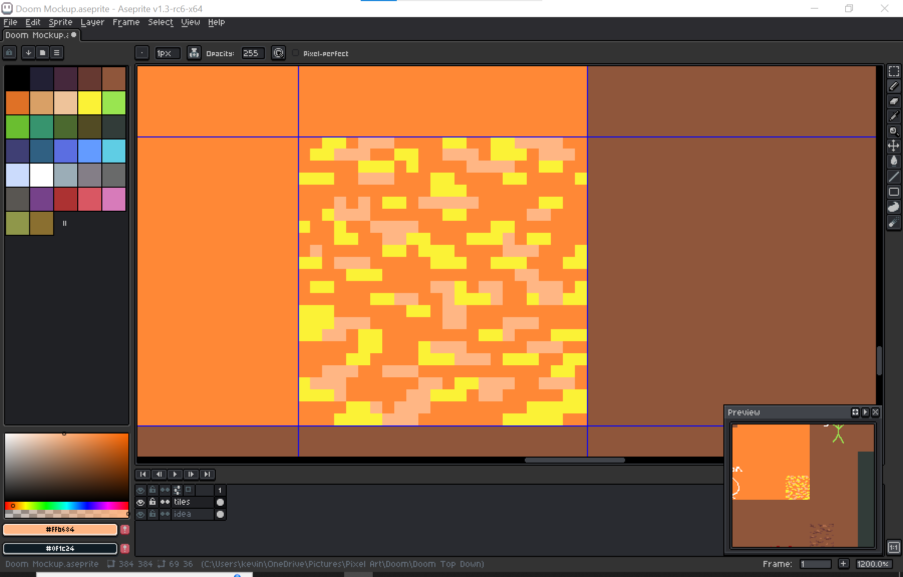

It looks better but could still use work. Looking at this where the rock and lava meet, the lines are too clean-cut. We have to make the transitions appear more natural. I ended up making some transition tiles with more jagged edges and tried cleaning up the lava to see how it would look without as much noise.
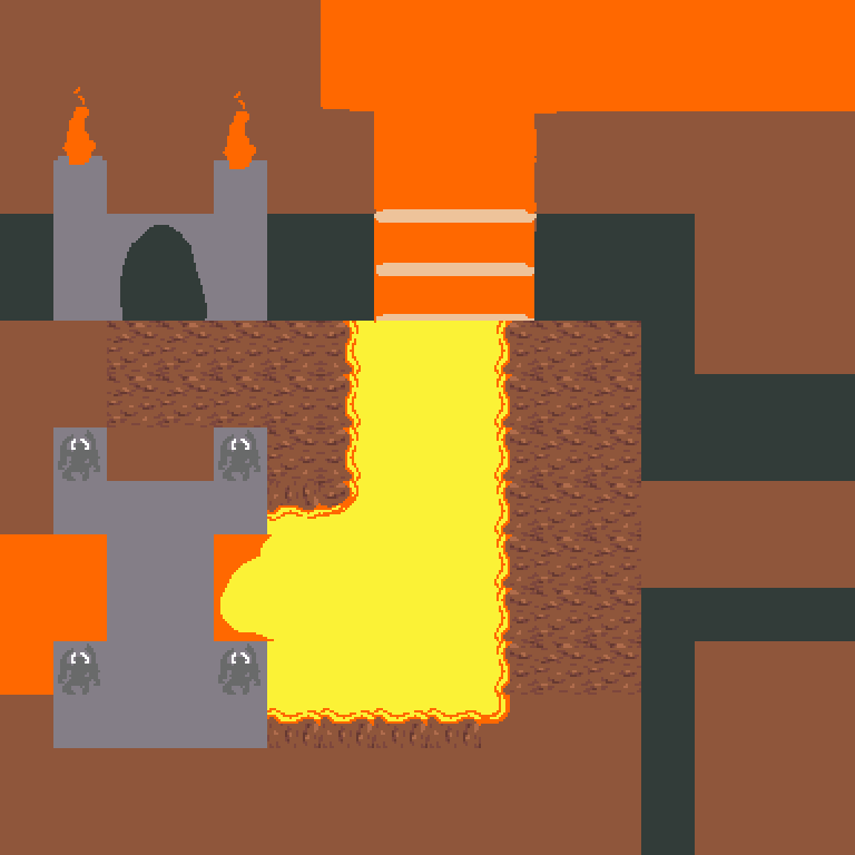
But this is where I noticed that I mostly wasn't liking the colors for the rocks. Searching up reference of hellish landscapes and volcanic environments, I noticed that the rocks tend to be a lot darker than this plain basic lighting we currently have.
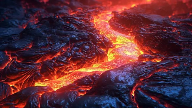
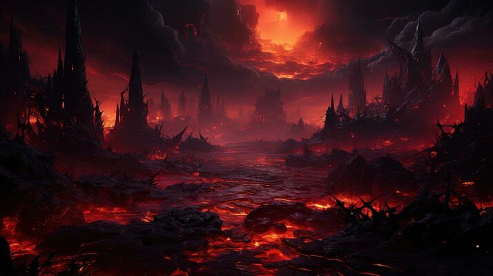
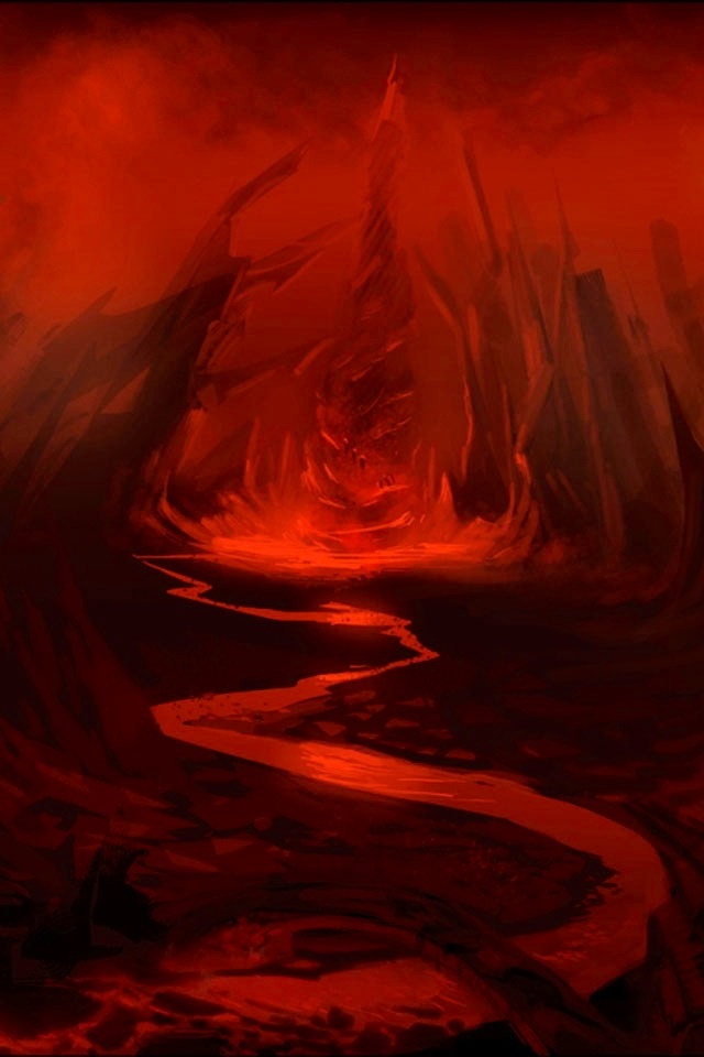
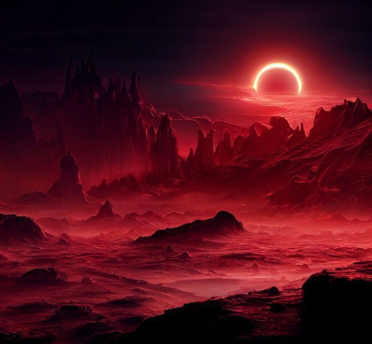
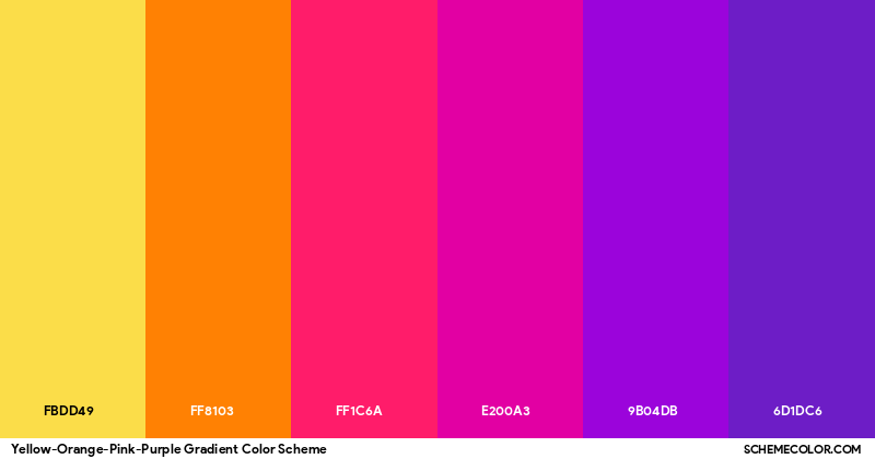
So I gave the rocks a darker purple color (with a little hue shifting as always). Also notice at the transitions how the rim lights are red on the rocks. The purple rocks are receiving a rim light from the lava. Why is it red? I assume if you blend dark purple and bright yellow, you'd get a reddish rim light, although I'm not completely sure, though it looks nice at least so I'm going with that for now. I also added some little rock islands.
We still need the walls. I want the rocks to look jagged so I start with just 2 colors to establish the shapes, then I polish them after. Here I also tweak the lavafall using just 3 colors, it's mostly just a lot of downward lines to simulate falling lava. It's not very droopy though so it's more like hot magma rather than cooling lava, so you don't see horizontal droops here.
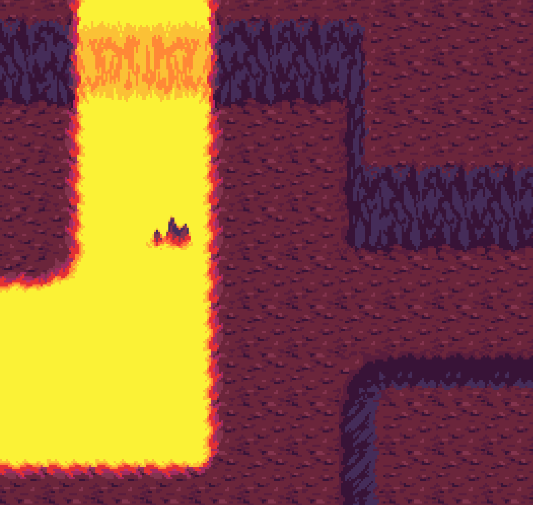
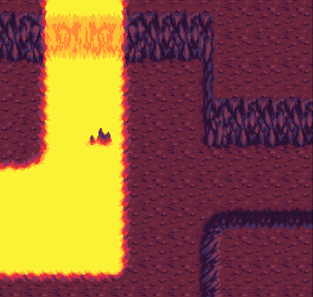
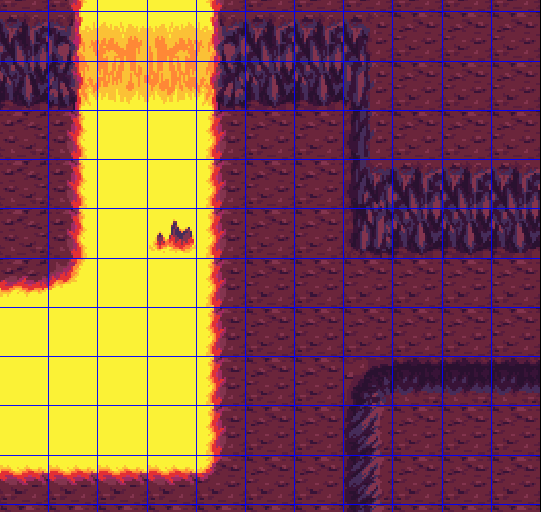
Next up, we'll talk about adding in Doom guy, then we'll do more of the environment work at some point although I'm not sure exactly when because I'll probably want to talk about adding pinky demons first. But that's it for this post so thanks for reading!

