Indie game storeFree gamesFun gamesHorror games
Game developmentAssetsComics
SalesBundles
Jobs
TagsGame Engines

Guessy

74
Posts
1
Topics
16
Followers
12
Following
A member registered May 22, 2019 · View creator page →

Creator of

Recent community posts

accurate simulation of filing your bloody taxes

It's an excellent and informative game! The technical aspects of it I'd love to hear about and I loved the exploration and discovery of terms (and thank you so much for including a map that tells us if we've missed anything). The gender dysphoria/euphoria room was excellently done and I found the bizarre elevator inexplicably mesmerizing to travel on.

The piano was also lovely. (though it did cut out after a while, probably because I kept escaping to write thoughts down here)

Some bugs I ran into:

Had to restart the first playthrough due to void getting stuck onscreen and blocking further inputs

Second playthrough, the pronoun room didn't seem to function correctly? I think I'm walking into the triggers meant to open the doors, but the triggers themselves are being treated as solid geometry. If I approach them from the side the doors will actually open but I can't get through. Saved void for last and... yeah, got hit by the void bug again.

Same bug with Void got me here as well

Only gotten past the prologue / first 'boss' on the tallest building, still playing through, but some initial thoughts:

Holy crap the amount of work that must have gone into this-

Taaank controools

Flying is fun once you figure out how to get off the ground (w + shift + space + mouse up so you don't immediately land) but walking/running with tank controls is misery. Trying to use the the quantum teleport gates when its a struggle to walk through a small gap accurately is no fun. If input had been relative to the camera this wouldn't be an issue.

In general there's a lack of cohesion to the control scheme: flying takes mouse input + spacebar and moves in the direction of the camera, walking is tank controls with WASD. Mouse sensitivity in flight is excellent but too much when flying stationary; I found I had to pretty much fly up into an enemy's face to aim worth a damn.

Combat in general feels... off? Flight is unquestionably the best part of this game, so having to stop to shoot feels strange. Given enemies completely fail to lead their shots stopping is also the only way they can hit you; combine that with the aiming issues mentioned earlier means combat pretty much boils down to 'fly into enemies face and trade hp until they die'. Your health regenerates, their's doesn't, ergo.

Took a bit of browser-hopping to get this playing (hoo boy does Unity WebGL not like Opera) but got there eventually.

Thoughts:

  • Neat little intro there
  • Background parallax! Neat!
  • Footstep sounds are pretty off. There's a delay of a good step or two before they start playing, and they don't play if you just tap the movement keys. It took me a moment to realise the sounds were the character walking around.
  • Loved the hold on the swipe animation if you don't move. That's a very neat animation touch. The animations in general seem to be really good.
  • Had occasional white seams in the background. Something something pixel perfect in unity = inarticulate screaming something something.
  • Toe your way to a ledge and your character will enter the falling state and very slowly 'slide' off of it. Is your character's physics a capsule shape + ground detection by vertical raycast by any chance?
  • Hollow Knight vibes are strong with this one
  • First boss (swordguy) is a pain for his contact damage + abruptly jumping around. Lack of warning before he suddenly zooms into your face feels very cheap (whilst his actual sword attacks feel fair). If you get stuck in a corner you're basically dead from contact stunlocks. Given the previous 'enemies' to this point have to literally stumble into you to damage you he's quite the unpleasant difficulty spike.
  • Grammar's a little hit and miss.
  • Lack of a down air attack makes the flying enemies a right pain to fight.
  • NICE lighting effects in the outdoor section!
  • Those floor crawling enemies in the dark cave stunlock you to death you're in front of where they're moving.
  • When you show up the options prompts (ie yes/no, talk/shop etc), have one of the items be selected. Hit up/down keys and it'll select one, letting you play the game via keyboard as seems largely intended. Having to move your hand off the arrow keys to use the mouse in menus feels pretty awkward.
  • In a number of places in the dark caves there are a few drops onto spikes you can't see because you can't 'look down' with the camera.
  • Some longer invincibility to contact damage after being hit would be greatly appreciated, it's all too easy to stunlock to death, especially on the small platforms with spiders and the ground crawlers. You only regain control when the invulnerability ends, so its often straight back into damage you can't do anything about.
  • ...That giant spider boss is like the worst issues with contact stunlocking personified. I only defeated it by finding a safe spot in the doorway and whaling on it for a minute with a 5-damage sword.
  • Got about far as the cat crawl ability + that underground base area with the circular robots and walking cannons, then I had to call it a night.

Haha, I am way too incompetent at bullet hells to complete this, but I had fun with as far as I could get.

Observations:

  • Boss battles were actually the easiest part because you just spam bombs until they die. How many bombs can you stockpile? It wasn't clear if there was a limit and I managed around seven or eight at one point.
  • Laser objectively best weapon. No travel time and all that.
  • Difficulty levels and the big hunk of energy given on respawn were a nice touch
  • Backgrounds are top-notch!

Oof, yeah, protect them eyeballs. Sorry to hear it, but take care yeah?

The score actually is the distance, I apologise for not making that clear.

Moving through closed doors without being harmed was a deliberate design choice I'm honestly reconsidering, yeah (they can't physically stop the player, because it's an infinite runner and that would drag them off-screen, so I'd hoped having them knock the player around would be enough of a threat).

Thanks!

From poking around a bit, this bug doesn't affect older WebGL games, so it's probably an issue with Unity's latest WebGL player. Fun :'|b.

Alright so I'm apparently having miserable luck with Unity WebGL games; it's just not recognising any input at all (this isn't the only jam game that's having this issue so it's probably Unity's fault :|)

Could you put up a windows build?

(2 edits)

Ah damn, I really want to try this but I can't get it to work on Opera. I'm stuck at the 'Press Any Key To Start' screen; even in fullscreen it's not registering any input on mouse, keyboard or controller.

Could you put up a windows download, maybe?

EDIT: Damn, just tried on Firefox and it's not working there either; same issue

Observations as I played:

Music is loud and the slider in the options menu doesn't do anything. Nor does toggling sound sfx, seemingly (the button is permanently 'on'; clicking it seems to select it rather than actually toggle it?)

Could have done with a prompt for which button to press to start the game in the map screen

Vertical parallax with the background/foreground elements is honestly too strong for me; it looks more like elements moving up and down on their own rather than a perspective effect. The vertical movement itself is too strong in relation to changes in the player height, the treeline graphic in particular seems to 'float' above the world, leaving cut-off parts exposed that probably aren't meant to be visible.

The foreground object in particular looks very similar to the actual playing area, so when it moves it looks more like a rising platform; it's pretty visually confusing.

Tl;dr look into how other games handle these things, f.ex try making the foreground darker, blurry and indistinct to clearly, visually separate it from the playable area. Similarly, you could make the mountains look more 'distant' by way of atmospheric dispersion/fog pulling them closer to the skybox's colour.

Mouse cursor being a sword keeps making me think I'm going to issue an attack order when clicking. That's probably just me though.

Near impossible to climb with an xbox controller. Much easier to play on mouse/keyboard. On a related note, there is no jump button for people with xbox controllers. I'm guessing you're using Unity's old legacy input? Controller mappings are a nightmare with that; I strongly recommend switching to the new Input System, as it solves a lot of that tangled mess.

On the first climbing wall, actually stopping on top of it for the coin is uncomfortably difficult as you zoom over instantly given in the instantaneous velocity you get whilst moving. You speed up instantly, but you actually slide about if controls are released, resulting in very slippery movement that's difficult to control. If you want to dig in on 2D platformer controls, this Gamemaker's Toolkit video breaking down how Celeste's movement works is an excellent start.

Sometimes she summersaults when jumping and sometimes she doesn't, and I'm really not sure why or when.

Died constantly just trying to grab the handlebars on the first hazard, because of the slippery controls. Eventually just gave up, took the hit and continued, which is probably bad tutorial design if you wanted to teach about the overhead bars.

I think she's trying to climb over very short obstacles. Like again, the first hanging bars, there are two small steps just in front of it. Push up against them and she goes into the 'against wall' climbing pose. This almost makes actually stopping on the last step difficult, because she keeps doing that climbing thing when she reaches the top of the wall and zooms off... into spikes.

Overhead climbing is as fast as walking. Feels weird and definitely doesn't match the climb animation.

The sword attack animation pushing you backwards is a very strange choice. Combined with the slippery keyboard controls it's definitely not fun. How far back they get pushed also feels very erratic and inconsistent.

Pretty sure I broke something at some point: enemies were just walking into me and dying. I suspect the damage trigger on the sword didn't deactivate. I was constantly getting pushed backwards too. Attacking again reset this, and I wasn't able to reproduce it. I assume activating/deactivating the attack box is based on events in the attack animation? Presumably, something interrupted it inbetween those events. If you're using AnimationControllers, you can addstate machine behaviour scripts that - amongst other things - can run code in OnStateExit to always close your attack boxes when it leaves the attack animation which would solve this issue.

It's not too obvious when you take damage, or how much health is left. I died a couple of times in the trap-house and often didn't understand why. It's a matter of visual feedback, mostly, it's easy to miss the player flashing red if your attention is elsewhere and the healthbar is pretty small.

The audio in the trap-house is odd. The sounds of the traps are at a constant volume, rather than increasing/decreasing as you approach. I honestly thought it was an audio bug at first.

Unfortunately I was unable to progress much further than that between the deadly traps and slippery controls, so I can't comment at all on the rest of the game.

So... yeah, it's a prototype. Unless I missed something you can only beat up three enemies and then quit.

To be critical...

  • The jump is oddly fast to the point I'd hate to try using it for platforming; feels like you're back on the ground in less than a second.
  • The character's shadow is misplaced when moving up and down
  • You're using pixel-art textures with texture filtering so everything is blurry
  • The controls are for gamepads but actually quitting the game is via Escape on the keyboard (though given the prompts are for Playstation controllers and I'm using an Xbox one, maybe that's just messing things up)
  • You can easily get caught on the collision in the trees at the top of the map; I'd recommend making their colliders sloped or circular so that the player doesn't get stuck walking against thin air
  • I'd advise against flying enemies in this. The drop-shadow works on pavement but if they fly 'over' the buildings as part of their attacks/knockbacks it kinda ruins the illusion.

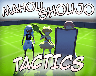
Otherwise... yeah, it's a prototype. You can move and hit stuff, stuff responds. There's simply not much to... comment on, frankly. That said, I do love the premise of an adult magical girl having to balance work and sparkles; that definitely has potential to go far. It's a shame we don't get to see any of it, since it's a prototype, but I still love the idea.

It's a solid concept for a puzzler, though the last mission threw me. I managed to clear it, but it was more a 'try shoving the crate everywhere' kind of clear than a 'aha, I know how to solve this' moment. So many enemies all in the same cramped space makes their cycles hard to grok, especially when you also have to factor the crate into it. The 'skip turn' mechanic also wasn't that useful, to be honest. There was one time I definitely had to use it, but all the others I 'saved it in case I need it' and wound up... not actually needing it.

Art style's great though, and I love how the levels rise/fall and assemble themselves.

Character's idle animation is a little odd; it kind of looks like her hat is breathing whilst the rest of her stays stock-still.

I'm definitely planning on building a magical girl tactics game, though I doubt it will be a continuation of this one specifically (there was a proper setting/story I had in mind for it I dropped for the Jam, along with a bunch of other mechanics like line-of-sight that would take too long to implement)

A-And yeah, Yellow's attack is pretty jank. She was implemented late and the ui for issuing orders wasn't really built for ranged attacks like hers so I had to cludge it with what I had in the time remaining.

(1 edit)

Seems space to activate the clock powerup doesn't seem to be working? I can't skip turns with it.

NEVER MIND, I'M JUST DUMB

(2 edits)

It's a novel concept, and you're the only jam entry I've played so far that actually includes a transformation sequence which definitely earned points. The story may be minor but it gives enough context and involves player interaction (ie it's not just a cutscene), so I enjoyed it!

Combat though is... clunky. It's not clear when enemies attack you, so you have to keep them at their distance, which is trivially easy by spamming the ranged attack. Though the melee seems to have a three-hit combo with a pause in which the enemy can slip an attack in, the ranged attack does not, and can be fired fast enough to keep an enemy in permanent stunlock. This is how I killed the final boss. Notably, if an enemy is in the hit stun animation, it also blocks them from their death animation, so I kind of wound up standing there spamming Y for quite a while...

(the ranged attack projectile also moves at the exact same speed the character does, which feels a bit... odd if you fire it and then start moving forwards)

I initially thought there was no 'dodge' mechanic until I realised you can actually jump on enemies with the lack of collision damage. It's a fun touch, I quite like that, honestly. It was an 'aha!' moment when I realised I could jump onto and over the slime-face things.

(3 edits)

I did not! And yeah, just some tutorial messages in the background would have helped out a lot to explain all this stuff. My first experience was 'mess about figuring out the controls, discover weapon-switching, find the pew-pew gun, stick with pew-pew gun because it Shoot Good better than the others.

Free-shooting + pixel art is hardly impossible: you can do it with 6 frames (up, up45, forward, down45, down), flip for the opposite direction and as long as the bullets are free-aiming people generally won't care if the character isn't (though you'll need a crosshair for obvious reasons). You'd probably need to split the sprite into upperbody/lowerbody if you want to run-and-gun and still stay sane as an animator, mind.

I wouldn't say you need complex AI, just to build your levels around the AI you've got. As it is, there's a lot of open space, so the player can just outrange the goons, and the tank is only threatening when you can't casually jump over its shots. If you want players to be dodging attacks at close distance... force them to close the distance. Even giving the mooks a range boost would help as long as they can't fire from offscreen.

(1 edit)

It feels stunlock-y; getting hit knocks you around and stops you firing, making you unable to stop the enemy from firing, if that makes sense? Even if you're not taking damage with every hit you lose a lot of control of your character.

...Honestly I never actually noticed you move differently with different weapons. Maybe that could have been made clearer? Heck, if the pistol-mode could double-jump that would encourage its use a lot. Though given you shoot horizontal projectiles you still need to be level at some point with the enemy to shoot them, which jumping around a lot hampers. Currently, the best 'strategy' to use against enemies is to just stand outside their range and plink them. You'd need to either break up the long sightlines in the level geometry or make aiming free-directional to try and combat that.

EDIT: Oh, and despite the screen telling you to use a gamepad... you cannot navigate the menu with a gamepad. Or at least I couldn't with an xbox controller in Opera.

It's a functional platformer, though the difficulty on the shooting is all over the place. You wind up in situations where the guy with the machine gun is more dangerous than the tank, because the machine-gun guy has massive area denial and can stunlock you whilst the tank can't.

The main issue is simply too many bullets in one big line: there's no way to dodge because jumping just drops you back into the bullet conga trail. If they - machine gun guys and the boss - fired in shorter bursts it would feel a lot fairer.

The exploding bullets were also pretty eh; they mostly fired in a rough cardinal direction, but only mostly, so they weren't predictable and between them and the boss they give both little room and time to avoid. So, like the machine gun attack, you're forced to facetank. Something like a lobbed mortar that landed with AoE would have worked much better.

Enemies are also completely silent on death, which feels a bit off.

Whilst the weapon choices are nice... functionally, you're just going to use the machinegun and hold it down, because there's no reason not to. Shotgun range feels awful; you have to be close enough to the enemy for the enemy to shoot back (or drive into you, with the boss), which... well, see the stunlock comment above. I'm not sure when you'd ever use the pistol or the melee attack.


...gave creativity points for yakuza with abrams can you hear homura screeching in the distance

There was a harder enemy planned; implementation would probably be ~1 day's work modelling and animating, and at least another finagling them into actually being fun to fight against, going from experience with the Jam. Unfortunately, I was still implementing the Defender and some of the Interrupt orders even on the final day, so they got dropped.

I admit I kind of assumed the camera movement was self-explanatory because 'that's how it usually is', or so it seemed to me. Really, the game needs a tutorial in general.

I was literally still implementing the last MGs and orders at the very end of the Jam. You're lucky the map even has benches in it :'D

Glad you liked it!

And yeah, I'm sorry it's so short. There was... there was a lot of stuff to code...

So I'm not quite sure what happened, but somehow in the middle of the second boss battle I got kicked back to the previous page...? I'm using Opera; presumably there's a 'go back to the previous page' key combo that's easy to make by accident whilst playing the game :x

Hardly your fault, but still an oof.

Concept is fun, I love the verticality to the levels, and I love the enemy variety. As for criticisms...

It took an embarrassing amount of time to realise I could doublejump.

The air attacks are very finicky, making the air enemies near impossible to hit at times. The up attack in general could do with some forgiveness with its controls, or maybe having 'aim up' and 'jump' be separate inputs. At least you gave the flying enemies no collision damage; that was a good call.

Platforming was fun, but on the second level getting to the station, it could really have done with more clarity on where it is and isn't safe to fall.

Glad to hear! I'm definitely continuing with the magical girl turn-based system after this, though probably not as Mahou Shoujo Tactics (there was a different project I had in mind for it I didn't use for the Jam because... well, no chance in hell of building it in time).

Could you expand on where you felt the controls were clunky? I presume this was some of the orders?

Aha... the lag...

That's actually not lag, that's a deliberate 'pause' (as in, I coded it to wait) whilst the AI 'decides' what interrupt to take. I wanted to make it more clear with some SFX and turning the screen grey but I didn't have the time. The simple AI mooks don't even Evade that often anyway.

Camera is middle click + drag. It's still not great though (you can move it whenever, including when your probably shouldn't, though it is at least limited to the map's bounds)

Yeah, if I had more time I'd try to clean things up more; more levels, more enemy variety etc.

The art is... the art is hilarious. The textures are 99.9% gradients whipped up in photoshop and creatively applied by abusing uvs. It shouldn't work. For all that though I agree they're weirdly compelling. My two complaints on that front (again, lack of time) is being able to give the MGs faces / expressions and having to battle the unity lighting system not to wash out all the colours.

Could you expand on where you feel the balance is poor? I realise having the one enemy type shoots it in the foot out of the gate but still.

Is there any chance of a windows download? I don't know why, but the Unity WebGL is refusing to load for me (it gets to ~95% loaded and then just hangs)

(1 edit)

Aaaaand she's up!


...and I am going to pass out because it's 1am.

Any major crashbugs I may hopefully wake up in time to try and tackle them, but no promises.


Pew pew gets old never


Last MG is in the game. Final stretch now, folks.

Thanks!

And yeah, she shoots linear doomlasers once she's charged her attack

Magical Girl no #2 is on the field!

Guess what she does :D

Alpha 3 is up on the project page, featuring the first MG (finally) and the unique mechanic of the game: the Interrupt System!


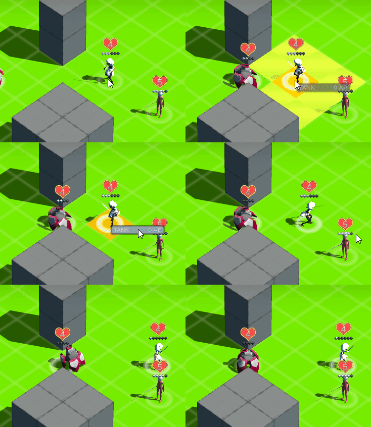
When a unit is attacked - yours or theirs - they have the opportunity to respond; spend Action Points to Evade (literally dodge into a nearby tile) or Tank the hit (lose HP, but save AP for the following turn). In this sense, it becomes a game of teamwork to bring your opponents down; a magical girl with a flashy boss-killer attack isn't going to do much good if her team can't pin it down first. On the flipside, if she gets attacked whilst still charging that anti-boss move, her team-mate with a towershield can intercept it by literally swapping their positions.

...Not that I've actually implemented those two characters yet, but I'm hoping to get those done in the time remaining. Getting the Interruption System functioning was a bit of a slog and took longer than expected to implement, on the player-side more than for the AI, weirdly enough.

Anyway, onto the characters! The first MG to make it into the game, designed by the talented CornyBones over at Sufficient Velocity: Talga!


She fits the 'Attacker' role in the MG squad: she has a decent melee attack and good movement, letting her go where she's needed to keep pressure off of the specialists, but she doesn't have much in the way of defence on her own, so don't get her overwhelmed.

Looking fantastic!

Gotta love train sequences. Looking good!


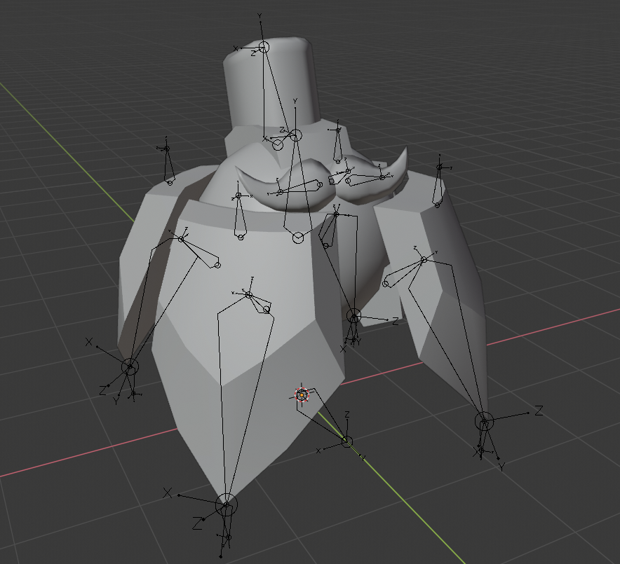
Random moustaches on things make everything better

Having messed around with it a bit, it feels significantly worse simply because it's not clear there's been a change in state. I'll need to show info/effects on the unit you're targeting at some point though so it'll probably work much better then.

'Prolly make it a menu option or something.

Aaaah, yeah. Hmm.

Would you say it's better to keep the 'auto-target when there's only one option' or just mandate the 'pick a target step' every time?

Er... you can? Or you should be able to?

Could you describe what happened?

So after getting turn/round structure and basic AI working, I added a basic menu and figured 'hey, now is a good time to do a test build' and HOO BOY-

So er. It turns out Unity has some less than well documented differences between release builds and development builds. In adding a main menu, I also added the ability to start/restart the game, aka 'unload/reload the main scene', which caused a whole bunch of other bugs thanks to me forgetting to unhook destroyed objects from static events.

In short I've fixed everything as best as I can find and the game should work, but there may be crash-bugs and if anyone is willing to give the alpha build a test-run I would greatly appreciate it.

Gotta agree, there's tons of room in that! Can't wait to see where you with it!