
Please contact me in the Discord, I have an invitation for you.
Captain Perl
132
Posts
3
Topics
8
Followers
A member registered Mar 06, 2023 · View creator page →
Creator of
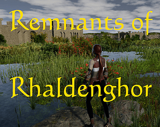
Explore the remnants. Fight monsters. Find portals. Connect the land.
Action
Recent community posts
New title:
A Game About Making New Friends In Town Where Everyone Looks Female At First
Getting serious, this is a very nice and relaxed game about an important topic. The city size is just right. Some far-off buildings are hanging in the air. The theme is well woven in.
You should deactivate Coco after he is supposed to run home. And state somewhere that the player should press E for interaction (well, it's standard but say it anyway). Better still, place an interaction button in the middle of the screen when the player is near a NPC. You want the player to interact, help Mimi here. You could even give her a character model instead of the basic capsule.
And +1 on kindmans comment.
Wow. Professional studio logo. Menu. Settings. Help text. Story intro. Here someone knows how to make a solid foundation.
Then: cool animation, eerie lighting, fitting music, variety in obstacles with SFX. Yeah.
The theme... "bring light to the beacon towers" might be interpreted as connecting them again, but it's thin. The story premise ("this is the last light") makes no sense - has anyone forgotten to make fire, somehow? - but it is dramatic at least.
From the other comments I see that the special moves are very important here; I ran, jumped and crouchslided my way forward but never found a beacon tower regardless of my path. Definitely a non-endless runner game.
I stand by the comments of Airy and Beebster. You give the mission what to do but now how. Don't assume that other people know the genre and its possible standards as good as you. Make an intro page or give more info about the controls, for example.
The models and animations were good, the game had a certain flow, SFX and music were ok. Though, I did not see the theme as it seemed to be a typicial tower defense game with waves.
Interesting story, good design. Looked very complete and sophisticated. Were the voices and the data screens AI?
I got stuck at the second terminal where I saw no orange target tile for the rerouting. Got nearly all tiles connected, even X ones but nothing was accepted as solution. Could not leave the screen either.
The theme is met, of course.
Remnants of Rhaldenghor jam comments · Replied to AiryTheDragon in Remnants of Rhaldenghor jam comments
Yes, like in your game I first had to integrate and adjust all the systems I needed (dialogues, notes, books, portal travel, minimap, compass, the crystal etc.) and building the world base before I could fill the levels with content. I was working on scripts which would help here but was unable to complete them because of bugfixing the other systems. In my tests I had fun though by looking for the next gate and fighting monsters alone. But after the rating phase the development will continue with more content.
A crash did never happen in my tests so I don't know what I could improve in this matter.
Thank you for playing!
The game jumps from "oh this is nice and easy" to "hey thats Soulslike" quickly. Too quickly. You can't upgrade or restore health (from what I have seen) so it's hard. It has the cute KayKit design and movements though so it's a little misleading.
Placing an abyss just behind a door is wicked.
I like dungeon crawling but I had preferred a less steep progression curve here.
Maybe the game meets the theme but the Golem prevented me from seeing that.
"Short memo to self. As a former server administrator, got a new job in the wasteland area. Seemed ok for the first seconds until I recognized the "Utopian" people wanted me to do my work as a Sneaker Network Manager, carrying huge USB sticks around. Is this 2006 or what? But that's not all. Obviously they are unable to construct stairs, forcing me to climb and jump over boxes stacked everywhere. The radiation must have grilled most of their brains! And I don't know what these servers are good for in the first place. Haven't seen other workers for days, and everything is painted grey, except these darn USB sticks. Here's some madness going on... I quit."
This game looked interesting. Then I realized it's some sort of 3D platformer/puzzle game, an amalgam of two genres I usually do not play. I tried though because you caught me with the intro story, and I always fall for a good story (could have had a little more drama and detail). There were never enough green sticks, somehow.
The aesthetics were quite dystopian. The theme is met. The doors were not high enough. Wrote a memo ;-)
What's good:
- runs on older hardware
- is completable
- meets the theme by connecting a cable
- moderate spooky with hints of sinister intent (cages and bunnies are a red flag)
- the flashlight worked realistically in lighting and did not need new batteries every 10 secs
What's medium:
- the area is small (is it even named "tiny house" on the .exe) so there is not very much to do
What's not so good:
- the goal set by the game is to akquire the goblet but in the end this could be only a trap set by evil NPC. So the player possible lead her into her doom.
- I missed a little context - a story: who is the girl, what lore is known about the house, what is she doing out there alone etc.
- the end is open; we don't know what happens to the girl, who the watchers are, why they are doing it etc. Give closure or make a sequel.
- the player character gets a "magic book" which gets never used in any way
What's good:
- ran on older hardware flawlessly, apart from an error message regarding point light shadows
- meets the theme by connecting ports by cables
- had background sound and SFX
- game is completable
What's medium:
- pulling mega-elastic cables across rooms makes not much sense
- lighting was strange. Could have been better if it has been darker probably.
What's not so good:
- the station was rather empty, therefore not very believeable. At least so it was easier to find what was needed.
- the "holding the plug" animation got the plug into the leg. Worked for use, but not elegant.
Uh. This begins with a nice classic menu page wich promises adventure. But in the box is a Survivors-like game - a genre I shunned... and with good reason, as I see now. I was barely able to do any damage at the skeletons and demons, after several deaths because I had to figure out which keys to use in the first place (cursor for movement, not WASD, and forget your mouse - which makes sense for you attack by the number keys, ok). But it is your job to tell that to the player instead of assuming "everyone knows how to play this".
After some further deaths where I got respawned at the same place the dozens of demons and skeletons had the brilliant idea to camp there and kill me in a split second, making the game unplayable because this situation did not change anymore.
Could set the half of the first village into color, got to the second one and was not able to activate anything there. The lore notes were readable, though. Good to have these notes, but they gave "only" lore background and no useful instruction how to reconstruct the ominous weave.
The lowpoly environment looked ok and at least it was an environment where I could move rather freely - aside from walking the stairs of the houses. A lot of invisible barriers at unusual places, jumping not possible everywhere; this is a very contained area. I liked the color/no color effect and the SFX.
I think the game needs more feedback, for example by clicking on the nodes. When I see "Left-click to connect" and I click and nothing happens then, there should be a message or a sound, maybe a hint. I clicked on every node I found in the second village - not only once - and nothing happened. Was is the wrong sequence? Is there a sequence needed at all? Do I have to switch on a generator first? Why did it work in the first village and not here? I'll never know.
Solid, from the handwritten help text at the beginning over the audio monologue during the walk to the arrangement of the furnishings. I solved some puzzles but then the light went out and all my batteries were used already. Good atmosphere.
In hindsight, I did not even see half of the assets you used. In my opinion the whole "short flashlight runtime" is an annoying element in horror games which only impedes players playing the game. With a working flashlight, I would still be playing it but for me it makes no sense to start a game anew only because the Dev thought it would be a good idea to put pressure upon me. It gets extra contraproductive when you integrate some handwritten notes which are important for the background story but in a small and unclear font that it takes extra time to read them. Your time limit creates incentives to NOT read your text and think about it afterwards - is it that what you want?
If you want to have the player explore the environment you have worked hard for, give him time to do it, layered by some ambience and maybe the right disturbing music. That sets the mood better than "Oh I have to rush through because I am out of batteries!" But that's only my opinion.
I got a permanent message in the upper left corner about the game not being able to provide all runtime point light shadows. This is probably because my testing laptop has no strong graphics card - the message appeared in "high" and "low" settings nonetheless - but of course this message does not belong in a production version in the first place.
My first question was: why is the main character half naked while in a winter environment? Then I recognized the Malbers Controller where this is the default character. Hm. Would have been good to exchange the model though, but we all know time is short in a GameJam.
The windows build did not go to fullscreen. So, reading the intro text (which vanished too early) was not optimal on my laptop screen. I had no cursor to change the window size, and when I pressed ESC to get it back, the game exited. Hmm.
70 seconds to find 7 fire places in this big viking village is not much. I found 4, including the phoenix fire place and the cave. Not everytime I was there the fireflies where recognized at all, and finding to get to a better suited place to "catch" them did cost time I did not have anymore.
Aside from that, everything looked good, the controller was fun, the music was nice, and I liked the lantern light effect. However, I am not a big fan of "reset and try it again" games. On Youtube there are some GameDevs who recommend "Anything gets better with a timer on it" but I doubt that. Especially a story with a spiritual background should be able to take its time to convey the story which was thin here. I would have preferred some inhabitants who could say something regarding to the task, the spirit tree and directions to the fire places, without the pressure of a timer. But hey, it's your game.
This is a nice, well-rounded, thoughtful, well-intentioned, calm... interactive movie, because the player has zero agency. He can the character not make to go away, consult a friend, call the guards, write his own ideas on the paper, ask for a sketch image, for the name of the other entity... he could only stop playing. And if he doesn't he is railroaded until the end. It's a sort of 3D visual novel without any choice.
Aside from that, of course it conveys a good message which is rarely heard in this times. It meets the connection theme perfectly. It is a likeable game which feels like a classic morally-guided fairy tale.
But not the missing agency but the stylistic gap between intro/outro and the gameplay itself is the actual weakness here, in my opinion. The video sequences are detailed and sophisticated which build high expectations, followed by a low poly game afterwards. I don't know whether you are a great artist or used AI for the video - but it has nothing to do with the real gameplay on the style level. I know several games which use a drawn story intro, too, but after that the games were more sophisticated than the intro (stylized -> PBR). In Fog Bridge, the change felt disparate and a step back.
It is still a good game because the message outshines all its flaws.
On the one hand: yeah, making a RPG, even in 2D, in a GameJam is an ambitious project (I did so in 3D ;-) It reminded me of games made with RPG Maker - if you made all the foundation systems yourself, wow! Nice that you have different music for every scene. And the descriptions of the things to find gave some background info.
On the other hand: I did not find the important elements you announced. No other characters (I pressed Q and E), not the "big intro text" - I read both signs at the portals but they didn't reveal much. I collected apples and flowers but they didn't seem to have a purpose and they did not appear in the inventory. Nothing was there.
I had no stats, too. The whole blue window was basically useless.
The save dialog is cruel: "Do you want to save? <pressing Z> Sorry, not implemented". Why do you ask when it's not there?
I stumbled into the mine by chance. There was no hint outside that this one rock could be an entry while the others weren't. Inside the left passage was blocked, combined with an ominous warning in bigger letters. I could do nothing here. And I could do nothing at the lever, far left outside.
Ok, there maybe is a great RPG behind all this, and obviously some other players found more. I used the web version, maybe the download version is different. I have played many RPGs but got stuck here. So I think the onboarding should be extended.
I really tried, read all info texts I could find, walked to all places the cute dragon was able to reach, but that's all I found.
There were problems playing the game - the logs were quite incomprehensible, turning by mouse was jumpy and laggy. Maybe the reason is that my testing laptop is not very powerful but this is the only game so far in this GameJam where movement was so impaired. Obviously the other players did not run into these problems.
While I was looking for the generator, the unknown entity that maybe was described in the logs got me.
It would be nice if the game had a little more onboarding and context - who is the player character, what is he doing in this installation, what is the situation and so on.
Thank you for playing! Great that you explored some of the remnants. Did you watch the crystal? It tells you when a gate is near.
More content is being prepared. When you were teleported back you obviously (and unknowingly) activated the personal portal rune which brings you back to the tower of your mentor. It is described in the dialogue, a note on the wall and in the help page.
I am glad that you had some fun in exploring the game.
Thank you for playing! After all the comments about a too big and empty game with bad graphics, your words restore my faith in the quality of the game. Of course the others are right, too - a large level should contain enough meaningful content. This is the crux of every open world game, and it takes time.
As you have recognized, at first I had to create the foundation. I had started to fill the city and the wood areas even more but bugfixing was more important. The selection of the right music for the soundtrack needed some time as well.
Thank you very much for your comment. The Elder scrolls series and the Witcher were role models for this, and they have inspired me to get into GameDev in the first place. This was my first attempt to make a "bigger" fantasy game, admittedly an insane idea to do so in a GameJam - but as I explained in my devlog, Rick mentioned a similar plot which lead me to the decision to try it now and not two years later, as I had planned.
Of course the game will be continued, with more content, mechanics, people, story, lore - and maybe a better representation of the found connections.
Nicely done and with a variety of mechanics to get forward in the levels. As GabrielRG, I was roasted in the lava rather frequently but I admit puzzlers as this are not the type of game I play very often.
I liked the movement/action help text in the starting area. Onboarding is always good when a game does not use the usual standard actions everywhere. The SFX and the music amplified the mood even if the music seemed a little too modern for a dungeon whirler - but it was motivating nonetheless.
Great. Unreal engine shines here. I stand by the comment of gordonfreeman01. Interesting setting, good aesthetic, and the old puzzle maxime "The most convoluted path is the right one". :-)
While the music was fitting, I had preferred when there had been more tracks to give more variety. The connection theme was subtle integrated by the puzzles to connect some parts of the maze - which seemed irreal, dreamlike at times.
The only thing which did not fit perfectly was the character body. It was not necessary for the experience but when you use one select a body according to the setting. A robot with a big U does not fit in the maze, in my opinion.
Regarding the file size limit, you can use the butler tool (itch recommends it) to avoid splitting the archive. I have used it as well with my game.
Great aesthetics, it reminded me of Rain World, only in grayscale. But as platformers are not my thing, I died early here, and even when I thought I made progress, a creature came from the underworld and killed me anyway. So - probably there IS some good game in there (as the ones playing before me seem to have seen), but not for me.
Give your title the missing letter.
Has potential, but could have been more. It promises a thrilling story about uncovering the truth, connecting to humans, findings in a mystery but what you actually DO in the game is holding the W button in 99% of the time. I rescued 3 of the 5 people and called it a day; it was too repetitive... or realistic. There is not much in space.
Besides that, the game proves that space is twodimensional after all. In a game where you fly a space ship a controller script for 3D movements is a requirement, in my opinion.
But the assets and the music were quite good. Even the AI images did halfway fit into the style.
To make it more a game, make it more interactive. Give it 3D movement. Dangers. Radio communication. Problems (e.g. "Whoa, the raiders have shot my engine, what should I do now?", "My radio is dead, I have to repair it.", "Is this a missile warning - Uh, it is...", "My engine overheats, I have to reroute to the station at once." and so on). In short: give it more chaos. Driving straight ahead is boring.
A nice looking 2D platformer (you can only walk left and right) with 3D aesthetics. Unfortunately with a very tight timing so I came not very far and missed much of the places/events shown on the screenshots. Did see nothing of the theme or a story but there certainly is one.
Surely this game has potential. I would recommend a little onboarding and a more forgiving timer.
A fairly unfair game where kings with swords attack you while you have a gun. The tables turn quickly when you are out of ammunition. New guns or health packs are RARE. So rare that I never escaped the maze.
However, I did not see the theme here.
For the rest, I completely stand by the comment of xselerx.
I'm just not good at finding things. Went thrice over the beautiful tropical jungle island, for half an hour, and found only two memories and a fake one. The first one was easy to find, and with the clue I found the third. I encountered several places which would have been a great hiding place for a memory but there were none.
The idea with the fog is interesting, and the story has potential but searching the whole main island (and some smaller ones) for objects not connected to any prominent feature can become a chore even if you like open worlds as much as me. So I think the environment design was great but the level design was not. I know you are giving clues over time but even then - the size of the level is very large for the task. And many players don't want to wait too long for progression.
I have been accused of making too large levels myself ;-) but I had a detection mechanic which shows when the player is near interesting things. You could implement similar elements.
There was no UI. I would have liked a hint for a button to recall the intro page.
The game is in desperate need of sound: ambient (it's a JUNGLE), background music for the mood and SFX for taking a memory.
Playing with keyboard and mouse, the controls worked flawlessly.
Reece The Thief - Cheddar or Nothin jam comments · Posted in Reece The Thief - Cheddar or Nothin jam comments
The good side: a 3D game with a level to explore. A story about a thief. Original characters. A really great cutscene at the beginning, albeit it looks somehow disconnected from the look of the real level which follows.
The bad side: obviously made for use with controllers only. Misleading descriptions (Press trigger / press X) - what does it mean for keyboard users? "X" was "E", "restart by trigger" did not work with any key, ESC quits at once. So, sadly, it was unplayable for me.
And there's no need to have the development console active in the final build.
Wow. A gamedev who has the courage to make an open world game during a GameJam. A game with cutscenes, an intro and a story. A cute city with cuter aliens. Of course it sits in the pool of the least rated games - where I found it. A pity.
But it is great. Instructions were clear, it ran flawlessly even on older hardware, and the city design and size was just right for the mission. I liked that it was the smallest alien who had to rescue them all. And a gun which does not kill but puts people into bubbles was a refreshing idea. A nice and complete game.
You could add some more variance in music, it sounds repetitive after a while. At least you had some.
Nice surrounding and certainly an original idea (spider webs as connection) but as the others, I didn't know what to to and how to play. The description on the itch page does not really count as usage instructions. Tell the player the goal and the necessary keys inside the game.
So I ran around, shooting the precious silk here and there, asking myself whether the symbols on the stones have some meaning. In most games, they have.
Focus on the gameloop. What is the real focus? The stones you feature in the screenshot cry "It's a puzzle game!" but the itch text and the timer yell "Catch bugs quickly, it's a reaction- and dexterity game!". And so you confuse your audience.
This game needs onboarding, and then the player can enjoy it and say "how cute!" about the spider.
You have met the theme. Definitely. The game is surprisingly simple to use; xselerx wrote it similarly.
For me personally, the concept "click on the screen until it is yellow with a turquoise layer upon it" has no appeal but who am I to judge about incrementals. So I am sorry, it is just not my type of game; technically it is original, and SFX for placing a node and a futuristic background music surely would convey the right mood for people who like to see numbers going up. So don't let you stop by my candid words and extend it ;-)
It starts as an interactive movie with narrative progression. Interesting.
As the others said, a little better onboarding would help - with a help page or a settings page with the controls. You give the hint "Press F" permanently so in the beginning I thought F was the Interaction key. It was just the flashlight. One of the annoying, flickering ones, only to be found in horror games. Reading the description outside of the game, I entered the house. Good use of cutscenes here.
By the way, you grass/flowers around the house looked like anti-tank obstacles, especially in the dark. I'm quite sure they are not as you intended. I did not find the breaker box either but I was nearly every room, even the attic. Quite effective spooky mood.
The well-lighted green equipment at the van (which has no inner colliders) misleaded me at the beginning to think that the main place of the game were there, and that I should do something with it. Just turn the light down there and a little up at the house, so you can lead the player better where she or he should go. ;-)