
Very cute art! I think the movement could benefit being a little faster, right now it feels really sluggish and slow to accelerate. I'd love to see the little cat character animated, or maybe some spooky ambience music in the background to show we are really in a spooky cave? :O The dragon was super well done! I love the transition of "wow look at all these coins" to "aaaah oh no dragon!" Would love to see this game fleshed out more if you choose to do so in the future!
cnmal546
21
Posts
A member registered Oct 26, 2021 · View creator page →
Creator of
Recent community posts
The seagull is great!! I'd love to see him animated, maybe when the player jumps he flaps his wings and goes into a flying motion? Also I really appreciate how you used both the score and the health mechanics of the UI. There's a lot of potential style-wise here, like the cars being moving audio sources, platform textures, background art, and maybe the coins are actually like little pieces of garbage, like seagulls like to collect. Super great so far!
I'm not sure if you know but, at first I thought the arrows moved the player, not WASD. The arrow keys make the player fly super fast and fall out of the level, so if you go back to this it'd be good to remove that. Also when I got to level 2 (I think it's level 2 at least?) The music suddenly stopped altogether. Otherwise I enjoy the movement a lot, it can be super satisfying when I am able to get it under control, but it is rather easy to lose control also.
When I saw the title was "food truck" I thought we were be a food server, not the actual truck itself, haha! I really like being the truck though. The platform style reminds me a lot of Line Rider, if you have ever seen that game. If this is worked on more I'd like to see something more than just navigating the platforms. Maybe the truck tipped over and lost all its tacos and now we have to go collect them? Maybe we have to hurry and deliver tacos to people? Also I think any kind of simple scenery in the background would be really helpful for navigation. With the solid color right now, it is hard to tell when you are actually moving through the level if there are no platforms on screen. I got stuck on something once and it took a bit for me to realize my truck wasn't actually falling.
The concept is interesting, somehow already there is so much emotion just with these faceless little rectangles! The movement feels just about right, whatever you adjusted it to works well! If you were to take this further, it'd be cool to see not just the environment change with each new color, but maybe there is some new type of movement/platform that is added with each too? Great work so far!
The fireball character is super cute! At first I thought it was strange that he can roll around upside down, but now I find it kind of funny and charming? The idea of the push mechanic is interesting, and I like the interaction with the water drops on the platform. Maybe you could take the interactions with fire further, such as the character burning the wooden box we have to push unless the box is pushed in water first (since we are made of fire). Either way, super cute so far! I look forward to see if you take this further.
As was said below, the slipperiness of the character makes it easy to ramp up to speeds way too hard to control. The level design is really cool, I love the use of an underground cavern structure. The ladders, however, don't really function as "ladders", as in I can't use them to go back up; adding that functionality would be much easier to navigate the level. If you were to add on to this maybe something in the sky to contrast it? Also I noticed that when moving there are this flashing blue lines between the objects your platforms are made of, maybe some sorting layer issues you would want to look into. The art is cute and fitting, but I believe these are premade assets? I remember seeing them in some tutorial videos. If this is taken further I would love to see your own characters and art used to give it your own personal flair.
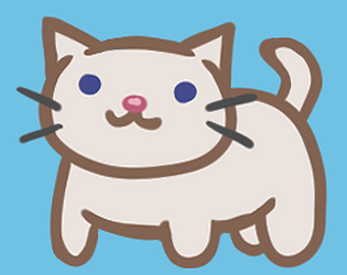
The characters are super cute and well drawn! I like the mixture of movement types, between the running/jumping and the "floating" through space. If you were to continue this, some animation for our cat character would be really cool, as well as some textures for the platforms we are navigating. Also there's a great opportunity for some great backgrounds with the space theme, you could really go wild with the galaxy/nebula textures and make each level feel like a unique environment. One criticism I have so far is that the maze level feels a bit arbitrarily big, as in the vastness of it isn't particularly adding much? If there were some obstacles or different things scattered in it, I think it would be much better as the current size, but for now it feels like it could be smaller and still have the same impact. Love it so far!
I love the humor in this, how casual the monster-talk is (like, "oh yeah, my family is from Venus"). If this were developed further it'd be nice to see different character portraits for different expressions, reacting according to the player's response. Also, formatting-wise, I think it would look nicer if the character art and text lined up a bit better. As of now it looks like the character art is just kind of slapped there above the text. Maybe having the picture centered and a bit bigger, with the text lined up underneath it? That's just one option though, there are tons of ways to format it. As people mentioned there are a couple missing or broken picture links, but that's an easy fix. Great concept, would love to see it developed more if you choose to!
Ok first of all the sudden duck quacking in the middle of the silence made me burst out laughing, very well done.
Anyway, this game is absolutely adorable! The art is so well done, I love Greensly, all his expressions are so cute. If you were to develop this further, I think formatting the game so that the art of Greensly and the counter span the entire page or "playable area" would look nicer. Right now it's just squished to the side (at least on my monitor). I had a bit of trouble finding the endings, sometimes I got stuck just guzzling down tons of potions. So far it is coming along well!
Really cute, the character art is great! I love that you put the effort in to make different expressions for the characters based on their responses, it actually made me feel a bit guilty when I chose the 'bad' options (which is good!). If you were to develop it further, I think it'd be interesting to have the characters interact with each other, such as being able to meet more than one of them at the party, and then meet up with the ones you met at the fair (maybe two of them don't like each other? :o ).
I love the background illustrations! It would be nice if the text were colored to match a bit better with them, instead of just black and white (the black and white makes it visible and readable, but that can still be achieved with more fitting colors). It seemed like the text choices that were in red were the "bad" options, I think it'd be more interesting if they weren't made red so that the player didn't know the outcome of what they were going to choose. There seems to be some inconsistency with text options taking to you a whole new page, or revealing more text, which is jarring and disrupting to the flow; I think this would be an easy fix though, like if the revealing-text had a fade in, instead of just appearing like a new page would (because both have the same animation I think that's what made it confusing). The art and characters are super well done, so your narrative is working super well!
An interesting concept. So far there seems to only be one real path to go down that actually leads anywhere. If this were finished, even the dead end paths that are finished (such as where the player decides not to go inside) end a bit abruptly; it'd be cool to see some sort of repercussion for not going through with the story. A unifying color scheme and maybe a couple pictures would be really cool, I can imagine the store being dark, and the fish tanks all glowy. I agree with the below comment about breaking up the walls of text, so much at once is a bit daunting and can be discouraging, or cause people to rush through the text.
Viability: I thought it was hilarious how you can game over just from the very start, and love how all the contestants are less-than-desirable in their own ways. Makes me want to replay just to see how "awful" each one of them is!
Presentation: The illustrations are well done! Everything has a cohesive theme and works well together.
Theme: The in-your-face comedy is great, love the memey-ness of it all! The cheesy dating game show theme was very believable.
Engagement: The illustrations and strong satire tie together well to make the player feel immersed in this game show environment.
Viability: The details and descriptions were amazingly done! Every single option is so well thought out, I would love to see this go even further with some of the endings. It was a small detail, but I really like how each ending was labeled on its respective screen; it helped to navigate through the game, and sometimes when I thought I would get the same ending, to my surprise it was different!
Presentation: Due to the lack of illustrations, sometimes the huge walls of text can be a bit daunting to read. I know it's just a prototype and there was no way for enough time to do all the pictures this game has the potential for, but I wanted to mention it to keep in mind if you decide to go further with this. Sometimes people are off put by huge walls of text; maybe simply breaking up the text with clickable arrows or something to divide it to smaller sections at a time may be a way to make it more easy to read without the labor of tons more pictures.
Theme: I love the scenery and setting described in the introduction, a very well done fantasy environment! I immediately went for the option of helping the little dragon as my first route, I love the enemy-to-friend with an animal theme. Everything is already so detailed and cohesive, I can only imagine what images would do to help bolster this!
Engagement: This is SO well written and fleshed out! The descriptions are amazing, this is like its own book! It had me keep reading non stop till the end. 10/10 for engagement.
-Tina
Viability: Very good start for an exploration game. The replayability potential is there for sure, with tons of different routes the player could take by going to rooms in different orders.
Presentation: I am not sure if it was intended or not, but there are a few passages that simply end with no text in them. There is also a "bug" where you can continue going back and picking up the knife from the kitchen until your inventory has tons of knives. But the interaction and use of the inventory system was great as a whole, adds well to the exploration!
Theme: I love the imagery of the room only being lit up by your laptop screen, or wandering in the dark with your phone flashlight. I love the "exploring a spooky house theme", very well done! Would love to see this filled out with more options and details if you decide to use this for your final. This format has potential for so many options.
Engagement: Such a relatable situation, being some when the power is out. Very engaging, and easy to imaging myself actually being there!
-Tina
Viability: I enjoyed the different endings, I didn't expect that I would be able to escape but leave my friends behind, it actually made me feel guilty! It was fun to play through the different endings.
Presentation: The little bird drawings were so cute! If there was more time to work on this/if it were developed further in the future, it'd be interesting to have little dialogue boxes with the birds' pictures next to their text. More illustrations as a whole would be great in the future, it has a great storybook feel to it!
Theme: The quick, sketchy and cross-hatched lines were a really nice style to compliment the aesthetic of the game. I really like the dark color scheme (I might be biased though), it adds to the mysterious element.
Engagement: The eagle character was well done, I loved how mysterious it was, and the shock factor of the sudden betrayal.
-Tina
Viability: The mechanic where your chicken can actually die and then you start playing as a different chicken is interesting, maybe for more replayability the narrative could change a bit, since we are now a different character? Maybe the second chicken notices something the first didn't, or vice versa.
Presentation: The background image should be darker, or the text have a slight black border or something to make it stand out better. It is a bit hard to read in some places, and the links themselves are very hard to read (especially after clicking them). The sound is jarring, and while I think it does help establish the atmosphere of the game, it is too much. The low quality of it and loudness (even with the volume as low as it can go) is too distracting for me to listen to it and read (maybe I just have short attention span though).
Theme: The theme itself is hilarious, being a chicken on a murder mission. If this is developed more in the future, maybe having more endings would be cool, like after the chicken is free to see what they do with their freedom, or having one where the chicken and farmer reconcile their differences and become friends.
Engagement: I know it's not particularly important, but there are many typos and grammar errors. A few isn't bad, but there are too many here where it is a bit distracting from what I am actually reading.
-Tina
Viability: Straightforward and easy to understand. If some replay value was wanted for this, maybe being able to try making the potion before having all the ingredients and it blowing up or something, different options like that, could make some different endings.
Presentation: The color scheme is nice and warm, fitting to the vibe of the game. The descriptions are good, and the little pictures of items are cute.
Theme: The cozy magic school feeling is really nice, and with the descriptions it is easy to imagine the environments. If there was more time to work on this then I can see little images for the characters being used and "talking head" boxes for their dialogue, or pictures of the cute little areas we visit.
Engagement: It is interesting that you can choose "bad" decisions like stealing or leaving the animal, but it seems as if there are no real repercussions to making these choices. If the game is further developed, maybe getting caught stealing or having the animal help you out after you help it would add some variability.
-Tina