Play game
The Book of Shadows's itch.io pageResults
| Criteria | Rank | Score* | Raw Score |
| Graphics | #46 | 3.636 | 3.636 |
| Originality | #50 | 3.636 | 3.636 |
| Fun | #52 | 3.273 | 3.273 |
| Accessibilty | #78 | 2.636 | 2.636 |
| Overall | #80 | 3.039 | 3.039 |
| Theme | #82 | 3.455 | 3.455 |
| Audio | #95 | 2.636 | 2.636 |
| Controls | #148 | 2.000 | 2.000 |
Ranked from 11 ratings. Score is adjusted from raw score by the median number of ratings per game in the jam.
Godot Version
4.3
Wildcards Used
Curses/Duck
Game Description
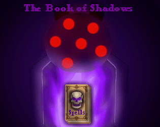
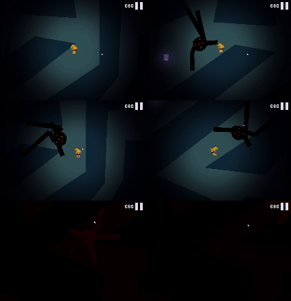
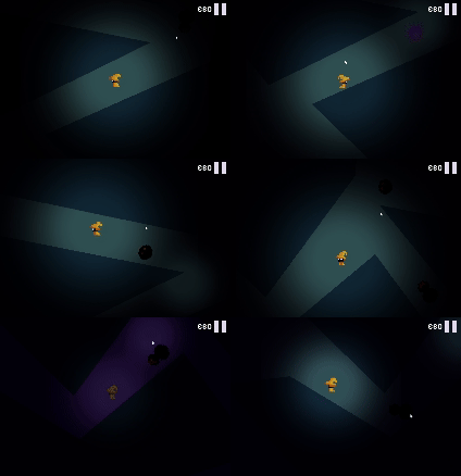
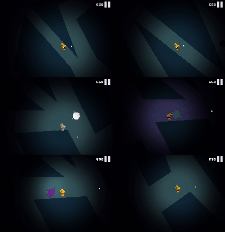
Venture into this world and battle darkness with light, recovering lost pages and magic from your book. Be warned, use these spells sparingly, or you might get corrupted yourself.
How does your game tie into the theme?
The world is filled with darkness, you are light (based on your health)
Source(s)
N/A
Discord Username(s)
Ninjafrog8
Participation Level (GWJ Only)
1
Leave a comment
Log in with itch.io to leave a comment.



Comments
Your game crafted with Godot Version 4.3, is a mesmerizing journey into a world shrouded in darkness. This indie title excels in blending engaging gameplay mechanics with a thought-provoking narrative, making it a standout experience for both seasoned gamers and newcomers alike.
I love how you are thrust into a world where light and darkness are in constant conflict. As the embodiment of light, your health determines the intensity of your glow, which is your primary weapon against the encroaching shadows. The concept of using your life force as a resource to ward off darkness is brilliantly executed. This creates a tense balance between self-preservation and the need to push forward, adding depth to the gameplay.
The unique spellcasting mechanic, where each spell cast comes with a risk of corruption, is a masterstroke. It forces players to think strategically about when and how to use their abilities, as over-reliance can lead to dire consequences. This system not only enhances the challenge but also ties beautifully into the game’s core theme of light battling darkness.
The theme of light versus darkness is not just a superficial element but is intricately woven into the very fabric of the game. The world is drenched in shadow, with only your character’s light piercing through the gloom. As your health wanes, so does your light, visually and mechanically emphasizing the constant struggle between survival and succumbing to the darkness. This clever integration of theme and gameplay elevates "Curses/Duck" from being just another action-adventure game to an experience that resonates on a deeper level.
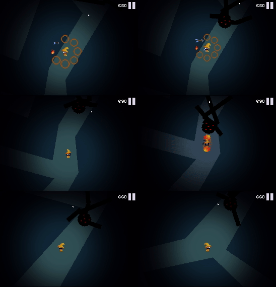
Godot 4.3’s capabilities are showcased wonderfully in this game. The visual contrast between light and dark is stark and effective, with beautifully rendered environments that shift as your light ebbs and flows. The atmosphere is oppressive yet compelling, drawing you deeper into the world as you seek out the lost pages and magic needed to push back the shadows. The use of lighting effects to symbolize health and power is particularly noteworthy, adding an extra layer of immersion.
Recovering lost pages and unlocking new spells adds a satisfying sense of progression. The narrative, though minimalistic, is deeply engaging, with the ever-present threat of corruption adding tension to each decision. The story unfolds organically as you explore the world, with each recovered page offering a glimpse into the lore of this dark, mysterious universe. This approach keeps players invested, eager to uncover more while dreading the potential consequences of each new spell.
This game is a stellar example of what can be achieved with Godot 4.3. Ninjafrog8 has crafted a game that is as challenging as it is thought-provoking, with a unique mechanic that ensures every action carries weight. The integration of the theme into the gameplay is masterful, and the atmosphere is both haunting and beautiful. For those seeking a game that offers more than just surface-level thrills, "Curses/Duck" is a must-play.
My Verdict:
A dark, immersive adventure that masterfully blends theme and mechanics, "The Book of Shadows" is a shining example of indie game design done right.
Very cool game!
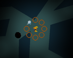
The scroll wheel spell selection was pretty cool, a mouse indicator surrounding the player when you are in the spell menu might be all you need to pull it off. I was one of the unfortunate players that was hit with the speed increase, I was wondering why it was so difficult because the game felt like it was on 8x speed.
Sorry about that haha, but thanks for acknowledging the bug! It's a little tough at the beginning regardless so I appreciate the feedback and I'll keep it in mind! I love hearing any reviews, thanks for checking out my game!
Spell selection is not very handy but at least you tried to made a cool system :) maybe a selection with other keys than wasd cool fit better ? Also it could be nice to have a health bar somewhere (or maybe I missed it ?)
Very good points, health is represented by light but it maybe lacks some particles and such to pull it off. I prefer show not tell when it comes to games but its a fair view, I might go for a health bar if players find the darkness ambiguous! I'm aware the selection is unintuitive but thanks for commenting!
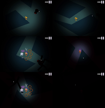
Owh okay' it's was I though but I was not sure as sometimes the darkness around was blinking red (if I remember when ennemies were around) and sometimes not ! But yeah cool idea fitting the theme well
this I think was less clear, I didn't incorporate it as well, but if you overuse spells you can get corrupted and thats why it blinked purple instead. Thank you so much for playing the game regardless I love the feedback
I could not figure out if I was attacking or not, there was a whooshing noise but it did not seem to do anything but move me a bit in a direction. I did manage to use the fireball spell randomly but have zero idea what caused the attack to go off.
Hi i'm sorry it's my fault the controls are a little intuitive, its something that I gotta work on. If a spell is not selected it will try to do a dash as a fallback which must be what you heard. I appreciate you checking out the game anyway! The game is unforgiving while you figure it out (will be changed) , but what you should know is when you left click, aswd is not used for movement but instead for selecting the spell, then when you release, that spell is activated, and flies towards your mouse. Hope that clears it up in case you give it another try
I like the intro and tutorial. Nice animations.
wow the enemies move fast! :D maybe even too fast. also player's movement is very fast. spell selection is bit tricky IMO. Maybe you could pause or slow the gameplay when selecting spell. Everything happens so fast it is hard to get far, I know that is probably the point, but it is way too fast and players may get frustrated easily because of that. Give them some time to breath and think of their options.
You have something intresting going on here. keep it going! :) good job with the gamejam!
I do believe the speed may be a bug, I think there is something wrong with how apply_force uses delta time, I noticed these huge differences in other computers, some too slow and some too fast haha. The spells are hard to use regardless so I'll keep it in mind thanks!
Love the concept and had fun playing. The controls to select and fire a spell were a bit confusing at first and hard to get used to and even when I thought I had gotten used to them they still didn't seem to work. Love the sprite of the main character though. It's amazing.
Yes I found it a bit buggy myself on the web version. Happy to hear you enjoyed it! If I continue the game I'll experiment with more controls for sure
I had a lot of fun playing this, it's a very simple and easy to get into rogue-like. I do think the controls stop me from playing more though because moving and casting with the same keys feels very confusing. Good job overall though!
Thanks happy to hear you liked the concept! You are not alone about the controls they are hard to get used to, I would have experimented more if it was outside a game jam hehe. I'll improve it if I continue working on it thanks!
Hey! Did you make the player sprite yourself? I really like multidirectional sprites like that, but animating those is a big pain in the butt.
Anyways, I like the game and think you had a really fun idea. I appreciate the little tutorial in the beggining. My main feedback would be just having the spell whell use the mouse to select spells instead of WASD, as it was very difficult to shoot and avoid enemies at the same time. Maybe lowering the speed of everything a little bit would help too.
Overall, great work! if you are new to making games, keep at it! It is a super rewarding experience :)
Thanks for the feedback! Yea I tried a couple things with the controls I did feel they were hard to get used to in the end but I had to move on from things since I had a lot of time issues. Animating it definitely took some patience.
If I continue the game I will keep this in mind!