Play game
Firepower does not scale's itch.io pageResults
| Criteria | Rank | Score* | Raw Score |
| Style | #4734 | 2.476 | 2.476 |
| Creativity | #5080 | 2.476 | 2.476 |
| Overall | #5120 | 2.365 | 2.365 |
| Enjoyment | #5254 | 2.143 | 2.143 |
Ranked from 21 ratings. Score is adjusted from raw score by the median number of ratings per game in the jam.
How does your game fit the theme?
You use bigger and bigger weapons for bigger and bigger enemies
Development Time
96 hours
(Optional) Please credit all assets you've used
See description for full credits
Leave a comment
Log in with itch.io to leave a comment.


Comments
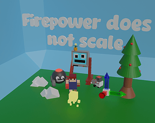
Art style was great and going 3D in a game jam is always a bold strategy, so kudos for pulling something together in the time constraint! The control scheme felt very unnatural to me and movement seemed to become awkward at places where the elevation changes; I'm wondering if voxels may have been the way to go?
The game felt surprisingly chilled given that it's pretty much a mob-survival game, but the music and art worked well together. I read in another comment that you were solo, so as a fellow solo dev, I commend your efforts here and congratulations on the submission!
Thanks!I added elevation kinda last minute using the unity terrain system so movement and shooting hadn't been designed with it in mind . I also tried doing voxels initially with magica voxel but quickly found it's time intensive and I am not good at it
Understandable, wise decision I think then! I've just this moment randomly thought that your idea might be kind of cool as a turn-based strategy game lol; clearly a sign that the concept affords a big design space, so great job coming up with the idea in the first place.
Nice job! Definitely ambitious to go 3d, but I definitely liked the art, particularly for the enemies. It could be useful to have a hint pop up (possibly a picture of what the correct weapon would be) if you try to use the wrong one.
Neat idea! I had a hard time with the controls, only moving on dash was disorienting. When I threw the weapons I would have expected them to travel less and drop near my feet, I think several times they disappeared from the world. Aiming from the hills was also difficult and I frequently missed. But if all of those things were tweaked and fixed I think this would be really addicting! The enemy speed felt good in relation to my own movement and I like how the the weapon system works. Music was a good choice, makes you feel calm in a situation that might be stressful. Good job!
Thanks ! I knew weapon throwing was a bit buggy and bullet height was poorly implemented but being solo I didn’t have time to fix them , I was implementing core mechanics mere hours before submission because things were much more complicated than I thought .
Interesting game with a unique control scheme! It's quite difficult though as the enemies have a huge amount of health! Overall, interesting entry :)
Oh , enemies have only 1 Hitpoint , but you need to use the right weapon(see game description ) , I didn't have time to make a tutorial so I understand your confusion .
Oh I see. I will have to give it another go!
This was a very fun chill game and I really liked the style and art. Overall great job had a lot of fun playing it.
This was very chill for what was happening on screen! I think the controls could be slightly better but it was pretty good overall.
Haha, Thanks!The chill guitar loop certainly contributes to that vibe ,my friend didn't have enough time to make another track.
The game was pretty fun. I really like how tense it got as more enemies started to spawn. I think the controls would've worked slightly better if the game was from a first-person perspective, but other than that they were intuitive to use.
The game probably could've been a little more connected to the theme, but I definitely see how what the intention was.
Although the 3d modelling was very simple, the lighting and screen effects make it look surprisingly nice. It was almost nostalgic in a way. I also really liked the music.
Congrats on submitting and getting a fully playable game out!
Thanks for the kind words! I don't usually do 3D modeling so I am glad you liked the visuals, it's an art style I picked up from my previous game jam game. I do kinda regret doing 3d since a lot of development time was spent doing particles, 3D movement and animations , will definitely go 2D next year.