Play game
Drawn To Scale's itch.io pageResults
| Criteria | Rank | Score* | Raw Score |
| Creativity | #2458 | 3.294 | 3.294 |
| Style | #2859 | 3.118 | 3.118 |
| Overall | #3296 | 2.941 | 2.941 |
| Enjoyment | #4437 | 2.412 | 2.412 |
Ranked from 17 ratings. Score is adjusted from raw score by the median number of ratings per game in the jam.
How does your game fit the theme?
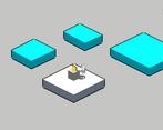
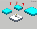
The game features a mechanic where the player must draw out an increasing larger arena. They must "Build it to scale"
Development Time
96 hours
Leave a comment
Log in with itch.io to leave a comment.


Comments
This is awesome. Great interpretation of the theme. So good to see really original and unique game design and game play. A few bugs to iron out in later development. Like others, I'd like to see this built into a fully developed game without the constraints of a 96 game jam deadline. This is a hidden gem. My favourite so far. Well done.
I like the overall concept of the game, I think it'd be better if you just make a wall with a stroke of one line. I like the overall visual style of this game. Keep working on this artpiece!
Really cool concept for a game! Though I found it quite difficult to make squares. As another comment mentioned it might make it easier for the player to simply click and drag to make rectangles. Otherwise this is a really cool idea and I'd love to see it develop further. I really like the art style too! Awesome work, keep it up!
Thanks for the feedback!
It's a bit difficult to create blocks and, above all, to use up all the ink. I think the game would be much more enjoyable if, instead of creating each line one by one, we could simply click to create a corner and drag to position the opposite corner! Regardless, I love the concept, great job!
I love twist on the theme and it was very very enjoyable to play!
Nice art but janky controls. The idea is cool though.
I liked the interpretation of the theme and the visual style is really good!
I wanted to like this game, but I struggled to connect the lines to create the blocks. The art style is rad. The character is cute af. I just couldn't get past the starting line. The tutorial also had overlapping text with the tutorial text and the notice to use up all your ink, so that didn't help.