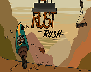
Play game
Rust Rush's itch.io pageResults
| Criteria | Rank | Score* | Raw Score |
| Presentation | #1934 | 3.043 | 3.333 |
| Overall | #2514 | 2.799 | 3.067 |
| Fun | #2538 | 2.617 | 2.867 |
| Originality | #2963 | 2.739 | 3.000 |
Ranked from 15 ratings. Score is adjusted from raw score by the median number of ratings per game in the jam.
How does your game fit the theme?
the movement is tied to your health
Did your team create the vast majority of the art during the 48 hours?
Yes
We created the vast majority of the art during the game jam
Did your team create the vast majority of the music during the 48 hours?
Yes
We created the vast majority of the music during the game jam
Leave a comment
Log in with itch.io to leave a comment.


Comments
Classic platformer! Perhaps a little too classic to justify all those explanations... ^^ But judging from the other comments you got, it's maybe not the case for everyone, so...
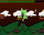
I liked the style, and the solowheeled robot moves well. I would not have called "damage" the jauge going down, it's more like carburant being depleted, but i'm pointing details... ^^
Got stuck by the platforms too, didn't go to the end...
But nice game!
I felt so bad for the poor robot! the art is great, and the music has a haunting but pressured feel to it. gameplay wise I like the grim concept, and once I got used to the controls I was able to progress pretty well.
the most difficulty I had was with the rising platforms, which are the true evil in this game lol. I had a run that ended because a platform shoved me into a block and I couldn't get out, so I had to wait for the timer to end xD
Yes lmao that is the most hilarious bug in this game. I tried to code it out but ran out of time lol. Thanks for playing.
Cool art on the robot and backgrounds! Movement was a little hard to control but I’m not big on platformer games. Good Job!
Thanks for playing!
Good concept (though I don't know how it fits the theme) and great visuals where there was time to dial them in! Music was also enjoyable! Player controller felt a little frustrating but I feel your pain there as we struggled with ours ^^
Theme = Health "joined together" to movement mechanic. Thanks for playing!
Cool entry, like the style. The game reminds me a lot of this Dutch game called Battery Check, which has a similar concept.
Thanks for playing and for sharing that. I def see the similarities. I haven't even heard of that game until now lol.
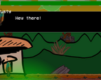
Game very polished but I didn't see the theme and I didn't have much fun playing it but I really liked the art especially the menu and dialogs. Good work!
The theme was intended to be the health mechanics being "joined together" to the movement mechanics. Thanks for the feedback. I worked really hard on the custom dialogue box and our artist worked very hard on the hard!
This is a pretty fun game, I like the presentation and dialogue, though a few notes, gravity feel way too strong and between that and jump height it makes jumping surprisingly punishing. I like the concept of movement being tied to your health, though I wonder if there might be extra mechanics you could add tied to it that would make it feel a bit more strategic in it's use, like a double jump that burned a chunk of health meaning you'd want to use it sparingly. All in all, a fairly good time, nice work!
Thanks for playing and for the feedback. Yeah I did that intentionally to try to show the "weight" of the robot but I can also see how it can be a bit irritating because of course one would expect a sense of "weightlessness" ina platformer. And I wanted soo much to syncranize the health a bit better to the mechanics but I ran out of time as many people probably did lol.
Ah ok, that makes sense, that feeling of weight I think is really hard to properly achieve, there's a fine balance between impactful and clunky, a mix of gameplay, sound, effects, and perhaps some camera shake. and yea never enough time haha, so many thing I wanted to add or change while scraping the submission deadline XD