Play game
Dragon Flea's itch.io pageResults
| Criteria | Rank | Score* | Raw Score |
| Overall | #3 | 3.846 | 3.846 |
| Compatibility with idea | #12 | 3.615 | 3.615 |
Ranked from 13 ratings. Score is adjusted from raw score by the median number of ratings per game in the jam.
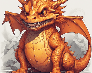
Did you included the image of the generated idea in the game's description?
What game engine did you use?
Godot
Did you worked solo or in team?
Solo
Leave a comment
Log in with itch.io to leave a comment.


Comments
Nice and extremely annoying mechanics! :D I really laughed so hard when I needed to make this perfect jump series to get higher. Nice game focused on one mechanics with pleasant visuals and music.
Hey 👋 thanks a lot for the kind words and for playing the game
I’m glad the reaction I got from you was laughter and not a broken keyboard
Thanks for organising the jam and giving me the impulse to create the game!
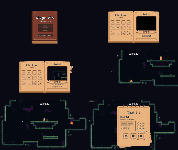
I love the presentation! The music, visuals and animation are all really cohesive and fun. I like the mechanic where you get a jump reset on touching a wall. It feels pretty nice and feels good to get better at! It adds a surprising amount of depth for a one button game! I like that it's on a timer too! It gives it a lot of replay value and makes it feel really nice to get better at it. There are a few stretches where it feels pretty punishing to miss jumps. You need to wait a while to get back around to reattempting the jump, which is especially tough when you're starting out.
thank you so much for the feedback and for taking the time to play and review the game!
Because there were several people telling me that the game is a bit too punishing (when missing jumps) I decided to re-do the level and make it more accessible, while still keeping it hard for people that need a challenge.
Will post an updated level probably at the end of the week. Thanks again for the imput!
pretty unique love how as you move up the camera follows which is cool
thank you for the kind words and for taking the time to play and review it 😊
Loved it, intensely frustrating in a way that made me want to keep playing. I was also sad that there werent more levels but the game felt very polished
Hey👋 Thank you for the kind words, it really means a lot to me.
I may actually make multiple levels and update the game in future cuz I really enjoyed working on it
cool entry!! there's lots of polish in this one which is nice: the art all flows together really nicely, the player/barrell/fire animations are clean, and the background music is a bop. i got stuck pretty early unfortunately so didnt make it very far but what i did play i enjoyed. you did a great job at adding gameplay depth despite having a simple bas mechanic with wall jumping and other shennagins which was cool too. one improvement might be to add a little bit of lore/backstory to the dragon to give the player motivation to help the dragon win. overall this style of game isn't really for me so i don't have to much valuable criticism but i enjoyed what i played and this was a solid game!
Thank you for the feedback and for taking the time to play the game!
Was there any specific part of the game that seemed too hard?
the barrels do seem a bit out of place, but i see you did what you had to do to fit with the idea generated, and although the controls take some getting used to with the jump being an exactly 45 degree angle making it much different from other platformers, i really enjoyed it. the character went fast and and it felt frantic but not too out of my hands to give up entirely, and then the inclusion of the timer is just the cherry on top to making this game feel fun. the wall jumps are a bit tough to figure out, maybe having the player slide down walls if they aren't touching the floor already could make them easier as well as allowing for more interesting platforming in the potential future. great game!
Thank you so much for the feedback!
The barrels were indeed an after thought. But when you say they don't fit, you mean:
1. they don't look consistent with the rest of the pixel art or
2. they just appear out of nowhere and don't seem to contribute to the narrative
it's a bit of both honestly, although there isn't much of a narrative other than being generally castle themed (which barrels make sense for), so i guess i just mean the pixel art. everything else uses a very vibrant color palette so it feels a bit out of place when the barrels are very low saturation as they are.
Got it. Thanks for the clarification.
Nice game ! Despite having only one touch, you successfully made a game with some depth of gameplay ! :D
A bit hard to understand the interaction with some walls (i was spamming at some point)
I am just sad that it has only one level !
Thank you for the feedback!
I received that feedback several times, and I'm thinking to add some friction with the wall so you have time to react rather than spamming. I may actually invest more time into the game and make 2-3 more levels.