Play game
Distant's itch.io pageResults
| Criteria | Rank | Score* | Raw Score |
| Game Design | #324 | 3.538 | 3.538 |
| Theme | #425 | 3.538 | 3.538 |
| Fun | #434 | 3.308 | 3.308 |
| Innovation | #502 | 3.231 | 3.231 |
| Graphics | #515 | 3.462 | 3.462 |
| Overall | #522 | 3.244 | 3.244 |
| Audio | #999 | 2.385 | 2.385 |
Ranked from 13 ratings. Score is adjusted from raw score by the median number of ratings per game in the jam.
In what way does your game fit the theme?
You rewind time to solve problems.
Did you write most of the code yourself and made all the assets from scratch?
Yes, except for the sound.
Leave a comment
Log in with itch.io to leave a comment.


Comments
Some random feedback in no particular order:
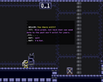
- Cool sprites and graphics.
- The text animation was really nice
- First level was good, nicely introduced the concept
- I wish movement was a bit quicker. Long walking times between terminals
Otherwise, a great job :)
Nice concept, I appreciate that a whole story was written to explain the gameplay, it's a nice touch especially for a jam game. As other people have said it's a bit hard to tell what is foreground and interactable versus what is in the background. The characters also felt slow to control and I think slowing down the player by that much when pushing boxes was unnecessary. The collider for the player also felt a bit too large, so when it looks like you should be able to fall through a gap you actually just walk over. These are all pretty minor things, overall well done!
Wow! This game's concept has so much potential and it would be super cool if you explored it further. Currently the game's platform physics and art aren't fantastic, but you have such a good starting point that if you ever feel like fleshing out the gameplay the experience could become super intriguing.
Nice puzzles! I think when switching between time periods, the white colors make it really hard to tell what's an object or what has a collider. This idea is really cool though and I think with a bit more polish it could be even better!
Nice job!
I really enjoyed the puzzles! good work
the graphic look great with pixel art, but it not clear and sometime I can figure where are the blocks which I can push.
Anyway, this is a good puzzle game, Good work
The game has an interesting main mechanic. Background music would have been nice and the sound effects are very low volume if you ask me. Also, the contrast on some levels between background and foreground makes some platforms hard to recognize.
Still fun and well realized project with quite a lot of polish. Good work!
Really fun! The pixel graphics were so cute, loved the walk animation :D
Very fun puzzle platformer. It's very short. When playing as Kat I feel a little blinded less white would help tremendously. I had a fun time! 3/5 fun puzzler with platforming