
Indie game storeFree gamesFun gamesHorror games
Game developmentAssetsComics
SalesBundles
Jobs
TagsGame Engines

How to do water depth tile transitions?

A topic by GreyFoxStudios created 65 days ago Views: 315 Replies: 6
Viewing posts 1 to 5


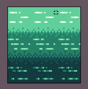
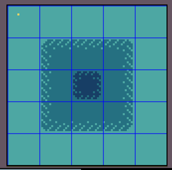
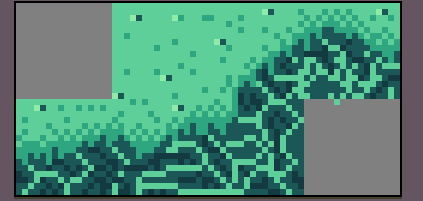
Here are my attempts at doing various water depths. All of them, I'm not incredibly happy with. I dont know if its because the 2 are too square, but the last one is chaotic and noisy for me, or what. But I am struggling with this. I Just realized that MAYBE its my water palette. but I kinda like the green water at the same time. I have no idea what to do and this is a HUGE struggle for me at the moment. Please PLEASE give me some ideas how to make water transitions look good.

It's tricky. I like how aamatniekss handled it in Era of Fantasy, by giving shallow water the texture of the ground below it, and underwater chasm tiles that transition to water deep enough that you can't see the ground anymore. (I took a similar approach in my own set, Land and Sea, which is more gameboy-oriented.) But obviously this means you'll have to treat every single shallow water ground differently and think carefully about how you palette them; this isn't a one-size-fits-all solution.

So, upon further investigation, I think ive been shifting my values in the wrong direction. 

All of the colors I have are super saturated, which can be an style all its own, but its not working how I want. Ill have to adjust my palette and see if I get a better result. 

Another thing Ive seen is the devlog for a game called Dauphin on YouTube, and how he approaches it is opacity. As long as the texture underneath is interesting but not distracting, that is another option 

You did convey the idea of different levels of water with your images.

I know I did, my fear is that the transitions are going to look awful and its going to be distracting to some extent. Im trying to find a good way to blend them together better so it looks smoother.

Animating it would probably help a ton. I found making the tiles look like moving water helped differentiate them to the player from non-water tiles. 

(3 edits)

For your the top-view example that’s your third image, the water appears to be underneath the water as if the sand is reaching across disturbed shallow water. An edge of a lighter color can represent a spray line to swap and a darker color can represent wet sand to make the water look higher than the land.

shore

Maybe not relevant to top view tiling (I haven’t taken a close look at that) but here’s a side view experiment you’ve inspired.

48-by-48-pixel water sideview

The bottom layer has lower saturation than the previous two stripes, is darker than the top to represent the loss of light reaching lower depths, but is also hue shifted slightly from green and blue.

That shift is to reduce contrast with orange and pink/red sprites. In reality, humans can see fewer colors the deeper the water, and reds are quickly lost.

(*edited again because early posting doesn’t result in the highest quality *😅)