Following part 2...
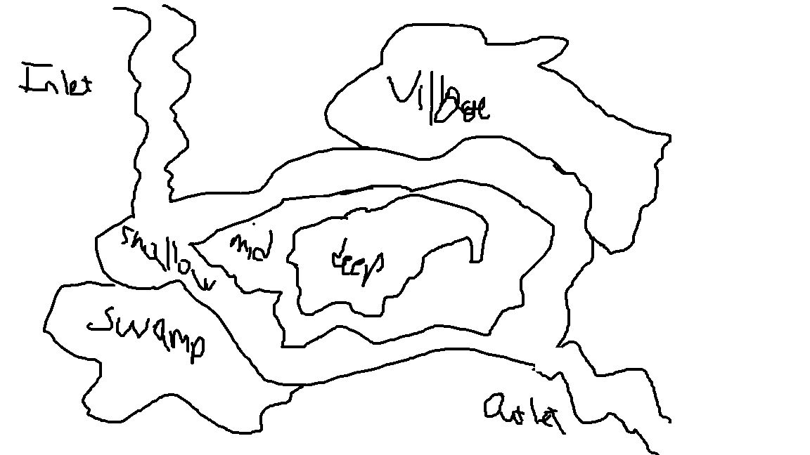
I don't have like a town or village map yet. What I have is this... its not great lol. Do you see why I make pictures out of tiny squares? (I believe its Brandon Greer on YouTube who says "I make art out of tiny squares" and I love it). It originally was going to be where the player travelled to new locations via boat/plane/car to catch new fish, but I like the thought of having one cohesive lake that the player will probably be able to walk all of the way around. Plus, doing it like this, I can keep the mentality on freshwater fish, and I dont have to worry about saltwater. The water is going to have all kinds of structure and cover, and I may even have like a map or radar on a boat that will show you where that structure is once the water gets too deep and you'd no longer could see the bottom.
That should be all of the updates I have for now. Sorry for the silly formatting, when I had all 3 pictures in the post, I was getting flagged for it being too long. Next update I will probably have a character, maybe the diner will be more fleshed out, maybe ill even have the exterior of the diner made. Who knows. I want to be able to update this more frequently, but I am learning this all myself so please forgive me if its a long time between updates.
Thanks for reading and have a great day!
Mr. Grey
Creator of
Recent community posts
Following part 1...
After watching some videos and doing some research, I have decided to go back to the 16x32 sprite size (don't know if I ever stated how big the sprites were going to be, but there you go.)
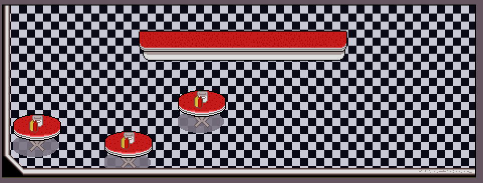
Next on the list: I started designing a room! This is Donna's Diner (WIP), meaning Donna is going to be character, and I will have to design her at some point. This was really made to make sure that everything was cohesive, and if I could do that outer wall look correctly. I think I did, except I don't really like the detail I started to add down in the bottom right corner. I also need to make the corner in the bottom left wider so it doesn't look quite as sharp as it does now. Over all, I like the aesthetic. Going for a 50s style diner, which I think I have started to capture quite well. I might add booths, a jukebox, and whatever would go behind the counter at the diner. Extending rooms will probably include a kitchen, a stock room, a cold room/freezer, and a bathroom. I might try and figure out how to have a window in the kitchen so that way the cook can peer out into the diner.
I haven't updated this in a while, so here it goes:
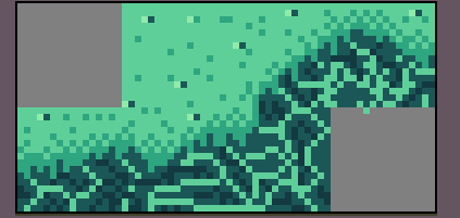
I have changed my focus away from the water. Right now I cannot come up with a good solution to it, so I'm shelving it for now. I will have to get back to it some time in the future, but for now, its on a back burner.
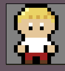
So I decided for a brief moment that I was going to do this in a 16x16 style. Meet Gil:
Gil even got a cute walking animation and everything for his 16x sprite booty. I have no idea how to upload the animation, but it's pretty common for a 16x sprite
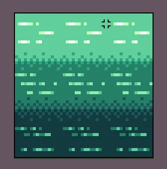
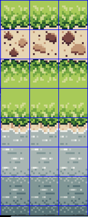
Here are my attempts at doing various water depths. All of them, I'm not incredibly happy with. I dont know if its because the 2 are too square, but the last one is chaotic and noisy for me, or what. But I am struggling with this. I Just realized that MAYBE its my water palette. but I kinda like the green water at the same time. I have no idea what to do and this is a HUGE struggle for me at the moment. Please PLEASE give me some ideas how to make water transitions look good.
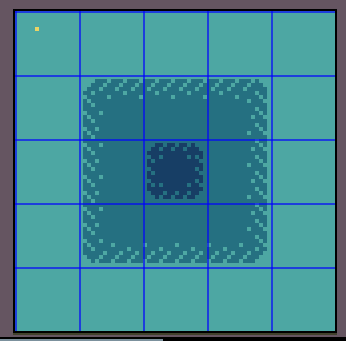
Here is kind of the first thing that I worked on. Grass, water, and a couple path tiles. A few things that I dislike, but are easily fixable are:
The outline on the grass is WAY too dark in my opinion. You can see a green in the grass pattern that is a shade or 2 lighter, and I will probably change the outline to that color so it isn't quite so harsh against the sand tiles.
Yes, the grass tiles on the other side of the path is just a Y-flip of the grass tile. This was more to check visibility, how does it look against the sand, and all of that. I would love to see if anyone has a suggestion on how to make this look better.
Without the grid squares, there's a clear divide in the sand path tiles. I have to figure out how I am going to not make that so apparent where the divide is per tile. Also the pattern is kind of MEH in my opinion, so if someone can point me in the direction of where to learn to make a better path tile, I would wholly appreciate it.
The water transition is... rough. This is really the only one that I have NO idea how to fix. Maybe an animation over the top will fix it. Again, any suggestions on what to do or where to turn to make this better, is greatly appreciated.
Let me know what yall think, and if you have any suggestions to make things better, please let me know!
Aaron@Grey Fox Studios