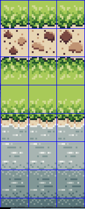
Here is kind of the first thing that I worked on. Grass, water, and a couple path tiles. A few things that I dislike, but are easily fixable are:
The outline on the grass is WAY too dark in my opinion. You can see a green in the grass pattern that is a shade or 2 lighter, and I will probably change the outline to that color so it isn't quite so harsh against the sand tiles.
Yes, the grass tiles on the other side of the path is just a Y-flip of the grass tile. This was more to check visibility, how does it look against the sand, and all of that. I would love to see if anyone has a suggestion on how to make this look better.
Without the grid squares, there's a clear divide in the sand path tiles. I have to figure out how I am going to not make that so apparent where the divide is per tile. Also the pattern is kind of MEH in my opinion, so if someone can point me in the direction of where to learn to make a better path tile, I would wholly appreciate it.
The water transition is... rough. This is really the only one that I have NO idea how to fix. Maybe an animation over the top will fix it. Again, any suggestions on what to do or where to turn to make this better, is greatly appreciated.
Let me know what yall think, and if you have any suggestions to make things better, please let me know!
Aaron@Grey Fox Studios