
Indie game storeFree gamesFun gamesHorror games
Game developmentAssetsComics
SalesBundles
Jobs
TagsGame Engines

I’m looking for feedback from players, QA testers, and fellow developers to help me understand if the game is heading in the right direction.

A topic by ProjectKP created May 28, 2025 Views: 475 Replies: 18
Viewing posts 1 to 9

Hi, I'm Karel!
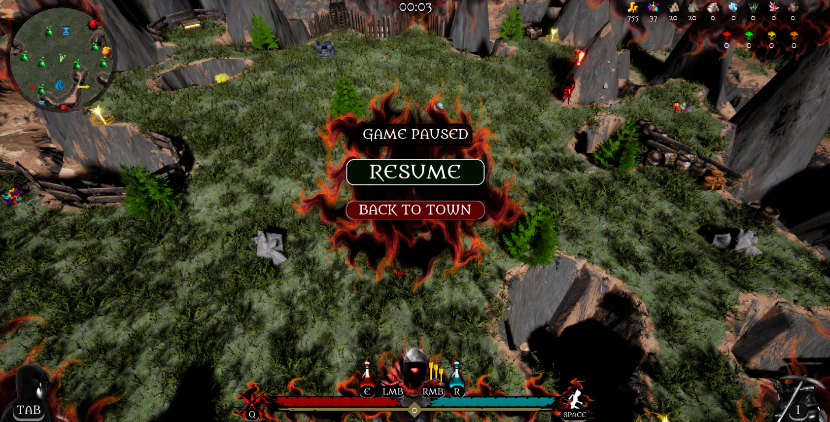
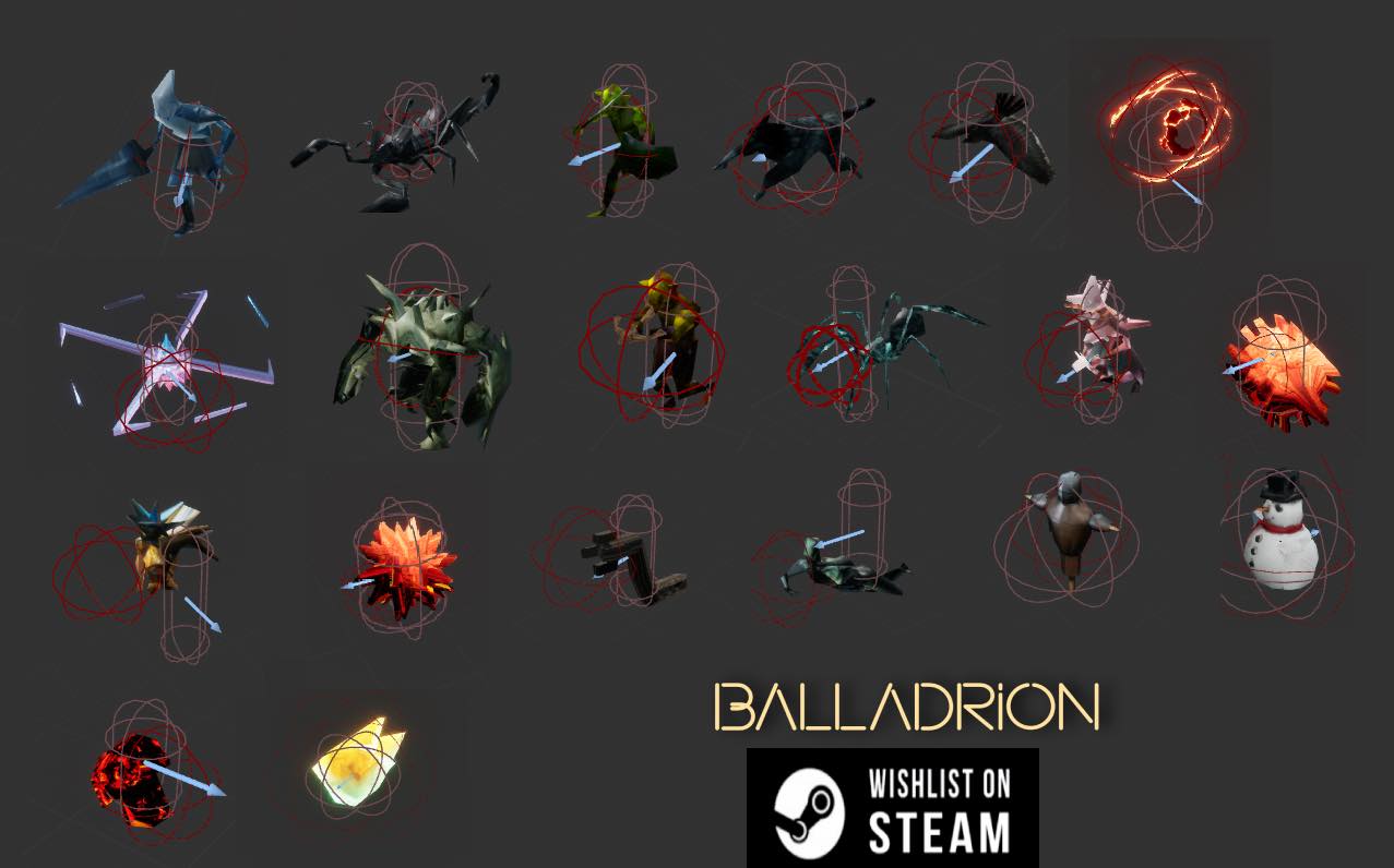
I'm currently working on Balladrion, a rogue-lite RPG with a light narrative focus.

I've been developing the game solo in my spare time for the past 6 months—and there's still at least another 6 (or more!) to go.
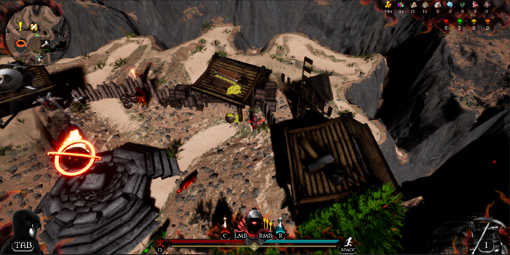
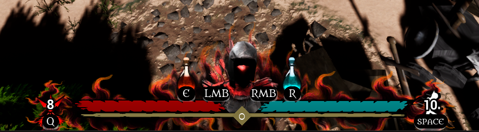
Whenever I get the chance, I work on improving gameplay mechanics and visuals, while also adding new enemies, maps, events, skills, and much more.

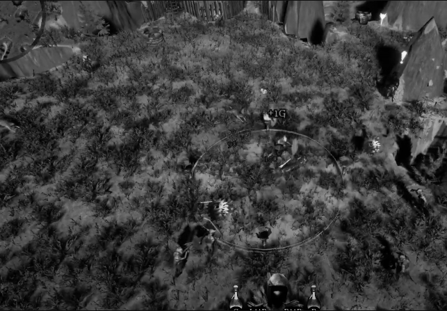
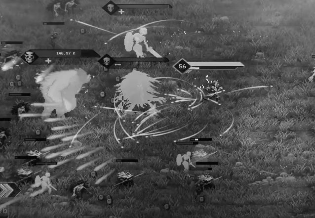
I just released a new video - FIrst alpha gampelay look -  showcasing the current state of the game!
I'm looking for honest feedback—so every info helps - what you like, what you deslike, if the game is slow, fast, looks easy etc ... everything what comes in your mind counts. - Currently working on new random events
You can comment here, or at youtube, or itch.io https://marionettecz.itch.io/balladrion or at the discord https://discord.com/invite/Q7vYkyGmgS 
You can find me also at: https://www.linkedin.com/in/karel-junek-b23644129/ 

(1 edit)

For more info:
The game is built in Unreal Engine 5.5.4.
Graphics and textures are created using Blender and Photopea.

Version of the game can be red here: https://marionettecz.itch.io/balladrion/devlog/952215/version-00157and here https://marionettecz.itch.io/balladrion/devlog/953970/version-00158-00159-00160  

If previous video is too long i have shortened version here: 


🐉 My game Balladrion has gone through a lot of updates and improvements recently. I’ve put together a new video, and I’d really appreciate it if you could take a look and share your thoughts or feedback.🐉

(+1)

The biggest issue is the visuals. There's no cohesive visual style. It's also hard to understand what's going on at any given moment, because there's so much visual noise that important gameplay elements get drowned out.

The game's identity is also not clear. Some sort of vampire survivors type with gathering resources, but none of it looks particularly compelling.

Not sure what your goals are with this game, if it's a hobby project or more than that. But it's very far from the standards you'd have to hit for it to be commercially viable in the current market.

(1 edit)

Hey, thanks a lot for the comment! The game is a roguelite with some upgrading and resource gathering elements.
My goal is to make something more than just a hobby project — I’ve been working on it for about 7 months now, and I’m aware that it still needs a lot of improvement.

Could you clarify what you meant by "no cohesive visual style"? I was aiming for a fantasy fairy tale kind of look — something in between those styles. What exactly feels inconsistent or off to you? Do you have any suggestions on how I could improve it?

Regarding the visual noise — do you have any tips on how to reduce it? Since the game is meant to be a mix between roguelite and bullet hell, I’d like to keep the action intense, but still readable

Here’s the full gameplay of the first easy level. If you have some time, could you describe what you would do differently?

 
(1 edit) (+1)

Some fundamentals on color theory and especially "values" would help here. Value is how light or dark a pixel is and it's what controls what our eyes are drawn to. Higher values will draw more attention than lower ones. And it is the contrast between those two that will create visual clarity for the player. 

Look at a screenshot of your game with all color removed and only values remaining. 
It is incredibly hard to make sense of what's happening in this scene. Where is the player? Where are the enemies? What's an important element to the gameplay, what is there just to look pretty? It's impossible to tell.
Make it a practice to constantly check your game visuals with only values and see if it's readable.


Compare that to a screenshot from Rogue Genesia. I can fairly easily tell what's happening in the scene.
I think in Genesia's case the healthbars above the heads help a lot. But also value contrast is much better.

(1 edit)

"Thanks a lot! I definitely need to learn more about contrast – what it actually is, how to use it properly, and how to work with it." But i see that the enemies which are not getting hit are not clearly visible too. Maybe health bar could help. But i dont know if i want to add it maybe its gona be to much. Im trying to reduce the UI 

(+2)

Like PapaCashew said in a previous comment, the visuals do need some work. However, what I am mostly concerned about is feedback on the player's status. From what I can tell, there isn't much feedback to the player to on how much health they have, except for the health bar. With all of the visual elements that are on screen at any one point, I found that my focus turned away from the health bar, which could be detrimental to a player that has low health. 

My recommendation would be to find a way to improve the feedback that a player gets when being hit (whether that's a sound effect, screen effect or other method depends on what your vision for the game is).

I would like to collaborate further with you to help test this project. While I don't have much testing experience, I could provide some helpful further feedback. Feel free to message me if you would like to collaborate further.

(2 edits)

Hey, could you clarify please what you mean exactly with the health?
There is a health bar that shows the player's health. Also, when the player gets hit, the character briefly flashes red and there's a hit sound effect.

Do you think the health bar should be placed somewhere else? Or changed to be bigger, smaller any tip ? 
I recently added an RPG-style health and stamina system, so I’d really appreciate any suggestions on how to improve its visibility or effectiveness.
Here’s the full gameplay of the first easy level. If you have some time, could you describe what you would do differently?

(+1)

I looked at the video and was not able to determine exactly which sound effect was the hit sound effect. It could be that the one you chose is getting drowned out by others in the scene at the time, but to me listening on earbuds I could not pick it out.. 


As for the health bar, my immediate reaction would be to add some sort of flash/pulse to the health bar when the player is low on health (refer to Halo’s shield bar when shields are low/broken). Alternatively you could do a pulse effect on the screen itself (I think Skyrim does this). 


However, going back to the previous comments, anything you do to the health bar might not matter if there is too much happening on screen. For example, at around the 2:30 mark in the video you provided I noticed that there were a lot of visual effects going on at one time. Someone who is easily distracted might get caught up in the action on screen and not notice the health bar. 


Side note: I don’t remember seeing any gameplay where the player dies or has extremely low health. It is possible you have accounted for the things I have mentioned  but it just didn’t happen to show in the gameplay.

To summarize:

  • see if you can mix the audio to allow the hit effect to be more prominent
  • Investigate adding some visual cue to the health bar/screen 
  • Investigate ways to reduce visual effects on screen where unnecessary 

I hope this helps. 

This is a UI screen. If you can point out anything that feels really off or disturbing, I’d like to change it or redesign it.

(+1)

The top right of the screen feels a bit too crowded in my opinion. Is there a way you can limit the items shown to those that are most important (gold for instance), then maybe show other items for a brief period when the player gains or looses that item?


For example, if the player gets wood, briefly show the new total of wood for a few seconds then hide it again.

The entire inventory then can be visible in a pause menu of some kind.

"Well, I need to think it through, because enemies drop items that you can use during the game. For example, when you kill goblins, they drop temporary red skulls that can be exchanged with traders on the map. I'd also like to add some real-time traders who can, for instance, trade 2 units of wood for a temporary map boost or a one-time AoE thunder strike that could save your life or turn the tide of battle. So I think I need to design all of them... Hmm, I’m still thinking about it. Not entirely sure yet."

Fair enough. If the player needs to see all items at all times then that's fine.

Changed some UI bar - bigger health and stamina, also bigger CD timers and skills. I will try to do something with the sounds

(+1)

I do like this change. Not only does it make the health bars more visible, I find it makes it more stylized in a way that compliments the game’s style. 

Redesigned UI and grapghics style to be more visible what do you think guys?

New trailer new design

N