
On Sale: GamesAssetsToolsTabletopComics
Indie game storeFree gamesFun gamesHorror games
Game developmentAssetsComics
SalesBundles
Jobs
TagsGame Engines
(1 edit)

Hey, thanks a lot for the comment! The game is a roguelite with some upgrading and resource gathering elements.
My goal is to make something more than just a hobby project — I’ve been working on it for about 7 months now, and I’m aware that it still needs a lot of improvement.

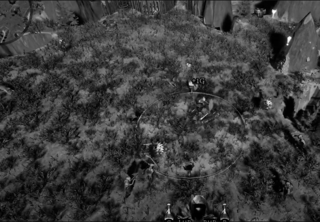
Could you clarify what you meant by "no cohesive visual style"? I was aiming for a fantasy fairy tale kind of look — something in between those styles. What exactly feels inconsistent or off to you? Do you have any suggestions on how I could improve it?

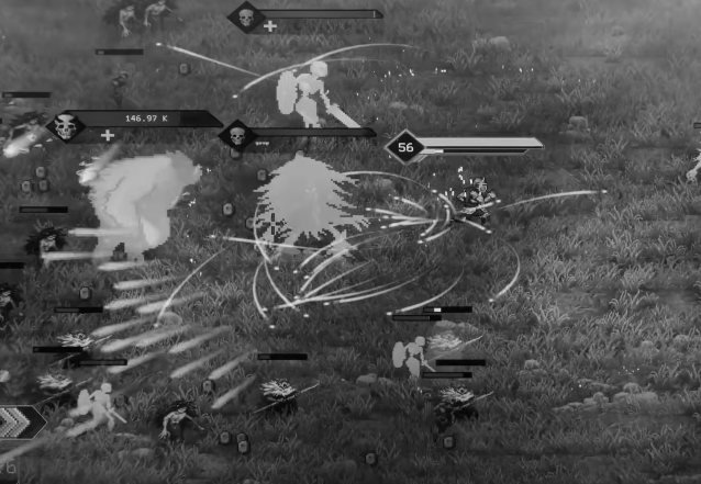
Regarding the visual noise — do you have any tips on how to reduce it? Since the game is meant to be a mix between roguelite and bullet hell, I’d like to keep the action intense, but still readable

Here’s the full gameplay of the first easy level. If you have some time, could you describe what you would do differently?

 
(1 edit) (+1)

Some fundamentals on color theory and especially "values" would help here. Value is how light or dark a pixel is and it's what controls what our eyes are drawn to. Higher values will draw more attention than lower ones. And it is the contrast between those two that will create visual clarity for the player. 

Look at a screenshot of your game with all color removed and only values remaining. 
It is incredibly hard to make sense of what's happening in this scene. Where is the player? Where are the enemies? What's an important element to the gameplay, what is there just to look pretty? It's impossible to tell.
Make it a practice to constantly check your game visuals with only values and see if it's readable.


Compare that to a screenshot from Rogue Genesia. I can fairly easily tell what's happening in the scene.
I think in Genesia's case the healthbars above the heads help a lot. But also value contrast is much better.

(1 edit)

"Thanks a lot! I definitely need to learn more about contrast – what it actually is, how to use it properly, and how to work with it." But i see that the enemies which are not getting hit are not clearly visible too. Maybe health bar could help. But i dont know if i want to add it maybe its gona be to much. Im trying to reduce the UI