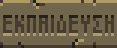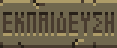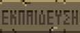
Yes, you can resize images - just not too much :) In this case, it's certainly fine. You can check out other translations for examples of what's acceptable.
yancharkin
Creator of
Recent community posts
Great, thank you! The web version has been updated with the latest changes. Hopefully, the translation is now complete. I think we both ended up spending more time on this than we initially expected - but it was definitely time well spent, as the translation is much more polished now. If you happen to spot any other issues, please feel free to report them. It'll likely be a while before I release a stable version, so making changes in the meantime is not a problem.
1. ON", "OFF", and "GAME OVER"
These are likely recognizable to most people, regardless of language. Still, they look a bit out of place when everything else is translated - almost as if they were accidentally missed. Don't you think it's worth translating them for consistency?
2. "JETPACK"
In many languages, when there's no direct equivalent, the word is transliterated. Would that be a suitable approach for Greek as well?
3. "TUNNEL1" and "TUNNEL2"
You are correct, these are not very important.
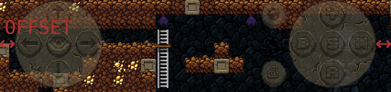
4. "TOUCH BUTTONS OFFSET"
5. Shop text
You don't have to stick to a literal translation if it doesn't work well in Greek. Reordering the lines is also fine if it reads better.
For example, it is possible to make something like that:
"'S SUPPLY SHOP!": "WELCOMES YOU IN HIS SUPPLY SHOP",
"WELCOME TO ": " ", # empty line, but must contain at least one space, otherwise the original line is used
Result: [SHOPKEEPER'S NAME] WELCOMES YOU IN HIS SUPPLY SHOP
6. Diacritics
If other diacritic symbols aren't used in the translation, there's no real need to add them - it won't hurt, but it also doesn't add much value.
I took another look at the charsets, and I agree - the regular version of Ή really does look too awkward. Also, since Greek uses several diacritic symbols (even if not all appear in your translation), it makes sense to switch to tall letters. I've made some code adjustments to address at least some of the potential issues with larger fonts, and tall letters are now used for Greek (web version already updated).
I also noticed that some lines don't seem to be translated, for example: "ON", "OFF", "GAMEPAD", "GAME OVER", "HIGH SCORES", "JETPACK", "TUNNEL", "TOUCH BUTTONS OFFSET", shopkeepers' names. Was that intentional, or did those strings get missed?
If you notice any other problems, please feel free to report them. And thank you again for your contribution!
I'd say it's better to avoid using 'tall' letters unless absolutely necessary. The original font sizes were hardcoded as 16x16 and 8x8, and while I've done my best to support taller fonts, the implementation isn't perfect - things may occasionally look off. For some languages, like Spanish, taller letters are unavoidable. But I don't think that's the case for Greek. Yes, Ή looks slightly inconsistent, especially next to Η, but it's only one letter. Switching to a 'tall' version of the entire charset just for that one character might cause more problems than it solves. Unless the normal‑sized Ή is unreadable, I'd say we should stick with the regular version.
It's perfectly fine to make changes now.
Few notes:
In the original font, the letters in charset.png are 16x16 pixels, but they are actually 8x8 scaled by 2. This means you should ideally treat a 4x4 block as a single pixel. So, it's best to avoid 3‑pixel‑wide lines and especially 1‑pixel elements, if possible. Ideally, charset.png should be a 2x version of charset_small.png.
This isn't just about visual style: 3 and 1‑pixel elements are more likely to scale poorly in‑game. However, these rules aren't absolute; sometimes you have to break them to make a letter look correct.
In this case, the red‑marked pixels will do more harm than good, unless the letter becomes unreadable without them:
For Φ and Ψ, it's better to remove the red‑marked pixels. However, this isn't mandatory, if keeping them makes the letters look significantly better, it's fine to sacrifice the black outline for readability.
Everything else looks fine - good job!
Ultimately, though, the final look of the letters is up to you - since I can't read Greek, I trust your judgment on what looks best.
OK, I've updated the tutorial sign to the second version.
The game is now published with your translation as a development snapshot, and it will be included in the next stable release once that's ready.
Thank you for your contribution!
Thanks! I've added your translation to the game. It may be a while before a stable release is ready, as there are several other tasks to complete beyond this translation. However, a test version is available here.
A few more things to check:
1. I used Google Translate for these. Could you confirm they're correct? Also, is it accurate that Brazilian Portuguese is simply called "ΠΟΡΤΟΓΑΛΙΚΉ" in Greek?
"el": {
"ar": "ΑΡΑΒΙΚΉ",
"de": "ΓΕΡΜΑΝΙΚΉ",
"el": "ΕΛΛΗΝΙΚΆ",
"en": "ΑΓΓΛΙΚΉ",
"eo": "ΕΣΠΕΡΆΝΤΟ",
"es": "ΙΣΠΑΝΙΚΉ",
"fr": "ΓΑΛΛΙΚΉ",
"pt_br": "ΠΟΡΤΟΓΑΛΙΚΉ",
"ru": "ΡΩΣΙΚΉ",
"uk": "ΟΥΚΡΑΝΙΚΉ"
}
2. Some in‑game text is graphical and needs to be redrawn. Images are here. I can handle the redrawing, but I need your translations for these words: level, new, quit, reset, score, start, tutorial, help.
3. I'd like to include you in the game's credits. Please let me know what details I should add - nickname, real name, contact info?
That file wasn't intended for in‑game use - it was only a sample. It may have been compressed or altered at some point. Here is an archive containing all the necessary files. Unpack it into the game directory, overwriting existing files, and then place your translated text.json file into [GAME_DIRECTORY]/locale/locale/el/.
Basically, you have to draw the characters yourself in almost any image editing software. For Greek, you can save time by copying most characters from other alphabets like Latin and Cyrillic (Russian, Ukrainian) and only draw the missing ones, likely these: Δ Θ Ξ Σ Ψ Ω. If for some reason you can't or don't want to do it, I can do it - just let me know.
Thanks for the report. I was able to reproduce the bug. I have an idea what may be causing it, but I'm not sure it will be easy to fix. I may try to address it someday, but it's not a priority for an immediate fix. While annoying, this bug is easy to work around. I've added a warning to the game's description. The game is also available here and here, and these versions are not affected by this bug (AFAIK).
На устройствах с тачем, читы включаются нажатием на невидимую кнопку в верхней средней части экрана . Скорее всего это и произошло .
Ещё на клавиатуре (если она вдруг подключена), F8 включает читы . Если нет клавиатуры, но есть геймпад , в теории может быть , что какая-то кнопка на нём срабатывает как F8, можно попробовать перенастроить его.
Информация по читам. Других неочевидных кнопок или сочетаний нет .
Thanks for the report.
There's still one thing I would love to see improved, dunno if that's possible or you want to improve it at all: control scheme settings.
Gamepad button names aren't consistent across different devices and OSes, so this feature won't work most of the time and will do more harm than good for most devices. In fact, a similar feature was previously implemented for Xbox controllers but worked poorly, so I removed it. It is possible to rename buttons manually, but only on desktop platforms.
Pause screen how deep you are (in feet), it seems that is missing from the translation?
"FEET" is definitely in text.json (the translation file), and all other strings in the pause menu are translated for other languages. Maybe you assumed this text was from the level editor and didn’t translate it?
Same with the $ in the result screen, this is still the $ instead of the € sign.
I'll investigate - the fix should be straightforward.
Anyway, these issues are minor enough that I'll wait to include fixes for them in a future update with more significant changes, since building and releasing takes substantial time.