Creator of
Recent community posts
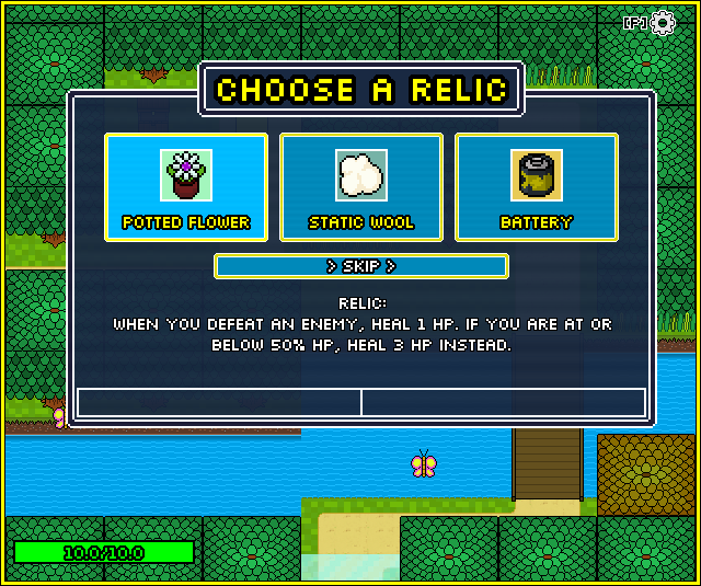
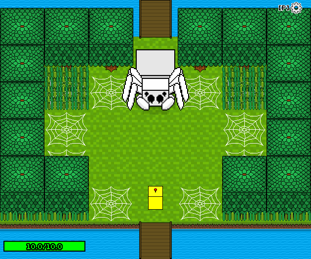
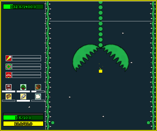
Recently made an update for my game: Rogueblock! It is a short roguelite, in which you are a small robot. You explore, fight enemies and slowly get stronger by improving your stats and finding and combining abilities and relics.
A run should take between 15-30 minutes, so give it a try! Would love to hear any thoughts!
https://unaware-robot.itch.io/rogueblock-working-title

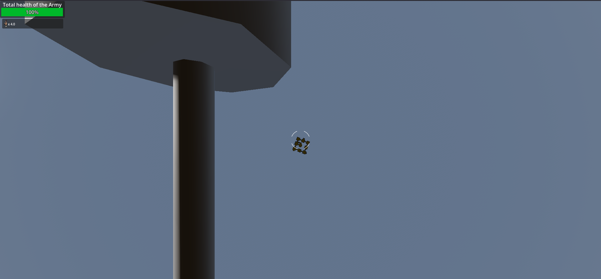
Honestly, I think this game needs a lot of work before it can even be playtested. As far as I understand, the only thing you can do right now is walk around a maze and spam click enemies as your army slowly dies, until you reach the end. The rogue-lite element is not there yet at all.
I think it could definitely be an cool concept, but before people can give real feedback I think you need to add the “roguelite” aspects of the game, so that players have at least the basic idea of how progression works in the game.
Also I fell off the map once XD