On Sale: GamesAssetsToolsTabletopComics
Indie game storeFree gamesFun gamesHorror games
Game developmentAssetsComics
SalesBundles
Jobs
TagsGame Engines

Shabs

182
Posts
9
Followers
17
Following
A member registered Aug 25, 2025 · View creator page →

Creator of

Recent community posts

The atmosphere is incredible. I felt this looming sense of dread wash over me intensifying the further I descended into the depths. The minimal UI is a great stylistic choice. It really emphasizes the isolation felt by the player, resulting in a terrifyingly immersive experience. The atmospheric sound palette and visual design are especially top tier.

I personally would have loved a depth gauge to see how far into the abyss I’d traveled, but ofc there’s only so much you can do in a jam.

Excellent work from the whole team!

This was a really neat idea! Growing out the mycelium by dragging across the screen feels satisfying, and it ties straight into the Expansion theme in a way that makes perfect sense. Dodging worms while chasing after apple cores adds that little bit of tension, and I enjoyed the natural flow of weaving your own network. The smooth camera and trailing effects add polish, and the UI stays out of the way so the focus remains on the growth itself.

This was a fantastic little experience. The way you’ve tied the Expansion theme into a survival puzzle is brilliant, as every move feels weighted with consequence.

Expanding your camp out into the frozen wasteland to scavenge supplies is tense but also very rewarding once you manage to plan ahead and keep your group going.

The presentation is spot on as well. The stark limited palette and sparse snow effects nail the feeling of isolation, while the clean grid UI keeps everything easy to read without breaking immersion. I particularly liked how the different tiles each had their own character, from forests to hermits, adding flavour to the cold world.

The audio deserves a nod too. That chilly, glassy atmosphere is subtle but powerful. The way the music and effects combine makes the quiet stretches feel almost eerie. I’ve wrestled with atmosphere in my own projects before, so I can really appreciate the craft in how well it has been pulled together here.

This was such a cosy and satisfying little game! The simple act of sweeping up leaves turns into something strangely addictive, and it ties into the Expansion theme in a playful way as your pile grows bigger and bigger. There is something very rewarding about seeing the once scattered lawn turn into a neat towering heap, almost like tidying up your own space.

The pixel art works really well here, with the colourful leaves popping against the green grass. The oversized rake sprite is a fun design choice that gives the game its personality straight away. The UI is clear and minimal, letting you focus on the leaf raking without distractions, and the upgrade screen is easy to read and fits neatly into the flow of play.

image.png

I guess I forgot to leave a comment on this one! The shrinking field of view tied to the curse is such a smart way to embody the theme, and fighting to expand your sight again makes the swordplay feel even more impactful. The teleport and return mechanic with the blade is clever too, offering a mix of combat and mobility that adds some depth.

Really clever concept here! Expanding your mind through a roguelike grid of ideas is such a creative spin on the theme, and it works brilliantly once you start finding those synergies. There is a great satisfaction in watching the numbers climb as everything clicks together.

The limited palette adds to the charm too. The bold pink and purple brain design is eye catching, and the clean UI makes it easy to focus on the strategy at hand. It all feels intuitive after a few turns, and I found myself wanting to push just one more run to see if I could optimise further.

This was a really clever and entertaining take on the theme. The elastic arm mechanic is such a fun idea, and it immediately sets the game apart from others in the jam. It gave me a proper laugh when the arm stretched across the street, and the interactions with customers had that brilliant mix of chaotic and satisfying.

The low poly aesthetic works perfectly for the vibe you were going for. The warm lighting, brick buildings, and autumn touches like falling leaves and trees create a cosy yet bustling café setting. The UI is minimal but effective, leaving the focus on the action while still keeping things clear.

Funny to see both this and “Leaf Tycoon” using stretchy arm mechanics.

image.png

😲😲😲

Really glad to hear it felt catchy and polished from your quick look, and I also appreciate you wanting to take the time to give it a proper go later on. Best of luck recovering from the jam madness! I’ll be keeping an eye on how your project develops too, so best of luck!

This is such a charming little project, and it really shines in how well it ties into the theme of Expansion. The simple yet imaginative idea of building a spider web piece by piece is both mechanically satisfying and thematically perfect. Each silk strand feels like progress, and before long you can look back at the intricate structure you have created with a sense of pride. It is a clever way of embodying the theme while also giving players a tangible and visual record of their growth.

The art style is an absolute highlight. The spiders themselves are endearing and full of personality, which is no small feat considering how easily spiders can come across as unsettling. By giving them big expressive eyes and soft shapes, you have turned them into lovable little characters that players want to spend time with. The background art leans into warm autumn tones, with the trees behind the window adding a seasonal atmosphere that feels inviting and familiar. The critter book is a fantastic addition too, offering a natural sense of collection and discovery that really enhances the replay value.

From a user experience perspective, the design feels considered and player friendly. The interface is neatly laid out, with clear controls displayed in a way that keeps the experience approachable for new players. Having the silk counter right at the top helps anchor the player in the mechanics, while the critter book being accessible at any moment gives a satisfying sense of progression without breaking the flow of the game. The pacing also deserves a nod, as there is a gentle rhythm to catching critters and weaving your web that strikes a balance between relaxing and engaging.

What impressed me most is how wholesome the game feels. There is a childlike wonder to the idea of being a spider in this autumnal little world, and the art and structure of the gameplay lean into that wholesomeness without ever losing focus on fun. It feels like a game that could entertain players of all ages, and one that encourages curiosity and patience.

Cheers for such a thoughtful comment mate, honestly. It means a lot that you took the time to write all that out. From one musician to another I really appreciate you noticing the little touches in the sound design and the music. Hearing you enjoyed the menu theme and the way the SFX land bang on time is especially nice, because those are exactly the kind of things I spent ages tweaking. Feels brilliant knowing that effort comes across.

On the music scaling side of things, you are spot on with what you picked up. Right now it is not the actual track that shifts, but the combo FX. Every streak you build pushes the motif up one step in the scale, and when you hit the top multiplier of five it resolves neatly at the peak. Everything is tempo locked, so you are right that you do not hear syncopation out of those FX. The system is designed so the combo only keeps alive if you are tight on the beat, which is why it always stays steady and on grid.

That said, you are right to want more variety and complexity. Fresh and I have already chatted about ideas where the gameplay track itself evolves as you go. Imagine hitting 50, 100 or even 200 notes in a row and suddenly a new layer of percussion or texture kicks in, then drops out the second your combo breaks. That sort of reactive layering would create the kind of growth you are describing, where the whole tune feels like it is building with you. We have also talked about messing with the FX so they are not always straight whole notes, which could bring in more interesting rhythms. Your feedback gives us even more reason to push further down that road.

I am also glad you mentioned the leaderboard and the mission accomplished vibe at the end of a run. That was exactly what we were going for. We wanted players to feel properly rewarded for a run, but also walk away with that itch to beat their score next time. Hearing you say that shows we managed to land it. And your point about us rowing in the same direction is spot on too. It was just the two of us, Fresh handling all the core design and myself on the audio, but we really did put our heads together to make it feel like one complete product. Lovely to hear that comes through.

And just to add, your kind words about how we chat with the community are hugely appreciated mate. For us the jam was never just about throwing a game together, it was about connecting with people who love games and music the same way we do. Knowing that comes across in how we talk to everyone really makes it all worthwhile.

So yeah, thank you again for the encouragement and the constructive bits alike. Both are massively valuable to us. We share your excitement for giving players more control and influence over the music, and it is an area we are keen to keep building on. Hope to see you climbing those leaderboards again soon!

I am going to write something far more substantial soon for you Mr Pistacho, but I just want to acknowledge the incredible amount of effort you’ve put into writing a single comment on our page. What a guy! And of course you deserve a full response in kind. But I’ll need a moment first!

Couldn’t just let this sit here unaccompanied. You’re a legend! Expect to hear from me shortly.

Now that sounds like a deep cut. Off to youtube I go!

This one radiates charm. The autumnal theme comes across beautifully, with the leafy textures, the mushroom houses, and that warm palette really sell the cosy forest vibe. The Expansion concept is neatly tied into the card-based mechanics, giving it that board game flavour while keeping things approachable.

The whimsical art direction makes the whole thing feel light-hearted and inviting, and I liked the way the camera bounces slightly adding playful movement. The UI is simple and functional, though a touch more in-game guidance would make it even smoother for new players.

As a musician I know exactly where you’re coming from. I would personally love to have a wide range of tempos and difficulty options added to the game eventually. There are of course other ways to increase difficulty as in your example, so I guess pot-jam it’s about trial and error, finding what clicks.

Thanks for all the help!

And that’s all done by Fresh, and Fresh alone! What an absolute whiz. I’m very blessed to be part of his team.

I’m glad you’ve mentioned that! When you say a harder track, how hard are we talking? If you have a moment to skim through these, let me know if any are close to what you’re envisioning. Would be a great help!

House Techno DnB

I know exactly where you’re coming from. We were in a pretty similar boar with our entry! Rhythm games aren’t much good to anyone without polish, so we unfortunately had to prioritize game feel over what feels like a huge list of things we wanted!

Still, that’s all part of the charm when it comes to jams. I’ve dropped a follow just in case you decide to work on this further! And I gotta say the twitch clips are a nice touch. Very high effort indeed!

Wow, what are the chances? 😂

Also I think we can just look at last year’s jam results and it should tell us

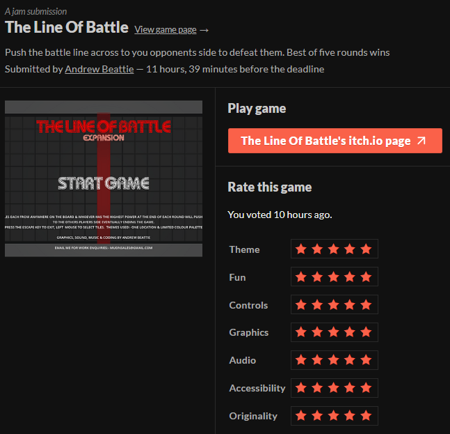
I’m a bit in the dark about this too, but not when it comes to my rankings for “The Line of Battle”

Stars, like movie stars? hahah i’m sorry, that joke was a bit corny. POP-corny that is! Which is what i’m eating when i think of a movie star, just realised that lmao

This was such a heartwarming entry! The whole café setting feels instantly cosy and the character art has real personality. Saigon especially is adorable and makes the experience feel welcoming. I liked how the shop and brewing screens carry that warm brown palette, really tying into the autumnal vibe.

The dialogue also adds a lot of charm, and the little touches like changing moods and debt management give it more depth than expected. I can see the influence from classic Flash era café games, but it’s been given a fun modern spin here. Could easily see this on Newgrounds!

Whatever it is you’re doing, just keep doing it!

This was a real joy to play! The whole thing captures the theme of Expansion perfectly. Watching the bear gradually grow larger as you hoover up berries and fish feels really rewarding, and ties nicely into that looming race against winter.

The art direction is charming too. The bear sprite has loads of character, and the landscapes shift from calm rivers to golden woodland in a way that keeps it fresh. The UI is tidy and clear, with the winter timer bar doing a great job of keeping the tension high without cluttering the screen.

(1 edit)

The MOST enjoyable? Now that’s saying something! Credit where it’s due, Fresh is the only dev on the team and absolutely put some shifts in to get it this polished and streamlined. We weren’t sure if our interpretation of the theme would be clear enough, so glad to see it translates!

Ah wow thanks! really nice to hear people are vibing with my music and sounds. Definitely making me motivated for sure :)

I can see it’s up your alley of interest looking at the leaderboard… 😉

We were able to craft SFX perfectly matched in tempo, rhythm and even key! That means that during each playthrough you’re creating a new and evolving piece of music! I really want to add even more levels of tonal sfx to this, to the point where PopRocks players are creating and playing their own music!

So glad to see you had fun with it :)

(1 edit)

Now it all makes sense. I was kinda blown away hearing such a carefully crafted soundstage from a solo developer. It probably matters to me a lot more than most, but when I hear audio treated with respect, everything else surrounding it feels levels more polished. I guess it’s because i’ve seen too many projects that treat it as an afterthought. Who knows? Regardless, your love for the auditory adds a level of refinement that just can’t be attained otherwise. Of course, you’ve done an excellent job on everything else! But I’m way more qualified to talk about sound lol.

Getting that first song out there into the world is incredibly daunting for sure. You do need to wait for the right time and moment, or your confidence can be shot forever! Safe to say that’s exactly what you’ve done here. I can imagine that finding the right balance with this track was a tricky one. Can’t be too involved or it’ll detract from the gameplay, too soft and it gets boring quick. You’ve done an excellent job at walking that tightrope, so kudos for that!

Had Turning Leaves open in another tab this whole time btw, can’t bring myself to close it!

Bit disappointed tbh, this one is flying under the radar

Absolutely loved the mysterious little world you’ve built here. The setup had a great sense of intrigue from the get go and I was curious right away to see what was behind that first door. The simplicity of the art style works really well with the more surreal undertones, and the muted palette adds a calm and slightly uncanny feel. UI is clean and unobtrusive, and dialogue boxes are readable and well framed.

Big shout out as well to the sound. There’s a subtlety to it that fits the tone perfectly. I found myself drawn into the ambiance in a way I did not expect. It reminded me a bit of my own approach to layering reactive audio.

Absolutely adorable. The concept of a needy pumpkin navigating a cosy little home is so charming and weirdly relatable. The visual style nails that nostalgic feel with warm autumn tones and clean pixel layouts. Each room is distinct and readable, and the mood bubbles make it feel alive without needing much explanation.

The UI blends perfectly into the scene and the whole loop is intuitive from the start. Loved how the Expansion theme plays out both in movement and emotional growth. Autumn is baked into the palette, props and vibe without shouting about it. Would be lovely to see a sound layer in future, but even in silence it holds its own.

Absolutely stunning work on this one. From the opening screen alone, you’ve set the tone with some seriously slick visuals. That whole neon sci-fi aesthetic is nailed perfectly, with those towering, glowing cityscapes giving proper high-tech energy. The crisp colour palette and lighting shifts across planets make each zone feel distinct and fresh. Massive props for that polish.

Gameplay-wise, the core loop is instantly intuitive and satisfying. The crane system has a nice bit of weight to it, and the way the modules stack gives this lovely tactile feel. It feels controlled and thoughtful, with each level asking you to push your limits just a little more. A real test of focus but never punishing.

Really loved how ‘Expansion’ ties into the whole concept too. You’re literally building upwards and outwards, extending structures into the skyline and across new environments. The change in settings keeps things feeling fresh as the scope of your task widens. As for the Autumn theme, the reddish Martian zone delivers on that seasonal tone with warmth and style, giving the game a little extra flavour.

Also, quick shout for the sound design. The subtle ambient beds and those crisp mechanical clinks on placement really anchor the atmosphere. You can tell thought went into each layer, and it helps the gameplay feel grounded.

Loved this. Quietly elegant and just really well put together.

This was such a charming experience. Everything from the hand-painted art to the gentle colour choices feels so warm and inviting. The UI blends beautifully with the environment and has this organic quality that makes every interaction feel relaxed and deliberate. I especially enjoyed the feeling of building something with care and attention, which suits the slow and mindful spirit of bonsai culture really well.

The expansion theme comes through in a really elegant way, not in scale but in depth. Watching the tree evolve as you make design choices mirrors that inner growth of a careful apprentice. And while Autumn is not hammered home visually, the entire vibe carries that same reflective energy. That warm afternoon tone, like sunlight through dusty windows, fits the seasonal mood perfectly.

This was a wicked little surprise. You’ve taken a retro visual style and paired it with some properly inventive teleport mechanics that feel fresh and strategic. The bold blocky tiles with a purple palette pop really nicely, giving off just the right amount of arcade charm without leaning too hard into nostalgia. UI is clean and does the job, and the mechanic explanation in the description is crystal clear which helped a lot going in.

As for theme, the idea of “expansion” comes through in a clever way. You are not expanding a world or base like many others went for, but expanding tactical reach with your jump zones. It feels like you’re slowly growing control across the grid, not in a passive way, but with every click and decision. Love that. Autumn’s a bit more abstract here, maybe in the way things decay if you don’t maintain them. Kind of like how fallen leaves are only vibrant for so long before they fade.

Absolutely stunning work. Ambergrove manages to distil the entire feeling of Autumn into a single glance. From the amber lighting to the stylised foliage and chunky mushroom forms, the aesthetic direction is both elegant and warm, like a mushroom fairy tale told through an isometric lens. The soft palette makes the whole screen feel cohesive without becoming bland, and the grid subtly guides the eye without distracting from the visual clarity. The UI is clean and minimal, but still playful, with just the right level of detail for a game that encourages thoughtful interaction. Really charming use of spacing and colour hierarchy too.

Thematically, this one is right on the money. The jam’s focus on ‘Expansion’ is beautifully represented through the slow, deliberate growth of your mushroom colony, and the way the landscape reacts to your choices over time. The ‘Autumn’ theme runs deep too, not just in colour, but in mood. There’s a sense of peaceful decay and quiet strategy, like watching a forest floor breathe. Easily one of the more tranquil takes in the jam, and one that’s stuck in my head a bit since playing. Very different tempo to my own entry, which makes me appreciate the restraint here all the more.

I still struggle to keep time and it’s my song! Tbh I’ve had better luck just staying faithful to the beat and tempo, the eyes can deceive!

(1 edit)

This submission really captured me with its simple charm and strong sense of atmosphere. There is something very grounding about the monochrome palette with soft pink accents, and the visuals do a lovely job of drawing you into the grove without overcomplicating the screen. The UI is super clean and the resource tabs are quick to parse at a glance, which makes the loop feel immediate and satisfying. I also quite liked the dark forest framing for the action, it really highlights your role as the last line of defence. A few subtle visual bobs or animation flourishes would have gone a long way in adding texture to the moment to moment but as a jam piece this already feels thoughtful and complete.

The theme of Expansion fits perfectly here, both narratively and mechanically. Nurturing that lone tree and defending it as it grows is a neat metaphor in itself, and the upgrades feel like a natural progression of that. There is also something vaguely autumnal in the tone and colour choice, which leans into the quieter seasonal theme quite nicely. It shares a similar thread with my own jam project (utilising rhythm), but I promise that doesn’t make me biased!

All I needed to complete the ensemble was a nice hot mug of tea! Well, that and some popcorn 😂

Super fun and dangerously moreish. The upgrades are nicely spaced out, and that gentle shift from clicking to semi-passive expansion feels really satisfying. It’s quite clear why this has pulled in so many positive reviews. The polish shows and the whole experience is snappy and rewarding.

Also really liked the clean and punchy aesthetic. Everything is easy to parse at a glance, and the little layered texture on the tiles helps the visuals feel just that little bit more alive. Feels like it already has room to grow into something even bigger. Properly solid jam entry.

Really charming work here. The pacing feels calm and thoughtful and the unfurl ability has a lovely sense of timing to it. It encourages just the right amount of curiosity and lets players solve things in their own way without ever feeling pressured. The way it leans into vertical movement is especially clever and adds a great sense of flow.

Visually the stark black and white aesthetic gives it a classic retro feel. I also properly enjoyed reading through the dev notes. There’s a real personal touch to the whole project and I loved the reason for the MC’s colour choice. That kind of detail speaks volumes without needing to be spelled out.