

First, I waited a long while for the web build to start. Then I realised it worked in Chrome but not in Firefox. But once I did get it working I did like it.
The story seems interesting but the combat felt a bit repetitive (there’s probably a bunch of ways it could be made more interesting, but all of them would probably also make the game harder, so people playing just for the story might actually appreaciate the simplicity of it). That being said, I liked that I could get past some enemies without killing them (some I could even just walk around without them noticing me, which seemed like the right thing to do since it wasn’t really their fault that they’d got turned into whatever they were). I also barely used dashing, and actively avoided it because I felt like dashing would get more enemies to notice me (not sure it actually did).
The music was nice, although I could have wanted to see (well, hear) more sound effects. It was easy to see when I got hit but sometimes I could hit an enemy without knowing if I was hitting it because there weren’t obvious visual or auditory clues telling me if I hit them or I was just a bit too far away to do so (probably would care more about visual ones since the MC is deaf). In general, I’m guessing you ran out of time before getting the enemy animations to look how you wanted them to.
This felt like it could have run on the PS1 or Saturn, perhaps as a homebrew game. I feel like commercial games for those consoles would have had slightly more detailed graphics since the console manufacturers didn’t really want the games to not look like 16-bit games.
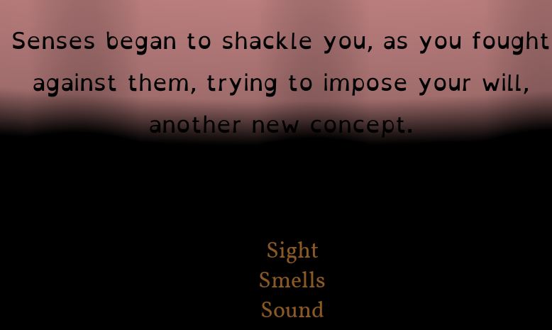
I imagine the characters communicated in a sign language, but it would have been easier to see if their hands had moved. You could probably have some simple “this character is speaking with their hands” animation for each character (it could even be a single frame of the hands being in front of their chest instead of down to the sides) although if you have the time and resources to do something more accurate that would probably look better.