Play visual novel
The Undersigned's itch.io pageResults
| Criteria | Rank | Score* | Raw Score |
| Game Graphic & Logo Design | #114 | 3.591 | 4.750 |
| Music | #142 | 2.646 | 3.500 |
| Log Line | #146 | 2.835 | 3.750 |
| Accessibility | #157 | 2.646 | 3.500 |
| User Interface Design | #159 | 2.457 | 3.250 |
| Story | #159 | 2.646 | 3.500 |
| Overall | #162 | 2.457 | 3.250 |
| Voice Acting | #176 | 0.945 | 1.250 |
| Character Designs | #188 | 1.890 | 2.500 |
| Game Page Design | #190 | 1.512 | 2.000 |
| Sound Effects | #201 | 0.945 | 1.250 |
| Halloween Themed | #203 | 1.323 | 1.750 |
Ranked from 4 ratings. Score is adjusted from raw score by the median number of ratings per game in the jam.
Leave a comment
Log in with itch.io to leave a comment.


Comments
I’ve read real-world terms of conditions and found them entertaining even though they seemed kinda hard to read, like a bowl of spaghetti code with bugs eating it (whether they’re eating the bowl or the contents is something lawyers could argue about for hours on end). But these made-up ones are both fun and terrifying, which is nice for a comedy/horror VN. (Also, sorry if the review is a bit short; I’m trying to review as many entries as possible before the rating period ends and also before the end of the month, as long as I don’t overwork myself.)
Story
Amusing and deep. Amusing because of the clauses that start out a bit weird and then go weirder and you end up reading weird sci-fi horror that still sounds so crazy that it’s more comedy than horror. Deep because it leaves me wondering which weird things I’ve agreed to over the years (probably nothing as crazy as this, hopefully).
Audio
The main menu music sounds fun and corporate. You can guess not only that there’s going to be comedy but also what it’s going to make fun of. And of course I had to let it end on a specific note when exiting the game.
The music that plays while you’re actually reading the T&C is also nice and corporate.
Art
Creepy-cute like corporations like it. I’m sure you’ll become successful if you pursue a career as a graphic designer or illustrator or whatever corporations call their artists nowadays.
Marketing
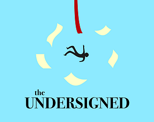
Between the text contrasting well with the background and the drawing of the soulless character falling between the papers, I think the logo is really good and fits the tone of the game. And at first I thought “why use a serif font in a logo that tries to look modern?” then I realised lawyers often use serif fonts in their logos so it actually fits the game.
The logline seems to describe what the game is about, although I would have preferred if it was more obvious that it was comedy (perhaps add a word like “crazy” or something like that).
The game page is a bit simple, but that’s what corporations seem to roll with nowadays unless they do that annoying paged scrolling thing (I dare them to make a page-scrolliing UI for displaying their license agreements, complete with illustrations next to every clause). I like that the tags are horror, satire and short.
Other
What I liked most: How corporate everything feels, and the text seeming crazy, then you read further and it gets crazier yet.
What I’d suggest changing: Perhaps you could add those parts you haven’t added yet. Unless you’re making fun of corporations that leave partially written content on their websites or something.
I want to share my thoughts on the game but
amind wormrecently installed by my employermy love for the company I work for forbids me to break the non-disclosure agreement. Have a jolly good day!