Play game
Corry The Corsac XTREAM's itch.io pageResults
| Criteria | Rank | Score* | Raw Score |
| Graphics | #1 | 4.125 | 4.125 |
| 90s | #2 | 4.500 | 4.500 |
| Fun | #2 | 3.250 | 3.250 |
| Overall | #2 | 4.000 | 4.000 |
| Sound | #8 | 2.875 | 2.875 |
Ranked from 8 ratings. Score is adjusted from raw score by the median number of ratings per game in the jam.
Did you, or anyone on your team, use AI to generate any aspect of this game?
No
Did you work on this solo or as a team? What was your team size?
Solo
Did you start on your submission early ?
the day before the start of applications, I made a model, without an animated skeleton
the boss texture was made a year ago
Leave a comment
Log in with itch.io to leave a comment.


Comments
i reviewed your game in my video :)
I think I found this one pretty fun even though I didn’t beat the whole game. I had some trouble getting from raft to raft in the level with the Blue Danube music.
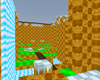
Nineties: The low-poly art and limited drawing distance feel pretty nineties. And the gems/crystals being visible from far away where the environment isn’t visible is also something I associate with that period.
Fun: I liked the platforming, and to a lesser extent the number puzzle (the latter could probably do with a bit more polish to make it easier to know whether interactions were detected or not, since I have had times where I might just have been in the wrong side of a blackboard or something, and without feedback I don’t know if I have to redo the interaction for it to count). And I think when collecting gems I was partially relying on the audio to tell me if I had got them or not (I think there might have been some gems you could graze without picking them up, though I guess there are a few that are supposed to require precision to pick them up, so perhaps making their hitboxes larger would cause more trouble than it’d save).
Audio: I really liked the music and sound effects in the platforming levels, but sometimes in the number room when I waked into a blackboard and pressed space I didn’t know if the game did or didn’t detect it. I think the number room would have benefitted from having some sound play when the player interacts with something. I also thought about the lack of music in the number room, but I think having it be more quiet than the levels might make it feel more special (although it might be interesting to see how it would be if walking in that room had a footstep sound, although that might make it seem a bit horror-y).
Graphics: other than the distortion (FOV?) that changes when the camera starts and stops moving (which could be a bit distracting at times, but it’s not really annoying, especially when you get used to it), I like how this game looked. And I liked being able to rotate the camera to better align Corry with the platforms.
At that place where I got stuck in the Blue Danube level, I feel like I would probably have had an easier time if I had been able to view things from above.
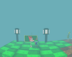
UI and controls: The “hub”-style menu feels like a good fit for a 32-bit game, and the score is easy to see too (I can even hear when it increases, well, except in the number room). A visual indicator for “the blackboard recognised that you visited it” would have been nice though.
The controls felt slightly floaty (when I want to stop moving in one direction I have to briefly tap the opposite direction, not like I haven’t got sorta used to that from other games). I also liked the discrete rotation steps on the camera, allowing me to align the character to the platforms before jumping.
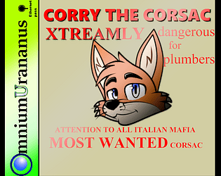
Marketing: You went with a logo that doesn’t show the gameplay, but it looks like a mascot, and mascot platformers were definitely a thing in the nineties. It would have been nice if you had a logline (the field that’s called “Short description” when you edit the game page) that gave some hint that it was a platformer, but I’m guessing platformer players would either find it on a list of platformers or they’d guess from the title and logo that they might want to look at the game page. And the game page seems pretty good: retro but not hard to read, and it gives us some story and the controls. Only thing missing is telling us that the jump key also acts as an interact key in some places.
You need to turn this into a horror game and not tell a soul. The whole feeling of this screams horror game. the fisheye makes it super unsettling, and the fact that there is limited camera makes it even more unsettling. This is a game of nightmares. (in a good way)
great graphics, it made me a little motion sick ngl, and the controls are a little floaty but very well made otherwise and very 90s.
I made the fisheye effect too strong, I'll make it weaker
Loved the art style! The distortion effect was a little bit too much at moments ngl but i really enjoyed the experience overall. Great work :)
thanks for the feedback, I tried very hard to convey the atmosphere, I used to think that the distortion was too strong, but still the strength of the fish eye depends on the movement, but how can you make it more difficult after training. and bonus levels for collecting all the crystals Аид F̬̞̞̦ͧ̒ͣ̎ͦͬ́͘oͨ̏̐̿̿͂̇ͦ̇ͨ̈́̃̀̑́ͨ͑̚͠҉͖̖̭̙̣̗̝̝̗͕́u̶̵̡̨̥̝͕̰͓̝̪̍ͣ͋̊͆ͫ͊ͪ̿̓͆͑͆́̇̒͞r̎͗ͧ͛͗ͧ̍̎̓҉̷͈͍͚͍̗̻̹͕̠̘͓̣̦͈̱͚̗͘͟ͅt̷̴ͣ̄ͨͫ̇̃̓̃́ͦ͐͑̚͏̵̢̘͎̹̻̹̙̲͎̘̝͓̗̲̘ͅḩ̳̻̘̫̭̠̤ͦ͊̓̌ͬ̾̔́̀̃́̀̋̅ͨͭ͠ ̸̠̫̪͔̼̣̼̤̘͍͛̒ͪͧ̂̈̎͐ͦ̿̀͝l̨̗̦͍̺̱͍̦̺̭͕͗̊͐̒̓̈͐͛͟ẻͨ͗̿ͫͩͤ̔̑̍ͥ҉̷̧̢̝̦̺̯̫̖̰̦̱͎̩̜̬̰͎̞̥̫͟v̡͇̙̠̪͖̱͕̯͉̬̭͑̑̂͌́͘ě̯̮͓̙̺̘̱̙͙̦̠͖͚͓̔̐ͤ̈̓̒ͧ̑̓ͩͧ̓̉̈́ͮ̕l̵̬̞͕͇͓̘̯͎͎̤̭̳͓̾̃͐̌̄͜ͅͅ