The web build seemed to work, albeit without audio. The downloadable build was a ZIP file which contained some files, one of which was itself a ZIP file containing some of the same files plus another file. Am I guessing correctly that you threw some files into a folder, selected them, right-clicked on them, and made them a ZIP file? Well, I think letting the engine generate a ZIP file and just using that would have been less error prone. Turns out I have to use the EXE file from the outer ZIP file and the PCK file from the inner ZIP file. You might want to mention that on the game page until you can upload a fixed build.
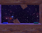
The framerate in the second level felt a bit low, but playing in a smaller window seems to fix it.
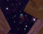
Nineties: The output resolution looks kinda high, which doesn’t fit the nineties theme very well (and while having a low framerate might be something you’d get in some 32-bit console games, the fact that I could fix it by making the window smaller makes me think it probably wasn’t intentional). The blur on the walls might fit an N64 game, while the blur on the background I’m less sure about. The lighting does look 32-bit, or perhaps a tad simple for that (I think since the environment is static, it could have had slightly more detailed lighting, see the graphics section below).
Fun: I liked the first level more than the second because the latter feels a bit too zoomed-in, meaning you can get into dead ends in the first couple of tries until you know where you’re supposed to go and then it’s suddenly easy. I did have fun beating both levels.
Sound: Nice 32-bit-ish music and I like the engine making a sound too. Though I guess it could have been nice if there was a sound that played when you hit a wall and respawned.
Graphics: The game looks fairly good, although the details feel like they were split unevenly. The ship looks quite bit more detailed than the walls, which would probably make sense since players are going to be moving the ship and wanting it to look good, but I found that when playing the game, I actually look a lot at the walls, both to figure out which way to go and to avoid crashing into them. And if you were playing this game in a resolution of 512p or less, the small details on the ship would probably be hard to see. And I think cutting new edges near the existing edges and then darkening the original edges with vertex colours could work as a simple type of ambient occlusion (probably using brown rather than black since the light that bounces forth and back between walls would take the colour of the walls multiplied by itself, thus making darker parts more saturated).
UI: There isn’t a lot of UI in this game, but it doesn’t really need it either. But I think the launch pad and landing pad could have had different colours or some other way to tell them apart, especially in the second level where it’s possible to get lost.
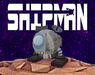
Marketing: The logo looks pretty good and polished. The logline (“Fly your ship from Launch Pad to Landing Pad.”) tells me what the game is about, and the game page seems pretty good too. I even noticed that the game page has completely different colours for text and hyperlinks but both are fairly easy to read on the background. Good job!


Leave a comment
Log in with itch.io to leave a comment.