

You articulated it so well. By avoiding doing what you really want I think you train your body to do things it doesn't want to do. I hope the bodies come back. I'll try to let others see them.
Ryan Trawick
82
Posts
3
Topics
1,147
Followers
11
Following
A member registered Jan 21, 2015 · View creator page →
Creator of

A small bullet hell game where your movement is confined to lines you draw
Shooter
Play in browser

Admission is FREE! Visit now, and you might even leave alive...


Recent community posts
Many things inspired me, the map-territory thing is based on this philosophical concept: https://en.wikipedia.org/wiki/Map%E2%80%93territory_relation The visuals of the game were inspired by System Shock 1's hacking worlds, as well as the game im null, which I think is currently unavailable to play: https://gamejolt.com/games/null/40128
Thanks again for spending time with it. It's a bit of a game design failure on my part, but it was a lot of fun to make and probably what I'm most proud of creating so far.
I appreciate the effort you're putting in, it really means a lot.
So, when you enter a terminal you are always "up-right" and facing north, I mistakenly told you the north tower but forgot that I rotated the entrance direction for the second terminal, so it would more properly be called the east tower.
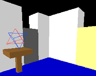
When you enter the second terminal, take an immediate turn to the right, 90 degrees, and go straight through the hall, it will take you to the middle pillar of the three pillars/towers/long halls in the second terminal's map. From there, go straight up that middle pillar, at the end you will find this area, think hard about this square:

Hey, thank you for playing, I'm glad you enjoy it! I have removed the cursor select flickering, I hope that helps, it still pulses over highlights though.
As an aside, you should be able to use your keyboard to input positions using the numbers on the side and letters on the bottom, so typing a1 or 1a will select or deselect a grid position.
Really excellent detective game, impressive work. If the full game can match this level of detail I think you have something really special on your hands.
I particularly liked that every logical followup I wanted to ask was asked right away.
Small things that could be improved:
I found it annoying to keep opening up the dialogue topic selector and selecting the same thing over and over just to exhaust all the dialogue options within the topic. I can see why making this cumbersome would be intentional, but players are gonna want every detail instead of focusing on deduction first, so might as well streamline by going back to the topic dialogue options instead of back to the main topic selector.
Double the walk speed please, it takes 10-20 seconds to get anywhere which adds up a lot walking back and forth. On the one hand I like having time to think and contemplate (and I really love how quiet the game's soundscape is, calming and serene, but also unnerving), on the other hand I don't want to walk to the end of an empty garden patch and have to walk all the way back when I got nothing out of it.
I think the art is great, it's a really cohesive and astute observation of this style of game I haven't seen done before. The faces have lots of character and personality. The ui matches and it's really easy to understand and pick up. I would recommend making the dialogue text typewrite from the left to right instead of being center-aligned, it'd be easier on the eyes, because right now I always have to click to skip it so I can actually read it. The typewriting is so slow you would expect to be able to read it as it happens, but since it shifts with every single character your eyes can't get a fix on it (this is a common ux mistake with dialogue text).
I wish I could've solved a scene in the demo, that would have capped it off better I think. Let the player see the full gameplay loop before letting them go. You mentioned in a comment that it is possible to solve one scene, but I scoured the entire grounds, asked about everything to everyone, and nothing turned red in my notebook to allow me to solve anything.
I found it strange that the metal pipe on the path that matched the model of the metal pipe behind the shed couldn't be interacted with. Since the game is so low-fidelity I guess you have to be careful with reusing models like that. I also wish I could've asked the gardener if I could have access to the shed. It also felt strange that I could only ask people about the drag marks, but clearly it was caused by the barrel, but I couldn't ask about the barrel or connect it to the barrel in any way.
I found the flower petals in her apartment, when I ask her about the flower petals at the grounds it should have remembered that and let me ask about it instead of her just ignoring it. I also wish the newspaper on the bench that I could connect Wilkes' name to her neighbor's name and ask her about it (grabbing words from notes and text in the world could be cool). I'm assuming her neighbor is a relative of the governor and she knew something that she shouldn't have (or she just witnessed a murder happening that she shouldn't have, which is more plausible from what the demo showed so far).
I wish your partner wasn't such a dull dud of a person. I don't get why he's a PI (I guess we don't actually know if they're detectives?).
Overall, really impressive detective game. This genre is incredibly hard to pull off but I think you have a really great system so far and it seems like you have a clear vision for where the case is gonna go with lots and lots and lots of complexity.
Maybe a silly question, but you cite Silent Hill in the description; the whole selling point of those games against Resident Evil was that the camera moved (hence the full 3D), and you got some really wacky claustrophobic angles with it. I think, especially in Silent Hill 2, it served the same function as you describe: keeping stuff out of the player's view to scare them.
I'm wondering if the jam rules might instead mean that players have no control over the camera? Or do you mean fully static, OG pre-rendered Resident Evil-style static?
Blast Heroes (early proof of concept) jam comments · Posted in Blast Heroes (early proof of concept) jam comments
This game was really enjoyable. I kind of wish the controls were a bit refactored; I don't think using the ability needs a dedicated button, you can just reuse the spacebar to trigger it since space doesn't do anything while they're moving about. I also think you should spend time making a mouse-only version of the control scheme as this would be a fun single-hand game.
I'd take another stab at the metrics/sizing of the game elements, I felt all the levels were too cramped and because of the solid walls there were only ever two or three places you could aim the cannon towards to do anything meaningful. Also stuff like spikes just take up too much space too, spikes are basically solid walls as well.
This brings me to my last point, spikes never did any damage on my characters, I wasn't really sure how the damage calculations worked either. I'd get rid of dodges entirely as well, it should feel more like pinball where you hit something and you do the thing, put the focus more on doing tight moves. I think moving elements in the level could add a layer of timing to the canon shooting, as it feels really static now. I do appreciate that the red line predictor is always 100% accurate though.
There's no real sense of danger, I didn't even feel like I had a limit on shots or that I was going to die so I could just spam shooting and win every time. The healer also never healed my dudes when she bumped into them, it also feels bad to push one of your dudes into spikes, even if the spikes don't do any damage. And the mushroom clouds didn't seem to do anything but they took up a lot of game space and the smoke obscured too many tiles behind them I think.
It's also unclear why, when I run out of balls, they all return to the queue. The level should be failed I think, starting over would let you try other strategies and make you focus more. It would also help you in designing levels to be more focused on what idea you want to convey to the player in each level.
It's a really fun and neat concept, DnD party of heros fighting with marbles, I think if you make the stats more readable and udnerstandable, and stackable/multiplicative, it'd be cool. I think the game essence is strategizing and getting all your marbles in the right spots then causing/seeing unexpected chain reactions. The lack of controlling the order of your characters is a detriment to this, as it makes every level feel the same, maybe try randomizing them. Character customization and upgrading between levels could be a lot of fun too, add build variety to each run. It could also be worth putting in a power meter for the canon so you can control more precisely where they land, like a golfing mini-game (again, adds more sense of timing and urgency). It might neat to have treasure in a cage at the top of the level, so you see what you win, maybe even sometimes character are caged and you get a new party member you get to upgrade. Think of your party as a bag of marbles, or a deck, and you only get to bring like 4 into each level. You could even "peak" at the level to decide who to bring and strategize.
EDIT: I got another idea reading your stamina idea. What if you get rid of the canon entirely and you flick each hero until their stamina runs out? So it's like a game of marbles with turns. Once all the stamina is out on all the heros, the enemies go. Kind of like Baldur's Gate/X-Com turn-based, but physics and more fun. So each character would be their own canon from their current position.
Really good atmosphere, controls really well. Nice UI.
The distance to the first objective is absolutely absurd though, I went for almost 20 minutes and didn't even make it halfway. The map being skewed and rotated is more an annoyance, constantly made it hard to know which way I was supposed to turn.
The spiders didn't do anything to me as far as I could tell but I avoided them anyways.
I got up on a highway and after following it for awhile a building stopped me as it was growing into and blocking the highway. I quit the game because I didn't want to drive all the way back, there's no way to go over the railing.
Really like your use of proc gen.
I think the gameloop needs to be shorter, or there at least need to be more dangers and decisions to make on the road.
Puzzle Cube: Prototype jam comments · Replied to comfycatgames in Puzzle Cube: Prototype jam comments
Okay I figured out the door puzzle, feel dumb. I didn't notice anything had changed besides changing B to C. I'd add a wire from the generators to the terminal, as on my first playthrough I assumed the generators were to refill the energy packs after you threw them.
I know wires are a bit like yellow paint on usable stuff, but it would help connect the two ideas. As it seems like a storage closet and I just assumed they had chargers for the stored energy packs.
I like the new walk speed, I'd make it even slightly faster, but the pace is already way more engaging.
Game took about 40 seconds to start up and clicking on it made it go white as if it would crash.
I went to the options and unchecked TAA and it stuttered for ~10 seconds, rebuilding shaders I guess.
Toggling most options caused a stutter of 2-5 seconds.
Trying to type in the max FPS box did not work. Rather have buttons for each one or a notched slider if you won't let me enter my own value.
Controlling the tank felt pretty good, I feel like the head of the tank should counter-rotate faster than the body should be able to turn.
The first dozen times I shot stuttered like crazy.
Yeah the head rotating is way too slow compared to the arcade speed of the tank itself.
I don't really understand how the armor works, the tanks are around 32 pixels tall max from the distance they're introduced, there's no precise way to aim and target them at all.
I don't know if this is on purpose because I'm not a tank guy, but I feel like going reverse and turning should behave like a car. So going back and to the left should turn the rear-end of the tank to the left, instead of the right.
I think an improvement to the first-person view would be if instead of the aim cursor going back to the center while rotating (being world-space locked), it should instead just stay in place (screen-space) so I can rotate forever.
There's no screenshake or feedback for shooting/hitting anything, feels like that should be the main thing.
Oh I can RMB to zoom in first-person view.
It seems like the repair QTE is timed but the timer isn't visible? I failed a lot even though I was hitting the correct buttons, seems like it timed out? It'd be better if the buttons were randomized each time you failed.
The head turning is so slow I can't hit the infantry when driving by. They also continue to damage me in the next cutscene/tutorial text.
Died quickly in level 1, seemed a little too open and grid-like. Would like to see some more hilly terrain where you can go up and down and maneuver to obscure yourself.
The head rotation speed being so slow put a big damper on how much I believed I could win. It felt arbitrary instead of physical. Maybe some mechanical sounds would help if you really want to keep it.
The support Hunter dudes are cannon fodder that can't seem to do any damage before getting picked off. I echo everything GorriDev said. Seems like you put a lot of work into this but I don't really understand a way to play where I can do anything meaningful beyond dying.
It's also super slow to gather troops at the base, then take them out to the world to fight (and quickly die), and then it's slow to go back to the base and re-amass them. Too much waiting.
150mb for a web build is also absurd, maybe it's the audio files taking up most of the space?
Game asked for internet access from Windows's firewall thing.
Remove the disclaimer, it sets expectations that are not met and just puts the player on edge for the entire experience (in a bad way).
The walk speed is way too slow for how empty the spaces are and how few choices there are to make during that walking.
I turned vsync on and it still tore, I went back to the settings and saw that it was still set to off, I set it to on and hit apply changes and left. I came back to the options and it still said it was off, my screen continued to tear.
Picking up a new gun should auto-switch to it, most players would not know to press 2 and switching weapons isn't even in the options menu under controls.
After I got the gun I went into a room with three enemies, I killed one and the second one hit me and insta-killed me. This is pretty stupid because I walked through empty, featureless halls for five minutes before this point and I had no saves. I was playing on Normal+.
I tried to reload and all the save slots were filled with level names and timestamps, but none of them loaded.
I quit.
Played it in Firefox and my mouse unlocked the first time I shot, so I couldn't rotate the camera. Reloaded the page and it happened again. Works in Chrome though, however if I press escape and unlock my cursor it can never be relocked unless I press escape again to pause and click resume. Maybe it's supposed to pause when you unlock your cursor?
Played the arcade mode for a bit, shooting the balls and seeing them fire a bullet that misses (because they were being rotated by my bullet) always felt super cool. Could not figure out how to get tokens, no screen indicator for how many I had, so I never bought anything and eventually died.
In the campaign I had to unlock my cursor for the computer cursor to work, so I guess the borked pausing came in handy.
I don't really understand why sprint has a limit and how long the cooldown duration is. The spaces are boring to walk through so sprint should just be on by default.
Tons of audio stuttering everywhere.
I kept holding LMB when I got the gravity gun and it kept shooting right after I picked something up, I thought it was a timed thing and was getting annoyed until I realized I can hold onto stuff if I only click instead of holding LMB.
I had no idea how to activate the B door, I tried putting the HL2 energy pack into the black holder thing to the right of the terminal, I tried putting it into the terminal itself. I gave up.
Took about 20 seconds to show the Godot logo, and that logo stayed for about 10 seconds, Windows thought the program was crashing.
All I saw was a grey screen and the Windows taskbar after that, almost crashed and then the game snapped in.
When landing a jump as the ground slug it snaps to the ground rather than landing naturally, jerks the camera.
Firing the first two bullets stuttered the game for 5 seconds each. The first ragdoll also stuttered the game for 5 seconds.
The unique control scheme is neat with the shooting, I like it. Didn't notice a time I would ever drop a weapon.
I'd like to know how to unpossess a character earlier.
If I press LMB and RMB at the same time while possessing someone they get stuck in an aim pose but drop their gun, fixes itself when I pick up a gun again.
Game stuttered for 10 seconds when leaving the first area and going through the hall with the boxes.
The room with the boxes has a dead drop that just looks like a shadow on the floor, add some sort of border maybe.
Almost zero air control makes the jumps off the pistons annoying.
It seems that velocity isn't retained when jumping off one of the white moving platforms, I could never make it to the piston in the corner and gave up.
Nice little Messiah-like I guess, use a more serious engine in the future.
The stuttering was unbearable and never let up. You should try prototyping some smaller rooms to test and experiment with different possession mechanics and puzzles you can do, right now it's pretty bare-bones, it feels like I'm playing a third-person shooter where the designer didn't put much effort into polishing the third-person controls because that's not the point of the game, but 99% of the time you are possessing someone, and the slug is very very boring to play when they should potentially have more navigation options than the humans.
Jumping adds a nice quirk to the VS gameplay, you could develop it in a lot of ways; hopefully more than just a timed invulnerability. I could see have two layers of enemies, so you also dodge air enemies, or even multiple levels of playing field where you go between them when overwhelmed. Longer hover times, etc.
The player is currently unkillable once you learn to jump and there's no scaling or power-ups so there's not much more to evaluate.
I'd be cool if the first time you play you slowly and inevitably get overwhelmed, time stops, and it just says press space, then the floodgates of possibility can open in the player's mind.
Congrats on making an Unreal game that doesn't tank my PC.
Vampire's Bullet Hell Survivor TD jam comments · Posted in Vampire's Bullet Hell Survivor TD jam comments
Nice idea, Katamari in space. I think you could have some UI or shader effect to show how close you are to objects, in Reizen I made "bullets" turn red the closer you get to them. It was just hard to judge distance and I'd often graze things I was trying to get. Maybe you could be a magnetic asteroid.
This points to an issue with how your camera is set up. Because the asteroid is in the center of the screen, it obstructs the objects you're trying to hit. So if you keep the camera angled so you can see what you want you end up going under it oftentimes.
I think this game could benefit from two views, a first person view, and a third person view. Could be a neat like, lowres space camera effect in first person. I dunno, maybe just try offsetting the camera. You should try 6DOF too, though players don't usually like that (see Egogia).
Tapping to move got a little better as I went on but I think it could be either less sensitive, or maybe just allow tapping forward to move camera-forward instead of on a flat plan, and space and ctrl won't be needed then.
I like the ending idea, I think it'll be really funny when you get an end screen saying how much damage you've done based on your size, how many people you've killed based on location, etc.
Maybe even, have the game be time-limited, so you gotta get big fast before NASA blows you out of the sky, maybe you can even go overtime and start dodging missiles while you get bigger, then you have to crash on missile launch sites, and a tiny part of you detaches to get big again. Could be a fun game-loop.
Your stars flicker like a motherfucker, I don't envy you, star shaders are cursed. I'd also play with the sense of scale a bit, the Earth shouldn't feel so small, but I get it needs to be arcade-y enough to be fun to collect stuff.
For sure, I think now that the base gameplay works it would be interesting to add on some resource management, maybe even hand-design puzzles have have "days" you have to win. I uploaded a new build that adds UI for showing how close you are to losing, and a money counter that you can cheese and incrementally increase if you want. Not much difference, but helps a bit I think.
Thank you for playing and leaving feedback, the capsule art and name definitely need work.
I agree that the game needs more space for immersion, I got too worried that players would be bored floating around with nothing to do, but perhaps setting up the goals more clearly would alleviate that. I was going for a Metroid: Prime feel but ended up closer to Banjo-Kazooie.
I'm glad you're so interested in the game, I was wondering if I should develop it further or not as the response hasn't been very vocal, but maybe the capsule art and poor writing is to blame for discoverability.
I thought this game was genius. I've been trying to do a 6DOF dungeon crawler forever and you nailed it.
It's on par with Portal as a puzzle game imo, but this is kind of the Narbacular Drop phase.
My main critiques are that I found the camera disorienting at first, I think it'd be nicer if it was centered on a point when rotating rather than being on an arm. Once I stopped using the mouse though I was fine with it, I had a better time with the keyboard anyways. Maybe adding a keyboard button to fire would be good too so the user can forgo the mouse altogether.
I also found the collision of where I could and could not rotate/walk to be rather opaque at times. Particularly the metal didn't seem intuitive that it was unwalkable, I think they had this same issue in Portal which is why they made the contrast between metal and concrete basically black and white. I also found the grey edge pieces didn't always connect every wall I could walk on, sometimes there'd be none and I could still go up it. This was exacerbated once the moving cubes were added as I couldn't tell what edges I could walk on, it seemed like maybe only the surfaces with the arrows could be.
I thought the floor lights/glowing cubes were lava at first so I avoided them for awhile.
Levels 8 and 11 filtered me, but it was alright because you allowed alternate levels to let you progress. Really good idea there.
I had a really comfy time with this, I think it's the best I've played so far this DD and I can't wait to see more mechanics and levels. I think you have a really good one on your hands.
It would be interesting to see if shooting an arrow straight above you could unlock even more puzzle designs; really take advantage of the 6DOF.
The Tower Prison (working title) jam comments · Posted in The Tower Prison (working title) jam comments
Couldn't tell any difference between the classes besides starting equipment.
The charge up to attack is annoying, delayed animation doesn't feel good, jerky. It's also not intuitive and forces players to peek in combat.
Hitbox on thrown weapons is way too big, my throw would miss most of the time because it'd clip a wall that it clearly shouldn't have. Make throws more directed at least instead of randomly rotating the weapon.
The fog looks kinda bad imo, dithering doesn't match the rest of the aesthetic. Would like to see more color variation throughout the dungeon between rooms as it all looks the same.
I didn't know if doors were locked, never had any indication a key was used if I picked it up from an enemy.
Walk speed is way too slow, dashing way too quick. Sprinting always took a good half second or more before I'd start sprinting, felt like an input delay issue rather than designed as such. FOV increase on sprinting and dashing is gigantic and made me not want to use them.
Not enough weapons to complete a dungeon and they break far too fast. Punch range is pitifully low too.
This is an incredibly well polished game, you'll make a lot of money.
Maybe it plays better with a controller, but I found it a little annoying I couldn't select stuff in the menus with A or D. It broke the game flow for me every time.
I can see it being really fun once you master it, but it's really fast to start with and hard to precisely jump like I want to, would be interesting if you implemented a slowed time mode just to relax it a bit. Would be an easy difficulty implementation imo.
Footstep sounds got a little annoying, maybe different sounds per level could be fun, it'd be easy to make each level feel a little more distinct with color and texture changes, don't be afraid to evolve the style a bit and stretch it in new directions.
I found the level endings opaque; why do they seem to end randomly? I want to fill in the entire board, let me do it, my OCD is begging you.
I was also never able to clear a stage without an enemy getting me once. Probably just a skill issue because I've never played it, but I found them very aggressive in the first few stages. It'd be nice to have a chill mode without enemies too because I'd legit just try to fill the board without repeat tiles as a challenge puzzle. You also don't make it clear in the tutorial that stepping on already cleared tiles will lower your stats, you only mention it in regards to the bonus mode.
I couldn't kill anything. The mouse controls are a good idea but the implementation needs work; I'd often move my mouse in a direction and click to charge, but it wouldn't take affect, and by the time I clicked again the direction prompt usually faded and I had to try again. You should implement input queuing for this and it'd feel a lot better.
Input queuing would also be good for after attacks, I often wanted to charge again but had to wait until the animation is done, which is annoying because I have enough in the world to think about than looking at the viewmodel animation.
The metroid prime map ui is amazing, placing markers is a cool idea too, I'm sure it will be more useful in the future.
I'd change the health from numbers to a bar, I thought the blue bar would be my health and didn't even notice the numbers until my third try after dying.
Everything is too hard and fast, maybe it'd be better with a proper introduction and level design, but traditionally skeletons are supposed to be the easiest enemy in these games.
I really like the aesthetic you're going for so far, keep working on it.