Nice!
Quixjote
Creator of
Recent community posts
As I work on it more, there will be a leading story arc as a tutorial. I originally wanted you to start in a castle talking to the king. Giving you the quest to hunt down the MDD. and then on your way out a mighty wind swept into the Great hall of the castle, blowing out the torches. Your tutorial would be lighting them back up again. in a dim, not dark, environment.
Key bindings are definitely planned! Having just started using Godot (or any game engine in that matter) in June, there are many things I know I can improve on. I am sorry you had to use CTRL and 1 at the same time. The CTRL was supposed to just be with the arrow keys for turning or "pivoting " your character to face a direction. I also plan on adding an indicator stating which way your character is facing.
Thank you! And yes, as you saw already, there were some timing and technical issues that I was running into . Only been using Godot since June, but I did it and pushed myself out of my comfort zone.
As I update this definitely things I am adding/cleaning
- up to 2 attacks for each enemy, and up to 4 abilities per enemy (though I think in my notes, the most any have is 3)
- Definitely more sounds, from fireball, confusion, footsteps, dripping water, etc. I am all for the immersive experience and it bugs me I wasn't able to get that going in time for you all.
- The Procedural generation will change into larger rooms. The spawning of the room type and what is in the room will follow the same general rules as now, while also adding in loot crates as well for equipment, and ability books for learning/leveling up abilities.
- Absorption system - Instead of "dropping" items from inventory, a player can choose to absorb it for a fraction of equivalent XP to level up faster (Yes, there are player levels in the game already... you probably noticed you healed occasionally. That was you leveling up. More hp, etc)
- Full menu to allow key binding, volume level adjustments (Although I am glad I was able to at least grab the mute button from my bricked game last min). I knew these games would be streamed by some, so I try to make things that are stream friendly as well.
Thank you for the in-depth review!
- I have seen a lot of 3D games over the years that use the "Moving in the dark" mechanic, but not many in 2D since maybe the late 80's early 90's
- Thank you! I can only really think of 3 ways to approach this: Mouse for directional look, "Pivot", or if changing direction, the first time you click the key it changes direction before you actually move. I wanted this game to be completely run from keyboard (or controller eventually as well) so mouse was out of the question.
- Right? Even the abilities (currently just fireball) moves with the turn. There will be more things eventually that determine move distance for each turn, but when I have the game zoomed out in dev mode it's fun to watch everything happen in order.
- The gradual heal is actually you leveling up. I didn't mention it page because there is no indicator for it. But there are multiple things affecting mobs. Mob strength is determined by your player level added with your fireball level, and the number of mobs that spawn in a room increase each few levels, up to a max of 10 per room. This was the passive aspect to the curse system.
- I soooo agree. and I didn't even think to look at the reverb in Godot. That is really good to know.
- There is a duck sprite... though I have only seen it once after adding in the leveling ;)
- Agree! I had planned on adding Health bars to the enemies as well - but... time. LOL
- I will have to think on the death thing. I hadn't planned on adding number of lives, but maybe I can make it an option, and the torches as a checkpoint sounds like a swell idea.
😁 I see my style is wearing off on a few people - Thanks for the advanced feedback!
- Thank you - I took a lot of inspiration from "TaskMaker", a 1989 RPG for the Mac. I was even in contact via email with the dev a couple years ago.
- Exactly! While the original concept would have been similar... it would have been rooms that locked as you enter, then you had to light all 4 torches in each room to unlock the door and progress. Had to change it up to one large dungeon
- Agreed - I will definitely work on adding that. I know not everyone reads the "manual" as it were, so definitely an in-game reference would be handy.
- LOL The monsters are bugged as heck right now. They ALL are Supposed to be moving. But they are so rebellious that they don't listen. I like the idea about the enemies interacting with the torches though.
- Eventually there will be some randomized loot tables and gear and such, as well as 4 more ability for the player to find and level up. The enemies will each have their own types of abilities as well.
This was a super fun game. Has a ton of potential and I am excited to see where it goes.
Pros:
- I loved the glider! So peaceful and fun
- The night sky was stunning
- You have a character with braces! I love that
- While not the most accessible, I loved the Chat interactions with the NPCs. Very OG Everquest feeling.
Critiques: (I know there are a lot here, I see it more like a checklist... I really want to play this one more, especially with more features)
- The purple slime somehow killed me from outside of the barrier in tutorial land. - I was able to teleport back to tutorial land to keep walking around, but still had 0 hp
- Don't like the MP Lobby, but SP world (Or "Hunting Grounds" as worded). Seems misleading for a MMO style game, but more like a fancy VR Chat at very short distances.
- Chat doesn't lose focus after a chat… would be bad in battle to try to quickly respond to someone.
- Super short distance to see others… Wouldn't be good when trying to find team members
- Can't see each other move in tutorial or when we happen to run up close to someone in the world.
- Logged out and back in to talk to quest giver
- Health went to 100 when logged out and logged back in (was lvl 3)
- When I got to lvl 4 it bumped back to 400
I know there are a lot of things that you are working on still in this game, and for the theme you did amazing. Personally I don't consider this an MMO with the way you have it set up... but I definitely think it has the potential to be an MMO. Too many things right now make feel more like a glorified single player, but with chat... Kind of like how NMS started out. All in all though, super fun, and I can't wait to see more. (Also: out of curiosity, what is the server load like per player? With the view distance between players so low, it makes me feel like there is heavy demand if that view distance was increased?)
I would love to see a donate button on your game page especially for this game -- I would definitely contribute towards it where I could. - Great work!
Definitely would love to see more of this, it has a ton of potential.
Pros:
- Once I understood more of the aspects of the game, it was pretty easy to keep up with.
- Controls were super simple
- Music was very entertaining for this game and not too loud.
- Loved the sails billowing in the wind. Very cute
- Fun Artwork
Critiques:
- Starting a new game from the menu continued where I left off at a higher level, I had to refresh the entire page to get back to level 1
- Would be nice to have audio adjustment
- Some more ambient sounds or monster sound would go a long way to add impressiveness
- In the shop or somewhere on the screen it would be nice to know what level your upgrades are currently at
I enjoyed playing this one quite well.
Pros:
- Seems quite well polished, great work especially in 9 days
- I liked that some of the mini-challenges forces you to experiment with moving
- That motion camera... Creepy and I love it.
Critiques:
- Would be nice to see some adjustments for mouse sensitivity
I feel I might have been close to the key, but when I went back to the archives, the game crashed. It was my only objective left! I will have to try again later!
Overall I loved this game, and would love to see a longer version of it. I kept feeling like something was going to be chasing me, and maybe something still will, but until the game crashed it was all in my head. 🤣
Fun Survival Survivor style game.
Pros:
- Cute art
- Fun concept - I liked the combining of the Survivor and Survival aspects, along with the TD aspect.
Critiques:
- It was easy to overpower enemies originally, and I probably could have just left my fire alone after a couple nights.
- Maybe a price increase on the crafting table after each purchase to scale difficulty
- Some audio would have made the game more immersive
- I didn't see a way to pause the game
Overall it has a ton of potential. Eventually more recipes, maybe another tower that you can defend with, etc. But the framework seems solid. One note: In the browser developer tools, your fireballs were racking up errors.
OMG I really liked this. Definitely reminded me of some Strategy based boards I used to play!
Pros:
- Fun loony-toon-esk music and art style, kinda reminds me of JackBox
- I like the initial Tutorial
- Feels super flushed out and clean
- Loved the board game approach - reminds me a little of Stratigo
Critiques:
- Add a sound to the SFX volume adjust so we can preview the volume adjustments?
- [Accessibility] - Instructions should probably be at the base level Menu
- No apparent way to reset if the game gets locked in moves (See Screenshot)
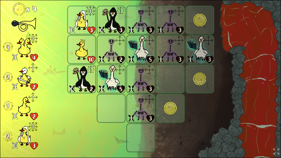
Interesting looking game, If the controls get cleaned up a bit, I would love to try this game again!
Pros:
- I loved that you have SFX Volume Adjustment play an SFX to preview
- Graphics were cute
- Level design (From what I could see) seemed well thought out.
Critiques:
- Music Volume not Linear
- "ESC" Key while bringing up the menu doesn't actually pause
- ESC Key for web only games will esc out of full screen (At least on Windows), maybe a way to rebind that for consistency in experience?
- Left/Right seems to sometimes stick, forcing you to have to hold the other direction. Not sure if it is an effect or not, but there is no indication that it should be like this.
Would definitely wishlist on steam.
Pros:
- Graphics great
- Well thought out puzzles
- Well Polished
- Great tutorial
Critiques:
- Little clearer instruction about game saving
- SFX preview on SFX Adjust
Update as of 4:30 PDT:
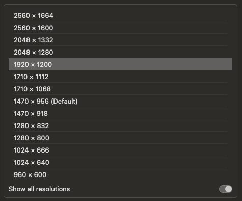
with all the mac issues going around I thought I would pull out the new Macbook Air M3 and give this a try. Chrome was a no-go beyond title screen, it just showed the focus dot but never loaded the halftoned shader. In Safari the game seems to load fine, but doesn't seem to capture the cursor correctly. In full screen this doesn't seem to impact gameplay too much though. I don't have FF or other browsers yet installed on this laptop. I have included the available screen resolutions for the MB Air 13" For you and would be happy to do testing for you in future (especially if you want to do mac builds)

Fun puzzle game, reminds me of Mac Sim back in the day making logic circuits, combined with a flat Capsella.
Pros:
- Creative Puzzles - Love puzzle games
- Duck moving through the room looks like it could be used for a level select system, which is very cool
- I enjoyed the electric artwork.
Critiques (I noticed you submitted right before the deadline, so like most of us.. I am guessing(?) that there were some challenges)
- More audio, and likewise an adjustable audio slider. The brief audio that was in the game, made it seem like there would be more throughout, and was met with silence. Even little electrical sounds when working on the circuits?
- I didn't really see a reason not to grab all the pieces initially, then fill out the puzzle. Maybe something like fuses as life, and each time you have to "RE-move" a circuit, it costs a fuse?
Fun game! Not sure if I did something wrong but I didn't get ending screen. Definitely would play more in future.
Pros:
- Great artworks, especially taking the time on the backgrounds!
- Easy control
- Loved the background music
Critiques:
- Having SFX slider play preview of one of your SFX would be nice
- Would be nice to have a pause button to access options during game.
Great Puzzle Platformer - With more levels I could easily see myself Wishlisting this on Steam or similar
PROS:
- Great art
- Adorable music fitting to the game
- Intuitive controls
Critiques:
- Having SFX Slider preview for Common SFX Sounds
- Consider Hiding mouse in full screen or when the game has mouse focus to prevent cheesing
- Jump seemed a little sticky at times... Non-responsive
- ESC in browser takes out of fullscreen before main menu
- Some way to pause, while still blacking out the map
Other Considerations (Things noted in stream):
- More levels
- Maybe a death counter to see how good (or bad) you did
- More neutral colors for light/dark so it is not so harsh?
Great game! Didn't manage to beat it, I kept getting flustered at the end being chased... but I am like that with all games that have a chase scene.
Pros:
- Great feel overall to the game
- Controls were pretty straight forwards - easy point and click
- Suspense music was spot on
- Loved that your SFX Volume has SFX Preview
Critiques:
- Having more audio incorporated... maybe sounds of cameras moving or so?
- Having an easier way to open/close the cameras menu would help immensely. I kept dying to the thing in the halls because my mouse hand would not go fast enough
- Didn't really feel how the light/dark aspect played into the game.. I saw there were lights, but am not recognizing a connection with the game for them, especially since the player is blind.
Solid game! Great work! Definitely gonna be playing this one more. After watching Wonder last night, and your comment about DL version working better, I played the DL version
Pros
- Audio had good variety. While sounding slightly Egyptian (To me anyway) the tone was perfect for this game
- Controls were responsive and intuitive
- Great Tutorial to explain the game
Critiques:
- Playing a SFX preview when adjust the SFX volume
- Had a weird glitch that eventually prevented me from picking up orbs, and inevitably couldn't progress to the next level. Not sure how I triggered it. Maybe in the heat of the ducks, I button mashed the right combo...
Question: On the store section, I had a couple times where I received 2 of the same upgrades in the same shop. Is this intentional? (Purely curiosity for me)








 Update: