The gameplay is very simple, but the incredible art style, fantastic music choice and the absolutely great atmosphere is what makes this game so fun to play.
MonsieurPazur
Creator of
Recent community posts
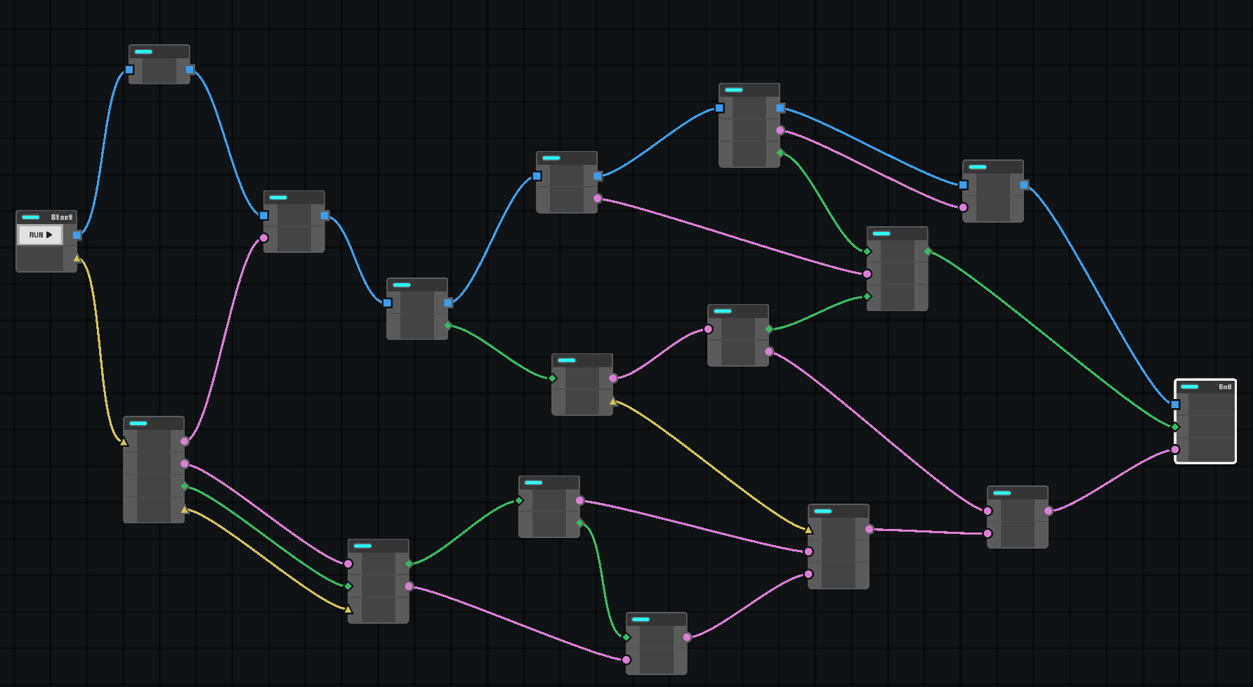
This game is just so freaking cool. The idea is creative and engaging, the meta-narrative about programming is awesome and when I was told that the last level can be done without any intersections I just had to figure out the correct solution. And there are even more than one :)
Phenomenal job, looking forward to seeing this in the top 100 :)
The platforming felt really good for a jam game: speed, control, gravity, wall jumps, double jump (and I think there's also slight coyote time) - it all makes for a very pleasant experience. The theme is used loosely, but I don't think there's anything wrong with that (not every game need to have literal building and/or scaling).
Visuals, music and audio are great and alongside the story make a very cohesive package. Nicely done :)
Super fun idea, very clean visuals and the concept is easy to grasp with minimal text to explain everything, great job!
The controls are a bit tricky to learn, but I think that's because our dumb gamer brains are used to use arrow keys and WASD interchangeably, so I was making a lot of mistakes that way :)
I think that the concept of stretching up and then immediately shrinking down to create some sort of "jumping" motion is very interesting and I was wondering whether it's possible to use that instead of dedicated "jump" button, but maybe it would be too finicky and annoying to use.
The levels were fine, although I didn't really click with levels with spikes. There's nothing wrong with them, but personally I think that the collision box could be a bit more forgiving, since walking into spikes (when those should be jumped over) never felt right and multiple times I found myself moving just a pixel or two to the left and colliding with one (although the reason for that may be that I just suck at platformers :D).
Thanks for playing :)
Yeah, widescreen with fullscreen option would've been better, but I started with square(ish) resolution for no real reason and it was too much to change later since everything was holding up on ductape.
As for the numbers and balancing. I started with an excel sheet but soon gave up, because it was much faster to just guess and then run a couple of tests and tweak stuff here and there. I'm actually shocked that people find it balanced. Shocked and humbled :)
I liked the idea, it's very cool and the laser is fun to use. However, I think that there's no need for the slider, since what you really want is either 0.5, 1.0 or 2.0 - it's more elegant that way and also it makes so there's less weird cases to account for (which makes for easier and more bulletproof levels). Also, this is probably the most important aspect of the gameplay, so obviously players will want to have that visible (the slider, I mean) all the time and currently it just takes too much space on the screen in my opinion.
The levels were fun and creative, the learning curve was very good and I really liked that you added rotated robot when on the edge of a platform or a block, really nice touch :)
Very clever ideas introduced in a sensible manner with rising difficulty. Easy to understand, hard to solve - basically what all puzzle games should be.
I'm not a fan of turrets/bullets mechanic at all (I'm not saying that it's a bad mechanic, just one I didn't enjoy as much as others), but that's because I enjoy my puzzle games in a more relaxed fashion.
Some early levels with blue no-scale zones were cool, but gave out the solution too much in the way the normal path was carved :D So it was just a matter of following the dark path and scale along the way :)
(I was also getting slight Baba Is You vibes from the graphics :))
The tiles look like if Loop Hero was made on hexes rather than squares :)
Pleasing to look at, too bad there's no sound/music to complement the fantastic looking graphics.
The "Expand wisely, grow strong!" part was a bit rough for me, since it was really tough to strategise because it's not easily readable/understandable what each tile does and why it can/cannot be placed in a specific place.
The effort went into what's really important - clever puzzles (and 45 of them, are you kidding me?!). Some of those are suuuper tricky (especially when it's obvious to avoid low hanging fruit of pluses next to starting position, since those could make it impossible to fit in some places). Really cool.
Now, for some nitpicks (because I really think that the game itself is great the way it is, those are just small things that annoyed me a little bit, also a small disclaimer - I didn't finish the game, there's just too many levels :D):
- The fact that there is a restart button, but no undo button. A lot of levels let you intentionally soft lock into a shape that will just not fit the exit, and that's cool. However, when you realise this, you have to repeat the same sequence from the very beginning and it became a bit tedious, especially at longer levels.
- I'm not a fan of locking levels behind stars like that (especially in jam game, since I just want to see later levels, if only out of curiosity :)).
- I don't see how those levels with red-spiky-things add anything. You still need mostly "perfect" runs to unlock starts and for most puzzles the optimal route is the only route anyways, so being forced to start over because of one mistake just didn't feel right (to me).
Ok, that's enough. You said in the description that this is your first game. It's a phenomenal entry to the jam and a fantastic puzzle game on it's own and you should be incredible proud of yourselves. Not all of us are talented enough to start with such a banger and I will definitely be waiting for your next one(s), cheers!
The idea has potential. The game is fairly simple though and the puzzles aren't that complicated if you know, what to look for. I liked the fact, that despite the art style being rather monochromatic (I don't mean this as a bad thing, quite the opposite, I enjoyed it very much) it was clear where to go and what to look for (thanks to glowsticks and red buttons). I know that you 'd be able to push those puzzles even further given more time :)
Nice job.
Oh, and some foreboding music in the background would be also great, but that's me nitpicking :D
I like that you put an extra mile to create interesting idea for a level selection rather than a boring grid of numbers :)
The ideas for levels were fine, but I think that I'd rather have less levels fuller with clever solutions rather than this many (but maybe that's just me :)).
Oh, and also - the game desperately needs some audio besides music (like for scaling the characters, pushing buttons and collecting gems), it would make a huuuge difference.
What an awesome idea, fantastic for speedrunning.
It's difficult at first, but once you learn to "vault" it gets incredibly satisfying to fly around :)
Also, I loved the little things like those green banners that help navigating the level and the fact that there are teleporters rather than some spikes or other similar stuff so you're immediately brought back to a "checkpoint" without losing any time/restarting/etc. Just great design allaround.
I really like the concept and the idea of the gravitational field is super cool. Also, plotting those trajectories must've been a headache :D
I just realised that this game might simply be not for me - way to difficult and way to stressful with it being real time (and also having to change the size of asteroids mid-flight), global timer and timers for particular planets. I think this is intentional. It's clear that you were aiming at a more hectic gameplay ;)
The game loop is very addictive and fun. The upgrades were simple, but fairly priced, so that almost each time I could buy something and see the progress. It's great that there are two resources for that (I could imagine this game being more tedious that it has to be if there was only one tied to both shooting at The Big Bad and also buying upgrades).
Graphics were clean, though I think I'd like a hit animation (even those "standard" white/red blinks) when hitting asteroids, because them shrinking down weren't as satisfying given I'm literally shooting lasers at them :)
Here's a few additional nitpicks: distance indicator for mothership is great, but I could really use something similar for enemies as well (maybe the red indicator could change size depending on that, since I was more guarding the mothership than hunting for them - but hey, maybe that was the point and I'm just a dummy :P). The asteroids sprites are nice but them being "spiky" made me think that they will hurt the ship so I was extra careful around them. Then I realised that the gatherer ship cannot be really hurt and it made flying around much faster.
All in all - great game and kudos for the team for creating that in half of the given time!
(Also, I think that the music might've bugged, since it didn't loop throughout the game (and I really liked it!).
Hi! I remember your games from `21 and `22! Oh, man it really warms my heart to read comments like this, thank you so much :)
Thanks for the feedback as well I appreciate that very much. I'd love to add more synergies and more "wacky" cards and effects but at some point I settled on "a little boring but fairly balanced" which was a safer choice but definitely less cooler :D
As for the benefits to place buildings. I planned to, then I cut the scope, then at the very end I added small bonuses when similar (in function) buildings are placed near each other and then added a "secret" bonuses when a column is full and then when row is full (just for fun, knowing, that nobody will do that :D). But that's really not that much and a lot of people are pointing that out and all of them are right :)
Thanks!
I would've love to have time and talent to make icons/pictures of each card so that it's easily recognizable, it crossed my mind at multiple steps during development :)
And yeah, most cards feel like afterthought and there's just a couple that actually feel impactful when playing - that's also something that I was aware of, but was a bit tired of everything and left it as it hoping people won't notice. But yet, here we are :D
As for the theme - there isn't much (anything?) mechanically going on, that directly relates to the theme. It's a rather loose fit - it's a game about building empire "in spirit". So that's basically what you do, even though it's not that obvious/direct which is TOTALLY a valid point and I'm less and less confident on that assumption the more people point that out. Something to keep in consideration for the future game I think :)
Thanks for playing!
Yeah, you're totally right about the theme being a bit loose on that one. I kind of thought of it initially as a game about "building an empire" and even if I removed the map completely I would still think of it like that (in spirit at least). But yeah, mechanically it's far from other games in terms of theme adhesion. That's very valid feedback.
Great idea. I really loved the fact that you can move and rotate everything to experiment and create ridiculous monstrosities :D
Game is much, much more fun at later stages when you can actually build and upgrade, but to get there you need to survive the (in my humble opinion) way to tough beginning with almost nothing.
Nevertheless, kudos for making this ;)
Strategy games (even simple ones) are notoriously hard to make, since there's a lot of stuff you need to code & take care of. The game looks polished, it plays well and has a cute theme to top it off.
One thing that was a bit weird to me is that new cheese is spawned (to make sure that there always is some cheese to collect) immediately after picking something. At first I was like: "did that mozzarella just teleported across the kitchen for no reason?", but that is a small nitpick in a really cool game.
Cute as heck. It was fun bouncing around. I liked the eyes-ears indicator when the cat was fully ready, but I think some visual indicator would be nice as well (though that might've been too much visual clutter, so maybe it's fine this way). I don't know if "slinging" (by stretching and then folding mid-air to cover large distances) was intentional, but it was probably the most fun way to move around :)
Man, those levels were much longer and much more interesting than I anticipated. The carpets puzzle near the end of level 3 was probably my favourite.
Really nice idea with great execution. There are a couple of similar games this jam but this one shows what's important - cool and clever level design.
Very cool atmosphere and it's always fun to play human-eating plants with powers granted them by demons, that's just game design 101.
I enjoyed the music very much, really cool vibes.
I think that the amount of stuff that needs to be devoured for each level could be toned down a little, but maybe that's just me :)
The movement feels great (and makes it not so trivial to both move and shoot, which is good). If I were to change something it would probably be the amount of fragments needed to upgrade (10 three times seems like a bit too much, the upgrades are really cool, but it takes ages to get to that cool part). I would also make it so that player bullets are of a different color, but that's nitpicking. Overall - nice game.
Neat concept. I liked building much more than driving actually. I don't want to repeat, what others said already, but the only thing that didn't really make sense to me, is how the car was at the very bottom on starting ramp, but when driving it was suddenly someplace entirely different, and I was like, "WHA?!" :D
But yeah, the idea is fine, but I'd make physics a bit more forgiving - so that it's possible to jump and do other weird stuff (and experimenting with the ramps), since right now - if you complete the puzzle in building mode, there's nothing to do really in driving mode, other than to drive (if you know what I mean).
The first few levels were a breeze but introducing wand make it whole lotta better - a bit harder and much more fun.
And while the music was a bit too repetitive and maybe "out of tune" - sounds like you made it using modbox or something similar - I still need to congratulate you on trying and doing it by yourselves rather than just yoinking some free tunes off of internet ;)


