Not planning to stop so far. This game really was an exercise in making stuff with very limited dev time, so I'm glad it doesn't show that much.
A member registered Jul 31, 2021 · View creator page →
Creator of
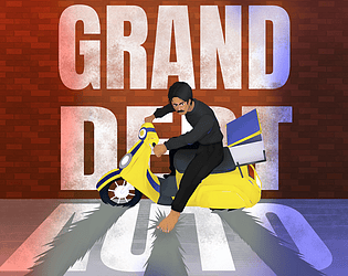
Your debt is piling up fast, so you have to doordash to earn those money
Action
Play in browser
Alice in Wonderland, but Alice has found a gun, which is quite concerning for the story.
Shooter
Play in browser
A reverse dungeon-crawl where you make the dungeon
Strategy
Play in browser
A fast-ish paced roguelike action shooter with improvisational combat about fighting in an arena
Action
Play in browser
A fast-paced arcade shooter, where you run head first into a room without a care for your own safety.
Action
Play in browser

Play in browser

A frantic "zombie" game as an employee of a store during a large sale
Fighting
Play in browser
A detectivistic game about asking questions and finding anwsers.
Puzzle
Play in browser