

Yes. It does not have true idle capabilities built into it, but, after hearing this, I think that made the list for next round of feature polish. Thank you for your feedback!
Grimmy
37
Posts
11
Followers
17
Following
A member registered Jan 24, 2023 · View creator page →
Creator of
Recent community posts
March 27th, at about 12pm EST the play through will be live on the YouTube channel.
https://youtube.com/@grimlytegames
The playthrough rewatch will stay up on YouTube so you can watch it at your leisure.
A direct link will be posted inside the discord channel as soon as the stream starts.
Game Name:
Parafriend
Developer(s):
Kisame712
First Impressions:
Alright, we’ve got a turn-based brawler on our hands. Standard damage and healing options—cool. But wait... your little buddy can suck your blood to remove poison? Totally normal behavior. Nothing cursed about that at all.
One fight in, then two—I’m picking up the rhythm. There’s a neat little dance here between offense, defense, and poison management. It creates a triangle of decision-making that adds depth: when to attack, when to recover, and when to let your “friend” take a bite out of you.
But here’s the rub: the poison mechanic feels unpredictable. Sometimes it barely triggers, sometimes it spikes off the charts, and I couldn’t lock down a pattern. That unpredictability throws off the strategy and shifts the game away from thoughtful decision-making and more into “hope it doesn’t go sideways.”
Game Loop:
A solid loop built around balancing attack, defense, and poison mitigation. It really shines in early encounters—learning to juggle your limited resources while your health bar does double duty as both life and currency is fun. That said, the randomness of the poison effect undermines the strategy and turns some runs into pure luck. If that mechanic had a visible range or a clearer pattern, it would elevate the whole experience.
Creativity / Originality:
Very creative take on a familiar genre. The core mechanic—managing a lethal poison effect by sacrificing health to a parasitic ally—is unique and adds an interesting twist to the standard turn-based brawler formula. It introduces a strong risk-reward dynamic that could definitely be expanded on in future builds.
As far as theme goes? You hit it square. Your only hope of survival is a parasitic friend who drains you to help you. That's about as “Unlikely Ally” as it gets.
Technical Execution:
Smooth sailing all the way through. Menus were present, intuitive, and offered a nice level of player customization. No bugs or crashes—clean and polished from start to finish. Great job.
Game Name:
Paranormally
Developer(s):
Sanj1t
First Impressions:
Did I really just witness a full-blown cinematic cutscene in a Game Jam submission? Absolutely phenomenal. The sound design, the effects, the tone—it all lands beautifully. Immediate immersion.
Now, let’s talk platforming. The lack of mid-air control is a bold choice. It’s definitely frustrating at first, especially in a genre where most players expect tight, snappy movement that bends the rules of physics just a little. But knowing this was an intentional decision, I set aside my muscle memory and gave the puzzles an honest try under those constraints.
Design choices like this can split audiences—some will hate it, others will love it—but if the limitation serves a deeper design purpose, it can absolutely pay off. In this case, it made every jump feel deliberate. No cheesing. No shortcuts.
The phasing mechanic is the real standout here. You’ve already nailed the idea that ghost mode avoids traps but can’t interact with the world—but I think you could double down. What if phasing not only affected world interaction but also gave you different toolsets for movement or problem-solving? Having to shift between those modes to progress would add some juicy layers.
Game Loop:
A puzzle platformer tied to a narrative arc, with a clever phasing mechanic that changes how you engage with obstacles. Once I got past the early hiccups and settled into the rhythm, the loop was satisfying—even if the floaty jump physics kept me on edge.
Creativity / Originality:
Let’s start with the big one: originality. After talking with the dev, I learned they were inspired by Elden Ring to experiment with new movement philosophies. While that game isn’t a platformer, I see the influence—it’s about deliberate movement, risk vs. reward, and learning to work within your limitations.
The core idea of ghosts helping a paranormal investigator by lending him their powers is a fun twist on the “Unlikely Ally” theme. The mechanic supports it, the story supports it, and the aesthetic ties it all together.
And again—major props on the cinematic intro. That was genuinely impressive.
Technical Execution:
We hit a speed bump early on with a broken build. Whether it was an upload hiccup or a weird system conflict, the original version wouldn’t let me progress. Thankfully, a patched build fixed everything.
In the updated version, ghost mode works as intended, the puzzles are solvable, and the mechanics function smoothly. Everything played as expected, and no bugs surfaced during the second playthrough.
Game Name:
Wreckless
Developer(s):
Sanj1t
First Impressions:
Oooh... physics-based wrecker. We’ve got some Angry Birds meets teetering tower energy going on here. The core loop is clear right away—wreck stuff with a swinging ball—and then you toss in a roguelike card mechanic between swings to spice it up. I seemed to pull quite a few negative cards early on, but I can see how this setup could lead to some wildly unpredictable and entertaining runs. Definitely the kind of formula that could spiral into some over-the-top, chaotic fun with more cards and interactions.
Game Loop:
Simple, clean, and effective. Smash something, pick a card, see what happens next. Rinse and repeat. This loop nails the “Keep it Simple” theme while also laying down the foundation for something super expandable. Absolutely the kind of game that would shine as a mobile time-waster—just load it up, smash stuff, and laugh at the physics mayhem.
Creativity / Originality:
There are a handful of good physics-based destruction games out there, but tossing in roguelike modifiers between levels is a smart twist. You’re definitely onto something that could evolve into a fresh take on the genre, especially if the card pool expands into more bizarre or risky options. Plenty of room for this to become something both unique and hilarious.
Technical Execution:
Smooth sailing all the way through—no bugs, no soft locks, nothing breaking. The systems all played nicely with each other, and it did exactly what it set out to do. Solid work across the board.
Game Name:
Simple Square
Developer(s):
Kisame712
First Impressions:
Right off the bat, I’ve got to give credit where it’s due—there’s some really smart use of parallax and 2D shapes here to build depth and atmosphere. You don’t need flashy art when you know how to layer your scene like this. It leans directly into the jam theme by showing how much you can do with the simplest tools.
Movement feels clean, the little dirt particle effect adds a nice bit of juice, and the wall slide mechanic feels responsive—except for that one spot in the intro where the material seems to be a bit different than the others. Level design makes good use of the mechanics, with a few neat sequences to test what the player has learned.
Game Loop:
It’s a classic platformer loop: learn the mechanics, get tested on them, feel rewarded when you succeed. The puzzles are fun and use the wall sliding mechanic in multiple clever ways. There’s plenty of room to expand on this foundation with more complex sequences or added movement layers later on.
Creativity / Originality:
Mechanically, it’s a familiar formula—platforming, wall sliding, puzzle-solving—but the creativity shines in how it’s visually presented. The use of parallax and the restraint in visual design makes it feel alive without overwhelming the player. That kind of creativity, especially when adhering to a theme like “Keep it Simple,” is worth applauding.
Technical Execution:
No game-breaking bugs encountered. The only issues were the initial wall that doesn’t behave quite like the others and the occasional snagging on level geometry—something that could be solved by reworking collider shapes with polygon mesh colliders instead of rectangles. Clean controls, responsive feel, and a well-structured level all point to a solid job technically.
Game Name:
SpaceBlast
Developer(s):
thorfinnking
First Impressions:
Alright... after getting myself stuck in the settings menu (side note: I always appreciate having volume controls, so bonus points there), I gave it a quick reboot and jumped into the game. What we’ve got here is a clear callback to the classic Asteroids. You pilot a small triangle-shaped ship, and square-shaped enemies—functionally asteroids—fly in from all directions. Just like the original, larger shapes break into smaller ones, forcing you to stay sharp and keep blasting.
Add in a simple upgrade system, and you’ve got yourself a solid, easy-to-digest arcade loop. Nicely done.
Game Loop:
Fly around, avoid the incoming shapes, shoot them to bits, upgrade your ship, repeat. It’s a classic arcade formula that works well for quick, pick-up-and-play sessions. It’s not trying to be revolutionary—it’s just trying to be fun, and it succeeds.
Creativity / Originality:
Not a ton of wild originality here, but that’s okay—it’s a clean, effective take on a known genre. This is a great example of how to “Keep it Simple” while still building in enough flexibility (like upgrades) to keep players engaged. The originality doesn’t come from the concept, but from the tight, minimalist execution.
Technical Execution:
Biggest hiccup was the settings menu missing a back button—something a quick reboot solved, but still worth flagging. Movement could use normalization on diagonal input (currently moves faster than intended). Also, it's hard to tell how much health the player has left—some extra visual feedback would help with that. Aside from those minor things, the game ran clean, the upgrade system functioned well, and I didn’t run into any critical bugs.
Game Name:
Don't Get Censored!
Developer(s):
Silee Goose Productions
First Impressions:
It was a bit tricky navigating the intro screen, not the most intuitive start, but once I got past that, I was immediately greeted with a character customization screen—which is always a good move for anything multiplayer-focused. Personalizing your character adds a lot of charm and longevity to games like this.
Jumping in… what do we have going on here? I appear to be armed with a t-shirt cannon? Wait—nope, scratch that. It’s a clothes cannon—and I’m literally launching hats, shirts, and pants onto the terrain and onto my opponents. This is absolutely ridiculous, and I’m loving every second of it. The core gameplay seems to revolve around either clothing or unclothing the enemy, resulting in them getting "censored"—a nice little callback to the game’s title.
Overall, it’s a fun little shooter that reminded me of some of those early first-person multiplayer games like Paintball 3D. Toss in the added absurdity of launching wardrobe items at your friends, and yeah—Silee Goose lives up to the name. Solid work.
Game Loop:
Simple FPS-style loop with a humorous twist. Tag your friends, gather points, gamble those points between rounds for a chance to drive your score even higher. It’s got just enough chaos to keep the loop light and fun, with a layer of unpredictability thanks to the betting mechanic.
Creativity / Originality:
Honestly, homerun on both fronts. Multiplayer shooters are a crowded genre, and if you want to stand out, you have to do something weird and wonderful. Building the entire premise around censorship and using clothing as the ammo? That’s weird in all the right ways. Completely original take, and it works.
Technical Execution:
Getting into the game was a little clunky—multiplayer is never an easy thing to pull off, especially under a game jam time crunch—but once I was in, everything worked as intended. No soft locks or game-breaking bugs, and all the commands felt responsive. For a multiplayer jam game, that’s no small feat.
Game Name:
Ironically Complex
Developer(s):
The Masked One
First Impressions:
Alright, an idle clicker. Definitely not my favorite cup of tea, but I’ll sip on this. First and foremost, the name is very fitting—it is ironically complex (in a good way). As I’m clicking around, enjoying the humorous commentary from the flapping lips in the corner, I’m also poking around a shop system and... whatever this other menu is off to the right.
Oh—oh my. It’s a mini-game? Okay, a Flappy Bird-esque side segment that genuinely reminds me of one of the more hair-pulling levels from the SNES classic Battletoads (always love when something tickles the nostalgia bone). Even here, the minigame switches direction at the end of each stretch—a clever touch.
A few clicks later, more unlocks, more mini-games, a whole new wing of the shop. My goodness, there’s a lot going on here, and yet somehow it doesn't feel overwhelming. The drip feed of content is spot-on, giving just enough to keep me curious without slamming me with information overload.
Game Loop:
The loop is simple—and for this jam, that’s perfect. Between the sound pops, visual bounces, and climbing numbers, it gives you all the dopamine hits you’d expect, but then breaks it up beautifully with side content like the minigames. That addition really rounds out the loop and keeps it from becoming a mindless slog. It feels thoughtfully designed and it works.
Creativity / Originality:
Idle clickers aren’t easy to innovate on, but you pulled it off. The humor, the variety, the little touches like directional shifts mid-minigame—they’re all flourishes that elevate this beyond a typical clicker. Any time a genre I normally bounce off grabs me and makes me want to keep playing? That’s a win in the creativity column.
Technical Execution:
No bugs on my end. Game ran smoothly from start to finish and moved me from action to action without any confusion. Everything functioned exactly how I’d expect, and the presentation held together throughout.
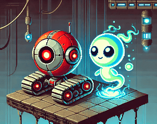
🕹 Game Review: Battery Bound
Submitted by: The Masked One
🎯 First Impressions
Bangin' soundtrack right out the gate, and we’ve got an audio menu? Already grabbing my attention—great start. The Masked One is a returning dev, and I was excited to see what they cooked up this time around.
Jumping into gameplay, I was immediately into it. The art style is great, and I really liked the little robot protagonist. What seemed like a straightforward platformer quickly evolved—time is your enemy in the form of a draining battery you need to recharge at checkpoints. Just when I thought I had the rhythm down, boom—a wheel mechanic appears. A bit tricky to get the hang of at first, but once I figured it out? That thing flies. I even found myself skipping over some obstacles thanks to its speed.
🔥 Fun & Engagement
Absolutely fun. I wanted to keep going and found myself genuinely enjoying this little robot’s journey. The mix of tight platforming and wild momentum made for some memorable gameplay moments.
🎯 Theme Use
Right on target. The battery-as-time mechanic is simple, effective, and perfectly integrated. You’re racing against the clock—literally.
🛠 Execution
The game plays great. The art is cohesive, the controls are responsive, and the mechanics are layered in nicely. My only nitpick would be that the wheel mechanic could use a little more polish—it’s fun but a bit unruly at first and can break intended challenge sequences by letting you bypass them entirely.
💡 Originality
Definitely fresh. I don’t see many platformers using a transforming wheel mechanic like this, and it added a unique flavor that helped the game stand out.
✨ Polish
Very polished. The audio slider in the main menu? Check. Crisp, clean movement? Check. In-game pause menu with audio options and reset function? Check. I ran into no bugs, softlocks, or performance issues. It all ran smooth and felt solid.
🛠 Areas for Improvement:
-
The wheel mechanic could be refined a bit—tighten its control and maybe gate its usage slightly to prevent skipping over key platforming sections.
🧠 Final Thoughts
Another great entry from The Masked One. A fun side-scrolling platformer with a lot of heart, a lovable little robot, and a wheel mechanic that feels like strapping a rocket to your feet. I hope you keep refining this—it’s already a blast to play.
Dinner Roll: Time for to roll towards you dinner before the time is runs out and the dinner is get's cold! jam comments · Posted in Dinner Roll: Time for to roll towards you dinner before the time is runs out and the dinner is get's cold! jam comments
🕹 Game Review: Dinner Roll: Time for to roll towards you dinner before the time is runs out and the dinner is get's cold!
Submitted by: Dentr
🎯 First Impressions
Right off the bat, I loved the charm of the main menu. There’s a quirky vibe here that hits just right. Would’ve been nice to have a little extra juice on the selectable UI elements for feedback, but the presentation still made me smile. Also, I think "John Travolta" is the volume slider? Hilarious, if a bit cryptic. Including credits in the menu is another classy touch.
Once in the game, we’ve got a 2D physics-based side scroller, and the key mechanic—besides rolling—is... farting. Gross. Hilarious. Perfect. It’s the exact kind of toilet humor that, when used right, absolutely works. The physics for fart-jumping are tricky—might just be me being terrible, but it felt hard to control. That said, I cracked up at the deflation animation on game over. Well done.
🔥 Fun & Engagement
I couldn't make it past the first or second obstacle—and this game has a boss level?! Still, I kept playing, not because I had to, but because I genuinely wanted to. That’s a huge win for engagement. The challenge was real, but the loop was fun.
🎯 Theme Use
You nailed it. A literal race against time to get to your dinner before it gets cold. And let’s not forget the bee enemies with clock faces—clever and literal. No question the theme is integrated throughout.
🛠 Execution
For a wild and weird concept, this is executed really well. The art is cohesive, the soundtrack slaps, and the mechanic fits the genre. The fart mechanic could use some refinement, but I'm honestly not sure what the best fix is—maybe locking its position relative to the player instead of factoring in roll momentum, or perhaps aiming it with the mouse. Still, it functions, and the chaos adds to the humor.
Only real bug I found was an odd lockout at the start—if you use the fart too early in a run, it seems to freeze controls for a moment. It doesn’t break the game but makes restarting feel clunky.
💡 Originality
Let me be clear: I’ve never rolled toward dinner on a 2D plane using gas propulsion. This gets a solid originality check from me.
✨ Polish
The game feels polished—start menu, solid art direction, catchy music, and a gameplay loop that’s frustrating in the best way. It may not be finely tuned, but it feels complete and cohesive.
🛠 Areas for Improvement:
-
Fart mechanic refinement: Hard to pinpoint the best fix, but the jump needs a touch more control or predictability.
-
Start-of-run lockout: Whatever timing or state check is causing the fart to freeze controls in the first few seconds—try to smooth that out.
🧠 Final Thoughts
It’s gross. It’s hilarious. It’s a toilet-humor platformer that actually works. The elementary schooler in me laughed the whole time, and the adult in me saw real potential here. I couldn’t make it far, but I kept trying—which says a lot. With some refinement, this could absolutely be a shippable, quirky indie title. Great job!
🕹 Game Review: Mayday: No Time to Wait
Submitted by: ArleGames
🎯 First Impressions
Arle is a returning dev, and it’s always exciting to see follow-up projects—especially when previous feedback has been considered and applied. Right off the bat, I noticed you can load a save that doesn’t exist, which probably needs a safeguard in your logic to prevent triggering that function without saved data.
Jumping into the game, I’ll give credit where it’s due: mouse movement has definitely improved from your last project. However, it’s still far too slow and unresponsive, making basic navigation feel clunky. The camera sway and movement tracking is extremely disorienting—it actually triggered some nausea for me. That alone makes this an immediate high-priority issue. Remember: the two things players do most are move and look. If either one is uncomfortable, it will immediately sour the experience.
Narratively, however, there’s a thread of cohesion. Despite the core mechanic frustrations, the fetch quests feel grounded and appropriate for the setting. With some work on fundamentals, this could become a solid little survival narrative.
🔥 Fun & Engagement
Due to the camera and control issues, I had to force myself to continue playing. That said—I do see how this game could be fun with smoother mechanics. You’ve set up tension, stakes, and a reason to keep going. The bones are there.
🎯 Theme Use
Time as an enemy is reflected through your survival narrative—a literal race against the clock in a hostile environment. Checks the box for me.
🛠 Execution
Execution is rough in its current state:
-
Mouse look is sluggish and inconsistent
-
Movement and camera mechanics are disorienting
-
Dialogue transitions cause temporary lockouts, making it unclear if progression is happening
-
Melee animations are rough
That said, you did execute on structure and narrative:
-
There’s a clear through-line from A to B to C
-
Stakes are established
-
The gameplay loop has meaning
💡 Originality
While the survival genre is well-tread, your crash survival premise brought me flashbacks to Hatchet by Gary Paulsen—and that’s a pretty unique lens to view this genre through. I appreciated the narrative angle.
✨ Polish
Still rough around the edges. Issues include:
-
Movement and camera (again, top priority)
-
Placeholder-like visuals with background artifacts (text visible in the skybox)
-
Clunky animations and UI transitions
These are all clean-up tasks that don’t require major systems overhauls—just time and polish.
🛠 Areas for Improvement:
-
Camera and Movement: This is your biggest blocker. If it feels fine in testing, compare your setup to what players may be using. If timing is involved in your code, make sure everything is normalized with
deltaTime. -
UI/UX Pass: Eliminate jarring transitions, fix the load system, and check for background artifacts (e.g., the text above mountains).
-
Combat and Animation: Consider investing time into animation timing and responsiveness, especially for melee actions.
🧠 Final Thoughts
It’s great seeing another submission from you, and even better seeing that you’re improving. While camera and movement still need work, there was noticeable progress from your last title, and that deserves credit. With more attention to core mechanics and polish, your next project could land much stronger. Keep putting in the reps—looking forward to what you bring to the next jam!
🕹 Game Review: Invaluable
Submitted by: Kisame712
🎯 First Impressions
Intriguing—Invaluable drops us into the world of a deck-building battler. While this genre isn’t usually my go-to as a player, I do enjoy watching content creators play games like this, and I found myself pleasantly surprised here. We’ve got all the staples you'd expect:
-
Action points determining how many plays per turn
-
A currency system for deckbuilding between rounds
-
A card combination mechanic that allows players to fuse cards into new, upgraded effects
All the pieces are here for a solid deck-building battler. What stood out most to me is that this is a genre leap for Kisame, and I love seeing devs step outside their comfort zones and flex new design muscles. Even better—the tutorial is integrated directly into the early gameplay. Show, don’t tell done right.
🔥 Fun & Engagement
The concept of combining cards to create new effects was really enjoyable, and it kept me curious about what outcomes different fusions might produce. It’s a compelling system with a lot of room to grow, especially if expanded with deeper layers or rarer, more unpredictable outcomes.
🎯 Theme Use
"Time is the Enemy" is more abstract here, but the lore gives it weight. The idea of time being used as a resource—a currency to build stronger spells—ties the theme in nicely with the game’s mechanics and world. It’s subtle, but it tracks.
🛠 Execution
Very well executed, especially for a first foray into a new genre. The tutorial section seamlessly introduces the player to mechanics without overloading them, and gameplay was straightforward and functional. Everything worked as intended, and the foundation felt solid.
💡 Originality
Deck-builders are common, but the card fusion mechanic is a standout. I haven’t seen that particular feature handled this way in a jam game before, and it’s a great idea worth refining. The potential here for creative deck evolution is high.
✨ Polish
Overall polish is strong. No bugs in my playthrough, and the game flowed smoothly. One improvement would be the inclusion of a sound settings menu, which would take things up a notch in terms of professionalism. Also worth noting: the current difficulty curve leans heavily in the player’s favor due to generous currency and powerful spell combinations.
🛠 Areas for Improvement:
-
Deck Mechanics Overhaul: Instead of buying cards mid-run, consider letting the player build a persistent deck that draws randomly each round. This would allow for more tension and strategic planning.
-
Rework the Currency System: Tie the currency ("time") directly to the fusion mechanic instead of deck purchasing. This could make the act of combining cards a more meaningful decision—and align more thematically with the world.
-
Difficulty Tuning: The current resource balance makes the game fairly easy. Reducing currency gain and increasing fusion power could help create a more rewarding challenge and tighter gameplay loop.
🧠 Final Thoughts
Invaluable is a strong first step into the deck-building genre—and with more development, I could easily see this evolving into a shippable product. The fusion mechanic alone sets it apart, and I’d love to see what you do with more time and iteration. Great work trying something new, Kisame—keep exploring and pushing those boundaries!
🕹 Game Review: Chronos Clash
Submitted by: Sanj1t
🎯 First Impressions
Okay. Time is literally the enemy. Love that on-the-nose humor. I’m also a huge nerd for Greek mythology, so this was already checking some great boxes for me. Sanj1t is a returning dev to our competitions, and it’s always a treat to see what returning developers bring to the table. I love watching devs learn and grow.
We’ve got weapon swapping that directly helps us overcome enemies and obstacles of the same color, and a platformer that uses vertical space well—nice touch. All of this leads to a final showdown with Chronos, a much more challenging but also mechanically sound boss fight. I do wish I could fire the weapon in the direction of the mouse cursor instead of relying on quick flipping along the X-axis to eliminate hazards during the fight.
🔥 Fun and Engagement
Definitely a fun little platformer. I enjoyed having some puzzles mixed in and getting my timing and reflexes tested.
🎯 Theme Use
Theme use was spot on—time is quite literally the enemy, and the presentation doesn't try to obscure it. Direct and effective.
🛠 Execution
Good execution all around. You can tell that your coding and refinement in platformers is steadily improving. This was the most cohesive platforming experience you’ve submitted to date. I really appreciated the inclusion of checkpoints (a must for platformers, in my opinion), and the use of puzzle/enemy mechanics to vary the flow. The boss fight was well-animated and felt fair—even though I had a few gripes with the shooting mechanic (more on that below).
💡 Originality
Platformers aren’t new, but the color-matching weapon system combined with visual logic puzzle elements gave this one some unique flavor. Definitely not something I see every day.
✨ Polish
Aside from a small bug at the start—where the player’s foot can get caught on an unseen collider—and a situation where falling from the second level to hit a spike on the first level warped me back to the checkpoint above, everything felt cohesive and well-polished. Bonus points for including a proper sound options menu—a nice professional touch that makes a difference.
🛠 Areas for Improvement:
-
Firing Mechanic: Adjust the firing system so that the character sprite flips and fires toward the mouse cursor, with the projectile aiming at the cursor’s direction rather than strictly from the sprite. This would make projectile-based platforming feel much more natural and responsive.
-
Jumping Physics & Animation: It’s time to refine the jump function. If platforming is your core gameplay loop, the jump needs to feel and look amazing. Dial in the physics and add some visual flair.
-
Platform Colliders: Consider using polygon mesh colliders for continuous platforms to prevent jagged edge overlaps that can catch the player unexpectedly.
-
Checkpoint Logic on Y-Axis Falls: When designing vertical levels with checkpoints, make sure that falling back down doesn’t result in checkpoint confusion. A fall-trigger collider or a vertical reset check could help with consistency.
🧠 Final Thoughts
Another great platformer from Sanj1t, and a strong showcase of the skills and refinements they’ve been building with each jam. I loved the nod to Greek mythology, and the overall presentation of the project was tight. Keep pushing forward—you’re improving fast, and it’s exciting to watch your dev journey unfold.
I appreciate you taking the time to follow-up with a thoughtful reply. I would like to apologize for flying off the handle like that. I had literally spent 6 hours of my day that day between the live recording, note taking, and then editing to produce those reports for every single entrant. Then having someone devalue my effort and work like I was some Ai bot just really struck a nerve with me.
Some background: I've been writing blogs for my business for decades, and over time, you fall into habits and rubrics that works for catching peoples attention and engaging readers in that way. There is a reason it reads like Ai, because Ai is following the marketing formula that works. On top of that one of my higher education focus's is in English and Writing. I also was a teacher for many years and that background helps me cater my reports to fit for a students perspective as well.
My Process: I play through the games, live. My first 5 minutes focus's on raw first reactions, which I narrate. After that, I go through each category that I am evaluating an entry on. I literally have a list in-front of me with questions to "ask my self." After the play through, I write a rough draft of the report for each report, in most cases, almost verbatim the audio notes I took during game play. I like to be whimsical, and tell a story through my communication, even in rough note form. Once the notes are taken, I then go back, re-read my notes, and edit them into the rubric I have created for these Jams.
Here. I am going to share with you the literal raw notes copy of your review. It will be very similar to my notes in the live video recording (which you can watch through as well.) It will also read like a rough draft version of the "pretty" report you got that has not been edited yet, but will have the exact same whimsical tone and marketing based communication.
Timeline P015***
V.
First Impressions: Oh, a text based adventure? Let's dive on in. As someone who likes to read, the theater of the mind is a wonderful thing to explore and play around with. being thrust into a story that has a slight choose your own adventure style to it was quite nice, especially, when there are dark secrets to uncover and work your way through. I appreciated the stories respect for the player in allowing a seamless movement backward and forward through the text allowing one to explore other options and avenues within the same story without having to be forced to the beginning or remembering all of their previous decisions.
Fun & Engagement: I did find myself quite engaged by the story. What was this families curse? What happened to their car? Was this a murder? I wanted to know more and was left with so many questions leading me to be curious about the rest of the story here and more backstory!
Theme Use: I feel the interpretation of the theme was quite loose here, but, you could argue that follows into the ripple effects of decisions we make and "Just One More Day" can ultimately lead to different outcomes.
Visual Presentation: Here's where it get's tricky. With these types of games, we want to allow the theater of the mind to create as much as possible, but, with this comes the challenge of utilizing lots of flavored words in our writing to help coax the brain to form pictures, hear sounds, and ultimately, paint a canvas for itself. We can, of course, utilize small visual cues to help with this. Quick flashes on the screen of a clock when we are checking the time, or barely visible car with no distinct features pulling through the background of the text as the family arrives home. It is a delicate balance, and if we choose the complete lack of visuals, we need more descriptive text.
Sound & Music: My personal favorite, when it comes to creating theater of the mind games. If you forego any visuals, sound can be extremely impactful, especially by itself. Utilizing an engine turning over sound when the car fires up, the gentle chiming of a clock when you look at it, or the subtle purr of a cat that's getting scratches. These can be powerful tools when trying to immerse your player in a text based adventure.
Technical Execution: Everything worked perfectly, no bugs, no soft locks, the abilitiy to move freely through the story and retrace paths was a very nice touch and respected the players time.
Originality: A good story is often times all you need to bring originality to a tired genre, and a good story becomes even more important when your game is completely focused on the story itself. Good work.
Polish: It's complete, and it all works in a nice little package. Well done.
Final Thoughts: A wonderful narrative taking us down a dark path with a family that has a curse. We end up with more questions than answers even after exploring the different avenues making us want to know more about this family. The lack of visuals and sounds made us rely much more on the descriptive text, but it felt a bit lacking in this department. Fortunately making up for it with some strong characterization! But here's where we can really dive deeper. A narrative game, unlike a book on paper, offers up unique opportunities to subtly play with the theater of the mind with brief and vague sound and visual ques without forcing the player to have a specific image. It is a strength that the game format has above pen and paper and can allow us to expand on our creativity.
Seriously? An unfounded Ai accusation? If I wanted to be talked down to after putting in a herculean effort to help people, I'd go teach children.
I spent two hours recording a live play through of every single entry, going into great detail of my thoughts on each game, in each category I was marking. The audio quality ended up being a bust, and I did it AGAIN. LIVE.
After this, I then took very detailed notes of my thoughts so I could make sure I had a great jumping point to to write out my report. Believe it or not- I have a rubric that I built to help me do all of this. It's a trick I've learned after years and years of practice and working on being an effective communicator.
I'm sorry you were so offended by eloquence compared to sophomoric writing and were equally off-put by my use of Emoji's and a rubric to make the report a more enjoyable read.
I'd offer you the raw notes in the word doc, but quite frankly, I am disgusted by you. All that work and effort, and that's how you respond?
Kindly never darken my doorstep again.
🕹 Game Review: Last Desire
Submitted by: Sanj1t
🎯 First Impressions
Right away, I knew I was in for something unique—a narrative-driven game with branching choices, and then… bam, mini-games inside of mini-games! The first run-through was hilarious—Nick, my so-called “friend,” only comes back years later if I let him win one last game of Pong? Rude. On another path, I found myself deep in math questions that tested my mental skills on the fly, leading to a school arc and eventually… a love story?! THEN I’M PLATFORMING TO SAVE MY TRUE LOVE FROM A HIKING ACCIDENT!?
What a ride. I did not expect this game to evolve into so many unexpected directions, and it kept me completely hooked. From narrative paths to math mini-games to platforming rescues—this was a layered experience that consistently surprised me.
🔥 Fun & Engagement
I couldn’t stop playing. I genuinely wanted to explore all the endings and uncover each branching path. The surprise factor of diving into totally different gameplay styles depending on my choices was brilliantly executed. You made me care about the characters, and you made me want to replay to see what else could happen.
🛠 Area of Improvement (Gameplay):
-
The platformer camera felt a bit too zoomed-in, making navigation slightly cumbersome and limiting my ability to anticipate upcoming hazards. A wider camera framing would give players more space to react and enjoy the level.
🎨 Theme Use
You absolutely nailed the theme. “Just One More Day” was explored meaningfully through multiple branches—each showing how small choices led to wildly different life paths. This is exactly the kind of interpretation game jams are built for. A+ on thematic integration.
👁 Visual Presentation
The art was simple but effective. It had charm and cohesion throughout, and each gameplay segment had a clear identity while maintaining visual consistency. Backgrounds were clear, characters stood out, and hazards were easy to identify. The quirky character designs added personality, and everything felt deliberate, not random.
🎵 Sound & Music
Massive kudos for including a volume control in the options menu. Always a professional touch that’s often overlooked in jam games. Music was appropriately selected for each segment, and sound effects for the platformer were serviceable and non-intrusive. There’s still room for more dynamic feedback in some areas, but everything worked as intended.
🛠 Technical Execution
Flawless. No bugs, no soft locks, and all math questions were accurate and well-structured. Bonus points for using correct order of operations—especially in a world where people are still arguing about PEMDAS. Having variation in the questions also helped keep that segment from feeling repetitive.
💡 Originality
Absolutely. A narrative adventure that dynamically branches into entirely different genres is a refreshing and creative approach. It wasn’t just a story with multiple endings—it was multiple experiences. This framework has massive potential, and you’ve already laid a strong foundation.
✨ Polish
Everything felt finished and cohesive, with a clear start, middle, and end. I only wish I had more time to explore all the outcomes. The overall flow was tight, transitions were clean, and each gameplay layer worked well within the broader story.
🧠 Final Thoughts
Last Desire was a grand slam. You hit the theme with emotional depth and humor, and you brought a mini-game anthology format into a narrative framework that kept me engaged the entire time. You’re showing serious design chops here, and this is the kind of structure that could be expanded into something even bigger.
Keep pushing this idea—it has real legs. I’m excited to see what else you build from here. Amazing work, Sanj1t!
🕹 Game Review: One Day
Submitted by: Yaso
🎯 First Impressions
Right off the bat, I loved the dev splash screen. That kind of professional touch goes a long way—it’s something you only have to build once, but it adds polish to every game you release and can be refined over time. A great habit to start early.
Jumping into the game, we’re presented with a puzzle platformer. I’m personally not a big fan of requiring players to hit a separate button to learn how to play, but to your credit, the instructions were clear and it didn’t take long to understand what I was doing wrong (user error with the fireball). Once I got it sorted, the gameplay flowed quickly. I especially loved the player character art and the smack animation used for puzzle adjustments—it added charm and personality to the experience.
Also, I only murdered myself once solving the first puzzle, which is a personal best!
🔥 Fun & Engagement
The opening puzzle was a little frustrating at first—mainly due to some minor friction with the platforming physics—but once I got used to it, the pacing and layout started to shine. The ricochet-based fireball mechanic was a standout. Having to build and angle the puzzle elements myself to solve challenges was satisfying and kept me thinking.
The bubble jump section was a fun test of platforming timing. Executing a “falling jump” into a bubble to gain enough height and clear a gap was a neat mechanic that added a good level of challenge.
I also appreciated how the narrative tied into the gameplay, even if it was brief. That connection elevated the experience.
🛠 Areas of Improvement (Gameplay & UX):
-
Platforming friction and wall interaction could use refinement. The player sticking or sliding unexpectedly on wall edges added a layer of challenge that felt unintentional.
-
Consider reworking the tutorial from a standalone instruction prompt to a more immersive “play to learn” sequence. This would improve pacing and player onboarding.
-
Temporary puzzle elements (like the ricochet block) could benefit from a visual cue to signal they’re time-limited. This would prevent confusion and improve puzzle clarity.
🎨 Theme Use
The connection to the theme ("Just One More Day") was subtle. While we’re told the character wakes up with no memory and starts platforming, the thematic tie-in felt loose. Still, you could make a case for it metaphorically—how everything can change in just one more day, and how we’re navigating a single, strange day in the character’s life.
👁 Visual Presentation
Your art style was clean and consistent. Every element felt like it belonged in the same world, and nothing stood out as off-theme or out of place. The character sprite, background elements, and puzzle pieces all meshed well. Great work here.
🔊 Sound & Music
The smack sound effect was great—it helped sell the physicality of puzzle interaction. That said, the soundscape felt a bit empty overall. Adding ambient music or subtle background tones would bring a lot more mood and atmosphere to the experience. Even a sparse piano or ambient loop could elevate the emotional weight and immersion.
🛠 Technical Execution
No bugs, no soft locks—always a great sign for a jam game. Outside of the earlier mentioned friction issues with the player on wall edges, the game performed smoothly and responsively.
💡 Originality
While 2D platformers are a crowded space, your environment-based ricochet puzzles, bubble jumps, and the inclusion of narrative elements gave this entry a nice original touch. You’re clearly thinking about how to weave puzzle design into world interaction, which is a great direction to continue pursuing.
✨ Polish
Overall, the game felt well-structured and paced—just maybe a little too short! It ended abruptly just as the challenge and story were picking up. That’s totally understandable given the time constraints of a jam, but I’d love to see more levels and puzzles in an expanded version.
🧠 Final Thoughts
Platformers are tough to stand out in—but you’re already taking the right steps: a cohesive visual style, narrative integration, clever puzzles, and a sense of character. With just a bit more refinement (especially in player physics and tutorial onboarding), this has the foundation of a memorable little gem.
This is a great build to continue from. Keep at it, and keep challenging yourself to push your design ideas even further. You’re doing great work, Yaso—looking forward to your next entry!
🕹 Game Review: Case Closed
Submitted by: Kisame712
🎯 First Impressions
Alright—we’re diving into a narrative platformer with some action and mystery to boot. Right away, I appreciated the show-don’t-tell approach to onboarding, and was immediately drawn in by the magnet jumping mechanic. Stepping into Detective Rogers’ shoes felt fresh, and the ominous soundtrack set a suspenseful tone. I also noted a revamped ladder climbing system—great to see improvements from previous jams! And this time around? We’ve got combat, baddies, and even a boss fight.
Some of the new mechanics (like firing your weapon) were a bit chaotic, and seeing Rogers' arms clipping through the ladder gave me a chuckle, but overall, this entry screamed growth and experimentation—and I loved that.
🔥 Fun & Engagement
This was an engaging mix of narrative, platforming, and experimentation. I really enjoyed working out the magnet jumping and timing, and adding enemies gave the game a welcome extra layer of tension and strategy. Even though the firing mechanic felt a little limited in terms of control, it didn’t take long to figure out how to navigate around enemies and handle them.
🛠 Areas of Improvement (Combat & Mechanics):
-
Firing Control: Giving players the ability to angle shots up/down could open the door for creative level design, enemy types (ground huggers, flyers), and combat puzzles.
-
Mouse Cursor Behavior: If mouse aim isn’t used for targeting, consider hiding the cursor or clarifying the control style. If a player sees a cursor, they instinctively expect it to direct shots.
-
Shot Origin: Always ensure bullets fire cleanly from a visible weapon or facing direction—this improves visual logic and immersion.
🎨 Theme Use
This was a powerful take on the theme. The narrative built slowly and darkly toward a heavy moment that hit hard. The final scene and notes from the boss encounter gave me chills. The emotional weight you delivered through gameplay and story integration was impressive. Well done.
👁 Visual Presentation
Everything felt cohesive and visually functional. The character design, level layout, and UI elements worked well together. The ladder clipping was the one standout flaw, but it presents a learning opportunity.
🛠 Areas of Improvement (Visual Layers):
-
Tie all player elements to a unified “player layer” that sits above object and background layers. This prevents visual clipping and opens the door to…
-
Layer-based parallaxing. Try experimenting with foreground elements, near-opacity overlays, and layered movement to give your 2D environments depth and atmosphere.
🎵 Sound & Music
The music set the tone beautifully—dark, ominous, and understated. It complemented the narrative-driven gameplay without overwhelming the player. Sound effects were subtle but present. There's room for added juice, but the restraint worked here.
Ideas for Expansion:
-
Add a unique SFX for the magnet jump—something satisfying and mechanical.
-
Enemy death sounds or boss “rage” audio cues would raise stakes and immersion.
🛠 Technical Execution
Gameplay was largely smooth and bug-free. The magnet jump had a few unpredictable quirks, and I got stuck on the boss’s head briefly, but nothing game-breaking. I was able to recover and keep playing without issue. Major props for that.
💡 Originality
2D platformers are a crowded space, but what makes Case Closed shine is the thoughtful blend of story, mechanics, and emotional weight. The magnet mechanic and layered narrative made this feel fresh, even in a familiar genre. You’re clearly experimenting with systems, which is exactly what these jams are for.
✨ Polish
From beginning to end, the game felt complete. The structure was strong, the pacing worked, and you wrapped it all in a story that carried meaning. There’s still plenty of room for refinement, but what’s here is solid and shows growth from your past submissions.
🧠 Final Thoughts
You’re pushing yourself—and it shows. New mechanics, deeper narrative, better pacing, and continued refinement from jam to jam. I’m really enjoying watching your progression, and I can’t wait to see what new ideas you explore next.
Your next challenge? Experiment with layer-based visuals, and expand the combat system to give players more agency. You’ve already proven you can build a great foundation—now it’s time to elevate it with more interactivity and immersion.
Keep up the great work, Kisame. You’re leveling up with every jam.
🕹 Game Review: Bobalicious!
Submitted by: recycledfunk
🎯 First Impressions
Alright, a boba shop sim? Let’s go. Ten customers in, no money, and I can’t make anyone’s order... but wait, I can flip them off? Okay, now you’ve got my attention.
This game immediately hits a quirky note with its irreverent mechanics—most notably the option to "politely" tell customers to leave by flipping them off. While I did run into some soft-lock-style frustration due to unavailable ingredients and RNG-based progression barriers, that absurd gesture mechanic was oddly satisfying and kept me invested just long enough to start making progress.
🔥 Fun & Engagement
While this genre (fast-paced order fulfillment) isn’t usually my cup of tea, I could still recognize the hook—and that hook was definitely the hand gestures. Flipping off customers and even petting a few? Delightfully weird and surprisingly fun.
That said, the early-game RNG softlock—where customers demand items you don’t have yet and you can’t earn money to unlock them—was a major pacing issue. Once I got past that hump, things became more playable, but the initial grind was a drag.
🛠 Suggestions for Improvement (Gameplay):
-
Avoid progression blocks based solely on RNG.
-
Consider adding a tutorial or a light onboarding mechanic to help players understand the serving order system faster.
-
Introduce stakes earlier—add a countdown, progress bar, or clear indicator that rent is due (e.g. "2 Days Left" marker).
🎨 Theme Use
A bit of a stretch, but technically it ties in: you have “just one more day” to make $500 or be evicted. The theme is there in spirit, even if it’s not overtly reinforced through gameplay. A little narrative framing could really drive this home—perhaps a landlord text message pop-up, or daily progress reports.
👁 Visual Presentation
The visuals were charmingly chaotic. I could tell the ingredients apart, and the expressive hand postures were a highlight. That said, some of the image assets had visible white halos and jagged pixel edges, likely from unclean transparent backgrounds.
🛠 Suggestions for Improvement (Visuals):
-
Clean up imported assets using transparency tools (magic wand/eraser in Photoshop, Aseprite, etc.).
-
Match pixel ratios for consistency.
-
Consider soft parallax movement or animated background details to liven up the shop space.
🔊 Sound & Music
The sound design showed promise. The bell sound was crisp, and customer mumbling added a fun touch of chaos. It would be great to expand on this:
Ideas for Audio Juice:
-
Squelch sounds for adding ingredients.
-
Pouring or sloshing sound for tea/milk.
-
A sassy or garbled insult when flipping someone off.
-
A cat purr or meow when petting a customer. Why not double down on the weird?
🛠 Technical Execution
Functionally, the game ran without bugs or crashes. However, one of the biggest friction points was figuring out how to properly serve drinks. Even when you had the right ingredients, the order of operations for adding them mattered in a very specific way that wasn’t clearly explained. Once I figured it out, it worked—but it definitely wasn’t intuitive at first.
Suggestions:
-
Introduce a quick in-game tutorial or recipe book to clarify drink assembly.
-
Use color-coded steps or visual guides to indicate correct assembly order.
💡 Originality
The genre is familiar, but the rude customer service twist is where Bobalicious! shines. The flipping-off mechanic was unexpected and genuinely funny—think Dicks Last Resort meets Overcooked. It’s a gimmick that hasn’t been fully explored yet, and you’ve got something here that sets your game apart. Lean into it.
✨ Polish
There’s room to refine both visuals and gameplay flow. The pixelated white rims and unclear order-fulfillment process detract from what could be a much smoother experience. Some basic onboarding, UI improvements, and stakes would elevate this to something much more engaging.
🛠 Suggestions for Final Polish:
-
Add a clear end-goal or "You’ve Been Evicted" fail state.
-
Smooth out softlocks by ensuring players can always earn some currency, even from failed orders or “flipping off” customers.
-
Consider implementing a short “Show, Don’t Tell” visual tutorial to teach mechanics.
🧠 Final Thoughts
Bobalicious! is rough around the edges, but undeniably funny and unique. That flipping mechanic gave me actual belly laughs, and in a jam full of earnest, emotional games, this was a refreshing palette cleanser. There’s something here worth expanding—especially if you embrace the absurdity and push the rude customer service angle even further.
With a bit more structure, cleaner visuals, and some tension-building mechanics, Bobalicious! could absolutely stand out in a crowded genre. For now, it’s an oddball with real potential—and one that gave me a good time despite its flaws.
🕹 Game Review: The Cherry Tree
Submitted by: thatonejake
🎯 First Impressions
From the start, The Cherry Tree impressed me with its simplicity—but more importantly, with how well that simplicity worked. Quirky music, an ominous sting, and the basic task of picking cherries. Seemed innocent enough. But by Day 3, I started wondering if the developer was messing with me (in the best way possible). The narrative slowly crept in—addiction, repetition, and an unraveling mind. Suddenly, days were flying by, the music turned foreboding, and my character started losing their faculties. I felt it. That creeping sense of dread. Just... One... More... Day.
This was a wonderfully executed take on the theme and a perfect example of how storytelling and mood can elevate a minimalist gameplay loop.
🔥 Fun & Engagement
At first, I was just curious—but then I had to keep playing. There’s something special about being able to convince a player to keep doing the same task over and over without feeling bored. That’s a real design win. The pacing of the reveal was spot on, keeping me hooked until the moment things turned.
🎨 Theme Use
Nailed it. “A World Without Color” was reflected in the game’s increasingly bleak emotional tone and repetitive actions. The concept of chasing “just one more day” was chilling in its execution and aligned perfectly with the theme.
👁 Visual Presentation
The 3D environment was simple but effective. Everything felt like it belonged. There wasn’t anything forced or out of place. It gave me just enough space to feel immersed, without needing excess detail.
🔊 Sound & Music
The music did exactly what it needed to—starting light and quirky, with just a hint of unease. When the narrative turned, so did the tone. That shift was impactful. That said, there’s room to build on this:
-
Adding footstep sounds could enhance immersion.
-
A “munch” or pluck sound when grabbing cherries would add game juice.
-
Consider adding subtle changes to the music each day leading up to the twist—small tonal shifts or distortions to foreshadow the unraveling.
🛠 Technical Execution
Zero bugs! A welcome surprise in a game jam environment. Everything ran smoothly, and I never encountered a soft lock or glitch. Clean execution from start to finish.
One small quality-of-life improvement: I really wanted a sprint key while exploring the forest. It would speed up the gathering process and open the door to exploring more hidden surprises in the world—like Easter eggs, secrets, or narrative breadcrumbs.
💡 Originality
You took one of the oldest mechanics in gaming—a fetch quest—and gave it a dark, clever twist. That level of originality, especially within the jam's constraints, was fantastic. The emotional arc baked into something so basic gave it weight and impact.
✨ Polish
The game could benefit from a bit more juice—particularly in sound design and interaction feedback—but the core experience felt complete. It was concise, intentional, and effective. You delivered a beginning, middle, and end—all in a short, self-contained package.
🧠 Final Thoughts
The Cherry Tree was a strong and memorable entry to the jam. It told a complete story, delivered its message clearly, and managed to make repetition feel meaningful. That’s a huge achievement. With some added polish—particularly around sound, pacing, and immersion—this could easily evolve into a larger project or an expanded experience. Thank you for taking the time to build this and share it with us. I’m looking forward to seeing what you make next!
🎯 First Impressions
Let’s be clear from the start: this was an unfinished project—and the devs were up front about that, which I deeply respect. Submitting something you know isn’t fully realized, and offering it up to be judged, takes guts. That vulnerability, that willingness to learn, is exactly how great developers are forged. Whether the lesson was about scope creep, team dynamics, or time management—whatever it was, I hope each of you took something valuable away from the process. That alone makes this project worthwhile.
Now, onto the game. The art and atmosphere hit immediately. Not just visually, but emotionally. You took the theme “A World Without Color” and pushed it beyond a stylistic choice into something deeply metaphoric. The breathing idle animation of the character, the heavy air of the world—you nailed that sense of psychological grayness. The project might be incomplete, but the feeling it evoked? That was fully formed.
🔥 Fun & Engagement
Unfortunately, the limited gameplay didn’t leave much room to explore or engage deeply. There was one interactable object that hinted at a possible mini-game system, but that was all we had to go on. Still, the ambition is clear. Tackling depression as a central theme—both narratively and mechanically—is bold. That’s not easy to gamify, and yet your world and setup suggest a path toward meaningful, introspective interaction. I’d love to see where this could go with more development time.
🎨 Theme Use
This is where Project Turmeric shines. You didn't just interpret the jam theme visually—you explored it emotionally and metaphorically. The player character, the bleak world, the atmosphere—all resonated deeply with the concept of a world drained of color and hope. For many of us, this was a very real and personal interpretation of the theme. Well done, team. You went beyond surface-level and made something meaningful.
👁 Visual Presentation
The visual art and direction were standout. The dithering and light placement were excellent—dithering especially can be tough to get right in pixel art, and you used it skillfully. The animation of the character’s idle breathing added weight and humanity to the scene.
One area of potential improvement is in the depth of background elements. They felt a bit flat compared to the atmosphere the foreground was establishing. Converting those background pieces into parallaxed objects and adjusting their shadow angles could help bring the whole world more to life. Think more “cube” than “square”—even just a touch of perspective and offset goes a long way.
🔊 Sound & Music
There was no audio implemented yet, but this is a golden opportunity for future development. A melancholic ambient track, rain lightly tapping in the background, and the slow, dragging sound of footsteps could drastically enhance the emotional tone you’ve already established. Minimal audio feedback for interactions would also help round out the experience.
🛠 Technical Execution
With what was playable, everything ran fine—no bugs or crashes. That said, there were some immersion-breaking moments, like being able to walk off-screen after the camera hit a boundary. Even in unfinished builds, adding quick temporary roadblocks or invisible walls can prevent this and protect the player’s experience. A small fix with a big impact.
💡 Originality
Tackling depression and emotional fatigue through a pixel-art platformer isn’t something we see often—especially in jam settings. While it’s a niche direction and requires a delicate balance between theme and gameplay, your idea is both original and courageous. If you pursue this game further, I’d encourage careful attention to gamification of the message—but I truly believe this kind of story can resonate with a wide audience when done with care.
✨ Polish
It’s hard to assess polish fairly when a project is incomplete, but what was there felt intentional. The tone, the art, the atmosphere—it all felt like it had direction and meaning. The polish will come with time, but the foundational vision is strong.
🧠 Final Thoughts
I’m genuinely sad I couldn’t explore more of this game. You clearly had something emotionally powerful in mind, and what we did get felt honest, personal, and intentional. More importantly, I hope this jam was a learning experience for each of you. Whether that was about development planning, creative balance, or technical scope—it all matters, and it will all serve you in the future. This game has deep potential, and I would love to see where you take it if you ever return to it.
Big respect to the whole team for submitting anyway. That takes courage—and it’s what game jams are all about.
🎯 First Impressions
Another returning developer! Kisame712 charmed us with their previous entry featuring a little robot finding its way home, so I was immediately curious to see what they’d bring to the table this time. Ink did not disappoint. This time, you’re not a robot—you’re an ink pot. And somehow, this ink pot is brimming with personality. The subtle “breathing” idle animation gave the character life in such a simple, elegant way. The game wastes no time throwing you into the story with purpose and direction, showing once again that Kisame knows how to set a narrative tone without slowing momentum.
🔥 Fun & Engagement
What we get is a side-scrolling platformer with puzzle elements—and from the very first moments, it’s clear: this is a step forward. You’ve taken lessons from your last project and leveled up. The jump animation with the little ink blast? Chef’s kiss. It looks great, feels great, and makes immediate mechanical sense. You delivered a smooth, show-don’t-tell tutorial, which is always a win in my book, and the pacing of level design kept me curious about what came next. A really engaging, cohesive experience.
🎨 Theme Use
The interpretation of the jam theme was clever and layered. The monochrome world is part of the world design, yes—but also directly tied into the character’s creation and narrative. It’s subtle, smart, and well-executed. Big points here.
👁 Visual Presentation
We’ve talked about it already, but let’s say it again: that jump animation? Fantastic. The parallax backgrounds also added depth that’s especially important when working in a limited color palette. However, some visual elements could use improvement to improve clarity:
-
Hazards like spikes didn’t stand out enough against the background. Giving them a brighter, sharper contrast—like a polished white or bold edge—would make them pop visually.
-
Droppers, being your main collectible, could use more visual distinction. Options could include a subtle idle animation, glowing outline, or aura effect to make them stand out and draw the player’s eye.
🔊 Sound & Music
The relaxing background music suits the tone and pacing of the game, and the jump “sproing” sound adds just the right touch of charm. However, there are some improvements to consider:
-
A sound effect when the player hits a hazard would help with feedback and immersion.
-
Restarting the level/music abruptly after a death is jarring. Consider fading the music and adding a quick visual or audio transition to smooth the experience.
🛠 Technical Execution
The game is mechanically simple—and that’s a strength. It’s tight, focused, and clearly built with care. That said, one area to refine is hazard hitboxes. As with many early platformers, the hitboxes felt a bit unforgiving at times. When in doubt, err on the side of generosity. Investing time in learning how your engine handles collisions will pay off tenfold in future projects.
💡 Originality
I love short-form story-driven narratives in jam games, and Kisame consistently delivers them with charm. The idea of an ink pot adventuring through a grayscale world is wonderfully whimsical, and the personality shines through. It’s memorable, and that’s not easy to accomplish in a small-scope game.
✨ Polish
Polish is solid overall, but a few focused enhancements could take this game from good to great:
-
Add visual/sound transitions for player death or respawn.
-
Adjust spike and dropper visibility for better guidance.
-
Explore a slightly more immersive restart mechanic to reduce abruptness.
Additionally, here’s a personal challenge from me: in your next 2D platformer, experiment with more Y-axis gameplay. Adding verticality—multi-level obstacles, climbing segments, or vertical puzzles—can expand the experience and showcase your evolving level design skills. You’ve proven you can build compelling side-scrolling levels, so now it’s time to stretch that vertical creativity.
🧠 Final Thoughts
Kisame712 delivers again—this time with more refinement, more charm, and a clear leap in development skill. Seeing this kind of growth in just one month between jams is genuinely impressive. You’re putting your lessons into action and crafting increasingly engaging little worlds. Ink is humble in scope but rich in character, and I’m already excited to see where this ink pot’s journey goes next—or what strange and wonderful characters you bring to life in your next entry. Great job!
🎯 First Impressions
Lore! This game has lore—and not hidden deep in some forgotten terminal or obscure pickup, but right there on the main menu. It’s unnecessary in the best way. That little extra bit of storytelling goes a long way in giving the game its own voice and identity. The clear instructions and level selection (three maps!) also made for a solid, intuitive launch into the chaos. So far, fan-freaking-tastic.
🔥 Fun & Engagement
As a single-player, the experience is admittedly limited—it’s clearly built for two players to gleefully obliterate one another. Still, I had a great time exploring the maps and messing around with the mechanics. The infinite wraparound design (fall through the bottom to appear at the top, walk off one side and appear on the other) was a brilliant workaround to the lack of a jump button. Speaking of which—no jump key? Shocking at first! Though I discovered a janky pseudo-jump (hold down + fire key), it wasn’t really usable. That said, the level design made jumping unnecessary, which speaks to smart environment design. The core idea of frantic mayhem shines through loud and clear.
🎨 Theme Use
Not much to analyze here. The game’s visuals stick to a black-and-white palette, so it meets the theme requirements. Sometimes the theme doesn’t need to be deep—it just needs to be present, and this checked the box without overreaching.
👁 Visual Presentation
Simple pixel art, effective and clear. The levels each have variety and distinctiveness, and the aesthetic calls back to the golden age of stick-figure Flash games in a way that feels intentional and nostalgic. The menu screen, despite its simplicity, had just enough charm to make it feel deliberate and stylish.
🔊 Sound & Music
Here’s where I felt the biggest tonal disconnect. The background music is pleasant and zen… which feels a little off when you’re supposed to be blasting your buddy into pixel bits. It’s great music—just not quite the right vibe. That aside, the sound effects are solid. Power-ups, weapons, and explosions all bring that sweet ear candy that makes a chaotic brawler pop. With more fitting music, this could elevate the energy of the game significantly.
🛠 Technical Execution
The game ran smoothly from start to finish, which is always a big plus. One soft lock cropped up when I used the wall-building power-up and accidentally trapped myself. The created wall wasn’t destructible like other environment pieces, leaving me stuck. A quick fix for that might be to make all walls destructible—or at least add a failsafe.
The destructible terrain overall was a great touch and adds a layer of strategy. That said, I noticed some inconsistencies—certain surfaces didn’t break as expected if the player was too close when firing. Also, I struggled with aiming due to the weapon flipping on the Y-axis when turning. It felt disorienting, especially since the weapon didn’t remain fixed to a direction. Adding a faint aiming line or an optional toggle for aiming assistance could vastly improve gameplay feel and clarity.
These may seem nitpicky—but that’s only because everything else worked so well. This is the area with the most potential for growth to push the game from “fun chaos” into “fluid, addictive brawler.”
💡 Originality
Arena brawlers aren’t new—but you gave this one flavor. The lore was unexpected and welcome. The execution of weapon pickups, destructible environments, and tight level flow gave it just enough flair to separate it from the crowd. The bones are familiar, but the skin is yours.
✨ Polish
Outside of the soft lock and destructible terrain quirks, this entry is remarkably well-polished. It feels like a complete game, not just a prototype. There are plenty of fun power-ups and a clear sense of progression in the available arenas. This is a great foundation.
🧠 Final Thoughts
Death Arena For Killing Your Friend feels like a love letter to classic Flash-era brawlers, with a modern layer of thoughtfulness and polish. It's fun, chaotic, and self-aware. While playing solo limits the experience, the design still invites exploration—and that says a lot. Adding a PvE mode, simple enemy AI, or a survival horde option would give solo players more to engage with. Deeper destructibility and regenerative terrain could further elevate the chaos, giving weapons more impact and the player more feedback. All in all, this is a great jam entry, full of charm and potential, and I’m excited to see what Dron makes next—whether it’s an update or a brand-new brawler.
🎯 First Impressions
Upon launching the game, I was immediately dropped into what looked like a "Try Again" screen, complete with a score already displayed—as if I had previously played (I hadn’t). It was a bit disorienting and made me question if the game had started correctly. That said, hovering over the options menu was a delightful surprise—the little character raising their hand on hover was a charming, personality-filled touch that instantly gave the game some heart.
Initially, however, the gameplay itself was confusing. After starting, intense music began (fantastic track choice!), and suddenly the Glorbo—your colorful orb-shaped pursuer—would teleport around the screen and end the game in seconds. I honestly thought I was doing something wrong.
Eventually, after trial and error, I discovered the game defaults to “Lunatic Mode.” Once I adjusted the difficulty in the options (after figuring out I had to click the flag to exit—unclear UI moment), the game became playable, and its mechanics much more understandable: avoid Glorbo, who chases your mouse cursor. Simple in concept, but effective once it's working properly.
🔥 Fun & Engagement
Getting into the actual gameplay was a bumpy ride due to initial difficulty settings and UI confusion, but after contacting the dev and reading the updated "read me" on the Itch page, things started clicking. The experience is minimalistic but has the skeleton of a fun time-waster or a future mobile game. The rapid difficulty curve made the learning experience more frustrating than fun at first. I’d highly recommend starting with a slower Glorbo and gradually increasing his speed to better onboard players. With that tweak, I could easily see this being an addictively simple game loop.
🎨 Theme Use
The theme was interpreted simply but effectively. A colorless world with one vibrant entity obsessed with catching you—check. It’s not deep or layered, but it fits the theme and communicates it visually.
👁 Visual Presentation
There were some great choices here, like Glorbo’s shifting expressions and the character animation in the menu. Those touches injected much-needed personality. However, during gameplay, it was difficult to tell what was happening visually. A more defined player character (maybe one that mirrors the mouse cursor) would help build a stronger connection and sense of control. As it stands, it’s unclear who you are on screen—which can break immersion.
🔊 Sound & Music
The music was fantastic—high energy and fitting, especially as it ramps up with the tension of gameplay. That said, there’s definitely room to add more “game juice” through sound effects. Glorbo making contact with the player could use an impactful sound cue, and even subtle effects for hover, chase, and fail moments would enhance the moment-to-moment experience.
🛠 Technical Execution
This category needs the most work—but it’s worth noting that the developer was transparent about the game being unfinished due to personal reasons. The issues with the game launching into an active state (complete with a leftover score) suggests that the game may not be initializing a fresh session per player, which could limit scalability and usability. The options menu also lacks clarity—players might easily get stuck or not even realize how to change settings. That said, once the difficulty was adjusted and the interface navigated, the core mechanic of Glorbo chasing your mouse functioned just fine. It’s a rough start, but the engine is there.
💡 Originality
A rapidly shape-shifting, face-changing orb of doom chasing my mouse? Yeah, I’ve never seen that before. Points for originality. The subtle option menu animation was also a creative flair that shows you’ve got a fun, whimsical approach to game feel—even in the menus.
✨ Polish
Understanding that the game is incomplete, there's still a lot of polish that needs to happen for it to become truly player-friendly. Key areas to focus on:
-
Fixing the default “already in-progress” state at launch
-
Improving the clarity and functionality of the options menu
-
Scaling Glorbo’s speed to match player learning curves
Each of these will go a long way toward making the game more approachable and enjoyable.
🧠 Final Thoughts
Colorless Ascent had a rocky beginning, and without developer contact or extra effort, I might have assumed it was broken. But beneath that confusion lies a unique little idea with the potential to grow into something quirky and fun. Glorbo is off-putting in the best way, and the game does create a weird tension that makes you want to keep dodging. There's still a lot of work needed, but I really wanted to highlight the elements I enjoyed—the animation personality, the music choice, and the core concept. With more development time, I think you’ve got the makings of a memorable little dodge-em-up here.
🎯 First Impressions
Sanj1t is a returning Jammer, and after enjoying Bubble’s Day Out, I was genuinely curious to see what they had in store this time. True to form, MonoChroam immediately won me over with its subtle storytelling and quaint charm. It’s not flashy or over-the-top—but that’s the magic of it. The cozy personality shines through, and the menu design was especially well done: clean, intuitive, and offering players the option to learn or dive in without fuss.
🔥 Fun & Engagement
The tutorial levels did a great job introducing mechanics in a clear and satisfying way. Each obstacle felt unique enough to keep me interested, and the design encouraged consistent forward momentum. I especially loved the flip animation during jumps—it was a small detail that added a big dose of charm and joy. That little touch made me want to keep going just to see what came next.
🎨 Theme Use
The game took a simple but fitting approach to the theme. A character, bored in a monochrome world, invents their own challenges for entertainment. While we never actually see this "building" happen, the context supports the experience well enough. With a little suspension of disbelief, the narrative holds up and adds personality to the journey.
👁 Visual Presentation
This is where I’ll offer a few constructive notes. While the background effects like parallax scrolling and “breathing” elements gave the world some life, the hazardous obstacles really needed more contrast. In a monochrome palette, visual clarity becomes even more important—players need clear cues about what’s dangerous and what’s not. I’d also recommend extending the edge walls just a bit more to hide "negative space" and unused areas from the camera’s view. These small tweaks could significantly boost immersion.
🔊 Sound & Music
Once again, Sanj1t shows a great ear for music that adds to the world’s mood. However, the soundscape could be expanded with simple SFX for actions like jumping, walking, climbing, or hitting hazards. Those little audio cues go a long way in making a platformer feel polished and reactive. It’s not a major miss—but it’s a clear opportunity for enhancement.
🛠 Technical Execution
Smooth sailing here—no bugs or soft locks encountered. At one point I thought I was stuck, but it turned out to be a design choice: a tempting chain that seemed explorable but wasn’t. Just something to consider—players love to explore, so if something looks like a path, it should either be a path or clearly signal otherwise. One area for deeper refinement would be hazard hitboxes. A little generosity goes a long way—hitboxes that feel too tight can frustrate players. I'd recommend iterating and testing repeatedly to get those nearly pixel-perfect. Once you dial in how your engine handles collisions, future projects will benefit massively.
💡 Originality
Narratively, Sanj1t always brings something cozy and a bit whimsical, which adds charm to their games. Mechanically, the platforming elements are familiar—but that’s not a flaw. Platformers are tough to innovate in, and this game still manages to feel personal and inviting. The originality comes through in the atmosphere and storytelling, even if the mechanics are classic.
✨ Polish
For a jam game, this is impressively polished. It’s cohesive, it plays from start to finish, and everything ties together well. That said, adding a bit more “game juice” in terms of visual and audio feedback would really elevate the experience. Those sensory layers help make actions feel impactful and immersive.
🧠 Final Thoughts
The flip in the jump animation genuinely made me smile—it’s the kind of small, thoughtful touch that gives a game its personality. I’m a fan of the micro-narratives you build, and I think your grasp on the fundamentals is strong. For future projects, I’d focus on juicing things up—more visual and audio feedback, clearer obstacle contrasts, and refined hitboxes. You’re clearly growing with each submission, and I’d absolutely play a future update to see what new ideas you add or obstacles you invent. Great work!
🎯 First Impressions
Right out of the gate, The Grey’t King grabbed my attention with its clever nods to classic gaming culture. The humor was charming and nostalgic, setting the tone for a lighthearted yet strategic experience. While the intro and menus felt a bit rough around the edges, the vibe and concept were strong enough to pull me in regardless.
🔥 Fun & Engagement
The reverse tower defense concept is a fun twist that really shined here! I found myself wanting to play through more levels, which speaks to the game's potential. That said, I think there’s room to push the gameplay even further. Consider adding specialized monster roles—like a taunter that draws archer fire or a siege unit that focuses on breaking down walls. Shifting wall mechanics from dealing damage to acting as choke points could also open up deeper strategic layers. You’ve built a solid foundation—there’s a lot of cool space to grow from here.
🎨 Theme Integration
At first, I wasn’t quite sure how the theme was implemented, but that may have been due to an audio issue on my end. Once I realized what you were going for, it clicked—and I thought your interpretation of the theme was clever and well-executed. Great adaptation!
👁 Visual Presentation
The contrast between the grayscale world and the colorful minions was a great touch, and the yellow minions in particular had a quirky charm that I really enjoyed. However, the UI could use a little more polish to bring everything together visually. With jam time constraints, I totally get having to make trade-offs—and prioritizing gameplay was the right call—but improved visual feedback (like clearer minion/tower destruction animations or wall crumbling effects) would definitely enhance the overall experience.
🔊 Sound & Music
The voiceover was a nice surprise and gave the game an extra bit of personality—not something you often see in jam entries! Still, the game could benefit from more “juice” in the sound department. Adding satisfying audio cues for minion deaths, tower attacks, and environmental effects would go a long way in making the game feel more alive and responsive.
🛠 Technical Execution
Rock solid! I didn’t encounter any bugs or soft locks, which is impressive for a jam game. I also appreciated having audio control options—that’s a thoughtful feature not every entry includes. One small addition that could really improve pacing and enjoyment: a speed-up/slow-down toggle for battles and movement. It’d give players more control over their experience without requiring a major overhaul.
💡 Originality
Reverse tower defense is still a relatively underexplored niche, and this was a great take on it. While the core mechanics felt familiar, the concept and execution gave it a unique identity. With continued development, I think this could easily stand out in the genre.
✨ Polish
Some areas felt a little unpolished—mainly the menus and UI—but that’s understandable given the jam timeframe. That said, other aspects (like the minions themselves and the level transition screen) felt crisp and complete. The end screen in particular was a chef’s kiss moment!
🧠 Final Thoughts
This game stands out as a refreshing spin on a classic genre, packed with charm and cleverness. I loved the throwback humor and appreciated the player-focused design choices. With some added polish and expanded gameplay mechanics, The Grey’t King could evolve into something really special. Fantastic work—I’m excited to see where you take it next!