Oooh! I like this!
- One page makes it super easy to grok the ruleset.
- I love the world map!
- This game clearly represents an elegant minimalist design.
Improvement Idea:
- More class differentiation. (AoE in 3 classes doesn't capitalize on the design space)
A member registered Jul 26, 2017 · View creator page →
Creator of

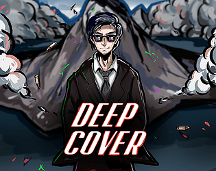
Craft a clever cover stories while playing as the world's most charismatic super spy!
Visual Novel
Play in browser


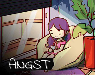
Help a socially anxious lady to make it through the day at her office job by fighting her inner demons
Adventure
Play in browser
Oct '19 - Unity - 3D Action Platformer - Ludum Dare 45 Game Jam
Action
Play in browser
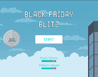
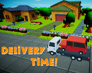
Black Friday, Carvana's busiest day of the year, is here; are you ready to deliver customer's cars?
Action
Play in browser