
On Sale: GamesAssetsToolsTabletopComics
Indie game storeFree gamesFun gamesHorror games
Game developmentAssetsComics
SalesBundles
Jobs
TagsGame Engines

ConnerKauffman

30
Posts
1
Followers
1
Following
A member registered Apr 16, 2019 · View creator page →

Creator of

Recent community posts

The game is quite simple, but surprisingly a lot of fun! As you stated, you made it in 2 days but I think some time could have been spend in making the boundaries for the height you are allowed to be in. Mainly because that's the way your game applies to the theme, and it feels missing without actually being able to see the border. A checkpoint indication or visual would also have been a great / simple addition.

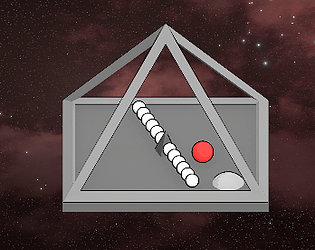
For a game that is mostly white, I actually really like the visuals, especially the vibrant background. It complements the much simpler colors in front quite well, and am actually really curious how you made this.

The gameplay also feels decently smooth!

(1 edit)

Great and polished suika game! The legenda and the setup for the game make the game feel complete. I also disagree with some comments, as dropping the balls randomly did not seem to get anywhere near the tally I would get if I placed the balls strategically. So that seems to be really well balanced.

The graphics are great, but it gets quite hard to distinguish the spheres from another and it gets harder to understand which spheres match. Especially ones the sun is dropped.

Apart from the polished suika game, I do have some issue with the limited shapes constraint. There are definitely only pentagons and circles used, but the actual gameplay is all build around a cube, where the spheres fall into. The UI and everything else works great with the limited shapes, but somehow having the pentagons in this particular setup feels like avoiding the actual limitations of the shapes for the gameplay. 

I was going to suggest having the bases of the pentagons hollow, so that balls can fit into the spaces. I do realise that that might cause the start of the suika game to be repetitive, as all the balls will slide into the pentagon, rather than a sturdy base.

It's a very simple game, but the gameplay works exactly as intended. The gameplay does get extremely stale quick, because there is not much to do besides holding left click and aiming at the targets. I'd suggest ramping up the difficulty or atleast having some extra features to the gameplay. This could be buffs, different types of enemies, etc etc. 

Also, just because you are using GDevelop and I know the pain. I think the game you made would also benefit from some animations or any visuals upgrades, which from my experience is quite hard to do with GDevelop. If you feel comfortable enough, and with the game you have made, I think you could take the leap and expand to some better but perhaps harder software to make the games. Unity is cliche perhaps, but there are so many courses / tutorials online for it that it could be a great stepping stone!

Great work though!

I like the concept of the game, it is very minimalist and it probably could be expanded to be even better! I like that the text is written with circles, but the actual UI panel around it is a rectangle. I'd love to see the ball get faster over time, and perhaps adjust the pentagon movement slightly because once the mouse is turned fully to the right of the pentagon it seemed to mess up the rotation of it, even if you'd release the mouse button and start from the middle with the drag again. perhaps resetting the movement after releasing would be beneficial? Unless this is already a thing and I missed something.

The sound really fits the game!

As you have stated, it for sure still feels like a test. I do like the movement mechanics, as it feels quite innovative. I am unsure whether it works as well for this particular game, as moving the pentagon already takes significant amount of focus. Perhaps you should be able to move and shoot at the same time? 

The game is super cute! It's fun once you fully understand how the game works. As everyone else has commented, the game would benefit from a simple tutorial.

I especially like that the visuals all include only the allowed circles and pentagons, and that it somehow does not feel like the shapes were limited for this game. 

The audio also matches the cute artstyle and make the game feel relatively polished for such a short development time. However I am a bit stuck on whether the music matches the gameplay, as the gameplay feels more intense than the music is. So the sound is both well picked and a bit off.

Good stuff!

Its not the genre games I would usually go for, but it suprisingly had me hooked for some time. I especially liked the little loading animation will all the circle popping up. The color palette was a bit too 'wavy' for my liking, even though it is a busy background it did not really distract so that was nicely done!

Gameplay wise it was really smooth, it seemed super polished. The addition of the cosmetics made me laugh a bit as well. However, I was wondering if all the circles that pop out are actually on the right beat of the song, as a few of them felt a bit off or felt like they were added in between.

(1 edit)

I think a little explanation on how the game works in the description would have made the experience 10x better. I had to turn to the comments to understand the lever.

I think the graphics are actually quite cute, and the game is pretty fun!

I do have some feedback on it:

  • The camera can get stuck to be outside the player range (no clue how I managed it). It is probably because the camera follows the mouse rather than the player. Though this makes the grapple feel more natural, as the cursor is the trajectory of the grapple, I think smoothening this out a little bit to atleast stay within the bounds of the player would give a better feel to the game
  • I think you really incorporated the limited shapes well, especially in your character design. But the theme was missing for me, I did not really feel any limited space throughout the game.

Awesome game nonetheless, I like that the visuals feel very handcrafted!

Incredible use of the shapes to create that many variations to the buildings! The game is suprisingly addictive as well. As mentioned by the others, the WASD control for the world is a bit counter intuitive and click and drag would have been a more intuitive option. However, you get the hang of the WASD controls quite quickly.

Also, this might just be my mistake, but does the festival building actually produce chill? I placed about 4 of them and the chill stayed at .1. Perhaps some other variables caused this, but I had no clue what to do to get the chill up after the third tier of buildings.

Finally, the building options eventually fill nearly half the screen. A dropdown menu would have greatly helped with the vision in the later stages!

Amazing take on the theme though, the space to place buildings feels SUPER limited once you reach the bigger buildings. So you absolutely nailed the theme. It is also quite fun to fully playthrough!

Bonus points for that introduction!

Honestly really happy that people are saying that the graphics stand out, with my personal unreleased projects the graphics are my main pain in the butt. 

Thank you for the review!

I was originally going to make more levels and have a system where harder levels would show up at higher scores. But I decided to spend my time elsewhere, so its currently just 5 levels and completely random which one shows up.

(1 edit)

The visuals are amazingly simplistic yet really pretty, the sound also really fits to the concept of the game. It gives some proper arcade vibes. I do wish there was some way of turning the volume down, because it was quite loud.

The idea for the theme was really well implemented. I do notice a tiny bug, where if you use your scroll-wheel to place all the balls, the score goes all the way up as it does not check if they are in bounce or not.  Which led to my incredible highscore of 56.

Great submission!

Visually, the game has some strange resolutions. For instance the main menu and UI text is super vague and pixelated compared to the actual player and obstacles / platforms. Perhaps you can adjust some settings on your images in Godot (I have only ever used Unity). The gameplay is really smooth tho, and the levels are quite creative! For the specific level with the 'fake platforms', with the walls closing in fast this particular level is more trial-and-error and hope for the best, which is a bit out of touch for the platformer concept it has.

The UI for the fps should also not be parented to your game-object as it currently flies above the screen if your player jumps. While playing I loved the music because I was thinking that you recorded yourself playing the piano, but you credited the sounds from some other place. The concept fits the theme quite well, and great use of the limited shapes.

Finally, your game icon on itch is probably the most appealing of the bunch! great job on that, really grabs the itch.io scroller to play your game.

You could give Chrome a try!

I am using Chrome, and it seems to work perfectly fine. What web browsers are you on?

Thank you! I will definitely take into account a quick restart button if I ever make something close to this again. As well as letting someone else playtest the game before I release it, as a lot of people are having difficulty with the sensitivity. Either I have played it way too much during playtesting or I have REALLY steady hands.

This game feels so polished and properly made. The UI is absolutely incredible and fits the game really well. The soundtrack playing gives me exactly the island feel, which is what the tiles represent (to me). 

I do have a question, is the game quality worse on the Web build compared to your Unity view? as the screenshots have a clear outline and the quality just seems a tiny bit off on this web version. (Mainly the outlines seem pixelated).

The visuals and gameplay feel so natural, that you completely forget about the Limited Shapes constraint. I think for the theme and visuals its a perfect execution.

The sound is quite appealing as well because it has the 'board game' type feel, which matches the aesthetic.

I'd love to give feedback, but there just isn't anything that should have been done differently. Really strong game!

I think that last minute design switch to this toon-style really worked out well! The gameplay is simple, but relatively hard with the wide turning angle. Forcing the player to reach the top of these flipped around pyramids is also a great design choice, as it makes it harder to dodge your own trail!

I think that the game would have worked out a bit better if the platform was smaller, as the scaling for the trail takes a bit of time before it actually reaches a point where you can't just make a loop and collect the object (not sure what to call it), which dodges the entire TRON concept.

Cool concept for this specific game jam! Fits the theme really well and is original!

Well your game does look fun, I think people playing the games made here is also not necesarrily about rating the games. But there are just so many games that player attentionspans are even shorter than what they usually are.  I love Idle games, but part of that fun is playing for longer periods which I think is hard for a gamejam.

(1 edit)

For a game jam, a game without a win / lose condition really makes it stand out (atleast I couldnt find them). Feels like a really cool version of cookie clicker, with additions to fit the theme.

Visually it is incredible, and I really have to give credit for making a tileable pentagon game, because that seemed impossible when the limited shapes were released. I do think that the game accidentally allows for other shapes to form than allowed, though it does not bother me as the game itself, and the placingsystem, is stunning.

Personally, I do think the game would have worked a little bit better if there was some sort of win / lose condition, as a sandboxing game is quite hard to properly experience with the limited time people will rate the game. 

You have got to be proud of this, because it looks really really good.

If the balancing is fixed it would probably be super fun. I'd say committing to making this game a full game is purely up to you and your ambitions. 

I was debating this, but I could not make a proper background with the limited shapes, it all made it look quite flat. I had a great cartoony image of a shaded cloud, but trying to make that fit the limited shapes theme made it worse than the starry background.

This is a great puzzle game, the difficulty scale is on point. The final level took me 11 minutes. I also really like that a tutorial was added to the game, as the rules of the puzzles would be quite confusing otherwise.

The game feels super polished and unique given the limited shapes and theme. 

Extremely polished! The fact you have to position yourself to hit the boss with its own projectiles is really unique and made it quite hard to survive!

I especially enjoy the visuals, like the attacks from the purple pentagon.

This is so super polished! Would have loved this back in school during computer lab sessions. The actual WAZXD controls are super hard to survive, but make it super unique! 

The theme and limited shpaes constraint are also properly met!

(1 edit)

I have no clue how you managed to make such a beautifully looking game with the limited shapes, incredible job! Gameplay is fun too, especially that it is quite challenging (atleast for me).

For the sound tho, the sound for the ray that is cast on the pyramid had the equivalent effect on me as putting chalk across a schoolboard. The 'whoosh' sound made up for it though!

Also, I only ever managed to survive with 8 pyramids collected, but I must have missed 2 and the shield-circle, after I had missed the two pyramids, went into a desert without anything there. I think this goes on endlessly so the game does not end.

Probably the best visuals out of any of the games!

It looks incredible! I saw the discord progress video and thought "what is the gameplay for this?", but its actually really well executed. I also like that the different sizes were incorporated, it seemed like (not sure though) that specific sizes were only allowed to park in specific spots, else you got deducted points.

As the other comments are saying, would have probably chosen a different button for the reverse, as its not really intuitive.

Great game, and especially really well done on the theme!

I love the way the limited shapes are incorporated in this! Seems like there are multiple strategies to this as well! The scaling might be a little off though, as I played for 20-ish minutes and at that point I could not really die or spend the resources.

Spend so much time playtesting I probably got a bit too used to the controls. Did not really take that into account. Thank you though!