

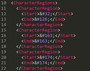
Wym? Does Notepad say "file cannot be opened" or something like that? When I made this game I was still using Windows 10 and it was fine, my best guess is they "updated" Notepad again and made it worse. Well you can always edit in a different text editor, or edit .txt files and then "save as" and change the file ending to .hi216. They're just basic TXT files with a different file extension to seem fancy.
A member registered Aug 25, 2016 · View creator page →
Creator of
A simple optimized "notes" app for speedrunning Slice of Sea
Run in browser
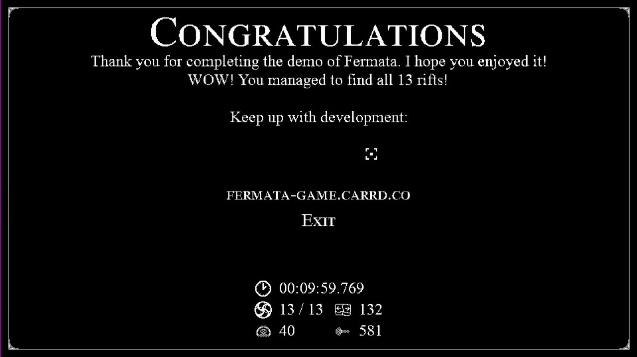
Can you restore your memories and find your tear archive?
Puzzle
Play in browser
A short point and click adventure. Can you break the loop?
Puzzle
Play in browser
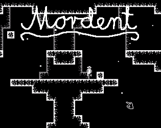
Explore a bleak ancient world in the most minimalist metroidvania
Adventure
Play in browser
Endless randomly generated game titles! Fully customisable!
Run in browser
A more efficient keyboard layout, optimized for multiple European languages

And you will kill and eat and thirst and consume and write and learn and embody like a human being of eight legs.
Interactive Fiction
Play in browser
A very simple programming language for various mathematical functions!
Puzzle
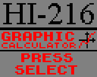
I made a buttload of fictional cartridges.


Alphaesque Resourcepack for Minecraft
the clock is ticking, the world is ending. the end is nigh and nobody cares. welcome home.
Survival
The only way to pass the school year is to enter the Greenes' abandoned house...
Adventure
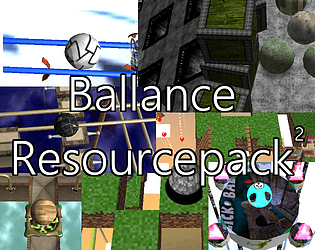
A pack of resourcepacks for the 2004 Atari game Ballance.
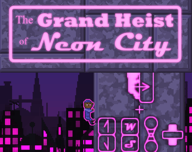
Turn on the 4 main systems and escape from Planet EQ-48 while keeping the core alive!
Action

Recent community posts
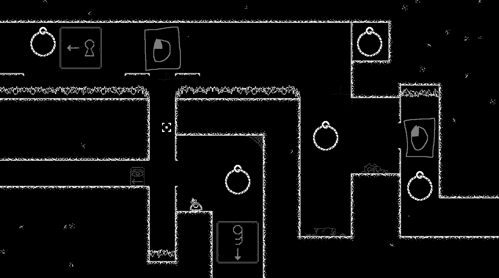
Huh, I didn't think that part would be *that* confusing, since there's no other possible explanation. Do you think a sign showing the crosshair moving up would help?
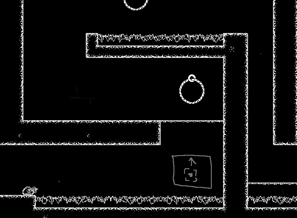
Also, what do you think about the sign in this room? Should I add a second sign at the first part:
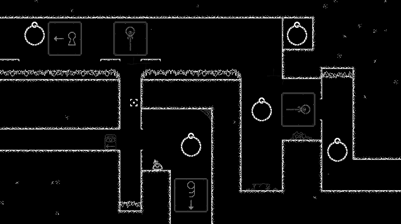
Or maybe change them to mouse button signs?