
Indie game storeFree gamesFun gamesHorror games
Game developmentAssetsComics
SalesBundles
Jobs
TagsGame Engines

Which Frost Icon Reads Better?

A topic by Hasthoth created 8 days ago Views: 115 Replies: 11
Viewing posts 1 to 7

I’m currently refining some frost/snowflake icons for a neon pixel UI pack.
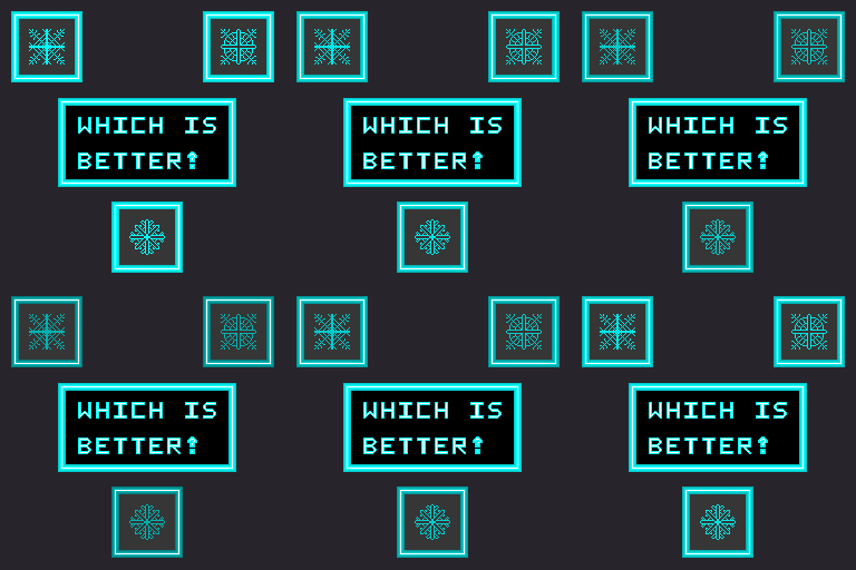
Trying to improve:

  • readability at small sizes
  • silhouette recognition
  • overall cyber/frost aesthetic

Which one reads best as “ice/frost” to you?

Also open to feedback on shape language or details I could improve.

Moderator moved this topic to 2D Art
Moderator(+1)

(moved to the right category)

Thank you! 👀

(+1)

I like the bottom one. The top right can be read as a wheel and the top left can be read as a spider web, but the bottom one clearly looks like a snowflake to me.

That’s actually really helpful feedback, thank you!

The readability/silhouette is exactly what I’m trying to improve, so it’s interesting hearing how each one gets interpreted differently

(+1)

Your style looks clean and properly feels neon. But I think the 4 or 8 symmetry doesn't feel icy because the popular ice representation has 6 branches.

That’s actually a really good point 

I didn’t realize how strongly the 6-branch structure affects the immediate “icy” readability until people started pointing it out. Really helpful feedback, thanks!

(+1)

Top left. That one reads as a snowflake. The right and bottom look only like Medieval decorations to me.

(+1)

I’d like to add: all three are pretty!

That’s actually pretty interesting 

I didn’t expect the more stylized ones to start feeling more like medieval decorations/symbols instead of frost lol Some people even said they looked like runes hahaha

Still really helpful feedback though, and thanks! Glad you liked all three 

(+1)

For me, top left is frost icon. Top right looks like plant while the bottom one looks like medieval symbol or tools.

That’s actually pretty interesting 

It’s funny seeing how the more stylized/geometric ones end up getting interpreted in completely different ways hahaha

Really helpful feedback though. I’m starting to realize how much the silhouette and branch structure affect the “icy” readability.