Play game
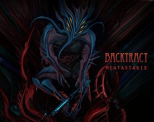
Backtract: Meatastasis Prologue's itch.io pageResults
| Criteria | Rank | Score* | Raw Score |
| Peoples Choice | #15 | 3.294 | 3.294 |
Ranked from 17 ratings. Score is adjusted from raw score by the median number of ratings per game in the jam.
Game Name
Backtract: Meatastatis Prologue
Engine Used
Unreal Engine
Leave a comment
Log in with itch.io to leave a comment.


Comments
I liked the graphics but I didn't know the controls and couldn't find where to go.
Cool looking game but my motion sick brain can't handle it.
fantastic atmosphere, bio horror, brutalist architecture and creepy ambiance are all things i really enjoy in a game, incredibly well done, the feeling of the crushing darkness and the breathing walls were all awesome, my only gripes were small, when in the maze, i didn't like it when a dialogue screen opened up 10 times, just have it pop up once and then never again. some of the audio loops didnt loop perfectly so there were moments when they would cut out. and the ending, whilst being good, i think fell a bit flat from the rest of the games atmosphere and story. despite those small issues, very well done.
I played a little bit of this and i have some notes! Firstly, the visual design. Whatever effect you have where the textures of stuff changes based on how close you are is genuinely amazing and it makes it seem as if the walls are shifting. As well as that, the lighting and environment design is genuinely beautiful. It's very attractive and i think it is this game's biggest strength. The music also sounds great even though it sometimes feels like it's trying to tell me how to feel rather than complimenting my feels.
I really like the lack of instructions because it really adds to the feel of the game but i struggled to find a goal after the light and got kinda lost. As well as that, this game has a lot of tell instead of show which drags me out of the experience a little. Scary mysterious games like this really benefit from strong sound design and something like echoey footsteps emphasizing the loneliness of the world would really add to the world. The jump sound effect felt a bit abrupt and i think it could have been replaced with like a wind sound effect to show the wind passing by you as you float would've really made a big difference.
Either way, your work here is incredible, I can't wait to see what you guys do.
honestly, I did not play much of this game. I can tell it is a great game, well put together and it looks like you got exactly what you were aiming for. the atmosphere was perfect. And that is why I could only play a little. I was too afraid to continue 😅
Firstly, this is a truly unique and interesting setting, especially since it was made in only two weeks, fantastic work by the team! I can sort of see it relating to the theme, but to be honest I found it very hard to play enough of before I had to stop. I got the light and the artefact but it was so oppressively dark that it went beyond atmosphere and into unplayable. From what I could see it looked interesting and ambitious, but yeah I just couldn't see the walls in front of me until I was touching them.
If you update it or do a lighting pass, I would love to see the rest of it, really good job creating something so unique in aesthetic and grand in scale, you could be proud! :)
Hello, thank you for feedback.
Could you describe in what section of the map did you struggle to navigate? Is this the 2nd maze section is that correct?
The environment design and atmosphere is impressive, the horror feels is really through out.
I really like the visuals of this game, and it's quite atmospheric. It is a little difficult to figure out the intended direction and I don't really see the connection to theme, but I like the style!
I can't stress enough how much I love the visuals! I spent a lot of time looking at the details of the world: the effective lighting, the particle effects, the pixels changing depending on distance, etc.
I love how the controls feel; the controls felt responsive, vertical movement felt great and the camera sway when sprinting elevates that sense of unease that the overall atmosphere and environment brings along with it. I'd really love to see where this goes next.
Game Looks Cool!
Truly impressive atmosphere and presentation. Those piano melodies hit wonderfully, and the limited colour palette really amplifies the grungy and unsettling darkness. It's fun to explore this oppressive and industrial space, plus the theming with the horror elements is excellent. Though unfortunately, I'm not sure how to progress through the dark corridor after obtaining the light source. None of the mouse buttons seem to do anything. I'd love to explore more of the game.
Not sure if I exactly see the trash theme represented, but this is a great submission nonetheless.
The light source saber thing can be activated by pressing 1. At the end of the big corridor there's a big vent in the ceiling that you can fly up towards by holding space. Hope this helps!
Thank you Dennis!
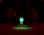
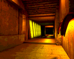
To progress you are supposed to go up the dimly lit green corridor (it's located on the left hand side from the Stunbaton-torch stand) which will get you back in the main corridor. After that try to progress down the air vent.
Our team had a bit of different approach of "Trash" interpretation and it's mostly represented through the emotional and physical experiences of our main character.
Managed to reach the ending! Took me a while to realise that the glowing particles were highlighting movable walls (thought they were pointing to vents in the ceiling at first) but I loved the environment design and ambient synth soundtrack.
That's great to hear that you managed to experience it.
I agree, we should've put better indications of what the player was supposed to do after artifact pickup.
The atmosphere and the environment was well thought out, i just wish there were some indicators in the game on what button you should press, instead of coming to look for the control on the game's page, but overall well done
Love the atmosphere!