Indie game storeFree gamesFun gamesHorror games
Game developmentAssetsComics
SalesBundles
Jobs
Tags

Modified game jam banners

A topic by Xom Adept created Apr 04, 2021 Views: 312 Replies: 13
Viewing posts 1 to 10

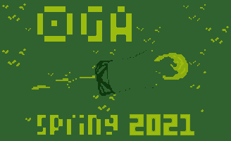
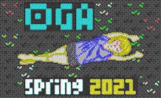
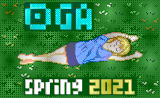
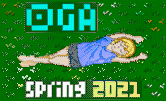
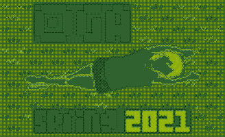
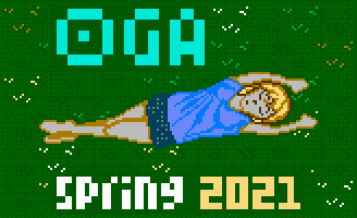
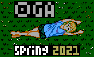
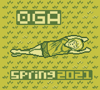
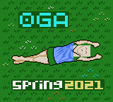
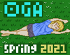
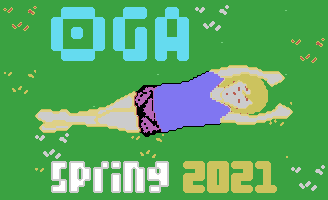
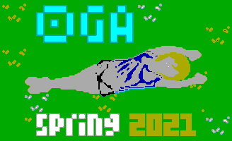
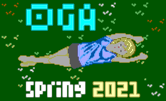
Like for previous game jams (Summer 2020, Fall 2020...), here are some different versions of the banner, with other color palettes.

Here is the Apple II version :

The MSX version :

The ZX Spectrum version :

The Master System version :

The NES version :

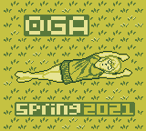
The Game Boy version :


Here is how to do this with GIMP (I learnt it yesterday).

1) Downloaded GIMP palettes from here :
https://github.com/denilsonsa/gimp-palettes/tree/master/palettes

2) Put them in the palettes folder.
If you do not know what this folder is, open GIMP then go to Edit -> Preferences -> Folders -> Palettes.

On Linux, with GIMP 2.10, I can tell you the default path is : /home/userName/.config/GIMP/2.10/palettes

3) Open GIMP, open the image you want to modify.

4) Go the menu : Image -> Mode -> Indexed.

5) Select "Use custom palette", then select the palette you want to use. Click on the "convert" button.

Submitted

Always nice to see variations of the OGA Banner. :)  You might want to check your settings though, as some details have been lost with the conversions, especially the Gameboy one.

Yes, the quality is not very good. withthelove's tool seems to be better for this.

I guess the problem comes from these palettes I downloaded, not from GIMP's settings, but I will check these settings anyway.

I see what is wrong. Maybe I should have used "dithering"

I will try it tomorrow.

Dithering worked well. Thanks, chasers, I would not have thought about it if you didn't talk about "settings".

Here are the corrected banners (the Game Boy version remains the least good, in my opinion).

Apple II :

MSX :

ZX Spectrum :

Master System :

NES :

Game Boy :

(4 edits)

I tried converting them using SLK_img2pixel. I’m not a pixel artist, so I don’t now how good (or bad) they turned out (All 2x original size):

Game Boy:

Apple II:

MSX:

ZX Spectrum:

Nes:

Master Sytem:

I haven’t added too much dithering, since I think it makes the images a bit too noisy.

It is not "needed". Actually, we do this mostly for fun, and in case somebody makes a game with a NES / Master System / GameBoy... graphics style.

So do the others only if you enjoy making them :-)

By the way, your tool seems very interesting. I have downloaded it and I will test it on a Windows PC when I have the time (it seems much easier to use on Windows than on Linux).

Yeah, I expressed that badly, I meant ‘want’ rather than ‘need’.

I’ve added the other versions to my previous post btw.

Great, thanks.

Your GameBoy version is much better than mine.

I would say your best image is the MSX version.

Deleted post

Yes, from all my versions, the Apple II is my favorite too.

(1 edit)

My take on it so far.

The fonts are recreated and the pants use line dithering.

And it has different  resolution (fullscreen; 160x144).


EDIT:

Improved version:

And Game Boy Color (split into background and sprites; background maxed out at 8 palettes)


Nice. This is the best Game Boy image here :-)