Play game
sewer scamper's itch.io pageResults
| Criteria | Rank | Score* | Raw Score |
| Engagement | #508 | 2.453 | 3.167 |
| Creative use of art assets | #560 | 2.324 | 3.000 |
| Overall | #570 | 2.238 | 2.889 |
| Overall polish | #588 | 1.936 | 2.500 |
Ranked from 6 ratings. Score is adjusted from raw score by the median number of ratings per game in the jam.
Leave a comment
Log in with itch.io to leave a comment.


Comments
Player is suppost to move? I cannot find the key to play, only work space and "J", could be a bug? I try to play it at fullscreen.
Hi, yes, I am sorry about that bug and am currently fixing it. I made the game's canvas scale incorrectly, so depending on the resolution of your screen, it won't load everything. It is "Tab" key to start.
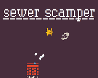
Hi! I liked the idea that the fish bounces back and can hurt you (and also: it is a FISH!). I also like the aesthetics. The red bricks look cool with the green grass, the everything that can hurt you is white (including the fish) and only the player character is yellow, which helps focusing on it. At first I did not know I had to collect food (but maybe it was there and I just missed it), maybe you can have a counter on the user interface to make it more evident. Also, the key use was a bit odd to me. Jumping with space is fine, but then I would have used Alt of maybe Ctrl for the fish throwing.
Hi! I liked the idea that the fish bounces back and can hurt you (and also: it is a FISH!). I also like the aesthetics. The red bricks look cool with the green grass, the everything that can hurt you is white (including the fish) and only the player character is yellow, which helps focusing on it. At first I did not know I had to collect food (but maybe it was there and I just missed it), maybe you can have a counter on the user interface to make it more evident. Also, the key use was a bit odd to me. Jumping with space is fine, but then I would have used Alt of maybe Ctrl for the fish throwing.
This was fun to play! I really liked how the projectiles bounced off the obstacles after destroying them. It really added another dimension to the game as I had to anticipate this, look ahead and plan what the best time was to shoot. I also liked how there were sometimes two possible routes through some parts of the game. You could make one mistake and drop to a lower level instead of instantly dying. The checkpoints were a nice touch of polish too.
Feedback:
I think it was possible to jump over the checkpoints and miss them, it would have been better if they were still triggered even if you jumped over them. Also some feedback when doing this would have been nice. ("Checkpoint reached" text flashing on the screen or something)
Also, at times the hitboxes felt a bit unfair: A common gamedev tip is to make the hitboxes a little smaller than the visible sprite. This makes the game feel fair as you can brush past enemies/spikes and still not die.
Good job overall and congrats on finishing and releasing your first game :)
Beat it! I agree with the things the other guy said, and I have a few more thoughts to add of my own.
First off, everyone names their game file MizJam1, so if you want to help people find the game in their cluttered download folder, name the file Sewer Scamper. Not a big deal but something to keep in mind for the next game jam!
I occasionally ran into a bug where my fish was thrown diagonally, and it really threw me off when it happened.
Game was a solid entry with a pleasing color palette, I liked the red especially (btw did you get that background color from a template or something? I've seen so many games with that same color background)
I appreciate you playing and leaving a comment! Smart call with naming . Naming the file as the title of the game just looks more professional, too. And yeah, some of the physics are wonky. As for the maroon color - one of the sprites was just an empty square of that color, so I just put it on a Game Object and used it as the background.
I realize after leaving the comment that it was the color scheme given by the art pack, I'm dumb. I only used the white monochrome version with no background so I didn't realize at first
Fun little platformer with some Geometry Dash style gameplay going on. I found myself jumping over my own bouncing projectile twice, which was quite fun. Could use some SFX work, and also (nitpicking here) some of the tiles didn't have a transparent background which makes the game feel less polished
Thank you for playing!! Totally agree, the game could use sound. And yep, I imported the tiles wrong and just said "screw it, that's fine" haha.