Play game
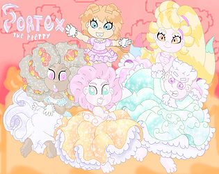
Vortex The Pretty MGGJ Edition's itch.io pageResults
Criteria | Rank | Score* | Raw Score |
Originality/Creativity | #20 | 3.618 | 4.000 |
Magical Girl Concept | #31 | 3.317 | 3.667 |
Overall | #34 | 2.874 | 3.178 |
Engagement/Fun | #38 | 2.312 | 2.556 |
Theme Interpretation | #38 | 2.613 | 2.889 |
Graphics, Audio, and Polish | #40 | 2.513 | 2.778 |
Ranked from 9 ratings. Score is adjusted from raw score by the median number of ratings per game in the jam.
How does your game fit the Magical Girl Genre?
Yes, twirling is my character's power, the enemy which is also a magical girl created the world you play in
Which theme(s) do you pick?
Atomic
How does your game fit the theme(s)?
The world's existence is based on the menipulation of atoms
Are all your graphics assets made by yourself during the duration of the jam?
No
some of them we made them before the jam
Are all your audio assets made by yourself during the duration of the jam?
No
some of them we made them before the jam
Leave a comment
Log in with itch.io to leave a comment.
Comments
So I manage to find some time to try out this game and wow, this concept is pretty unique in its way and surprisingly its built using the Panda3D framework which is kind of a niche game engine as an entry for this game jam besides the MegaZeux ones.
So I tried the game and I like the idea of how the twirling mechanic maintains a force on that keeps the player character on a sloped surface without falling off. The game has quite a steep learning curve due to the bunch of buttons at the player disposal which confuses me at first but I got around it by trying out each key on my own and discovering that its basically made up of two sets of keys, with one controlling character movement relative to the camera direction, and the other sets is for the camera orbit/zoom controls. Somehow the jump and twirl button is grouped with the camera controls which is not a big deal but I notice that the arrow keys were not present as part of the UI which only shows the camera controls. I didn't get to read the instructions in the comments below (due to spoilers) or on the page (the yellow text blends in with the wallpaper making it hard to read). I was assuming there were UI hint for the character movement in the game but unfortunately there isn't any in the game.
So my suggestion for control key is that would it be possible to shift the camera rotation/zoom controls to the mouse instead? I'm not familiar how Panda3D handles the control system but it would be easy to pick up the game with mouse movement controlling the camera direction, which help with pointing the character direction as well. Besides that, I notice how the character movement is different when twirling on a vertical wall and on the horizontal surface. The former feels right since the left and right arrow key moves the character horizontally and the up/down moves vertically. Where as the later seems have the character strafe around the camera point, making the character move around the camera. Obviously I could rotate the camera in that direction but notice that strafe is tied to the camera origin point and is not actually a linear strafe. Its a common issue in early 3D adventure games where navigating the character to a transition point to the next scene with the camera angle at a different configuration screws up the character relative bearings to the camera direction. One way to resolve this is to have the camera strafe along with the character so the camera doesn't rotate in any way and maintains distance to the character. One other controller suggestion is that since the twirl is pretty much used through out the entire game, it would make more sense if there is a switch on/off state button rather than holding down the twirl button for long periods of time. This way players could turn on or off twirl and would have a free finger for the camera controls.
Besides that, basically the game has good ground work here and the mechanics is fun to play around with. Since the game starts off with a mission, an indicator of where to go would be nice since I do know I have to collect 4 bells from the first cut scene but since I'm not familiar with the terrain or how the bell looks so I was a little clueless at finding it. There was one near the start point but it looked like a rock at first and there wasn't any indicator that I actually picked up a bell. Maybe something to highlight it or a UI prompt saying I picked up a bell?
Anyway, I can see you have put in a lot of good effort in the level design and populating it with tons of fun models so do keep up the good work and keep on developing the game. Hopefully my suggestion could help improve the UI/UX side of the game since it vital when new players are exposed to a game with a niche concept. By the way, I only notice the walkthrough and other stuff you post down in the comments after trying out the game.
Thank you for your time, I will consider your comments, yeah others have said the UI is not that good, and to be truthful, it is not really finished by a long shot, the controls are that way because I play mostly console games, so the controls reflect that with the keyboard acting like a big arcade pad, but I really need to consider the PC controls though, I do have a key remapper for this issue since someone in the Panda3d forums pointed this out and offered a fix there, but I didn't have enough time to put it back into the game, sorry about that, it will be in the full preview released later this summer
Panda3D does feature mouse inputing, however I work on a laptop, so it is difficult if not impossible for me to work and test on such a feature, my apologies for that. I will fix the game page now though, maybe I went a little too overboard with the style heh heh, sorry. I did get another comment about controls hints, and I am working on trying the fix for that now, you should see a way better UI in the full preview in the summer.
Your camera locking idea seems like a nice one, but I am worried that it might strip the "freedom" feel from a already limited experience, sorry I could never get natural transitions from floor to wall or wall to ceiling right, and is still a issue I wrestle with whenever I revisit it. but thank you for giving me something to think about, I will add that all the mini games are supposed to provide replay value though, a cheap trick by me for people to master the controls, so they are not meant to be completed by beginners and require seasoned experience, since it is the secret ending that it leads to, so camera balancing while moving on the wall was all considered.
I did later realize this couple of weeks later that replay value like that would be bad because it is a game jam (short free time for playing because of multiple entries) , so for the sake of the jam I did provide a walkthrough for people to rate the content and skip the work, I apologize for this.
I am sorry for the bell issue, the whole bell quest was made, planned and completed 1 day before the deadline, I had actually planned on having a UI arrow always point towards the next bell but had to drop it because I didn't have enough time. there was also supposed to be a stamina limit for twirling, but I didn't have enough time to put it back in, anyway much thanks for the feedback, it is really helpful since I am working on the game right now.
Hi Jnpicklee, thanks for your reply and informative explanation to my questions.
I do apologize for my ignorance since I have not thought that the controls were built with consoles in mind, this actually made sense then since I assume incorrectly that the game was built with PC controls as it did not feature any gamepad controls. It would be nice to inform in the main page that gamepad controls are recommended so long as you have them in place.
Its good that you are continuing development with the feedback in mind and I can see that you have what it takes to get a good game out with a novel concept. So, I wish you all the best with this current dev and any future developments.
Thank you for your considerate response, it is not ignorance, you had it right, the game (build) you played should have been built for PC controlling but was too rushed, so it is not your fault for pointing that out, my apologies for the confusion, I do believe that the key mapper I had would taken care of gamepad functionality though, but as I have said, it could not be implemented in time. But will include it into the update later
Update: I tweaked the animations to have Vortex spin more naturally, I have also tweak the AI to be slightly better as per a request, A word of warning to those watching the video, the animation for spinning will look different between the video and real gameplay, thank you all for understanding.
Looks like it was a good thing I chose to run this on the macOS side of my computer! Like other reviewers, I recognized the N64 aesthetic and was confused about how to complete my tasks.
After reviewing your video guide, I believe the weakness largely stems from one thing: you need to tell the player how to play the game better. Yes, you do provide the controls both on the itch page and at the beginning of the game and even have a floating reminder diagram throughout the game, but there needs to be more, and better.
One of my biggest epiphanies as a game developer was realizing that in addition to testing my players' skills, I also have to teach them how to play my game. It doesn't matter if it's a familiar genre or style of game; I still need to include a tutorial or guide or SOMETHING that slowly shows the player how the game is played. I know that those overbearing tutorials that basically walk you up to a target and flash a big "press this button now!" sign in your face are not well-regarded by players, but the reason they exist and keep appearing in games is because they are highly effective at showing the player what they need to do in no uncertain terms. Now I'm not advocating pulling a Final Fantasy 13 and make a game where half of the playtime is in a tutorial setting, but I do think this game would benefit from a few instances of tutorials that show the player how the controls work and how tasks should be completed. If there was an initial tutorial (optional or mandatory, your call) where the game guides the player to collect one item, it would help immensely with players understanding how the game is supposed to work.
This philosophy of teaching the player also extends to helping the player find all of the required items and where those items are placed. Right now the player has to guess where to go and traverse a distance that is long and boring even when flying directly to the destination (as displayed in your video walkthrough). Game worlds don't need to be massive to be fun, and keeping things small makes it easier to polish the world and keep it interesting. If the game world was shrunk by about 50% and the player was given some sort of indicator about where the various collectables are located (be it a map, a radar, a minimap, a waypoint, etc.) the game would be snappier and more enjoyable.
There are some other user interface-related issues that, if remedied, would improve the experience significantly. Dialog text that can be controlled by the player, as well as displaying the text in an easier-to-read format is one improvement. Another is to display the contextual button presses more clearly. I did appreciate that there are "press this button to interact" popups, but I missed them initially because they are so small and blend into the background. Also a sound to indicate that a collectable was picked up would help to make it clear what happened, along with an indicator about how many collectables had been found and still need to be collected.
In summary, this is a good start to a game, but it needs to do a better job of telling the player what needs to be done and what is going on (plus a bit of polish). Good luck on your future endeavors!
thank you, I am working on polishing this game up and including more features right now, the tutorial thing is something I have not thought of though, I mean I get the idea of slowly teaching the player how to play as they are playing and was thinking of simply locking up a lot of the gameplay mechanics and teaching the player them when they get unlocked like Banjo Tooie did,
But, I have actually experimented with a "action button" system in a vary early prototype that behaves similar to the one found in the first 3d zelda games where when the situation comes up the button would have a simple word of what the key would do in that situation, but you are right I completely missed the mark on the user experience, and start focus on it in the near future, I thank you for bringing it to my attention.
Disclaimer: to anyone having trouble playing or just want to watch to see the content, I made a full walkthrough for those interested in this option, it contains both endings and how to get to them if you wish to play the game, the walkthrough can be found in the link below.
Here's my experience with the game
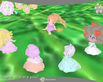
The game looks quite unique, The character has a really interesting design and the environment is pretty surreal.
Now the game start and the cutscene.. is.. idk what’s going on tbh, no idea who’s talking or who I am, and the text cut off at a weird place makes it confusing. But the only thing I get is to collect Bells? I guess.
Now there’s a tutorial pop-up, it just tells you what button do, But I feel info dump, I tried to memorize it but the tutorial disappears before I could. and I can’t open them back up so I just trial and error until I get used to it.
I really like how the character spin looks, It’s pretty nice. and it seems like a nice mechanic.
I don’t like the camera rotation, It’s feel invert of what I used to somehow, And it’s kinda slow
The game started, first I go to the right, there’s a robot that makes me race him, It’s impossible, I keep falling when I tried to spin up and I don’t even know where the goal is, And when I skip the dialogue, The race won’t start so I have to spam S button instead, but spamming it makes me accidentally start the dialogue again even after the race start, now I have to finish the dialogue while the robot now going ahead of me, after many attempts I gave up, and go back to green place(I will call location based on their color from now on)
A look around and found a guy asking to bring his friend there, so I did exactly that. (apparently, this guy said he isn’t foe, which implies he’s supposed to be our foe, this is when I realized the thing walking around the start were supposed to be enemy, I don’t even notice, it’s small and barely posed a threat so I assume it’s some weird environmental NPC or something)
So I scare the “runner” to him and he gives me the gold thing (while I’m doing the quest I also collect silver bells), Which I assume it’s the gold bell. after that nothing anymore happened so I decided to go around collecting the silver bell or whatever
I go to a purple place and collect the silver bell that just lies there.
then I go to a blown place with blue crystal which if I spin into it, would launch me through the floor and makes me fall and die, then I collect the silver bell.
I collected 3 silver bell, which means there’s one left, the robot race!. (I didn’t realize that the robot isn’t the one who will give silver bell, oh well)this time I have to beat him somehow, I can’t run away, Tried it many times, to the point the robot starts glitching that it never reaches its destination, which gives me infinite time.
And then I discover a groundbreaking technique, If you hold W and X when you spin on the wall, You will be stuck on the wall until release. that’s mean no more falling! now the next enemy is the camera, It’s trying to rotate to follow your direction but all it does here is making you unable to see what ahead of you.
After reaching the top the robot seems to stuck with the purple thing, I see the purple bowl from far away, so I glide down and see the platform that leads to the silver bell, I collect it and go to the castle, and the game end there’s an art at the end, it’s okay I think. I not even sure if I’m going to bother getting the secret ending.
Conclusion: this game has a good concept, but it packs with really bad movement and control, The movement doesn’t seem to work as I want most of the time and the camera work against me. I don’t know if most problems have anything to do with the fact that I played it on Window though.
Thank you for your interesting insight, the windows version is vary slow but I am working on a fix as I type this, also you hold "X" key to remain twirling, in this state, you can move up (and stay on) walls or the ceiling, the dialog feature I have to apologize for, it was a vary late cut and paste job from my previous game for the jam and intend on rebuilding it later.
I thought the cutscene feature was ready, but is still not, only found this out vary late into jam so, I did simple tricks to make it functional, it's not pretty but functional, I apologize for that, and my apologies again for the bad collision, I would have put more work into it but I ran out of time.
You choose weather to pursue silver bells or go after the objects the other girls are trapped in, however the silver bells are in plain sight on purpose to deter away from the other objects, as the silver bell ending is the bad one, You were actually on your way to the secret ending by getting the gold bell.
Which was the first step, beating the "robot"jellyfish's race would have been the 2nd step, while the 3rd is another mini game on top of the tree stump in the "silicon forest" (or the area in the back with the sapphires)
I guess I only discover about staying on the wall through holding W and X is because holding W is the only way is make the camera stay where I prefer when I try to go through that part.
That would make sense because you are ascending up, W positions the camera to be close to you on the side you (not above or below), now thinking about it, the mini game is unfair as it expects you know how to move on walls decently, but also when you reach the end you are expected to "Twirl Dive" into the rose awaiting you at the top before the jelly fish reaches it.
I did edit the game page to include the controls if that helps, but I am also thinking of creating a video walkthrough of the game to see if that helps, I mean I could also slow down the jellyfish, but that would be tweaking the game, and I only want to tweak the game if a technical issue arises, but if this is a enough of a problem to enough people, I will be willing to consider it a technical issue ;)
This is a really interesting world you've created! Gives me big Mario 64 vibes, but with a surreal twist that makes the whole thing feel very unique. There's a doll-like appearance to the characters that definitely stands out from other games I've played.
I like the saw mechanic and the platforming challenges, though I did find it fairly difficult. I'm playing on Windows though, so I'm getting the speed issue others are having.
I hope you get the windows version running a little smoother, as I'd like to give it another try at the intended speed!
thanks, I was going for a Alice in Wonderland feeling (or Coraline to be accurate) so I am grateful you enjoyed it, I am still looking into the windows issue though, I know it's something with collisions not the graphics, but I will definitely let you know if I fix it, thank you for your interest.
Update: I manage to fix the windows version, except the speed, so you can now play it to both endings and the graphics are restored, I am still working on a fix for the speed, let's hope it can be done, thanks everyone for your understanding!
Critical Update: the windows version has just been pulled, I found out it was more then slow, it was not functional, plus all the shaders did not work, so it look like a ms-paint drawings (the environments), I am currently investigating the issues right nowt, so I hopefully can have the windows version re-uploaded soon, thank you for your understanding and I apologize the troubles.
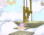
I enjoyed exploring the area that I was able to get to easily. The game has a visual style that evokes N64 with its low rez stretched textures. But running in a modern high rez screen lends a uniquely bizarre quality to it. I really liked it exploring because of this.
Due to my being on a Windows, as mentioned in other comments here the framerate felt sluggish. The platforming itself was too hard for me to do, possibly linked to the performance, but also in part due to the awkward control scheme.
That said I was content to explore the world and soak in its strange ambience for a time.
Thanks, I have to apologize to you, I just tested the windows version today with bootcamp, it is not functional, shaders don't work and it runs half the speed at 14fps, once again thank you for playing.
Edit: the windows version is updated to function, the speed issue still persists though.
Disclaimer: the theme of the game is not shown in the standard ending of the game, instead it's in the secret, to get the secret ending, ignore the mother's silver bell hunt, and go help dust bunny in back of the castle for the gold bell, play the jellyfish's race in the sky area and race up the structure and grab the lavender rose before he does.
play and win the silicon plant bros's shuffle game at the top of the tree stump in the silicon forest area, then head back into the castle for the secret ending.
I always love seeing odd frameworks and in-house tech. I'd actually never heard of Panda3D before.
I'm personally not a fan of the style- I found the characters pretty ugly and the environment not much better. But it's clear that a lot of thought and effort went into the modeling, and the animations are smooth and appealing.
The intro cutscene was cool, and does a pretty good job as a hook. I did find it hard to tell who was talking, though, and some of the text was cut off.
How complete did you consider this project? It feels maybe halfway to me. There are a lot of interesting movement mechanics to try, a decent section of world, but also it seems some of the interactions aren't working and it's unclear where to go once you're dropped into the world. I did have fun tooling around and playing with stuff, though.
I found it really awkward to play for a few reasons. The movement mechanics are super cool when they work, but I often found myself drifting in random directions, just not stopping, or getting stuck in one mode or another. It's really hard to judge depth for some reason, which makes platforming sections difficult. I also found the controls awkward, but I think with time I would have gotten used to it a bit more.
The game runs horribly on my machine, although I understand it's a known issue (Windows user here).
Finally, is that the presidential seal hidden (?) in the map?
Interesting insight, to be blunt this was a rush job for the jam, a lot of code and unused assets were taken from my other project Whilrigig Willies, and I say a lot and not all because I was rebuilding Whirligig Willies back into a cute girl game (it was one before, but 2020 reasons for changing it), so all of the features were rebuilds (not copy pastes) of ones from whirligig willies.
I had just done the movement and action mechanics by the time the jam started. so I started work on the rebuilds of the cutscene and mini-game features, sadly half the jam was finished by the time I got done, I had to port in a few simple features, but some major ones did not make it back because I did not have enough time, like boss fights, the hud (with stamina), and customizable controls.
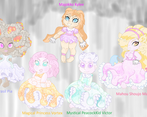
When you say the characters are ugly you mean the princess girls right? because everything else including the short skirt magical girl is supposed to look strange on purpose, the world's graphics use simple normal mapping created from blender's texture displacement module, it is actually my first time using normal maps outside of vary simple tests, not bad for a first try?
The cutscene feature was a rebuild of the cutscene feature found in my whirligig willies project which was meant to have voice acting so it is still not fully developed, the project would be in it's 2nd alpha stage once all the feature rebuilding is completed, so less then half way. What modes are you getting stuck on though? and what do you mean by drifting? like moving while standing? hmm I thought I had the gameplay mechanics on lock, anyway the movement while standing is a issue I am still addressing.
The depth? which direction? if down, maybe I can add a shadow to help the player, so the controls, if you noticed in the instruction image, there is no single key explained as that key for that feature, instead you have the key map on the upper right corner being explained on what each of the keys does, this is because you were able to customize the controls, but the module was not implemented because time constraints, I apologize for that.
Once again apologies for the windows version, now did you not enter the castle? just walk and try to run into the front door, you will be warped into the castle, the castle's floor is a replica of the president's office floor which you get a hint why if you get the secret ending, I should put a disclaimer that the game's theme is also revealed in the secret ending and not standard.
Pretty much every game I made is at least partially recycled from old bits and pieces; I've used the same set of sounds for female player characters since Tactical Weapons And Tactics.
I don't find the characters badly made, more just not a style I like and maybe a little uncanny valley as well. Frankly, I'm not sure what they're supposed to be and it creeps me out a little.
One of these days I'd love to do another game with voice acting- it's like an instant +10 to production value- but the logistics of it have been too daunting for most of my projects.
I tried to go up a wall in spinning mode, and it worked for a bit and then I couldn't go any further and fell back down (this might have been by design). When I fell onto the ramp I got kinda stuck in that mode and stuck in the ramp for a bit, I think I jumped off and that put things back to normal. The next time I tried, I went up and to one side and just kind of kept going until I came back down a fair deal away and fell out of the map.
I think the place where the lack of depth was most problematic was the series of platforms near the start of the map. It was very difficult to judge how far apart they were and how far I needed to jump. It could be a lack of shadows, but I think there were early 3D games without shadows that played okay so I'm not sure.
I was able to warp into the castle once but couldn't get out and couldn't figure out what to do from there. On my next run I avoided it like the plague.
EDIT: I had to take down my original response because everything you just said I just found why was happening when I installed bootcamp, the version you have is non functional, the shaders don't work, so everything except the characters look like ms-paint job, and it runs at half speed, I will say my apologies to you for having to go though with that.
Edit: the windows version is updated to a functional state, though, the speed issue still persist.
The art has a very N64 feel to it, quite nice. Sadly my PC is too potato to run this thing in a good framerate.
if you are using the windows version it is not your fault, my apologies, windows does not do openGL well with Panda3d, There is a SDK with directX thats runs with a full framerate, however there is no runtime builds that I can build a directX executable from, I guess licensing issues.
Edit: you may have experienced more then just speed issues with the windows version, I play it myself and it was not functional and the graphics didn't work, however, today, I updated the windows version to function, but the speed issue is still there.