Play game
Thermophobia's itch.io pageResults
| Criteria | Rank | Score* | Raw Score |
| Community Spirit | #22 | 4.000 | 4.000 |
| Fun | #54 | 3.200 | 3.200 |
| Overall | #64 | 3.450 | 3.450 |
| Use Of Theme | #74 | 3.300 | 3.300 |
| Originality | #81 | 3.300 | 3.300 |
Ranked from 10 ratings. Score is adjusted from raw score by the median number of ratings per game in the jam.
Team or Solo
Pixel artists: Happy Taffy, The Shade Lord
Coders: Oehoi, Helixcube
Sound designer: Daniil29
Credit:
Everything is made from scratch.
Did you follow the theme?
Yes
Did you (you or your team) do the graphisms yourself?
Yes
Did you (you or your team) do the musics and sounds yourself?
Yes
Comments
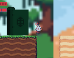
Heyyy. Adorable btw. but my main gripe with the game was the background. I think the main sprites look really polished but the background sort of takes away from that. blur isn't the way to go. what I found helpful was lowering the opacity of my background to make the foreground stand out. Thanks for your feedback on ^3 as well.
Nice little platformer, the art was pretty good the bg might be a little to zoomed in on but nothing that breaks the game.
the only issues I would say were the platforms well moving down you are unable to jump since you keep bouncing around same with side to side you don't move with the platform unless that was the way you wanted it to be.
A really pretty game. The colours used and the music is great! The camera is a tiny bit too zoomed in, also you can kind of stick to walls if you keep pressing the move key. There's a few ways to get around this but the easiest is to give the walls a frictionless material, that way the character can't stick to them. The menu when you die is also a little too zoomed in, my guess is the games resolution is set super high. I would say with the art style you have you could make a nice 2D platformer where you play on the scale of an ant, going through a back garden or something. Great job to everyone involved and I'd love to see a development on this in the future.
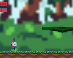
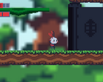
A nice platforming experience! I liked the idea of different environments having different temperatures, and the changing music and backgrounds helped convey that very well. The different doors and platforms also helped add some nice variety and challenge to the game. I'm not really one for difficult games, but I still would've liked it if it was a bit more challenging, though - a lot of my time was just spent moving right, and I didn't really feel that affected by the changing temperatures. Some of the platforming felt a little clunky as well, but it was nothing game-breaking, and I still got through in the end.
The art was really nice, and I especially liked how the environment changed as you went through the game. The player's sprite was pleasing too, and the animations were a nice touch. The backgrounds were a bit blurry, though, and they did cut off at the edges as well, which took away from the experience a little. The sound effects and music were good, and the little footstep noises were a small, but charming little addition - and they added some nice auditory feedback to the game!
This platformer was a fun little adventure, and it has some interesting ideas to use - well done on making it!
I really liked the art and music, especially how your character got blue or red depending on which environment it was in!
I did also run into the issue with the walls, which would help a lot with the platforming feel. You could also add acceleration to the jump/side-to-side movement (but this is all stuff that obviously time limits make difficult).
Overall, a really cool concept to have different sections within the level that balanced your temperature (even if it was pretty difficult), and added a time pressure.
This looks great!
to the design of the little guy to the ground tiles, all the art is really good, and so is the music! although the background was a bit too pixelated but that might just be a problem with my resolution.
besides having accelarating into walls stop your vertical momentum (can be solved in unity by adding a collider with no friction on the side of the wall) and the moving platform not move the player alongside it, the mechanics are very fun.
I'd love to play an expanded version of this not limited by the jam time limit.
I liked the different environments, their artwork made the game feel like an adventure. Music is really good too! I wasn’t sure how to avoid losing health in the hot and cold areas though, so that felt a bit confusing. I also struggled a bit with the platforming and jumping. Great work overall!
I love the character design. The artwork really comes to life. The faded background really adds to that. Music is really good. It's a very inviting game.


Leave a comment
Log in with itch.io to leave a comment.