Indie game storeFree gamesFun gamesHorror games
Game developmentAssetsComics
SalesBundles
Jobs
TagsGame Engines
A jam submission

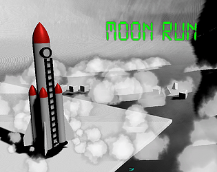
Moon RunView game page

Run to escape the Moon before you are obliterated!
Submitted by Maaack, tomy_59, Twitchywhalez — 16 minutes, 19 seconds before the deadline
Add to collection

Play game

Moon Run's itch.io page

Results

CriteriaRankScore*Raw Score
Theme#203.9204.333
Originality#313.1163.444
Audio#362.7143.000
Overall#402.6992.984
Accessibility#412.4122.667
Graphics#432.7143.000
Fun#482.2112.444
Controls#551.8092.000

Ranked from 9 ratings. Score is adjusted from raw score by the median number of ratings per game in the jam.

Godot Version
3.5

Wildcards Used
We tried for all of them

Game Description
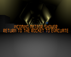
The mission had 600 single-points-of-failure, but this was not one of them. Run.

How does your game tie into the theme?
You are on the moon! Jumping on the moon is not recommended.

Source(s)
https://github.com/Maaack/Moon-Run

Discord Username
Maaack#2870, tomy#6757, Twitchywhalez#1865

Participation Level (GWJ Only)
Joined several. First submitted last month.

Leave a comment

Log in with itch.io to leave a comment.

Comments

Submitted(+1)

Felt like I was on the moon. :)  Nice game

(1 edit) (+1)

Great immersion, congrats!

Submitted(+2)

Nice job! I loved the atmosphere you created with the music and the breathing. As others mentioned the controls were really challenging. I almost made it to the tunnel before getting hit by the meteor. :)

Submitted(+1)

Pretty polished game, well done! I found the controls tough though! On my first play I ran into the wall right at the beginning, spun out, and couldn't get up pretty much, haha. Second play was better where I made it to the rest of the world, and eventually ran out of oxygen. 

It's probably realistic, but just a little less float-y and spin-y might help players get further. :)

Menus and UI are, yeh, polished as well. It's impressive.

Submitted(+1)

I like the general concept a lot. However, I found it pretty awkward. It was hard to tell what I was doing wrong at first. I think it would have been much more obvious in third-person, though that would obviously have a different feel. Maybe just some kind of tutorial or even a security video showing the player in the first area might helped?

The gravity also seemed a bit too extreme for walking. I think I would have preferred if walking was a bit more manageable and jumping was necessary but easy to over-do. Regardless, definite potential here. Nice job!

Developer(+1)

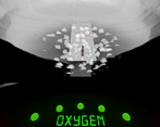
Thanks for leaving the feedback! I absolutely agree that the controls still need so much work. It's current state is actually an improvement over previous iterations, if you can imagine that. At the very least, the lights indicating contact with the ground should have been made more prominent on the HUD. If I had 2-4 more hours, I would have added the tutorial.