Play game
Hate Me Not's itch.io pageResults
| Criteria | Rank | Score* | Raw Score |
| Creativity | #108 | 4.323 | 4.323 |
| Overall | #124 | 4.181 | 4.181 |
| Enjoyment | #263 | 3.938 | 3.938 |
| Presentation | #306 | 4.281 | 4.281 |
Ranked from 96 ratings. Score is adjusted from raw score by the median number of ratings per game in the jam.
How does your game fit the theme?
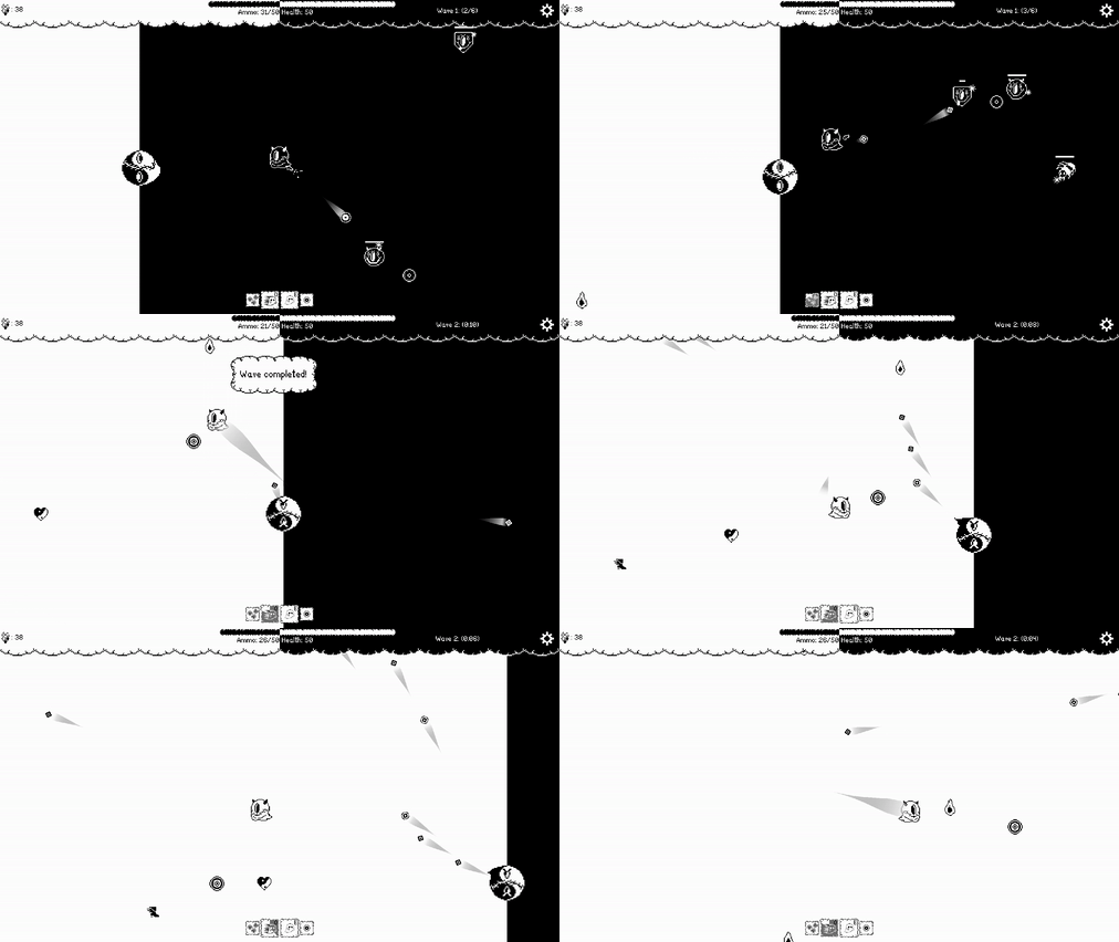
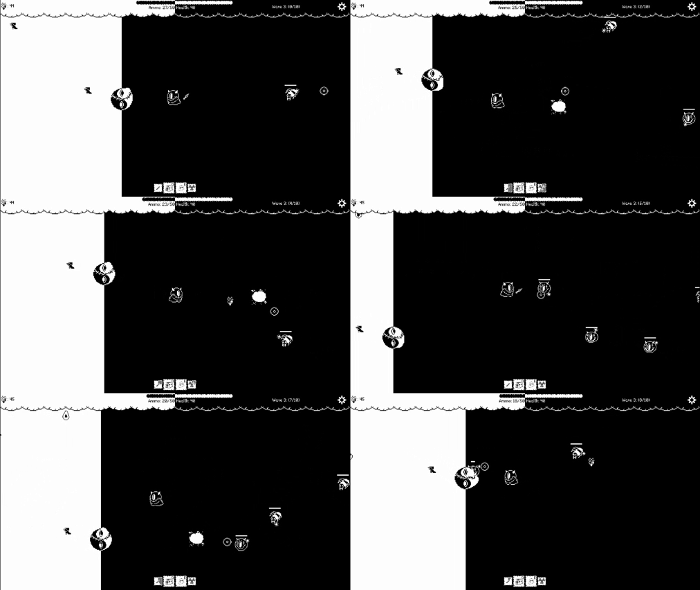
Your role gets reversed every time you pass the middle of the screen. If you cross over to the right side, you are the defender of the Yin Yang. If you cross to the left side, you need to avoid the aggression of the Yin Yang.
Did your team create the vast majority of the art during the 48 hours?
Yes
We created the vast majority of the art during the game jam
Did your team create the vast majority of the music during the 48 hours?
No
We used pre-existing audio
Leave a comment
Log in with itch.io to leave a comment.


Comments
I love the game. It is really complete with even a skill tree and tutorial. Had a blast playing it :)
Thank you! I am happy to hear that! Glad you enjoyed it :)
I love the design and the gameplay is very good, but the improvements are very expensive :(
Thanks! Yes, they are too expensive for the gems drop rate. Thank you for pointing that out. It will be fixed in the post-jam dev stage :)
Really Fun Game and Concept !!!! Enjoyed it alot!
Thanks for trying our game!
Really cool, nice level of variety and the art was lovely. Difficulty felt pretty good too although I sometimes got in a hole of having no ammo and not enough spawning, maybe the ammo should spawn more if you are running low?
Thanks for checking out the game! Yeah, some things need to be a bit more polished but the time restraint didn't allow for that. We are definitely eager to add more to the game post-jam.
Great concept and great execution!
Thank you!
Very well-thought out, simple, fun game! I like how the player has to move into an unsafe area to pick up boosts and ammo to be able to defend the yinyang. The binary colors and roles suit the concept in addition to the theme, and the pixel art is charming. Great job!
We are glad you enjoyed our game :) We are really happy with how it turned out.
Really great game. I love the art style and the general gameplay loop. The only thing is that I didn't find the cost of upgrades in the Shop.
But otherwise, everything else felt super nice. Keep it up!
Thanks for the kinds words! We didn't manage to add the costs in the shop since we barely managed to implement it but the costs are written in the description of the game. Apart from that we are definitely going to add them in the shop when we release the post-jam version.
Very addictive!! I liked it! Good Job!
Thanks for checking it out!
This was really cool, great art style, and a lot of cool ideas, i like how the heart only attacks you while you're on the light site.
We are glad that you enjoyed! We are really proud of the art style as well. The artists did some great work here.
Nice play on the theme, very creative, and the visual style is pleasing to look at.
Thanks for the kinds words and for checking out our game!
pretty fun idea, my high score was 156 on my 2nd run, may come back and play some more later after testing some other games
Will be happy to have you back :)
Really creative idea. The premise of having to defend a thing that is actively attacking you is pretty diabolical, and I love the way it looks like something is squirming around inside the stitched-up Yin Yang. No idea if I got close to collecting enough currency to upgrade my skill tree, but it's impressive you managed to build that in during a jam!
Thanks for the kind words! And yes the Lead Programmer of this project really went all out in this one.
Wow. This is really cool. I love this take of the theme!
Thanks glad you enjoyed it :D
This feels really nice I really enjoyed, it's so addictive! also, you used the theme of this gamejam so differently to other games I played, really original and creative! Well done!
Really happy you enjoyed it! After 48 hours of development and cooling down a bit, reading comments like this is pure bliss. :D
The art style is fantastic! And the player movement and shooting feels very nice! This is a very well made and polished game! Love it!
Thanks, we are overwhelmed with the awesome community here!
Really good interpretation of the theme, fun to play, liked the black and white artstyle !
Thanks, love to hear that!
Being killed by the very thing I am protecting is something I've never experienced before...
Really cool concept and I love the theming and the art style to match.
Would have loved to see some font that fit the art style a bit more.
Overall, really enjoyable. Great Job!
Thanks, really means a lot! We will for sure think about theming the UI a bit more to the monster art style :D
Thank you very very much for the feedback :>
very good gameplay, very fun. I liked the choice of art style as well. I could also have a short-range attack that I could send enemies away with little damage, so I think I could put a slightly higher frequency of enemies and make the game a little more frantic lol
Oh yeah, that would also solve the problem we had in the beginning, trying to balance the spawn rate of the ammo, so that you would not run out so fast. You would have some kind of push back attack, which could deal no damage, but would buy you just a little bit of time!
Definetely will be thinking about this one, if / once we go for the post-jam development version of this!
i really like how both sides have equally engaging gameplay and going back to restock on ammo can cost you even more time if you're not careful. very cool idea. like everyone else already said, it is a very solid base for an expanded game. congrats!
Thanks, very glad to hear that! We are definitely considering a post-jam version of this ´,
Such a cool art style! And the theme is used extremely well!
Thanks, glad to hear that!