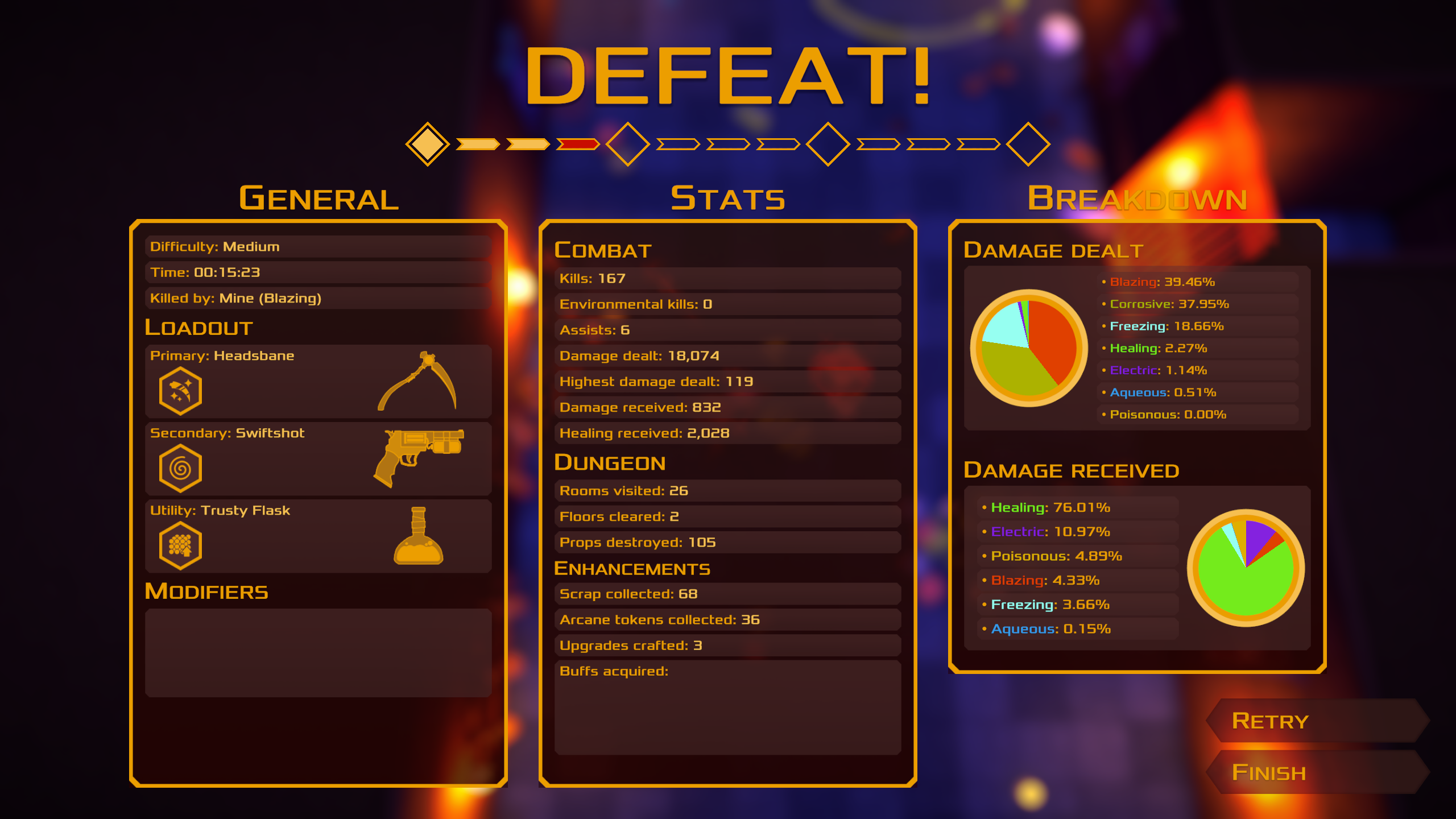
I bitched a lot at the beginning about using a modifier key to use mixtures, but I think it was fine, I got used to it. It'd be interesting if I had the previous direct bindings tho, kind of want to test it out.
There's something about the mobs that felt less rewarding to beat. This build, versus the previous one I played, feels a bit more messy. I've been trying to figure out why... But I think it's a mix of:
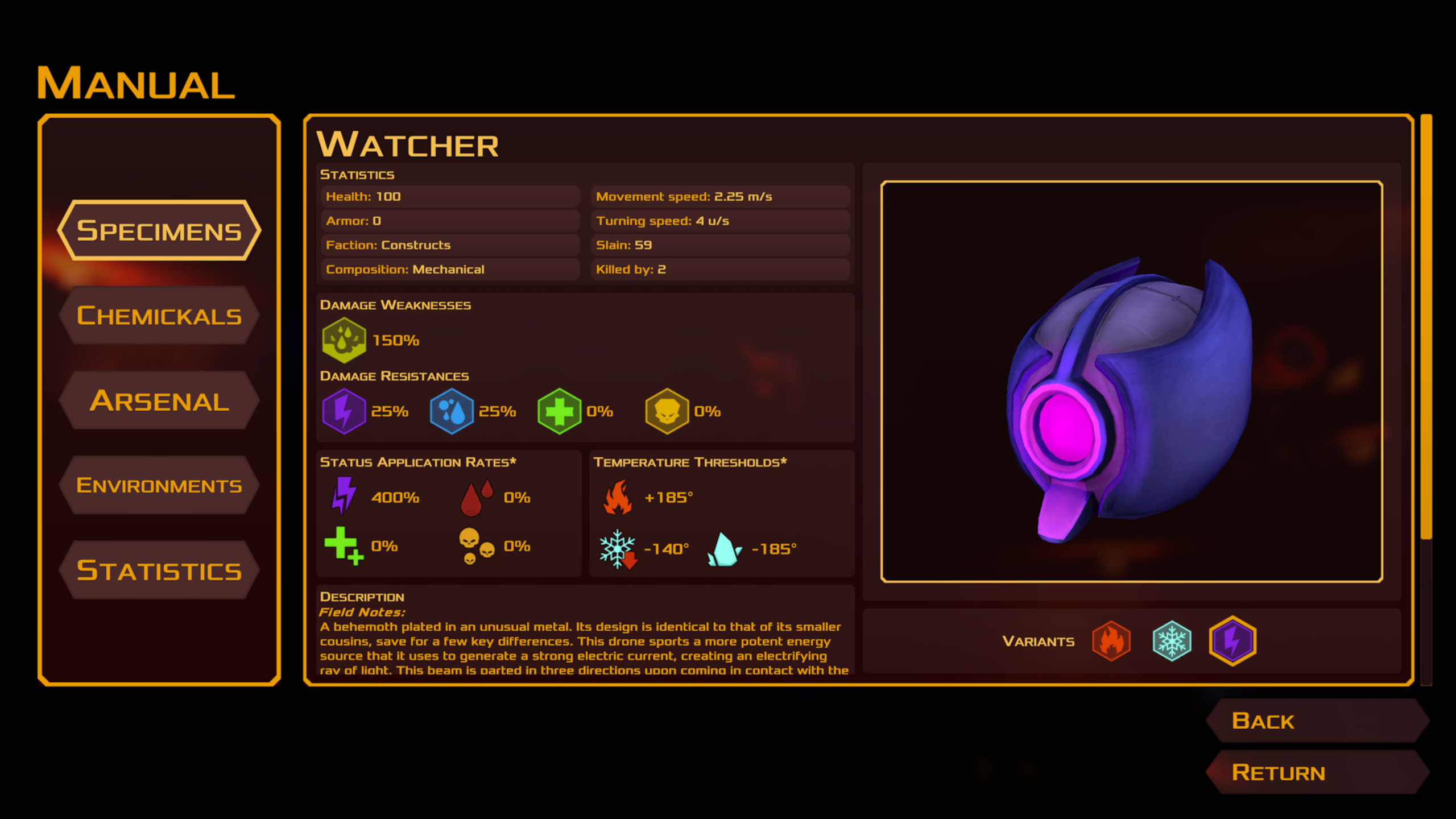
* Too many enemy variations in general. I feel like as a whole it isn't very cohesive. And maybe I'm not even talking about gameplay, just visually. Maybe... Less variations of the same enemy, and to introduce more enemy types with different attacks instead would be cool.
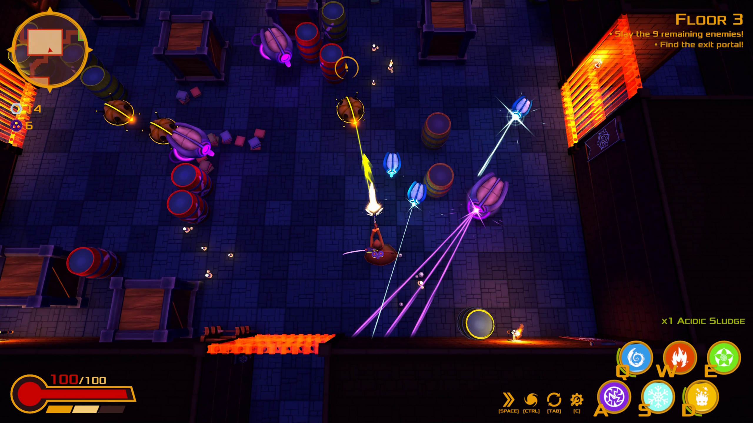
* Similarly, and this is probably then main thing, too many enemy types in one single wave. Like I felt like it was very common to have a thunder variation, a fire variation and an ice variation of the same enemy. It just looks/feels a bit random. If it was for particular waves that's fine, but it seemed that was the norm, the waves didn't seemed 'themed' or planned, they looked to me like it was always a bunch of random enemies thrown in.
* Something that compounds the previous thing, is that the game starts without bombs. I had like a moment where in a room I had four guys in the middle of room following me around shooting the same kind of laser of different colors. It's not like it was hard or anything, but it just looked goofy. And then on the second floor, there are some waves that are just 3 bombs of different colors. Which again, felt a little one-note. The best waves are when you combine the enemies.
* I like the map variety, but I feel like most don't need to be as big as they are. To me the game excels when the action is tight. I'm thinking like the big H or the huge cuadricular thing doesn't feel suuper interesting, if it was smaller I could see it working better. Like honestly I'd take me a small square room over them, because right away I'm dashing and doing shit.
But still, just like before, very cool game, it feels great to juggle lots of different things, change mixtures, change weapons, use the environment. is very cool.
also, in regards to the end of my last run, I hope hell treats you well!
i just suck at this game i suck so hard that i keep forgetting the controls lol honestly, changing the weapon with the mouse wheel would feel more intuitive than pressing R also, shift is more common for dashing compared to the spacebar fire damage seems very punitive, especially considering how easy it is to press the wrong magic in the heat of the moment and further hurt yourself rather than heal shopkeeper lookin good as always
honestly, changing the weapon with the mouse wheel would feel more intuitive than pressing R
I hate scroll wheel for weapon switch so it'll never be default, but you can always rebind your keys.
also, shift is more common for dashing compared to the spacebar
Means you wouldn't be able to mix while dashing, you can't hold CTRL and press shift simultaneously.
fire damage seems very punitive, especially considering how easy it is to press the wrong magic in the heat of the moment and further hurt yourself rather than heal
True, I should make the other damage types more punitive to compensate.
The options menu scrolls with the scroll bar automatically downwards. Hard to see options because of that when changing the default resolution. I don't see why I have to press control to select something that could be a movement key when the number keys already exist, I wish control wasn't used as the default, Q would be better. Since moving my finger down there gets tiresome every time I want to switch, and this game is about switching on the fly. I had to change it and having it as Q with the rest being the number keys is so much better. It really should be the default with how much better it is to use once changing it around. keyboard shortcut support too would be nice for certain combos. Tutorial needs respawn checkpoints. Also a way to skip the tutorial when accidently killing yourself, which falls in line with checkpoints for the tutorial. Maybe showing visually that you are in the mixing menu outside after selecting something would be a nice touch too.
The game, outside of the default controls being bad, is decent and fun. Needs more music. It is a fun game. I don't have anything else to add about bugs I could, since the other post talked about it already. The only major thing is the default controls is just awful. Once I changed it, I had a much better time overall. I think with some polishing, this will be very good.
The options menu scrolls with the scroll bar automatically downwards. Hard to see options because of that when changing the default resolution.
I'm not sure I follow.
I don't see why I have to press control to select something that could be a movement key when the number keys already exist
Because it's difficult for people with smaller hands to stretch their finger to the 6 key. Might not be a problem for you and I, but the default setup allows people to keep their hand in one place and minimizes uncomfortable stretches. You're always free to change it, as you've done yourself.
Since moving my finger down there gets tiresome every time I want to switch, and this game is about switching on the fly. I had to change it and having it as Q with the rest being the number keys is so much better. It really should be the default with how much better it is to use once changing it around.
I can try it, but CTRL feels comfortable for me.
Tutorial needs respawn checkpoints. Also a way to skip the tutorial when accidently killing yourself, which falls in line with checkpoints for the tutorial.
I can make the tutorial automatically restart when you die, but no checkpoints.
Maybe showing visually that you are in the mixing menu outside after selecting something would be a nice touch too.
The mixing text changes color slightly, but sure. Have any ideas?
It is a fun game. I don't have anything else to add about bugs I could, since the other post talked about it already. The only major thing is the default controls is just awful. Once I changed it, I had a much better time overall. I think with some polishing, this will be very good.
In the video options, in full screen it doesn't show all of the video options. Only 4 for resolution types. So I selected a tiny one and it started showing every single option once out of full screen. But clicking to select an option has it auto scroll downwards even when not pressing any key or using the mouse where trying to move. It took me a couple of minutes to select an option since it kept flying past what I wanted to select.
Took me a few tries to get back in the groove but it was smooth sailing after that.
The new rooms are nice, it's good to be able to put some obstacles between you and your enemies. The minimap should show the direction to the exit after you've found it. A "full map" button that only shows the rooms you've been in would be nice, that way the player can more easily make sure they've cleared the whole floor before going to the next one.
The miniboss dies weirdly while frozen, the dying animation slows to a crawl and the audio cue doesn't play properly. Maybe frost should defused it like the mine enemies. Also I would make it so the last floor's ending portal is always behind a miniboss so that players have a final challenge to look forward too. It's a bit anti climactic to enter the last floor and find the exit after 3 rooms.
The new UI layout is nice but you've removed the "press C to open upgrade menu" text so players won't know that exists unless it's in the tutorial. Taking your eyes off the character and your enemies is still dodgy to do in combat. I'd prefer if the chem stock UI was, like, 3 times as big and transparent, but don't do that because it would look ugly.
Really fun. Looking forward to playing more and seeing new enemies.
Thanks for playing! I always look forward to your feedback.
The minimap should show the direction to the exit after you've found it.
Sure, why not.
A "full map" button that only shows the rooms you've been in would be nice, that way the player can more easily make sure they've cleared the whole floor before going to the next one.
The new map menu achieves this: it shows the entire dungeon, highlighting completed rooms in green. You can open it with M, I can see how you'd miss that if you didn't go through the tutorial again.
The miniboss dies weirdly while frozen, the dying animation slows to a crawl and the audio cue doesn't play properly. Maybe frost should defused it like the mine enemies.
I'll take a look at it.
Also I would make it so the last floor's ending portal is always behind a miniboss so that players have a final challenge to look forward too. It's a bit anti climactic to enter the last floor and find the exit after 3 rooms.
Boss rooms should be in the next update. You'll have to defeat a boss, then the portal appears afterwards.
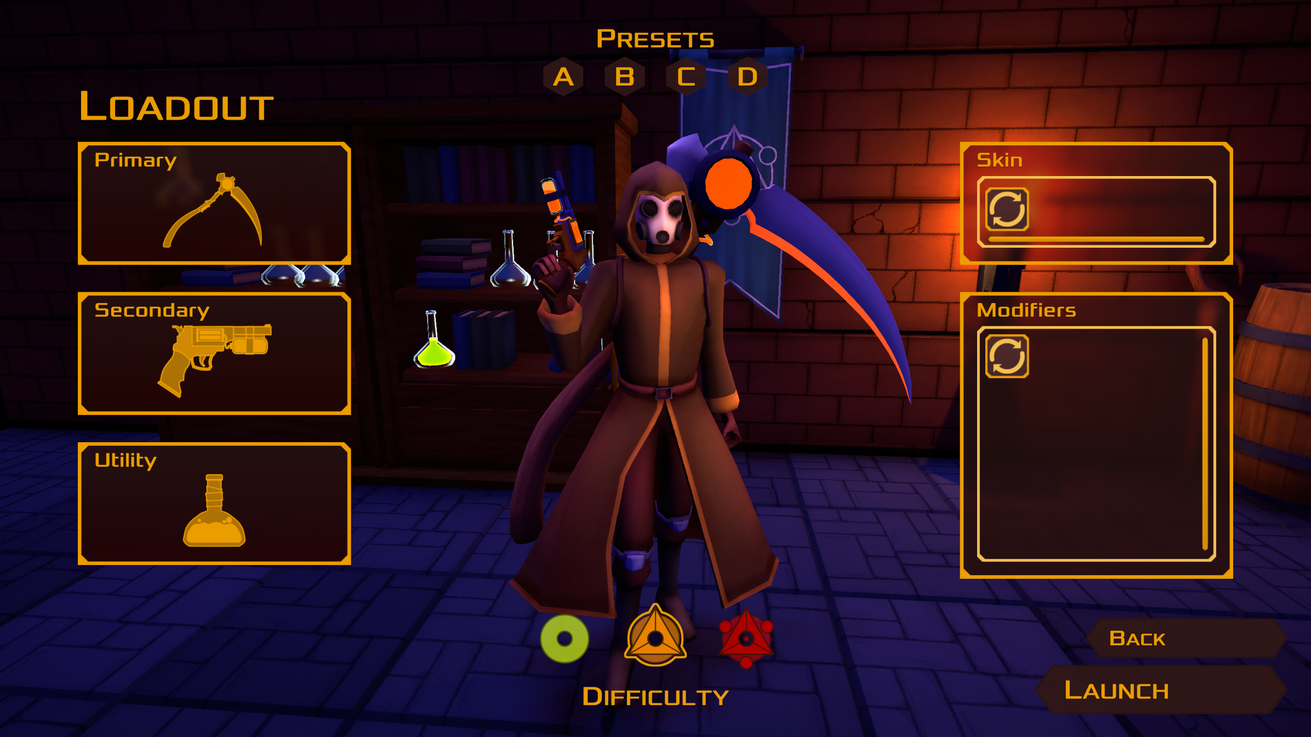
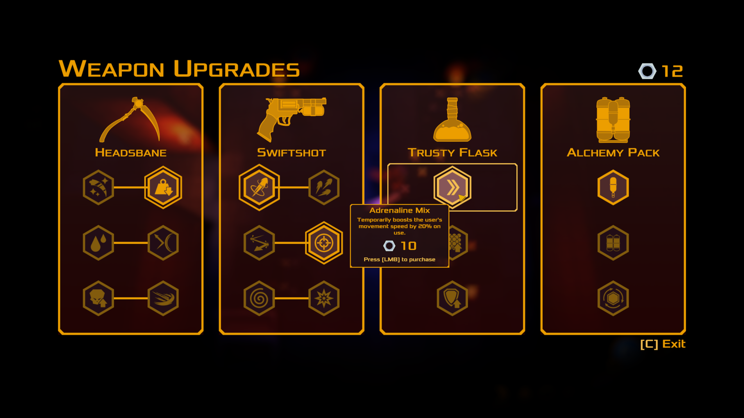
The new UI layout is nice but you've removed the "press C to open upgrade menu" text so players won't know that exists unless it's in the tutorial.
It's in the tutorial. On that note, I am in the process of moving the weapon upgrades menu to a dedicated workbench rather than a keybind: a lot of people forget to press C, and it's just too overpowered to be able to change your build anywhere and anytime.
Taking your eyes off the character and your enemies is still dodgy to do in combat. I'd prefer if the chem stock UI was, like, 3 times as big and transparent, but don't do that because it would look ugly.
The alchemy slowdown is supposed to alleviate this a bit since it gives you time to look down, but I agree to an extent. There's not much else I can do to address this issue without compromising the UI, it's just an inherent part of the game.


Comments
You added scroll wheel to change weapons, 10/10.
Have a video:
I bitched a lot at the beginning about using a modifier key to use mixtures, but I think it was fine, I got used to it. It'd be interesting if I had the previous direct bindings tho, kind of want to test it out.
There's something about the mobs that felt less rewarding to beat. This build, versus the previous one I played, feels a bit more messy. I've been trying to figure out why... But I think it's a mix of:
* Too many enemy variations in general. I feel like as a whole it isn't very cohesive. And maybe I'm not even talking about gameplay, just visually. Maybe... Less variations of the same enemy, and to introduce more enemy types with different attacks instead would be cool.
* Similarly, and this is probably then main thing, too many enemy types in one single wave. Like I felt like it was very common to have a thunder variation, a fire variation and an ice variation of the same enemy. It just looks/feels a bit random. If it was for particular waves that's fine, but it seemed that was the norm, the waves didn't seemed 'themed' or planned, they looked to me like it was always a bunch of random enemies thrown in.
* Something that compounds the previous thing, is that the game starts without bombs. I had like a moment where in a room I had four guys in the middle of room following me around shooting the same kind of laser of different colors. It's not like it was hard or anything, but it just looked goofy. And then on the second floor, there are some waves that are just 3 bombs of different colors. Which again, felt a little one-note. The best waves are when you combine the enemies.
* I like the map variety, but I feel like most don't need to be as big as they are. To me the game excels when the action is tight. I'm thinking like the big H or the huge cuadricular thing doesn't feel suuper interesting, if it was smaller I could see it working better. Like honestly I'd take me a small square room over them, because right away I'm dashing and doing shit.
But still, just like before, very cool game, it feels great to juggle lots of different things, change mixtures, change weapons, use the environment. is very cool.
also, in regards to the end of my last run, I hope hell treats you well!
Thank you for playing. I will make the tits bigger to increase depth.
i just suck at this game
i suck so hard that i keep forgetting the controls lol
honestly, changing the weapon with the mouse wheel would feel more intuitive than pressing R
also, shift is more common for dashing compared to the spacebar
fire damage seems very punitive, especially considering how easy it is to press the wrong magic in the heat of the moment and further hurt yourself rather than heal
shopkeeper lookin good as always
Thanks for playing!
I hate scroll wheel for weapon switch so it'll never be default, but you can always rebind your keys.
Means you wouldn't be able to mix while dashing, you can't hold CTRL and press shift simultaneously.
True, I should make the other damage types more punitive to compensate.
evil man
The options menu scrolls with the scroll bar automatically downwards. Hard to see options because of that when changing the default resolution. I don't see why I have to press control to select something that could be a movement key when the number keys already exist, I wish control wasn't used as the default, Q would be better. Since moving my finger down there gets tiresome every time I want to switch, and this game is about switching on the fly. I had to change it and having it as Q with the rest being the number keys is so much better. It really should be the default with how much better it is to use once changing it around. keyboard shortcut support too would be nice for certain combos. Tutorial needs respawn checkpoints. Also a way to skip the tutorial when accidently killing yourself, which falls in line with checkpoints for the tutorial. Maybe showing visually that you are in the mixing menu outside after selecting something would be a nice touch too.
The game, outside of the default controls being bad, is decent and fun. Needs more music. It is a fun game. I don't have anything else to add about bugs I could, since the other post talked about it already. The only major thing is the default controls is just awful. Once I changed it, I had a much better time overall. I think with some polishing, this will be very good.
Thanks for playing!
I'm not sure I follow.
Because it's difficult for people with smaller hands to stretch their finger to the 6 key. Might not be a problem for you and I, but the default setup allows people to keep their hand in one place and minimizes uncomfortable stretches. You're always free to change it, as you've done yourself.
I can try it, but CTRL feels comfortable for me.
I can make the tutorial automatically restart when you die, but no checkpoints.
The mixing text changes color slightly, but sure. Have any ideas?
I'm glad you had some fun with it.
In the video options, in full screen it doesn't show all of the video options. Only 4 for resolution types. So I selected a tiny one and it started showing every single option once out of full screen. But clicking to select an option has it auto scroll downwards even when not pressing any key or using the mouse where trying to move. It took me a couple of minutes to select an option since it kept flying past what I wanted to select.
Took me a few tries to get back in the groove but it was smooth sailing after that.
The new rooms are nice, it's good to be able to put some obstacles between you and your enemies.
The minimap should show the direction to the exit after you've found it.
A "full map" button that only shows the rooms you've been in would be nice, that way the player can more easily make sure they've cleared the whole floor before going to the next one.
The miniboss dies weirdly while frozen, the dying animation slows to a crawl and the audio cue doesn't play properly. Maybe frost should defused it like the mine enemies.
Also I would make it so the last floor's ending portal is always behind a miniboss so that players have a final challenge to look forward too. It's a bit anti climactic to enter the last floor and find the exit after 3 rooms.
The new UI layout is nice but you've removed the "press C to open upgrade menu" text so players won't know that exists unless it's in the tutorial.
Taking your eyes off the character and your enemies is still dodgy to do in combat. I'd prefer if the chem stock UI was, like, 3 times as big and transparent, but don't do that because it would look ugly.
Really fun.
Looking forward to playing more and seeing new enemies.
Thanks for playing! I always look forward to your feedback.
Sure, why not.
The new map menu achieves this: it shows the entire dungeon, highlighting completed rooms in green. You can open it with M, I can see how you'd miss that if you didn't go through the tutorial again.
I'll take a look at it.
Boss rooms should be in the next update. You'll have to defeat a boss, then the portal appears afterwards.
It's in the tutorial. On that note, I am in the process of moving the weapon upgrades menu to a dedicated workbench rather than a keybind: a lot of people forget to press C, and it's just too overpowered to be able to change your build anywhere and anytime.
The alchemy slowdown is supposed to alleviate this a bit since it gives you time to look down, but I agree to an extent. There's not much else I can do to address this issue without compromising the UI, it's just an inherent part of the game.
Also need main music menu
Thanks for playing and for the fanart!
What's new:
Press backspace to enable cheats: comma adds money, period skips the current stage. Proper devlog coming sometime in the future.