Hi, folks!
We are very happy to announce that Seven Doors will be launched on Steam this June 26, 2020.
Here's the link: https://store.steampowered.com/app/1329320/Seven_Doors/
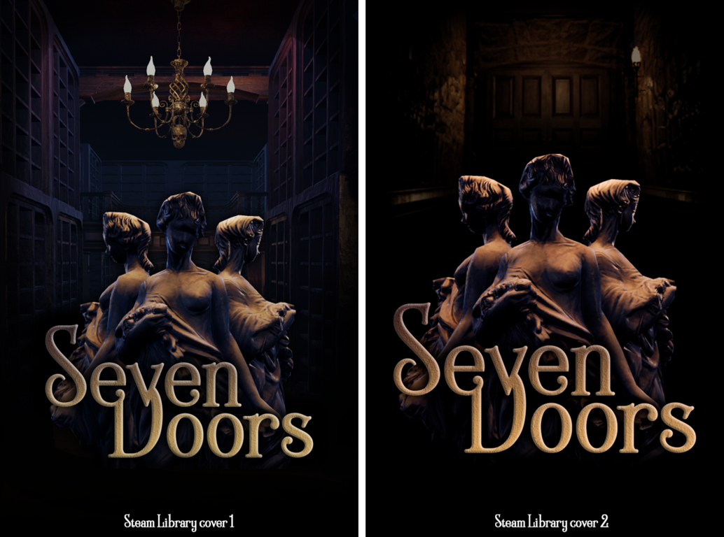
We're setting up the final Steam game image, and we can't decide which cover we like best! These covers will be the image that the player has in his library when he already has the game of his property.
We hesitate between these two, which one do you think is better?

Please leave us your opinion in the comments or at sevendoors@indigostudios.one
If you like the game or you think it looks good, share it with your friends and family and add it to your wish list. For us it will be a very precious help!
Remember also that if you buy the game now at itch we will give you a Steam Key at its launch!
Seven Doors at itch: https://indigo-studios-gamedev.itch.io/seven-doors
Here's a review of the game: http://gameramble.com/Seven-Doors-PC-Review
Thank you very much to all of you who havIe supported us, thanks to you all this is being possible. :)

