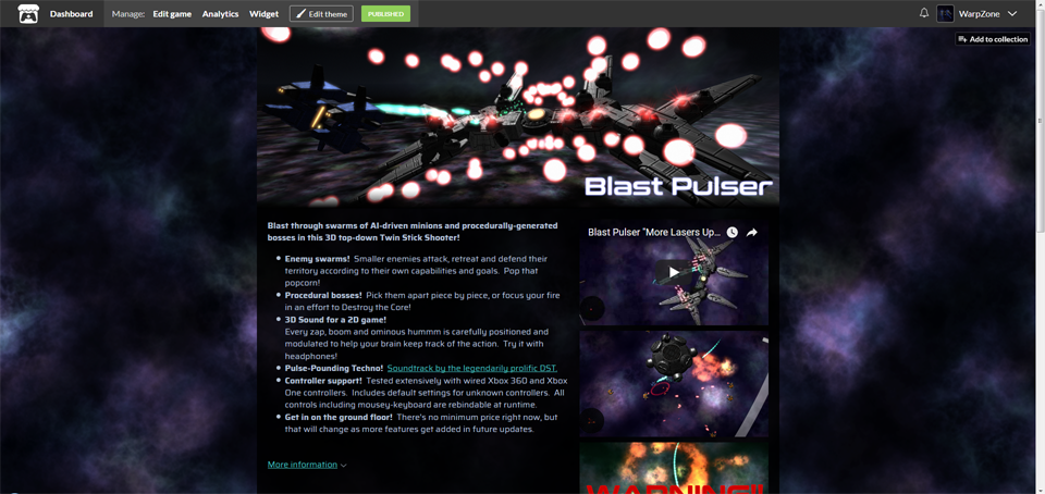
That isn't true atm when the price is said to no payments. With optional donations there is one on top. I feel like it should be atleast optional to not have a seperate download page (like the one after "No, just take me to the downloads") because with the install instructions AND the whole other text its quite a lot to scroll in some cases.
This guy managed to find a way. Darned if I can figure out how he did it, though!
No matter how many lines of text I add to my description, the button never appears above the fold. My game is free with optional donations, exactly like Neon Collapse.
Update: Figured it out. Apparently I just wasn't using enough superfluous text:
You need your button to be above the fold. Need need need. Everyone says so. Literally everyone in every web-based marketing anything ever says so. Don't like marketers? Only care about the opinions of developers? Tim Ruswick, Developer of Philophobia and creator of Game Dev Underground, says so. Button must be above fold. Your business needs that to put food on your table. Therefore, you need it to live.
I don't think itch's current system even knows where the fold is.

You have to admit, a factor of 3 is a pretty big margin of error. My screen is 1920x1080, for instance. How big does itch *think* my screen is? Does it take into account formatting? The text specimen I used from Google Texts? My header image? The fact that I'm using Firefox? The fact that I'm logged in and there's a grey top-bar at the top? My operating system's UI elements?
I actually don't think you should give people the option to choose where the Download button is. I think proper Download Button placement, supported by every A/B test ever conducted by the entire human race, should be mandatory on all pages. I think it should be at the very top of the document, just under the Header, in case your customer is easily bored by the wall of text and can't be bothered to scroll down to find it, and another one at the very bottom of the document, just above the footer, in case your customer read every word on your page before getting bored and don't feel like scrolling all the way up again.
Sorry for typing so much, but this boggles my mind. Everything else about the itch.io experience is excellent. Why would you mess up the one thing everyone says is the most important?
I figured it out. (For real this time.) It's social engineering. The reason they did it like this is to force you to list all the controls on the page. Even if you have a menu in the game to rebind the controls. Even if you use the same control conventions as every other game in your genre. Even if you sunk a ton of elbow grease into in-game tutorials. Honestly, I can live with that? I just don't like finding out about it by second-guessing the admins.
They coulda just said "Your Download button will probably end up below the fold if you don't list your game's controls."