
Indie game storeFree gamesFun gamesHorror games
Game developmentAssetsComics
SalesBundles
Jobs
TagsGame Engines
0

NEBULA FORCE

A topic by Andgameplay created May 01, 2025 Views: 219 Replies: 2
Viewing posts 1 to 2

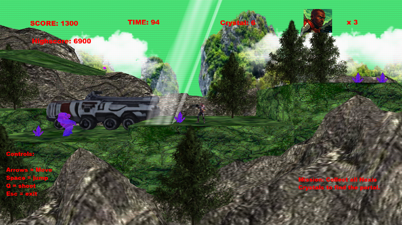
Hello everyone, I created this 2.5D shooter inspired by retro platform games like Contra on the NES!

The game has a paced gameplay and requires reflexes to jump between platforms and dodge enemy attacks!

The game was designed to be lightweight and playable on modest computers!

Developed on the Coppercube engine;

Thank you very much!

https://andgameplay.itch.io/nebula-force

Hi, i played your game and i have some feedback for you, i couldn't upload in the coppercube forum so, i will respond here.


Well, here i go. I want to clarify that i don't write with a offensive/rough intention, just in case it looks like, i'm being 'neutral', what i say is just my subjective opinion and you are free to make your game as you wish.

 1) The main menu: The main menu looks nice but weird, you have elements that doesn't 'blend' together (those towers the main character for example along the water and the logo falling down) Sometimes less work helps, notice how NES CONTRA for example  was just a black screen with contra logo, or if you want a more 'modern' art style, a pre-rendered/stylize image, just keep things simple (like Max Payne, COD 1 or the classic Commandos main menu) Perhaps just the Nebula force logo with the background of starts might be enough for example. Other thing in main menu is the text alienation, it looks weird there is the name of the game in the middle of the screen and 'Press start' (or 'press enter', sorry i am in work right now and i don't remember all details) is on a side. Perhaps all centered or all at a side might be aesthetically good, but  one thing here and one thing there is... 'weird'? (english is not my first language sorry).

2) intro cinematic: it's good, it's simple and clear but the skybox look (bend?, cut?) near the sides (because it's not seamless), perhaps a simple plane with the stars textures as background might work better. And the nebula force logo at the side of the screen feels like out of place. It's like that friend from school, but then you go to your cousin's marriage and find him there, like, 'Dude what are you doing here?'

3) Gameplay. I couldn't go more than the first level so i can only talk about this one.

I found difficult to jump the first hole in the ground, i just couldn't reach the other side easily. Other jump to platforms are also hard to my, but since i am not a platforms player it may be lack of skill, i will keep an eye to comments about that anyway just to be sure.

The enemies die after several shots but the player die only with one, feels a bit unfair.
Shots are hard to see, not just because the bullets move fast but also because the color blend with the background. In many classic games bullets had a color that contrasted a lot with the background (and anything else) to bet easy to see.

Same with the HUD, it's hard to read well because it mix with the background. You can fix that by putting a black 2D Overlay behind them (i don't know if it's possible to change the order of what is front or behind).
There are trees between the camera and the scenario, i recommend to always keep a clear line of sight between them because those decorations might hide shots or enemies. (and make the game feel unfair to players)
There are also decoration elements that are high poly, did you made them with photogrametry software or img-to-mesh ai? Just curious :-). But those models feel 'out of place' with the rest of the art style and might introduce performance issues or made the game more hardware demanding than it should be. Because those models might have like 20000,  50000 or 60000 vertex probably, and for bein decorations (that are quite distant of the camera), is not good.  If you know Blender i'd recommend the 'decimate' modifier, is not perfect but might help, TRELLIS 3D might help too to get nearly usable img-to-mesh objects (unless you already used it, in that case i am just looking like an idiot :-/) There is a 'grid' texture to try to make a pixelated effect? i found it weird, but maybe other people like it, or perhaps has a aesthetic-lore related reason and i am spoiling a plot-twist by bringing it up? :-o  

So far i don't remember any more, sorry for the amount of text, you are making a nice game, I see potential in it. but there are some aesthetic 'issues' that might make the game don't look as good as it is, they may be story related? still may make some player walk out of it, which will be a shame.

But again, i am not trying to mock you, or say you did everything wrong (you didn't). I want to give you some feedback that may help you with your game.

And if i said something that is hard to read/doesn't understand. Tell me.

Best of lucks.

Hello DREAM_SEARCH_REPEAT, first of all I would like to thank you for the complete and detailed feedback, and I really appreciate it! Your feedback is excellent and not offensive, quite the opposite, it is extremely detailed and I appreciate you taking the time to do the analysis, it help me a lot! :)

I am analyzing the points you mentioned in the intro screen, and cinematics, I really need to make these adjustments.

In the gameplay the idea is to do several jumps in a row so the character gains enough force to be able to jump and cross easily, but during development I thought a lot about changing the concept and making him jump enough with just one jump, I will analyze this possibility.

Regarding the HUD, scenario artifacts and the poorly highlighted enemy shots, I can make adjustments, it is very easy!

Thanks for the tips on the 3D models, I used the Mixamo character for the player and for the other elements I used Lumalabs.ai to create the 3D models of the scenery and enemies and some jpg images for the background. I will use your feedback for future improvements!

I appreciate your feedback and I hope that reviewing the game was enjoyable and fun!