Indie game storeFree gamesFun gamesHorror games
Game developmentAssetsComics
SalesBundles
Jobs
TagsGame Engines

Which UI style do you prefer?

A topic by Joyless created Jan 30, 2023 Views: 505 Replies: 11
Viewing posts 1 to 8
(+1)

Hello world, I am working on a game. Currently, I am stuck between various different UI styles.

My favourite three options are:

1. Health Bar + Portrait

The health bar would decrease in size as your health decreased and the portrait would only be for stylistic effect. I could also remove the portrait entirely and make the bar taller.
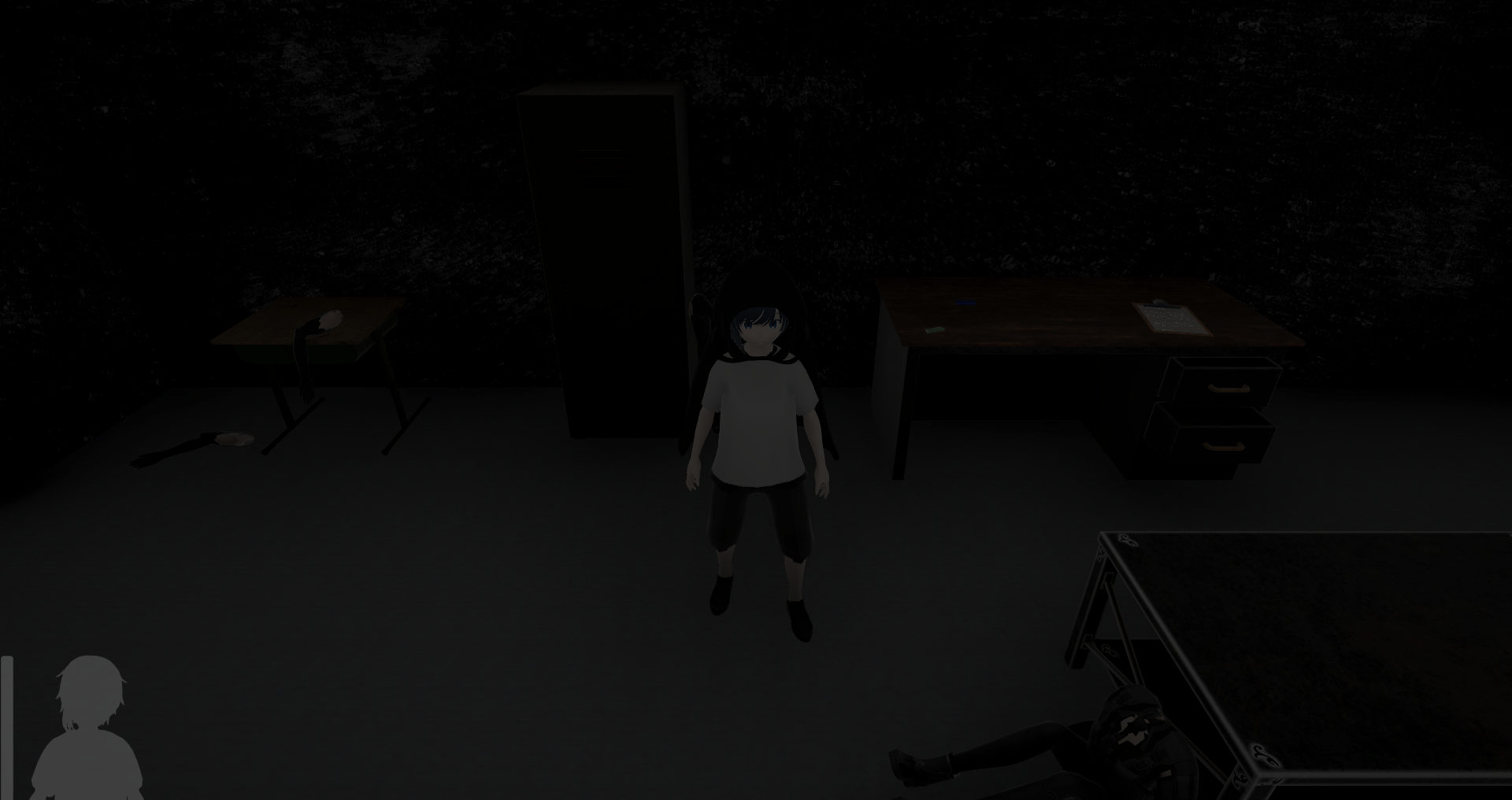
Health Bar + Portrait

2. Portrait Only

The portrait fill would decrease as your health decreased (e.g. at 50% health, the head would be greyer and the torso whiter).
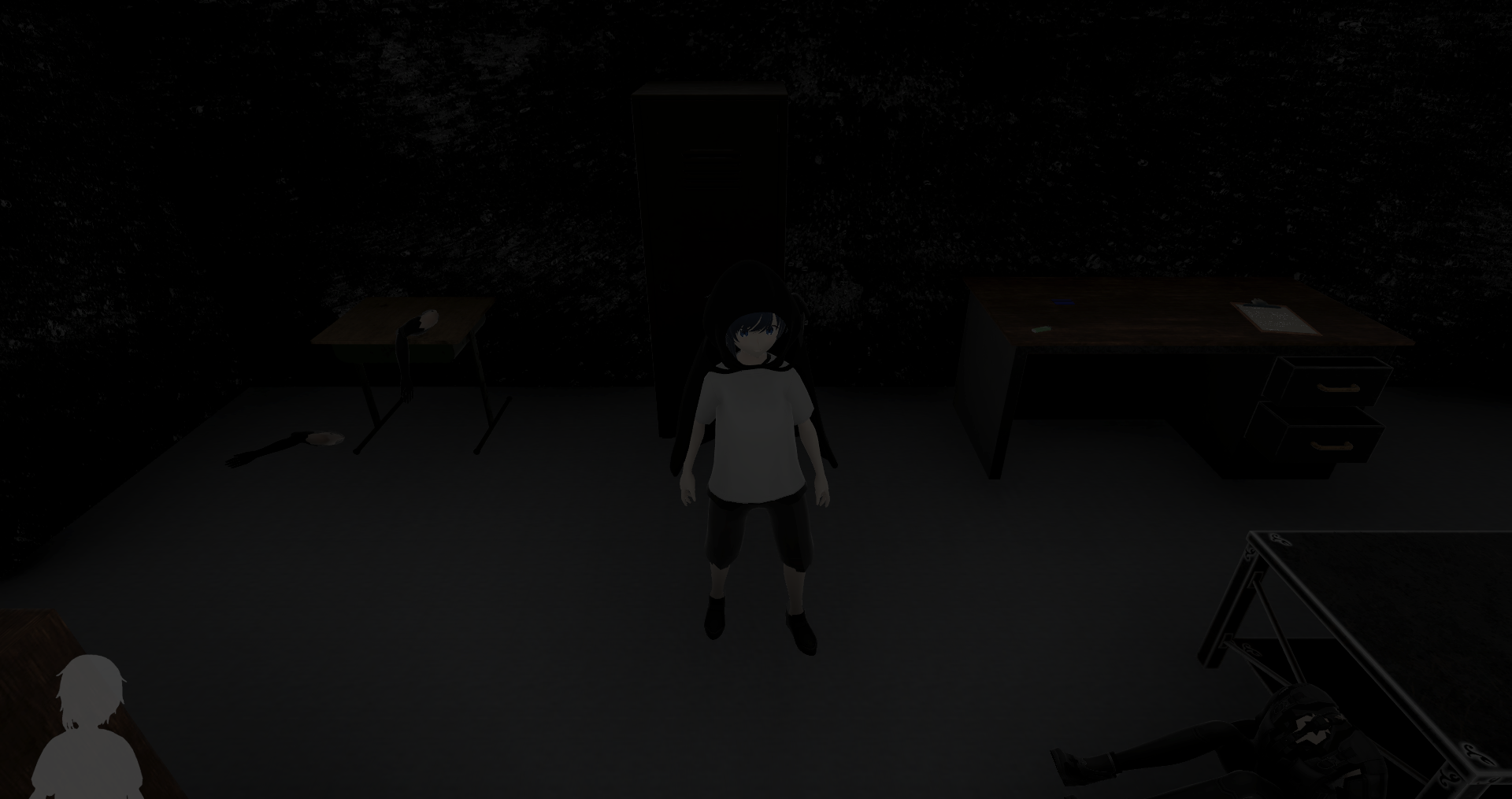
Portrait Only

3. None

There would be no display of health and your health would either be shown through animation or blood overlay, or I could even remove health entirely and have instant death.
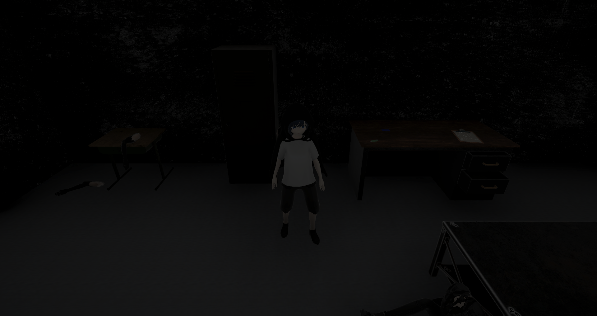
None


Please tell which style you like best, or even if you don't like any of them. If you choose one of the first two, please also say if you think it's too big/small, too light/dark, too opaque/transparent, too left/right or any other issue.

Thank you ^_^

(+1)

3 -- if you were going for minimalism, (and I'm assuming this is a horror game of some sort), you could have blood dripping down the screen to indicate player health. Slow drips = more health, fast drips = less health. You'd just have to be careful that it doesn't get in the way of the action. 

Thanks, I do agree 3 is the least crowded option. I'm not sure blood drips will work for my game specifically but I will look for another option. <3

(+2)

I prefer no 1 cause HUD is really important and not something you can remove for sake of visual. If you have more portraits, no 2 could be used but instead of grey/white alteration, the portrait changes depending on current health: full health = default portrait preferably with smile, 75% health = light wounds portrait with no smile, 50% = medium portrait with sad or hurt expression and 25% health = bloody portrait with badly hurt expression.

Thanks for the different perspective, and your solution is unique although difficult to pull off. <3

(+2)

I'd prefer just the health bar over just the portrait.  If you want a HUD that takes up minimal screen space while providing clear, accurate, easily readable information, then it's hard to beat an unadorned health bar.

You're right, and it could fade away when not full or not changing.

Deleted post

You are right, about giving graphics the most attention. However I am concerned about adding unnecessary controls to bloat the player.

(+1)

I would go with 2. Health is important to be able to see at all times, but 2 is also minimalistic enough to not be in the way.

(1 edit) (+1)

Depends a lot on the related mechanics.

  1. Health bar is important if health doesn't regenerate, as you definitely want to see how much health you have (because if you don't then you kind of just randomly die which isn't very satisfying).
  2. if health regenerates, then we can do much more vague health indicators (such as increasing red color many games with automatic health regen do)
  3. I wouldn't add just a visual gimmick for health, unless it somehow changes how the game operates

In general with UI I'd say, it's not an aesthetic choice, it's more thinking about what supports your core mechanics.

(1 edit)

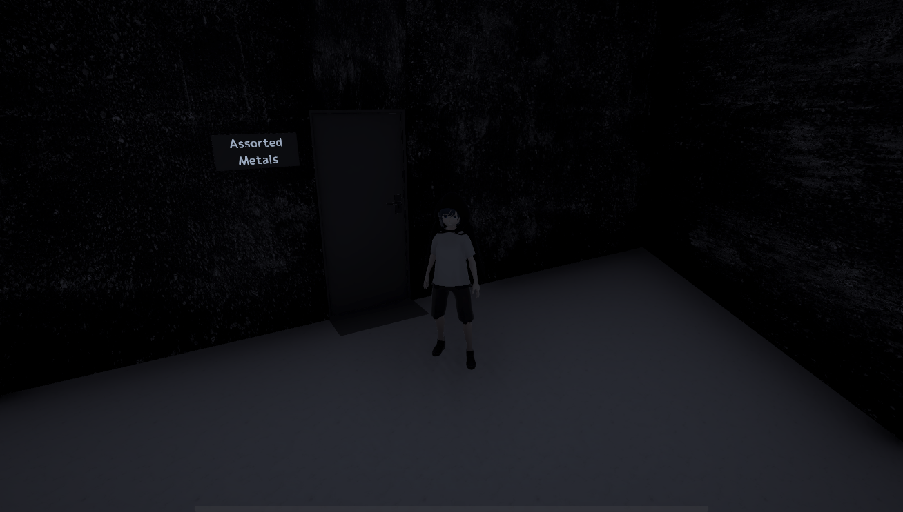
Hi everyone, thanks for your input. The main response is that it's important to know your stats but also that they don't get in the way. The solution I chose is a nearly fully transparent horizontal bar at the bottom of the screen (4 / 255 opaqueness) which is clear enough to see but doesn't steal the attention. The bar goes invisible when at full health.

It is hard to see on itch.io due to the white background, try clicking "open image in new tab". The current health is 57%.


Hopefully this can help any other horror developers decide.