I liked playing Finding Autumn, it's a cute and very colorful and vibrant game. The action is fast-paced, and it's a unique game that kept me engaged. Would love to see something like physics added to trees or objects to bounce and fly the witch off her broom or around the screen! :) Jump feature or "Fly Up" would be cool too, because it would add to the controls and widen the experience of movement. Thanks! Keep it up! :)
A member registered Oct 18, 2025 · View creator page →
Recent community posts
itch.io Community » Game Development » Get Feedback · Posted in Need Feedback on 2D Action Platformer
Hey Ciejay,
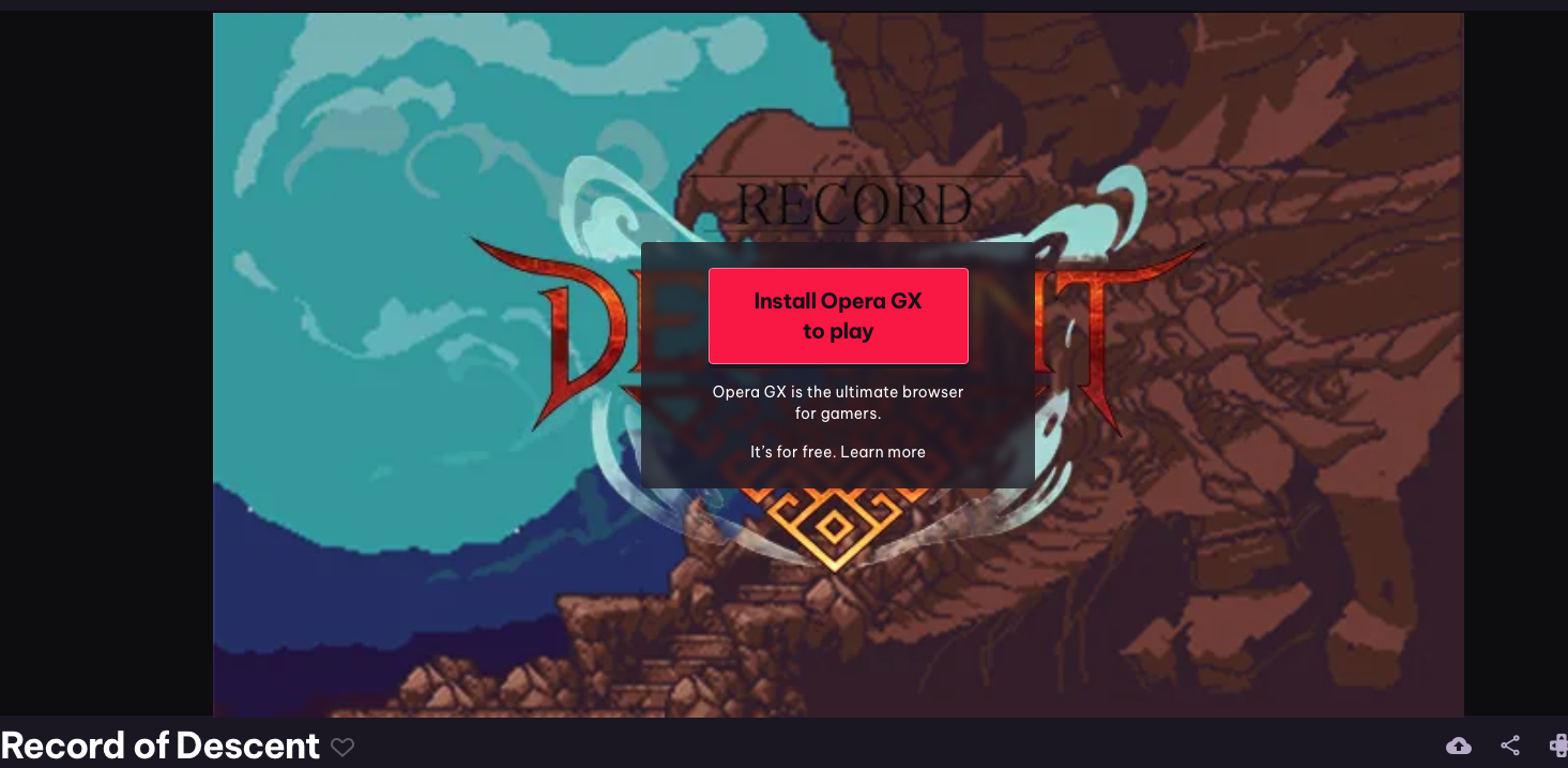
I noticed the build’s set up with Opera GX-only launch — any chance you could make a standard HTML5/PlayCanvas/WebGL version so testers can access it cross-browser? Testing across multiple browsers helps catch unexpected bugs and improves the experience for all players. I’ve got Chrome, Safari, and Firefox ready.
Thank you - excited to play and try the game out as the last remaining dwarf!
itch.io Community » Game Development » Get Feedback · Replied to TORIN the Turtle in [Prototype] Turtle RPG Character, Need Feedback!!
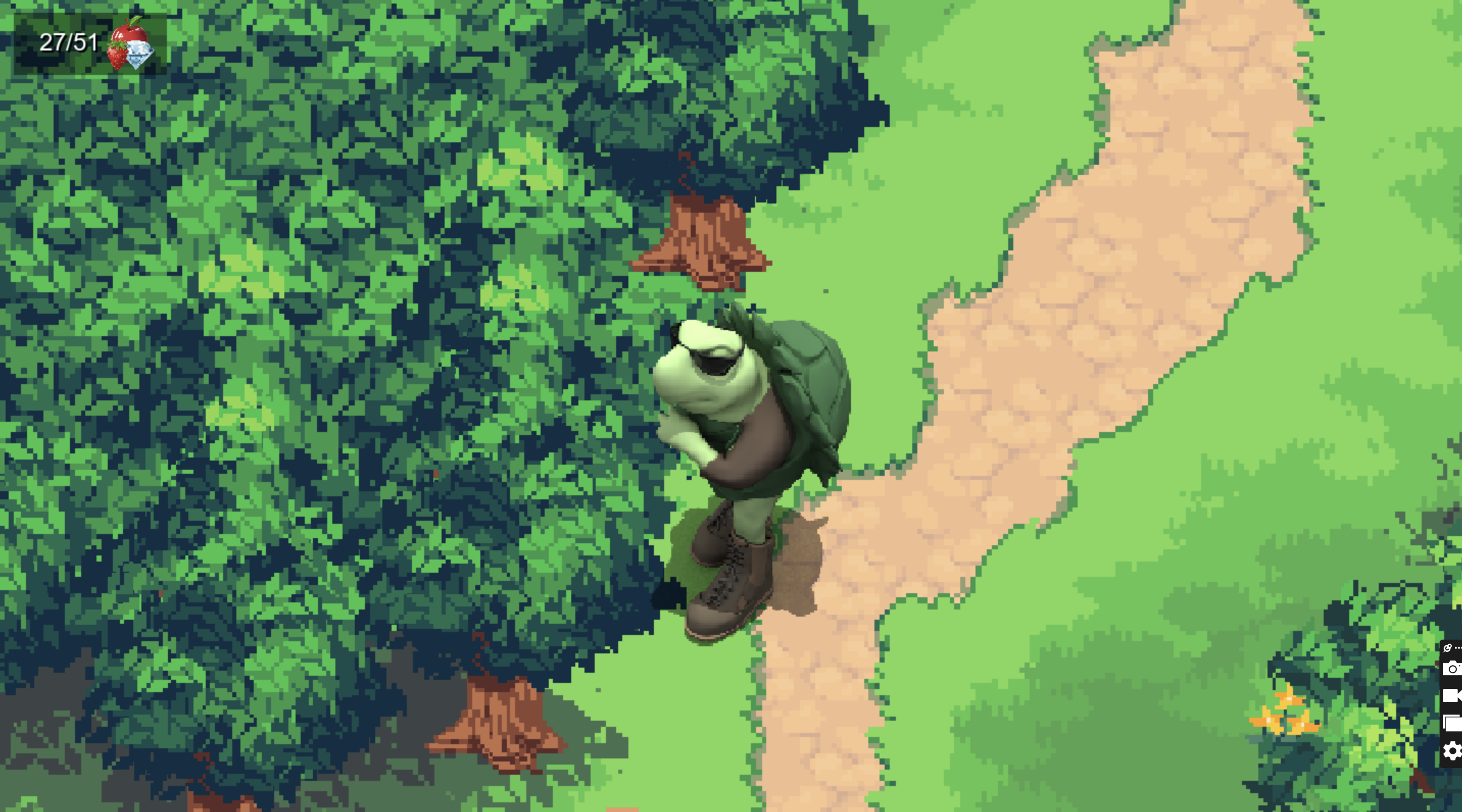
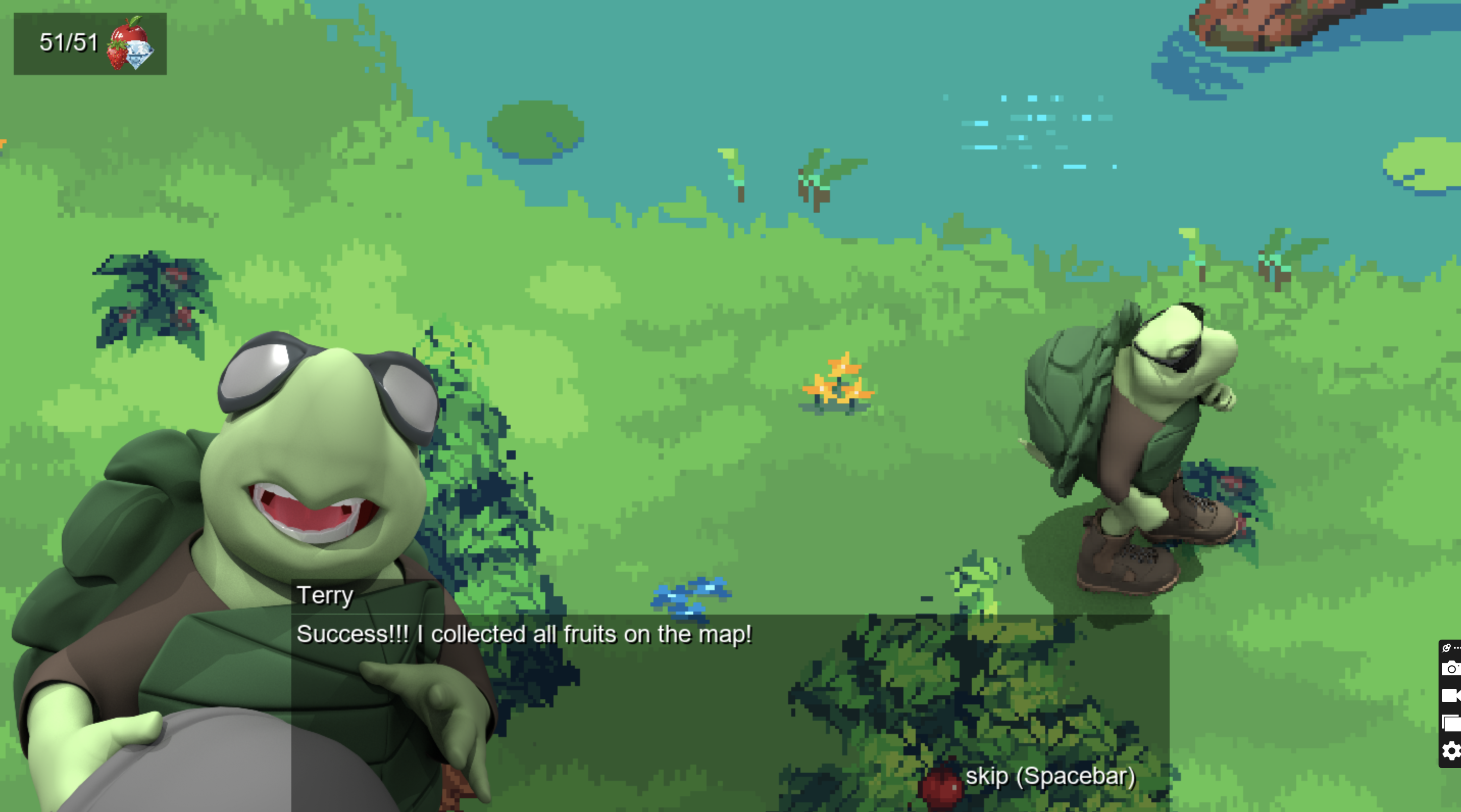
Hello General Terry the Territorial Turtle! 😊
I see you originally posted your game almost 30 days ago, but with a recent update a week ago, so I wanted to dive in and give Turtle RPG a try!
First off, thank you so much for sharing this prototype — I had a lot of fun playing it! I really appreciate all the thought, effort, and creativity you and your team have put into Turtle RPG. The game feels charming, original, and engaging, and I wanted to share some friendly feedback and observations to hopefully help as you continue development.
🖥️
Zoom / Screen Size
- Tried zooming in/out on Mac (Safari) and resizing browser window — didn’t work.
- Noticed the gray arrows square in the bottom-right of the screen (possibly an itch.io feature?) — works to maximize the game screen, though not resizable. Not a huge deal at this stage.
🎨
Artwork / Visuals
- Scene cover reminds me of Ninja Turtles. Love the artwork!
- The scene is colorful, beautiful, and very vibrant; flowers and retro-digital style are a nice touch.
- River effects are well done, showing thought and effort from you/the team.
🕹️
Gameplay Mechanics
- Going into shell with Q is fun; resizing the turtle smaller with keys is cute and interesting.
- Layout is very clear — top-left functions for strawberries are intuitive. Tutorial is written well, friendly, and easy to follow.
- Using R and other keys to resize the Player/Turtle was cool and funny. This is a nice and unique gift to give players to play with.
🐞
Bugs / Issues / Observations
- Stood on the first strawberry patch and got locked/frozen — unable to move with AWSD, arrows, or mouse. (Q still works to go in/out of shell, but movement was frozen until I reset by closing the browser tab window and re-entering your game through this Itch thread)
- Eating strawberries with E works off-bush, but punching trees on right side and the lone tree left-center does not trigger eating animation or increase counter. (Later learned not to explore trees, but only interact with (punch/eat) trees that visibly have fruit on them.)
- Apples also require hitting W first before E to eat fallen fruit — could be clarified in tutorial with image prompt.
- Possible freeze/glitch related to turtle being minimized in size; max-size turtle doesn’t freeze in strawberry bushes. Could require a screen recording QA test to reproduce reliably.
- W key is punch, which could conflict with WASD movement for some players.
💡
Suggestions / Feature Ideas
- Lazy-loading asset % would be cool (noticed one between main screen and start scene).
- Adding a “run” feature to explore faster — fun and practical. Turtle movement feels slow, but still charming. 🐢(after all it's a turtle!)
- Jumping/falling in water causing HP loss or swimming mechanics could enhance realism/fun.
- Show top-right viewport icons for individual fruit counts (currently apples & strawberries counted together).
- Bridge could lead somewhere in future updates for exploration/playtime.
🌈
Fun / Positive Notes
- Tutorial is engaging; internal/external Mac keyboards didn’t trigger arrow movement directly for the first half of place experience, seemed inconsistent, could be the browser, but overall instructions are friendly and ultimately they worked later -- sorry for the lack of clarity on this one.
- Noticed switching objectives from fruits to diamonds and shifting to night-time to be a nice touch.
- Notifications (turtle popups, eating 20 apples) are cute and motivating.
- Skipping tree punching and just eating the apples off the trees by making turtle max size is funny and convenient.
- Overall, the game is relaxing, fun, original, and easy to engage with — excellent foundation.
💬
Overall Impression
🌟 The prototype shows so much creativity, polish, and thoughtfulness. Thank you again for sharing it — I hope my feedback is helpful, and I can’t wait to see how Turtle RPG grows and evolves. Keep up the amazing work — it’s a joy to play!
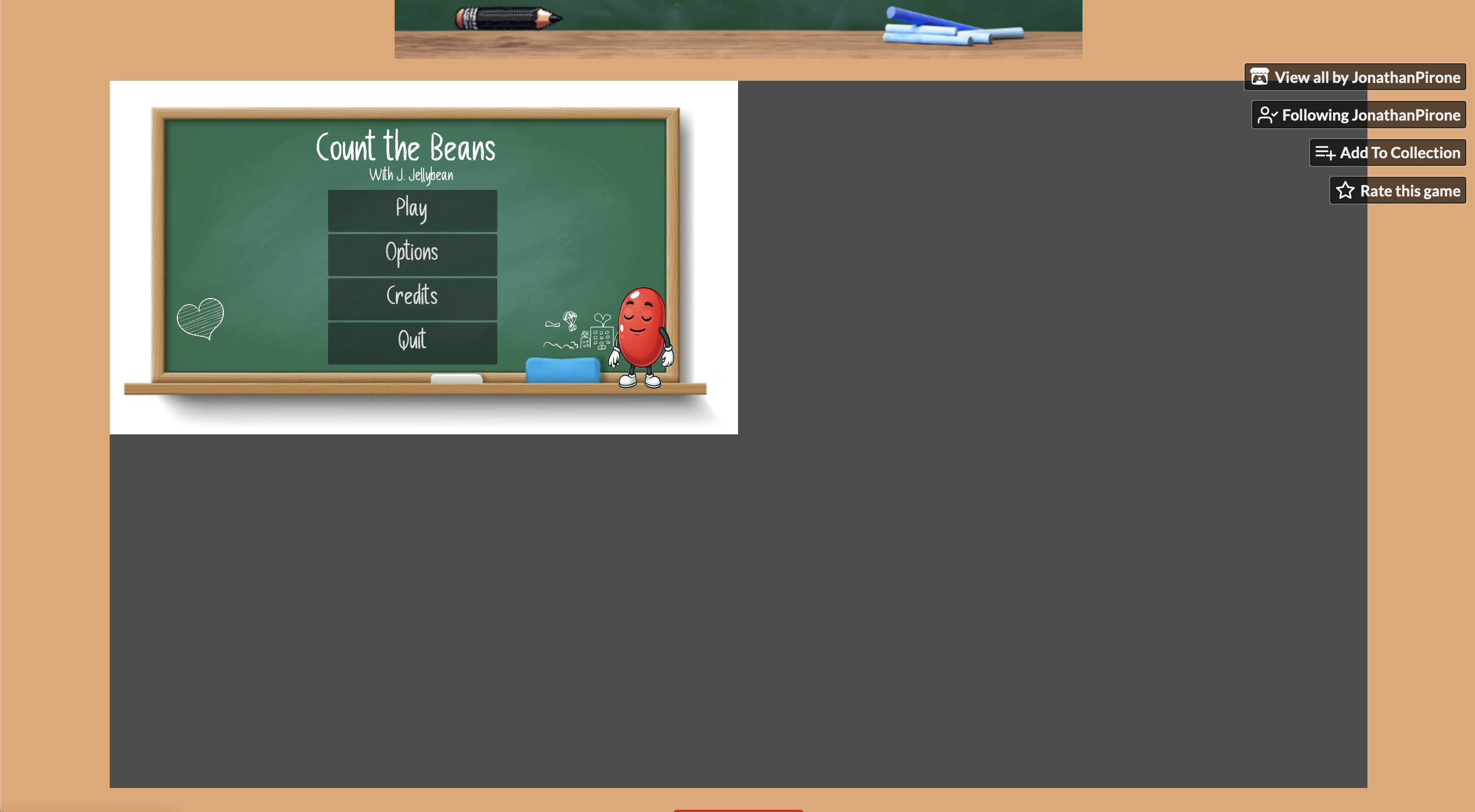
itch.io Community » Game Development » Get Feedback · Replied to JonathanPirone in "Count the Beans” – An Early-Access Counting Game for Kids, Parents & Teachers
Hi Jonathan, that’s a great point. I ran a quick test of the game in Google Chrome on my Mac (Sequoia 15.6.1), and everything works as intended (screenshot below).
I really admire you and your girlfriend for all the thought and effort you’re putting into this accessible, friendly, and academic project. I'm exited to let my daughter try out the game this weekend too!
From a QA/UX perspective, have you considered adding a sound/music volume button or a Pause button to the UI? These could help keep the game balanced and calm, while giving the player more control over their experience.
Looking forward to seeing the next version with your updates — keep up the awesome work! Please feel free to Tag or DM me when the next version is ready for play testing.
Best,
William
Screenshot 1/1:

itch.io Community » Game Development » Get Feedback · Posted in "Count the Beans” – An Early-Access Counting Game for Kids, Parents & Teachers
Hi Jonathan, :)
I had fun testing the web version of Count the Beans! Here are my observations:
- The music is really nice and engaging—great touch!
- On Safari, after selecting the correct answer for the first question, the game didn’t continue. I could select other answers and it marked them as wrong/audio response/interaction, but no additional questions appeared. Clicking around (heart, bean, eraser, chalk) didn’t trigger the next question.
- On Firefox, the first question works, but after selecting the correct answer, the game hangs—similar issue.
- I’m on a Mac and wasn’t able to test the Windows (.exe) version -- please be sure to tag me or notify me if and when it becomes available to test and play on Mac too!
Suggestions:
- Consider adding a “Next Question” button or allowing clicking the bean to move to the next question.
- Include instructions on the Itch page, with the web browser version, perhaps with screenshots, so new players or parents can understand how to play and guide their child.
Coming from a K–12 academic advising and tutoring background (IELTS and other subjects), I’m really excited about your project and eager to test it further once the browser version is working reliably. Please let me know if I can help with additional testing!
Also, I love that you are approaching development with an accessibility-forward mindset -- very commendable.
-William
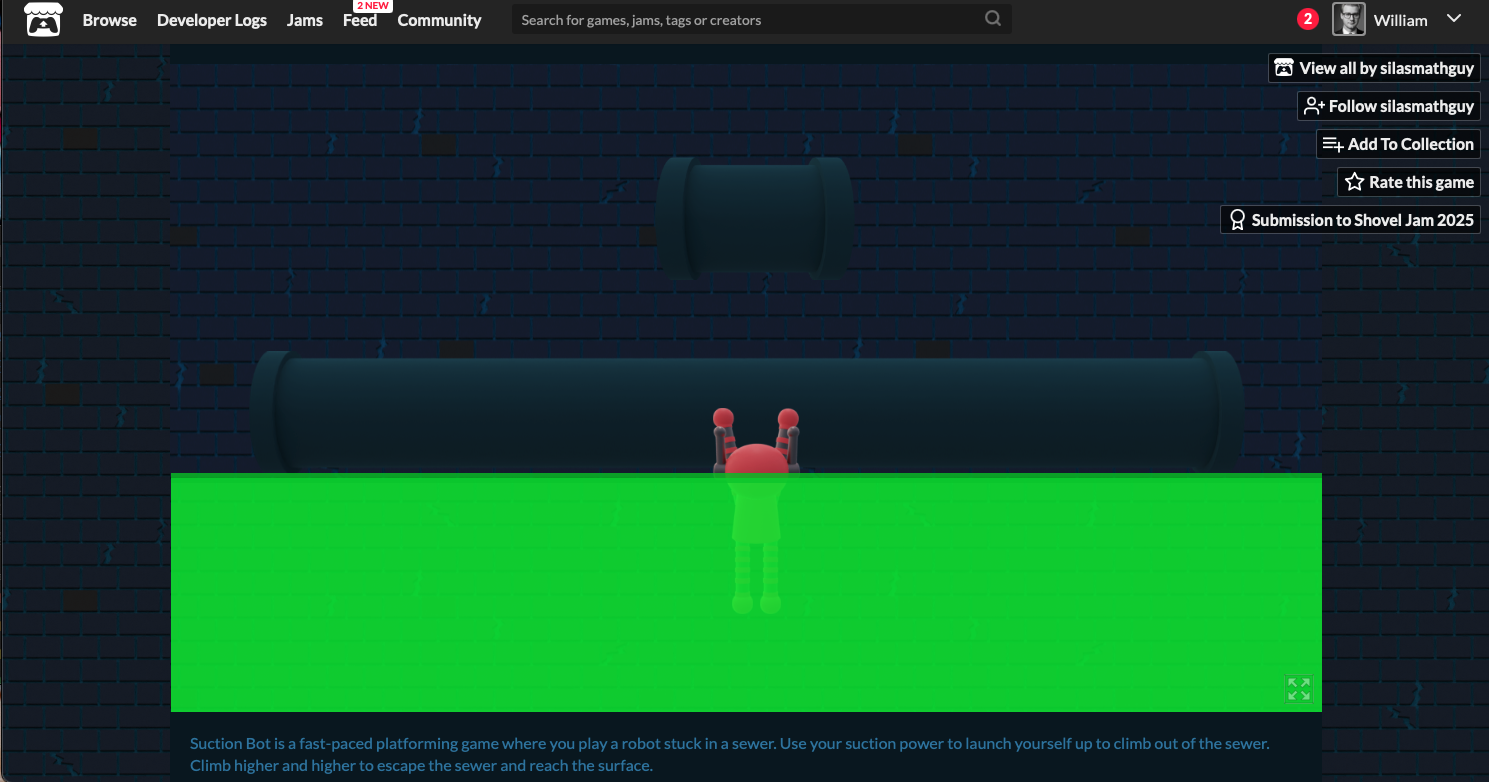
itch.io Community » Game Development » Get Feedback · Replied to silasmathguy in Feedback on my robot platformer game
itch.io Community » Game Development » Get Feedback · Posted in Feedback on my robot platformer game
Hi @Silasmathguy,
Thanks for sharing your game — I really appreciate the effort and creativity you’ve put into “Suction Bot”! I spent some time exploring it and wanted to share some feedback from my perspective.
- On the home page, I noticed a bright neon green bar on the bottom — I wasn’t quite sure what it represents, maybe a quick tooltip could help players.
- I tried the Convery Climb mode. The lava looks really cool, but it wasn’t clear how to get out once I fell in. The W key sometimes anchors to the tube, but I occasionally fell back into the lava. Spacebar and arrow keys didn’t seem to work for me (or AWSD), so maybe a small control guide, controller buttons, or hint system could help new players*
- The music is fantastic — smooth and really adds to the atmosphere!
- The right-click mechanic to stick to walls is creative, but I found it tricky to understand how to use it effectively to climb higher. Maybe some visual cues, sparks, arrows, or a brief tutorial could make it more intuitive, colorful, and engaging*
- The maximize screen option is nice, but I couldn’t find a way to return to the original size, and Escape didn’t work on my Mac. Some additional UI options for resizing or returning to the main menu could help avoid frustration. I was forced to force-quit Browser and restart it to get back here.
- Interacting with objects like tubes sometimes worked, but not consistently. A few more visual indicators on interactive elements might make navigation smoother.
- I tried Level 1: Learn How to Climb, which is a good start, but highlighting the path or giving directional cues could make it easier for players to learn mechanics without trial and error. This mode, even without full-screen, didn't have a clear "Return to Home" button to try the other levels in Suction Bot. It may be useful and fun for players if you add that*
- Beginner Player Experience: I want to note that it wasn't clear from the main-screen, maybe because the theme color is a little dark, that we should start the levels in chronological order starting with 1, the tutorial. I just randomly clicked one that looked cool and fun, but because I didn't do the first Level, I didn't succeed at getting out of the green lava and it was a little frustrating.
Overall, I think the game has a really fun, retro-inspired concept, and I can see a lot of potential here. A bit more guidance, clarity on controls, and consistent interaction cues would make it much more approachable and enjoyable for players. Thanks again for sharing your work — it’s clear you’ve put a lot of thought and work into it, and I look forward to seeing how it evolves!
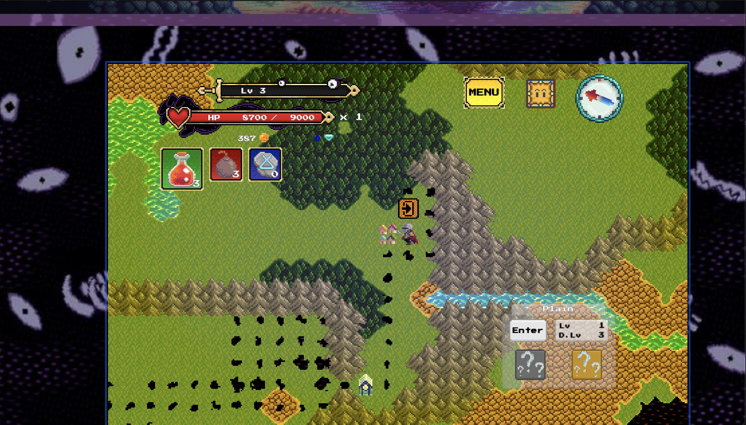
itch.io Community » Game Development » Get Feedback · Posted in The Rogue of Nexus - Feedbacks on my Roguelite
Hi Tenkarider,
Thank you so much for sharing the web demo of The Rogue of Nexus! I had a lot of fun exploring the game and wanted to share some feedback and observations from a QA perspective.
Gameplay & Mechanics Observations
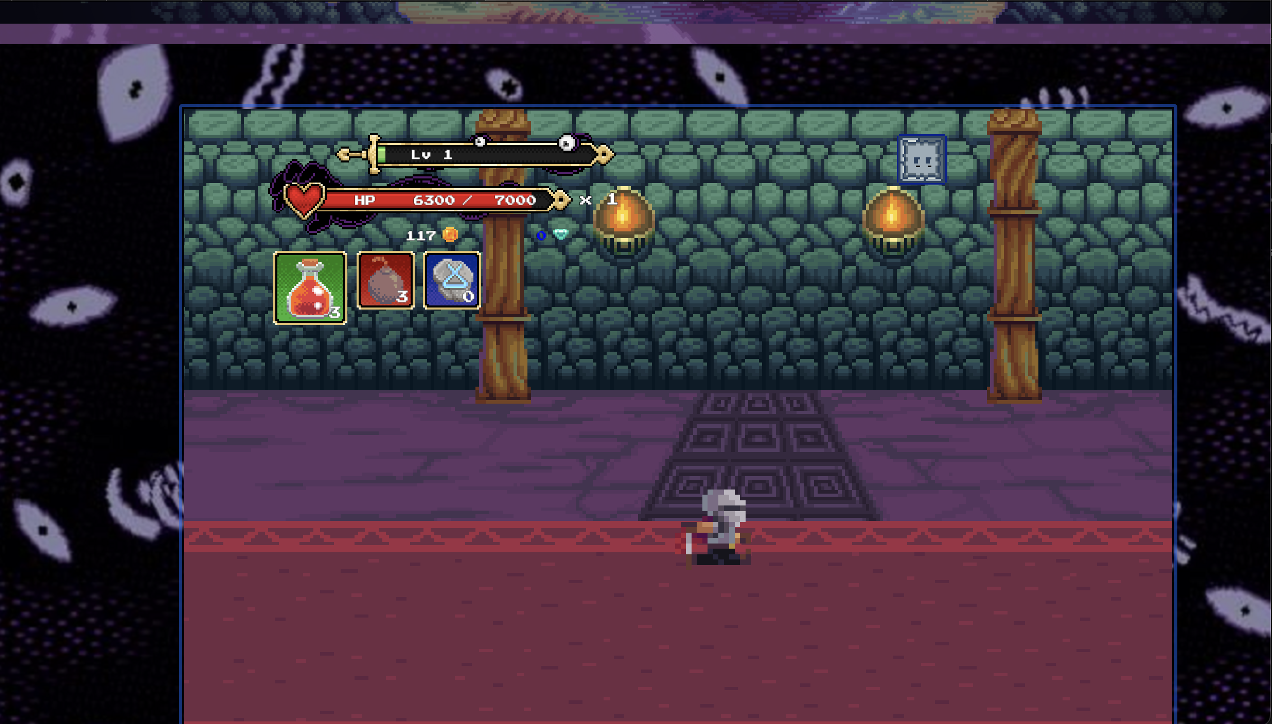
- Directing the fighter at enemies was fun, and the physics of spikes and monsters felt smooth and engaging.
- Green star effects for pickups are bright and satisfying, and notifications/alerts help prevent the player from feeling isolated.
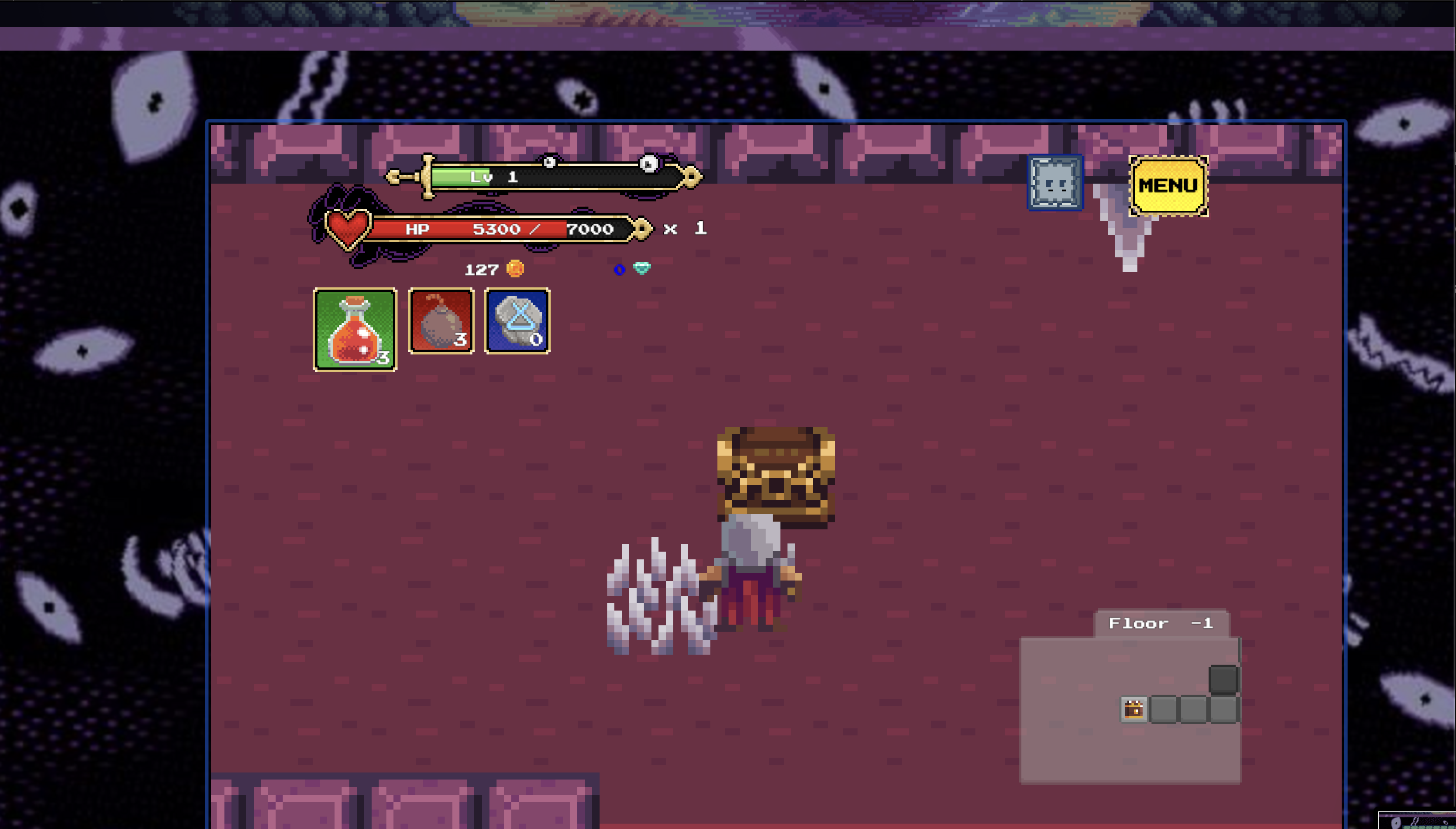
- The compass is a nice touch! However, I wasn’t entirely sure if it’s meant for directional guidance or for briefly accelerating (“dash”). A dungeon map might be useful for players to track rooms and progress in longer sequences.
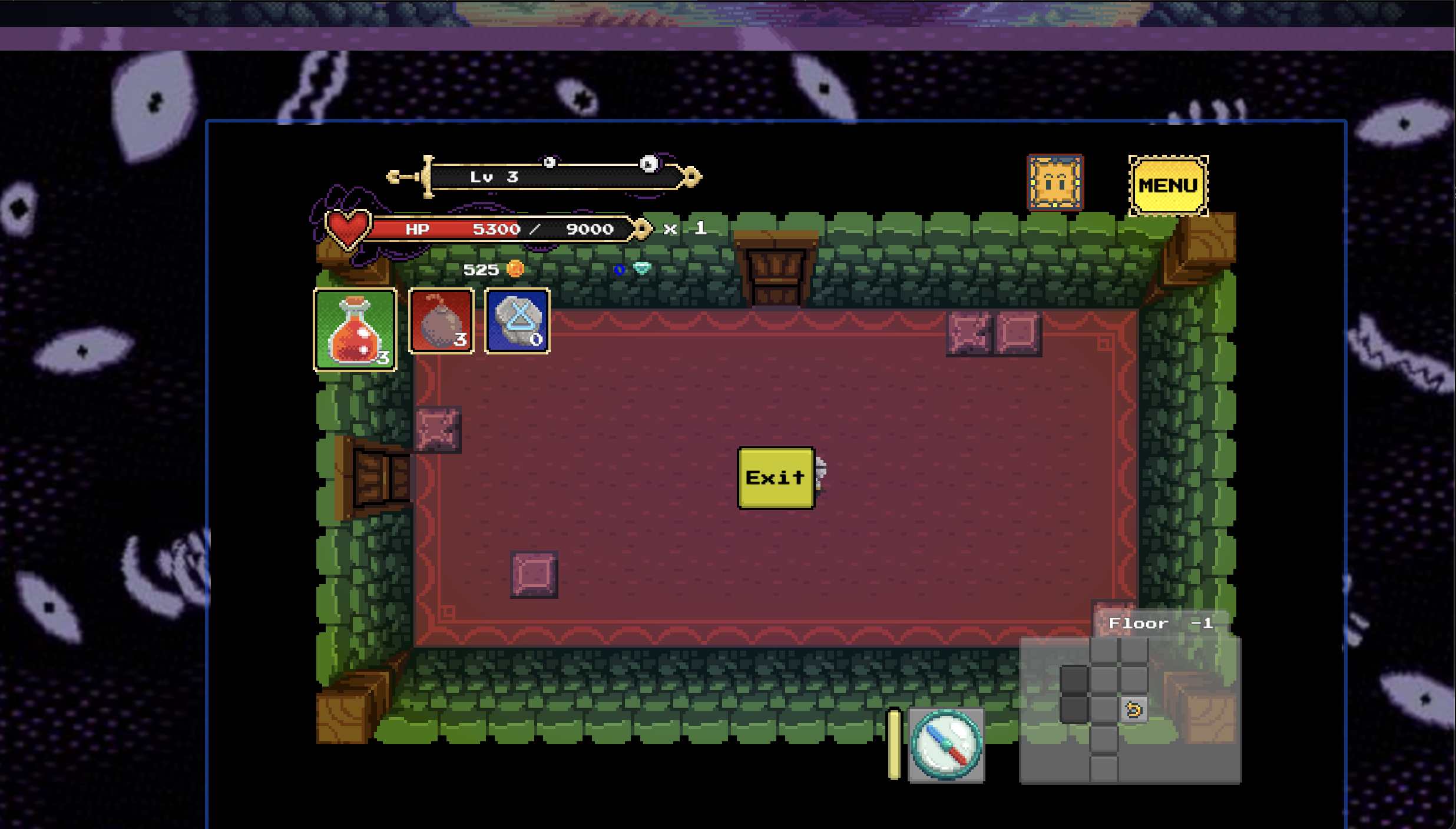
- Resting mechanics work well, but moving the “Rest” button to the top-right (yellow ribbon frame) could make it more obvious.
- Jumping during combat could add more interactivity and fun.
- Tutorial city guides are very well-written.
UI/UX & Clarity
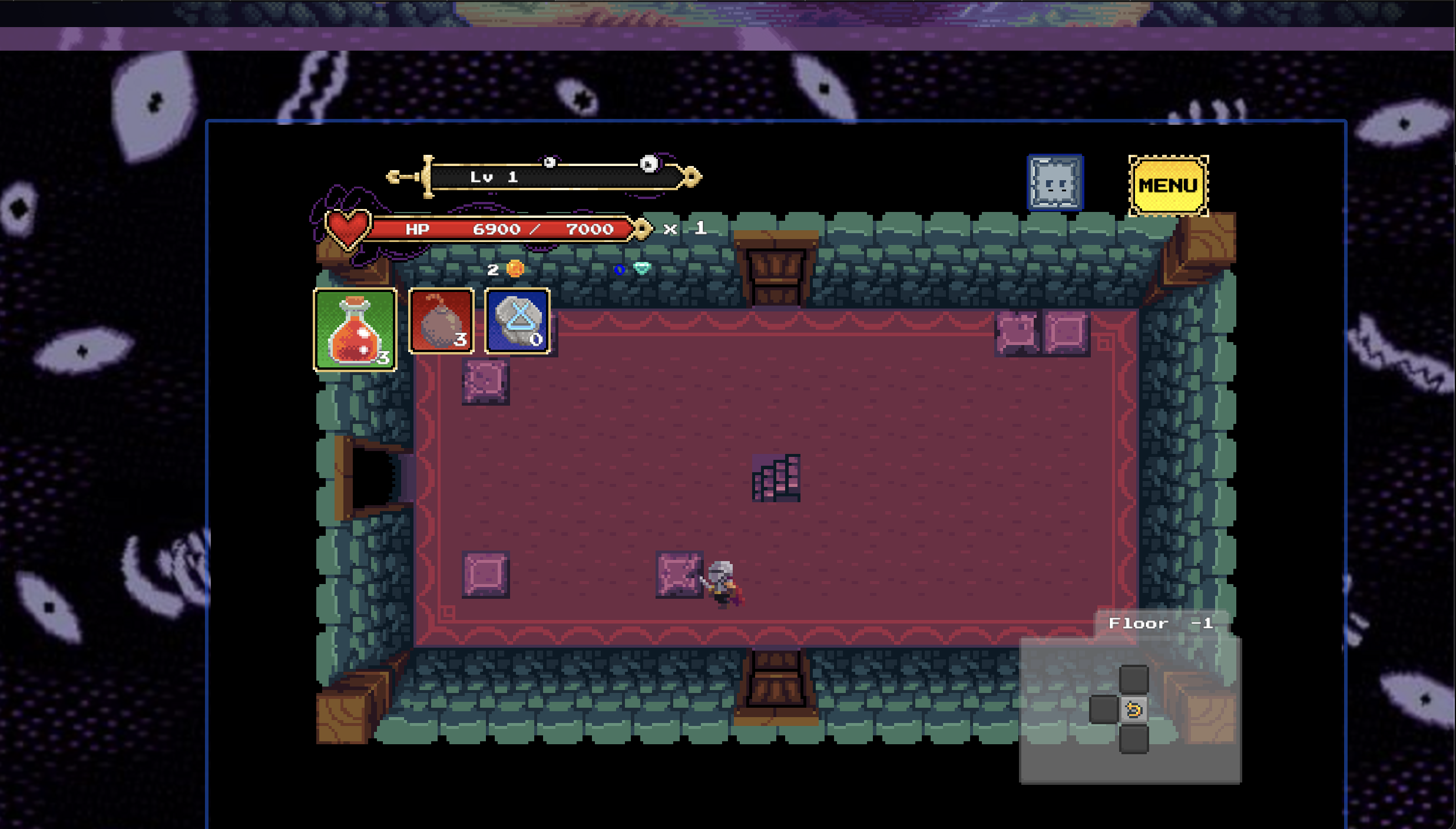
- Coins and shields were sometimes unclear; it took a while to find the shield needed to open the wall in the main map. This may be intentional, but could feel overwhelming for new players.
- Purple boxes in the dungeon appear decorative; breaking them had no effect.
- Some pink squares looked different — are they interactive or do they contain rewards?
- Flower tiles inside the second dungeon are beautiful, but their purpose is unclear.
QA Bug / Game Behavior Notes
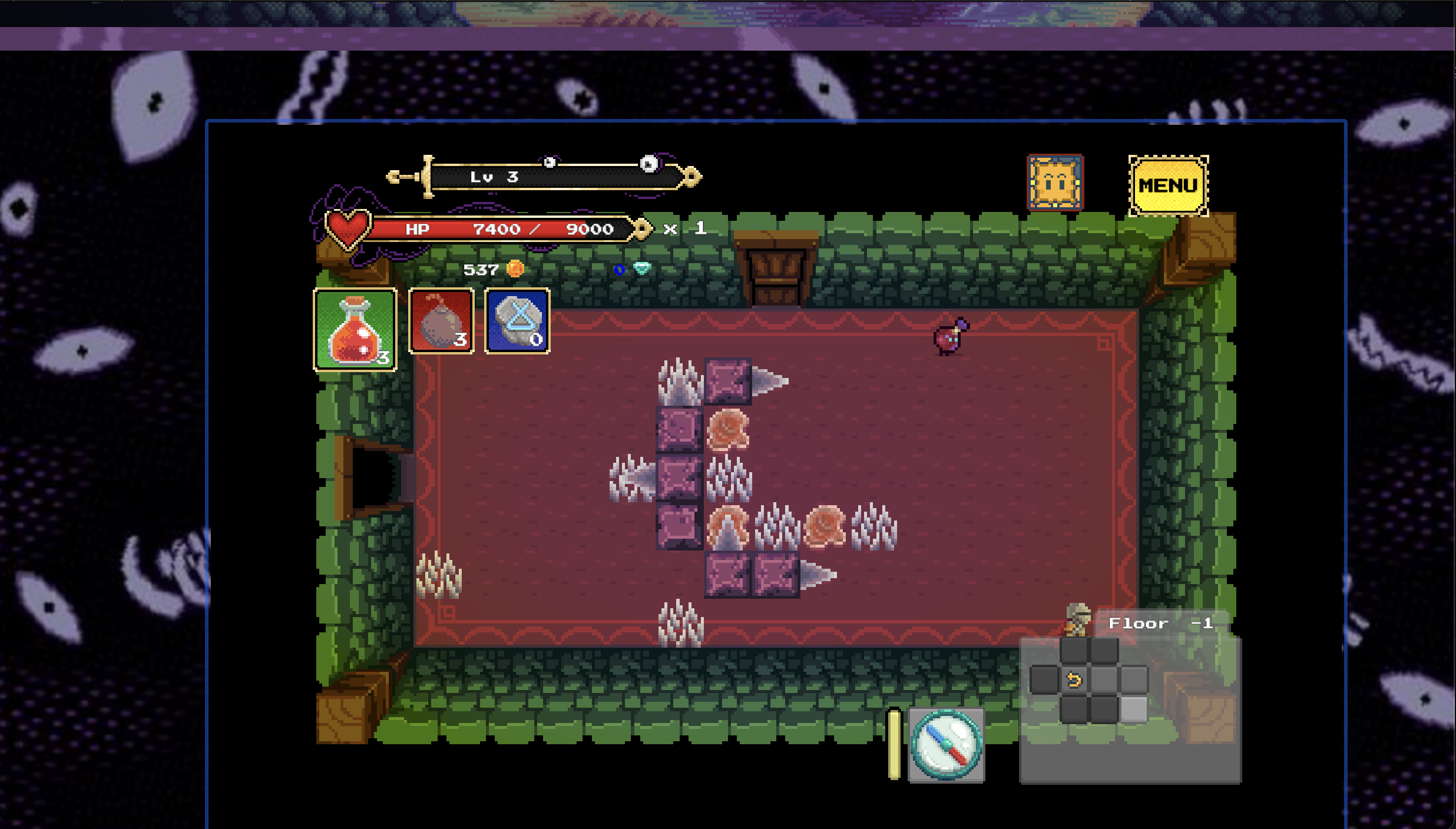
- Dungeon #2 red ball enemy NPC (Reference Screenshot #5 below): Always runs off-screen to the right, creating a loop where I couldn’t engage or exit combat; I had to wait for the screen to reset.
- Second interaction with Dungeon #2 red ball enemy NPC (SS#5): Physics and mirroring made it impossible to collide and engage in a third fight.
- Third interaction with Dungeon #2 red ball enemy NPC(SS#5): Attacked me first, then ran off-screen again during battle, leaving me locked in a loop.
- Compass button inside the dungeon grants super speed instead of navigation — could confuse new players. (SS#3)
- Main map vs dungeon orientation (West → East) felt inconsistent when exiting tunnels. (Reference: Screenshot #1 below)
Miscellaneous Observations / Suggestions
- Black artifacts on the main island — are they trash, monsters, or related to The Hand? (Reference: Screenshot #1 below)
- XP system: no visible increase noticed when attacking/defeating monsters; XP+ effects could make progression clearer. (Reference: Screenshot #2 below)
- Multiple-floor navigation via stairwells (“Go Upstairs,” “Go Downstairs”) could add fun exploration. (Reference Screenshot #3 below)
- Red/silver key placement is good; encourages intentional backtracking.
- +HP recharge elements in dungeons are a nice quality-of-life touch.
Overall Thoughts:
I really enjoyed the game — it’s interesting, fun, and has a lot of depth. I hope these QA observations and suggestions are helpful for future updates. I’d be happy to extend free, collaborative QA bug testing and analysis for a couple of weeks if you’re interested in testing the web version together.
Final note / question: I never got attacked or “pulled in” by the "Dark Hand."
What does that look like, and where does it take the player?
Note: The web demo may take a little time to load and can appear stuck around 95%. Be patient — it will eventually start!
Thanks again for sharing your game!
— William
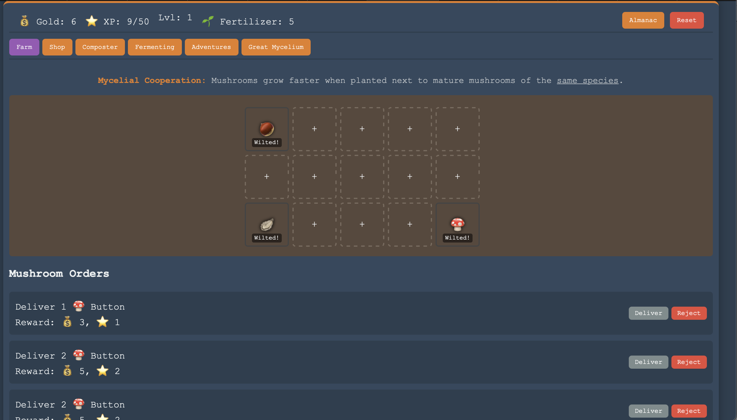
Hi BuddhaTheGreat,
I just played Mushroom Tender and really enjoyed it — cute, simple, and fun! 🍄 The bottled sunlight gave a great fantasy + RuneScape vibe, and the almanac with unlock-in-shop and find-on-adventures features makes exploring rewarding. I actually found it therapeutic and relaxing, and it was funny to see my mushrooms wilt when I left them alone too long.
Strengths: Cozy and charming with satisfying resource management.
Observations / Suggestions: For the long rectangular farm, maybe adding flowers, weather, or other visual touches on the sides could keep players entertained while waiting 15–30 seconds for mushrooms to grow, if they elect to just sit and watch.
Overall, a really enjoyable first project — can’t wait to see how it evolves! :)