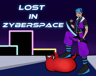
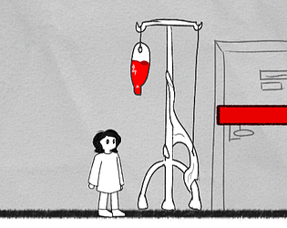
Simple and fun! I really like the design of the big monster chasing you.
Cyrus
Creator of
Recent community posts
Neat concept! Definitely has a strong sense of atmosphere, but after the 8th or so loop with nothing too crazy happening it started to feel a little repetitive. I liked the hallway with the banging door sound and the one with the lights turning on, I think those were the best at making me feel scared.
I’m a huge bullet hell fan, so this was nice to see! In terms of gameplay I feel that the second boss was the most fun for me since it was the only one that genuinely focused on dodging something unique over just running away from the enemies while they sometimes shoot at you. Sound effects in general would be really helpful, especially to telegraph certain attacks while the bosses are off screen.
Thank you so much! I appreciate the comparison to Outer Wilds <3 I should clarify that the events are taken from a short story, but Alec as a narrator in the original simply isn't as interesting of a horror protagonist compared to his sculptor friend. I did have to rewrite the narration in order to focus on that character.
I really liked this one! The writing was phenomenal and really made it feel like it took place in the 1900s. The futility of all your choices really nails the psychological aspect. I also really liked all of the minor, subtle effects happening- sounds, camera shake, etc. I died in the snow. Great job!
Cool game! I liked the story and how it was presented, I think using ‘memories’ to discover more of the story is a neat idea and actually incentivized me to play a few times to get all of them. It was a struggle to collect them all though as the controls were pretty floaty and inconsistent. Sometimes my character would start moving really slowly, slower than the oncoming darkness which led to some (in my opinion) unfair deaths. Same for the jumping too, sometimes I would jump really high and sometimes not high enough to clear obstacles. I did like the darkness mechanic though. Good job!
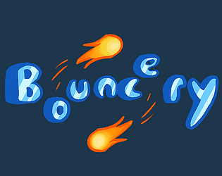
Really fun! I love how bouncy everything is. The music is also really good and definitely had me in the zone. I also liked the story and character choices used here!
One thing that I would add is an option to change the speed that the notes come at you. I'm a rhythm game player and I generally prefer having notes approach quickly, it helps me differentiate between the different notes better and gives me more accurate timing. The way the game is, it's hard to tell notes apart and when to hit them when they are all clustered together, especially on hard mode. That said, this was really good!
Cute art and I like the concept! It's very short and I don't mind that, but if the level is going to be that short the player shouldn't be crazy fast. She controls kind of like sonic, and if that's how you want her to control then a longer level designed with a faster character in mind is needed. Or just slow her down!
I think more could've been done to sell the 'shrunken character' aspect of the game. The level kind of just looks like any other, and I would have no idea Renko was supposed to be smaller if not for the story text. Why not have blades of grass as tall as she is or giant flowers? Anything would work as long as it's a big version of a small thing.
For your first time using Unity this is pretty good! The game ran smooth and I personally didn't encounter any bugs. Would love to see this expanded on!
This was cute and fun! The controls were smooth and responsive, which is essential for a game like this. I also really liked flinging a bunch of bullets back at enemies, and learning their patters to time your attacks was really satisfying.
Sometimes enemies would spawn on top of me and start shooting right away, particularly the fairies that shoot a straight homing attack. It's hard to avoid them when they're right in your face, and its hard to tell where they are going to spawn. Other than that, the game was really balanced!
I'm not sure what the connection to the theme is, but I think this has a lot of potential if you wanted to expand on it for a future project/jam. Good job!
I think the idea of a turn-based danmaku game is pretty cool, but I'm not sure I get that from this game. It kind of feels like the game stops every few seconds, forcing you to choose between two attacks that I can't really tell the difference between mechanically. Since we can't see Eternity's health, I kind of assumed Strawberry Cross was worse than Dream Bomb since it had a smaller range.
I also think some of the hit boxes were weird, there were many times I got hit and didnt think I should have. But it it was hard to tell if I was getting hit or not since the bullets kind of disappear when I got close, without a sound effect or anything. It was unclear when i was losing HP or gaining GP. I think you have the bones of a good system and some clarity would really help with that.
This was cute and I really loved the concept! Tycoon games are fun for me and it was a really great use of the 'Scale' theme. Choice of characters was also really nice to see and I adore seeing Yamame and Wriggle in the same game.
I agree with another comment saying that the generation of the flowers felt slow- I think it's fine to have them be slow at first, but upgrading them didn't really feel like an exponential increase the same way tycoon games are kind of balanced around. I didn't feel that big of a difference when I did.
Thanks for getting back to me! I'd be more than happy to elaborate on some of the things I mentioned. There isn't a crosshair in the windows build of the game, and when I shoot, it seems to land towards the right instead of the center. The bullet trail is helpful though. There's also no indication that an enemy has been hit, they don't change color (that I noticed) or make a sound effect. A sound effect might be more helpful than the color change since most of this game is in darker areas. I found that collecting ammo was also pretty unclear, I didn't know you had to step on it at first and kept trying to interact with it.
As for the textures, there's quite a bit more that I noticed than just Z fighting (that weird flickering/clipping). The gun is partially transparent; it looks like its normals are flipped or the wrong faces are being culled. Same goes for a lot of the roots/branches in the second area. Not all of the textures are oriented the same way, sometimes the bricks start going vertically. There's also a few areas where the walls seem like they have stripes running up and down them, though this might be more the UVs than the textures. The UVs do seem off in some places where the texture starts warping (ex. floor of the swimming pool area). Most of the textures on the walls are pretty low res, but they're used on such big objects that the jpeg artifacts are visible. This is a fairly easy fix though, just tile the texture of the wall materials a bit. If anything I mentioned here isn't clear, you can always reach out to me on discord (kazamis) and I can send you screenshots of what I mean. This is still pretty impressive for a first time 3D modeling, you made quite a bit in such a short time! I'm glad to hear you're continuing on this project and I wish you the best of luck!
Loved the story and the atmosphere! Great use of sound to create tension and scares. Keeping track of the codes found on the screen was a well appreciated touch as well. I found there to be very little ammo though, and it was hard for me to tell where I was going to shoot. Both of these combined made combat a bit frustrating. If you were trying to steer the player away from combat that'd be fine, but I couldn't find a way to get past enemies without having to shoot them 5 times. There was also a lot of texture jankiness that I thought was a little distracting. Despite all this, I want to stress that you still managed to create a unique, tense atmosphere, which is one of the most important things for a horror game. Great job!
This was pretty fun! The gameplay was a little confusing at first, and I lost a few times before I was able to get my bearings and understand what I was supposed to be doing. I appreciated having to click through each different action to grow the crops and I think it added to the stress of the game. I think this is a bug, but sometimes when I'd click, it would go forward two tools instead of one, which would really throw me off of my rhythm. I enjoyed the core game though!
Fun concept! The goals were clear and the enemies were surprisingly tough at first. I'm not sure I won though? The world blew up. It was fun experimenting with the different weapon objects, but I didn't think the hierarchy of them was very clear; why is a mop better than the metal rod I start with? I also had a bit of trouble figuring out the range of weapons for both myself and the enemies. It felt like the wrench had a very small sprite, but its actual hitbox was much larger. I think you're onto something here though, and I hope you continue developing this!
This was an interesting little game! I really loved how the Uncle made comparisons between the machine and the life of the characters. It seemed like some of the dialogue lines were skipping for me though. I also wish there was more to do with the other parts of the PC, but I think it's a great sign that I want to play more of your game. I hope you continue to develop this idea!
The visuals of this game were nice, polished, and consistent, and there was just enough quirkiness to make it interesting! I though the UFOs in the second level were a nice touch. However, there was quite a few issues that made this game harder to enjoy. I had to figure everything out by trial and error since there aren't any controls in the game or the game's description. It was impossible for me to aim since I couldn't see my cursor, I just had to guess as to where my bullet was going to go. There's no respawn cooldown where enemies don't affect you, and I would very frequently die, respawn right into an enemy and die again, and have that same enemy kill me a third time because I hit the same enemy which hadn't moved. When I finally did die, I had to quit to the menu to restart. Because of all these issues, I was not able to make it past the second level.
With all that said, this is something to be proud of if this is your first game! When I finally figured out what I was doing I thought the gameplay was fun, almost arcade-like. With a little bit of tweaking, this could be something really fun and engaging. I hope you continue to develop this!
I really like the sprite work and I'm surprised someone else went with a ghost theme for this jam! Unfortunately, I found this game really hard to play. The jump was very high and came down really quick, so it was hard to predict where I was going to land. A drop shadow underneath the player character might be helpful if you want to keep the very high jump. I also felt that the levels were very repetitive, having to perform similar jumps over and over again was tedious. I gave up when I fell out of the level and didn't respawn. Making a platformer is hard, so I really commend you for your efforts and I hope you can use this feedback to make a great game in the future!
Also, it's generally a good idea to keep files together in one zip file so the player can download both at once without missing anything. I almost couldn't figure it out because I had only downloaded the .exe.
Great concept and cute character! You've made an impressive amount of levels as well, which is really nice to see! However, I was really frustrated by the explosions. There's nothing to indicate where they are when they're not going off, and there's no 'charge'/anticipation graphic or time period that would let me know to move out of the way. They all seem to come from nowhere and knocked me off my path completely, which was pretty annoying and felt pretty cheap. Their hitboxes also aren't very clear, and their timing seems a little inconsistent. This was still a cute little game though, and I'm a big fan of the main mechanic of managing your battery! I hope you continue this project!
This was incredible! The polish and attention to detail is really top-notch. I'm a big fan of the subtle sprite changes when we're not looking at the screen and how the intensity of on-screen glitchiness increases towards the end. And this was in only a week? Wow! Great job, keep making games like this!
Great visuals! The environment had enough clutter that it felt lived in, and the fog was a nice touch that added both ambience and difficulty. There are quite a few game-breaking bugs though; I clipped through the ground multiple times, I was able to float over the monster after coming down the stairs, and the pause menu doesn't actually seem to pause the game. Its also a little unclear when the monster sees you vs when he doesn't or what catches his attention in the first place. You have a great start though, with a little bit of polish and bug fixing this could be really fun!
This was really scary! The pixelated assets plus the scaled-down real footage create a real sense of uneasiness. By the time the player's used to it, you throw them a curve ball with some full color stuff. I also appreciate the build up to the jump scare, you can actually see the 'father' approach before the screamer, which helps it not come out of nowhere and alerts the player to the cue they should be listening for- especially the first time around. Everything was really thought out, great job!
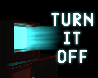
You did a great job of building a really intense atmosphere before the monster even showed up, I swear I was getting scared of my own shadow while waiting to repair the TVs. The monster itself was freaky and scared me quite a bit. I thought the game would be over with the reveal, but it kept going! Great job!


