Remi Vaughan: The scope of this game is really incredible, lots of variety in terms of how to play and what opponents you fight. Really creative with all the characters, but also all the stages and the map selection view. That said, I'd consider changing up the UI; the buttons on the side might be easily pressed during gameplay, which could be frustrating - maybe put them in a pause menu? Also I'd consider trying to ditch the virtual joypad altogether since it covers so much of the action. I'm not sure how you'd do this while sticking to mobile though... maybe this game would feel better on computer/console? Give lots of things a try, because you have a really good game here.
remivaughan
Creator of
Recent community posts
Remi Vaughan: Interesting gameplay mechanic, really reminds me of a game I saw not too long ago with a very similar mechanic. Lots of people talked about adding exploration and making it so you weren't just shooting backwards at enemies, but I think you should double down; ditch the virtual joysticks, make the player just follow the user's finger, and have the player automatically shoot a trail of bullets behind them. I've never seen a game that does anything like that, and your game seems to be going in that direction already, so maybe try it out if you're interested!
Remi Vaughan: Really loved this game, very well executed on the underlying idea. Lots of care was clearly put in to make the game not only visually appealing, but also satisfying to control. Also, lots of nice touches with stacking ability sprites and custom trails. The one thing I would change is making the game a bit more forgiving, such as by shrinking the hitboxes or by ensuring that obstacles that don't actually touch the top of the screen can't kill the player. But very nice game overall~
Remi Vaughan: Visually it is lovely, and the main mechanic is simple yet well executed. Things tend to line up well, too, making the gameplay satisfying. From here, I think the best thing you can do is add more variety to the music, and maybe make it faster to it can really scratch that rhythm itch. Also maybe adding customizability would work well since this is a mobile game
Remi Vaughan: This game is super cute! I love all the small details in fitting the mechanical parts of the game with the theme and the aesthetic. All of the animals are so cute, and the goal being a big box you hide in just works so well! I think the thing I most want improved about this are the controls, which are sometimes kind of buggy (Navmesh agents are really hard to get working 😔) which makes it hard to feel like you're really in control of the character. But on the other hand, that can sometimes add to the experience! The Last Guardian for the PS4 I think experimented with that lol
Remi Vaughan: This game simply looks spectacular. The models are all very nice and all fit together, the color choice is flawless, and the lighting really gives the game an afternoon-challenge kinda feel. I think the one thing I want to see most from any future development on this would be for things that can harm the player to be more well telegraphed; right now a lot of things you can only avoid if you know they are coming rather than by seeing them about to come and dodging, if that makes sense
Remi Vaughan: This game was really cute! The character and enemies all met this really nice aesthetic, and I thought the music worked really well too. I especially loved the special effects going on in the background. Everything came together to make a nice vibe for the game. My one problem would be the sometimes unfair level design; the player should be eased into the game with elements meant to teach them what they're doing and how to do it, but (especially at the very start of the game) I feel like I'm being punished for not knowing what is going on.
Remi Vaughan: This game was super cool, probably one of the most ambicious games of that week. Getting the models and animation and all that really worked with the vibe you were going for, and all of the ambiance effects like the lighting and sound were nice too. The design of the last level especially was great. The change I'd like the see is more levels like the last one. The others just don't really seem to fit the vibe, even with the effects added in.
Remi Vaughan: This game was super funny, especially when I played it the first time. I never was able to beat those levels haha. I love games like this that are all about variety and really surprising the player, but not making any of the traps unfair on a second try. It's all about remembering what traps exist and remembering how to avoid them later. One thing that I think needs to be improved tho is some of the later level design. The small levels I saw in the first release were really fun, but you seem to have gone with a different design path for the final release. I prefer the one-screen levels you had as I think they fit best with the gameplay, and would like to see more of those if you keep working on this in future.
Remi Vaughan: Omg I had forgotten about this game. The whole thing is super cool: the minimap was a great idea that made it feel very metroid-vania and was well executed, the enemies were perfect, the level design was engaging both mechanically but also aesthetically (it actually *feels* space-y). The one thing I'd like to see improved is the UI. Text in the corner is functional for class since time is limited and you clearly used a lot of it on what you already have, but if you continue work on this game you should consider adding a well-designed HUD.
Remi Vaughan: The art style of the game is very pretty and ambitious, especially the player character. I like that you made sure to inform the player of the mechanics - this is something that I often forget about when making my own games until the very end, when I just add in something that doesn't really work as an afterthought lol. I think the next steps for this game would be to double down on the aesthetic and maybe even focus on the story; this seems like it would be a very chill story-focused game, if you wanted to take it in that direction
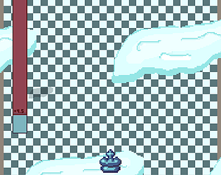
Remi Vaughan: This game is very cute and is a pretty solid platformer overall. The visuals are great, and I think you did especially well in your choice of sound effects. They all fit the game very well in my opinion. In terms of improvement, I'd say to try to give the game something that makes it stand out, like some kind of mechanic, theme, mood, etc. Maybe start with snow/ice related mechanics to fit with the theme?
Remi Vaughan: This game was super cute, the whole aesthetic was very fun and the mechanics chosen fit the aesthetic of the game very well. I really liked the time-based health thing, it really fit with the whole trying to avoid waking up thing. One thing I think I'd change is the player movement options. Get an exact idea of what you want the player to do, when, and why, and design everything around that.
Remi Vaughan: I think I said this in class but this was probably my favorite game of the midterms. The mechanics all meshed together really well and were all really fleshed out, and the throwing mechanic especially was fun. I think in terms of improvement I'd say to go all in on the throwing and make it easier to kill enemies with it, more varied in what you can do with it, and more intuitive in general systems-wise.
Remi Vaughan: This game was great. I loved how you went all in on the variety of the content but without deviating from the central theme. It was all very creatives and often very funny to see the ideas that came up in each new level. I also like that the graphics are very cohesive, all being in the same style.


