
Nice little game. It has the main appeal of Infinite Craft, but with goals and different pathways to go down.
A member registered Aug 01, 2019 · View creator page →
Creator of

Recent community posts
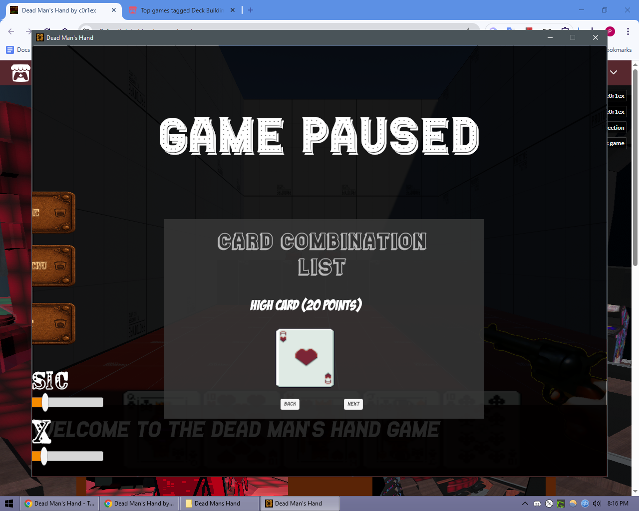
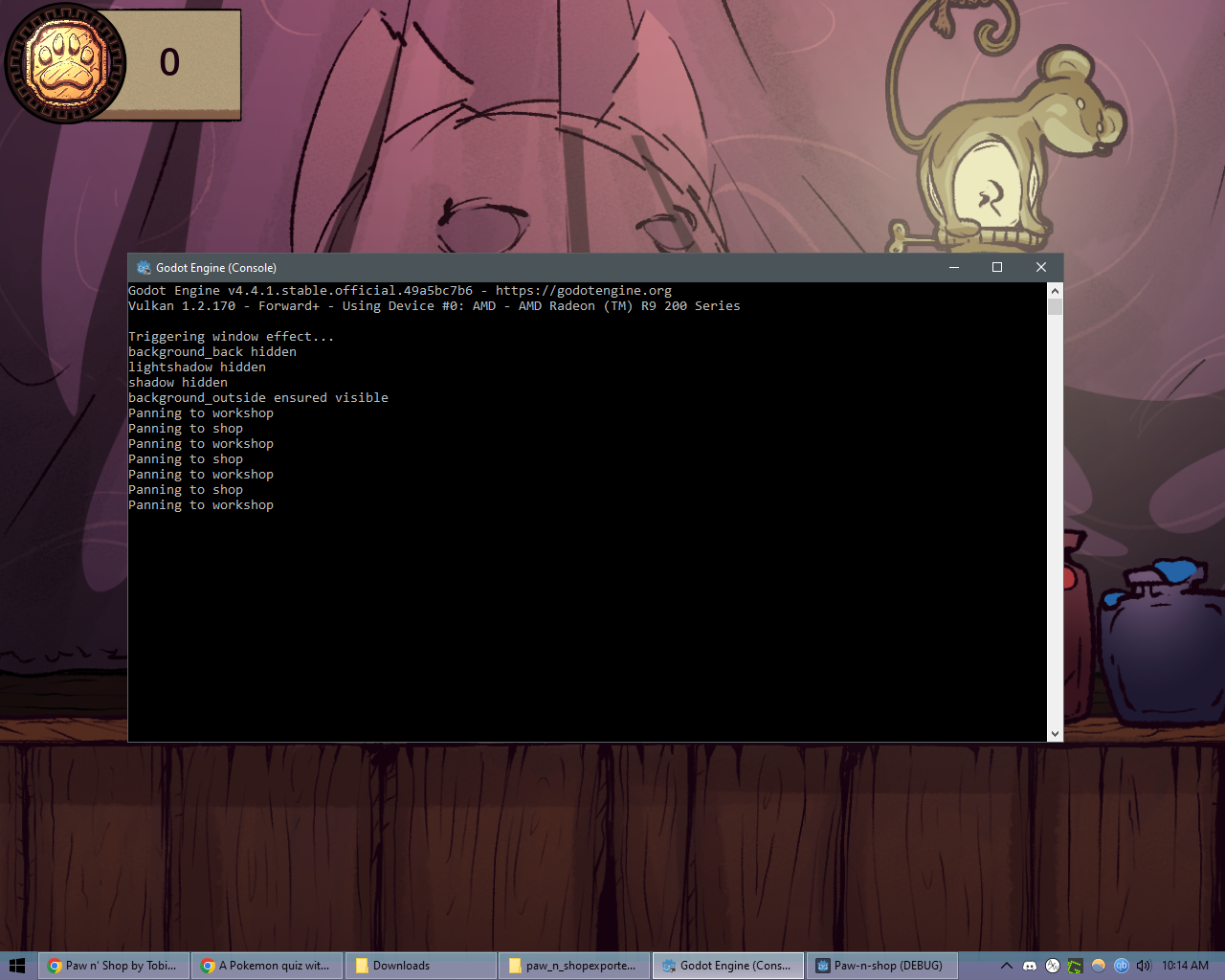
It seems really interesting, but I'm having trouble playing it. I'm on a 1280x1024 monitor, going fullscreen or zooming out in the browser makes it unplayable. vvv
A downloadable version would be appreciated too, so I don't have to re-download it each time.
I filled out the form, but I'm posting this part here for the picture.