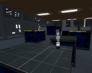
Nice work, I’m super jealous of how much stuff you did that I wanted to do but didn’t; I don’t know what it is, but I love the 2d character in a 3d world. Lots of panache and I really appreciate the gamepad support!
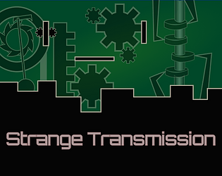
I think the core is ideas are good but a handful of changes would help. I don’t know if it was gamepad related or something else but the elevator especially was often really finicky, I’d keep pressing up or down but nothing happened, step off then back on for maybe 15s. But not always, sometimes it just worked. After reading a terminal, I couldn’t move left or right but was able to jump and maybe that made moving work again. Also gamepad not working in the menus was a bummer.
Having a little something for the surfaces when things are depowered would have been really nice, maybe just around the character. Since the level was so simple, it wasn’t too bad but if it would have been a bigger game by even a small amount, I can imagine it being frustrating to navigate.
The bird interactions where confusing, at first it felt like a buddy but then I had to attack it?
You definitely have something cool to build on here, keep at it!


